

Retail Store Organization Structure Chart




Try Before you Buy Download Free Sample Product
 Impress Your
 Audience
 100%
100% Editable
 Save Hours
 of Time


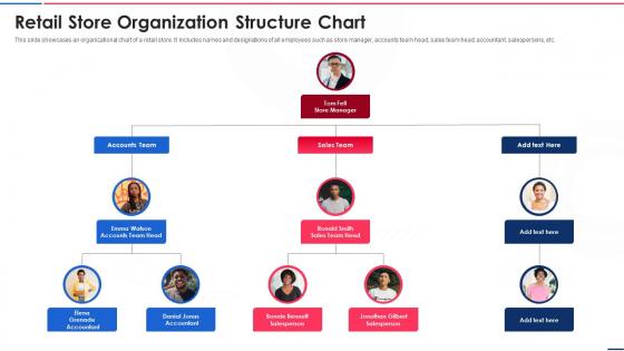
This slide showcases an organizational chart of a retail store. It includes names and designations of all employees such as store manager, accounts team head, sales team head, accountant, salespersons, etc.
People who downloaded this PowerPoint presentation also viewed the following :
Retail Store Organization Structure Chart with all 6 slides:
Use our Retail Store Organization Structure Chart to effectively help you save your valuable time. They are readymade to fit into any presentation structure.





FAQs for Retail Store
Honestly, the trick is making people walk past everything to get what they actually want - stick your popular stuff way in the back. Create a clear path through your store but avoid dead ends (nobody likes feeling trapped). That whole "golden triangle" thing works too - your entrance, checkout, and main displays should flow together naturally. Watch your customers for like an hour and you'll immediately see where they get stuck. Use wider aisles where it gets crowded, put your best sellers at eye level. Oh, and those endcap displays? Pure gold for impulse buys.
Your signage is like having extra staff working for free - it guides people around and actually increases sales. Customers who can find stuff easily will browse longer instead of getting frustrated and leaving. Plus good signs push impulse buys by showcasing deals and steering people toward your profitable items. You'll want signs that are clear, consistent, and at eye level where people naturally look. Oh and here's what really works - walk through your store pretending you've never been there before. You'll spot the confusing areas right away.
Dude, you've gotta get your inventory sorted out - it's a game changer. Good organization means your staff isn't scrambling around looking for stuff while customers tap their feet impatiently. Nobody wants to be that store, you know? You'll actually save money on labor costs since employees can find things fast instead of playing hide-and-seek with products. Plus it helps you spot what's flying off shelves versus what's collecting dust. Honestly, just start with basic labels and group similar items together. Your future self will thank you when you're not drowning in chaos during busy periods.
Dude, retail tech is a game changer. Barcode scanners and RFID tags basically do the heavy lifting - your inventory software tracks everything automatically and sends alerts when you're running low. The analytics are pretty sweet too, showing which products fly off shelves and where customers grab them most. Your POS system can actually suggest better shelf layouts based on real sales data. Honestly feels like magic when it all clicks together. Oh, and don't go crazy trying to install everything at once - pick one system first, then build from there. Way less overwhelming that way.
Start planning 6-8 weeks out - seriously, it's never enough time. I learned this the hard way lol. Set up zones you can swap out fast, and get fixtures that work for multiple seasons (holidays, back-to-school, whatever). Keep a calendar tracking when stuff arrives and when to start markdowns. Put your newest seasonal items right at the front entrance where people walk in first. Oh, and definitely brief your team on the layout changes beforehand. Nothing worse than confused staff during a busy weekend when customers are asking where everything moved to.
Oh totally - placement is everything! Eye-level shelves can bump sales up 35% compared to the bottom ones (learned that one the expensive way lol). Put your money-makers where people naturally slow down or stop. Cross-merchandising is clutch too - sauce next to pasta, batteries near electronics, you get it. Those impulse buys by checkout? Pure gold. Map out how customers move through your space first. The sweet spot is eye to waist height - that's where the magic happens. Don't bury your bestsellers like I did!
So category management is just organizing your store how people actually shop instead of whatever random system you inherited. Put pasta sauce next to the noodles - revolutionary, I know! But seriously, it works. Your inventory moves faster, customers aren't wandering around confused, and you can negotiate better deals when you're looking at whole categories instead of random products. I'd start with whatever section already does well for you and mess around with the layout. Track the numbers for a few weeks and see what happens.
Put your most-used stuff at eye level and close to the door - saves so much time. Clear labels are key, maybe throw in some color coding too. Group similar items together (seems obvious but you'd be surprised). Get shelving that goes up, not just out - floor space is precious. Oh and make your aisles wide enough for whatever carts you're using. I learned that one the hard way! The real trick though? Actually train people on where things go. Doesn't matter how perfect your system is if nobody follows it.
Honestly, your team makes or breaks this whole thing. Good training means they'll actually know how to restock properly and keep displays looking decent. Without it? Total disaster - I've watched stores turn into complete messes when staff don't get the basics. The trick is teaching them WHY staying organized helps with sales, not just the how-to stuff. Short bursts work better than marathon training sessions, trust me. When everyone spots problems early and fixes them fast, you're golden. Start with solid onboarding, then do quick refreshers every few months.
Honestly, visual merchandising is like your secret weapon for boosting sales. Walk through your store like a customer would – where do your eyes go first? Put related stuff together at eye level, and use color blocking to make different sections really stand out. The "rule of three" is weirdly effective for displays since odd numbers just look more natural to us. Your window displays and endcaps should tell some kind of story that draws people in deeper. Oh, and create clear sight lines so people can actually navigate without getting lost – nothing kills a sale like confusion.
Dude, it's like trying to run two totally different businesses in one spot. Your customers see empty shelves but you've got tons of inventory in the back for online orders - super frustrating for everyone. Staff gets pulled in every direction, picking orders while helping walk-ins. Honestly, the constant packaging noise is kind of a vibe killer for people trying to browse. You need separate zones for each thing or it'll be chaos. Also - and this might sound obvious - train your team to switch between roles smoothly. The layout's gonna make or break whether one side cannibalizes the other.
Get feedback however you can - surveys, comment cards, just chatting with customers while they shop. Listen for stuff like "couldn't find the fitting rooms" or "checkout was a maze." That's your roadmap right there. Also track where people keep asking your staff for directions - those spots are obviously confusing. Honestly, most stores collect tons of feedback then do nothing with it, which is insane. Pick the biggest complaints first and try small tweaks before doing anything drastic. Test it out, see what works.
LED lights are your easiest starting point - swap those out first. Ditch printed stuff for digital signs since you're probably changing displays constantly anyway. Set up some recycling bins that customers can actually see and use. For inventory, get reusable containers instead of all that wasteful packaging. I'd create a whole eco-friendly section to showcase sustainable brands - people are way more into that now. Oh, and don't light areas you're not even using. That's just burning money. Digital signage is honestly a game-changer because updating it doesn't require reprinting everything.
Look, it's all about knowing who's shopping there. Young people want that treasure hunt vibe - make them wander around, throw in some random displays. Older folks? They just want to get in and out, so keep aisles wide and everything makes sense. Families need room for those massive strollers (seriously, when did they get so huge?). Rich customers expect everything spaced out and fancy-looking. Budget shoppers actually like when stuff's packed together - makes them think they're getting deals. Just watch how people move around your space first. Test little changes before you blow money on a whole remodel.
Dude, retail layout is SO culturally specific. Japanese stores cram everything together because customers want endless options to browse through. Meanwhile Scandinavian places are all about that clean, minimal vibe with tons of empty space. Middle Eastern stores often separate men's and women's sections entirely. Asian cultures are wild about lucky numbers too - like they'll literally skip the 4th floor because it sounds like "death" in Chinese. Latin American stores group products totally differently than we do here, thinking more about how whole families shop together. Honestly, you really need to study local shopping habits before you design anything.
-
Colors used are bright and distinctive.
-
Very well designed and informative templates.