


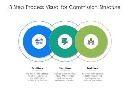
3 step process visual for commission structure infographic template




Try Before you Buy Download Free Sample Product
 Impress Your
 Audience
 100%
100% Editable
 Save Hours
 of Time


This 3 Step Process Visual For Commission Structure Infographic Template is a professionally drafted slide that can be deployed by managers, executives, owners, consultants, and other individuals to make their presentation more visually appealing. This layout helps the viewers gain quality information in less amount of time, thus conveying your message in the best possible manner. It reinforces the topics presented and makes their explanation more simplified, which is why this infographic template will suit any professional domain. Its vivid colors, graphics, design, etc., not only increases the aesthetics of the slideshows but also initiates immediate action. One of the advantages of downloading this PowerPoint design is that it can be reproduced as PNGs, JPGs, and PDFs that can be stored for further application. Hence, without indulging in a vigorous brainstorming session, download this layout now.
People who downloaded this PowerPoint presentation also viewed the following :
3 step process visual for commission structure infographic template with all 2 slides:
Use our 3 Step Process Visual For Commission Structure Infographic Template to effectively help you save your valuable time. They are readymade to fit into any presentation structure.

FAQs for 3 step process visual for commission
Effective commission structure infographics include clear rate tiers, performance benchmarks, calculation formulas, payment timelines, and qualification criteria. These visual elements streamline compensation understanding by presenting complex structures through charts, flowcharts, and comparison tables, ultimately enhancing sales team clarity and motivation while reducing administrative confusion across organizations.
Visual elements improve commission structure clarity by transforming complex numerical data into digestible charts, graphs, flowcharts, and color-coded hierarchies that eliminate confusion around payment calculations. These infographic components streamline comprehension by highlighting tier breakdowns, performance thresholds, and bonus structures, with many sales organizations finding that visual commission presentations reduce disputes, accelerate onboarding, and ultimately enhance team motivation and transparency.
Sales commission infographics commonly feature tiered commission structures, flat-rate models, draw against commission systems, residual commission frameworks, and performance-based bonus tiers. These visual representations help organizations streamline compensation planning by clearly illustrating earning potentials, quota thresholds, and payout schedules, with many sales teams finding that visual commission structures enhance motivation and transparency.
Determining the best format for a commission structure infographic requires analyzing your audience's needs, data complexity, and communication objectives through flowcharts, hierarchical charts, or comparison matrices. Consider your sales team's preferences, the complexity of commission tiers, and whether you need to show processes or static comparisons, with many organizations finding that interactive formats enhance understanding and adoption rates.
Common mistakes include overcomplicating visual elements, using unclear hierarchies, neglecting mobile optimization, inconsistent data presentation, and failing to align with brand guidelines. These design pitfalls can confuse sales teams and reduce comprehension, with many organizations finding that streamlined layouts, consistent formatting, and clear visual flows ultimately enhance understanding and drive better commission plan adoption across their workforce.
Color schemes significantly impact commission structure infographic perception by influencing emotional responses, directing attention to key data points, and establishing visual hierarchy through contrast and saturation. Strategic color choices enhance comprehension by differentiating commission tiers, highlighting performance thresholds, and creating intuitive associations, with many sales organizations finding that well-designed color palettes increase team engagement and motivation around compensation goals.
Commission structure infographics should include average commission rates by industry, performance benchmarks, retention statistics, and comparative earnings data across different role levels and territories. These metrics enhance credibility by providing concrete context, with many organizations finding that transparent statistical backing builds trust with sales teams, demonstrates market competitiveness, and supports strategic compensation decisions.
Infographics can be tailored through audience-specific data visualization, industry-relevant metrics, personalized messaging, and strategic color schemes that align with brand preferences. Sales teams in sectors like real estate, insurance, and technology customize commission structures, performance benchmarks, and incentive frameworks to match their audience's experience level, ultimately enhancing engagement and driving higher conversion rates.
Recommended tools for creating commission structure infographics include Canva, Adobe Illustrator, Piktochart, Venngage, and Lucidchart, each offering specialized templates and data visualization capabilities. These platforms streamline design processes by providing drag-and-drop interfaces, customizable charts, and professional templates, with many sales organizations finding that visual commission structures enhance team understanding and drive performance accountability.
Storytelling techniques can be integrated by creating a narrative flow that follows a salesperson's journey from base salary through commission tiers, using visual metaphors, progressive disclosure, and character-driven scenarios. Through strategic sequencing, color progression, and relatable examples from retail, real estate, and financial services, organizations can transform complex compensation data into compelling visual narratives that enhance comprehension and employee engagement.
Icons and illustrations enhance infographic effectiveness by simplifying complex information, improving visual hierarchy, creating emotional connections, and increasing memorability through visual storytelling. In commission structure presentations, these elements help sales teams quickly identify different tiers, understand percentage breakdowns, and recognize performance milestones, ultimately delivering clearer communication and faster comprehension across organizations.
Feedback from sales teams improves commission structure infographics by identifying clarity gaps, highlighting confusing elements, and revealing which metrics matter most in daily operations. Through direct input from field representatives, organizations can streamline visual hierarchies, enhance data presentation, and ensure infographics address real-world scenarios, ultimately delivering more intuitive tools that accelerate comprehension and drive performance.
Templates for commission structure infographics deliver consistency, time efficiency, professional design quality, and easy customization across sales teams. These pre-designed frameworks streamline the creation process by providing proven layouts, clear visual hierarchies, and standardized formatting, with many organizations finding that templates enhance communication clarity while reducing design costs and ensuring brand consistency across all commission-related materials.
You can effectively convey complex commission structures through visual hierarchies, color-coded tiers, flowcharts, comparison tables, and simplified calculation examples. These design approaches streamline understanding by breaking down multi-layered compensation models into digestible components, with many sales organizations finding that clear visual representations reduce confusion, accelerate onboarding, and ultimately enhance team performance and transparency.
Commission structure infographics enhance training by simplifying complex compensation plans, illustrating tier progressions, comparing different earning models, and highlighting performance benchmarks through visual clarity. These visual tools enable sales teams, HR departments, and new employees to quickly grasp incentive structures, ultimately accelerating onboarding processes and improving performance transparency across organizations.
-
Visually stunning presentation, love the content.
-
Excellent design and quick turnaround.
-
Really like the color and design of the presentation.
-
Excellent Designs.