


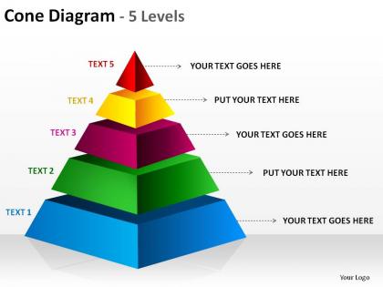
3d pyramid cone diagram 5 levels split separated ppt slides presentation diagrams templates powerpoint info graphics




Try Before you Buy Download Free Sample Product
 Impress Your
 Audience
 100%
100% Editable
 Save Hours
 of Time


Your audience will owe you a debt of gratitude. Lead them to profit with our 3d pyramid cone diagram 5 levels split separated ppt slides presentation diagrams templates powerpoint info graphics.
People who downloaded this PowerPoint presentation also viewed the following :
3d pyramid cone diagram 5 levels split separated ppt slides presentation diagrams templates powerpoint info graphics with all 9 slides:
Our 3d pyramid cone diagram 5 levels split separated ppt slides presentation diagrams templates powerpoint info graphics are no laughing matter. They treat your thoughts very seriously.
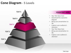
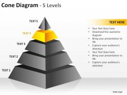
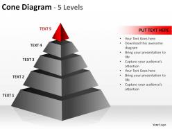
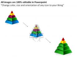
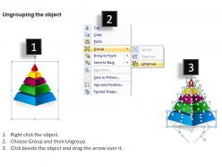
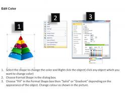
FAQs for 3d pyramid cone diagram 5 levels split separated ppt slides presentation diagrams templates
Key features of a 3D pyramid cone diagram include hierarchical data representation, visual depth perception, proportional segment sizing, color-coded categorization, and interactive layering capabilities. These visual elements enhance data comprehension by displaying organizational structures, market segmentation, and performance metrics with dimensional clarity, with many businesses finding that the cone format effectively communicates priority levels and resource allocation strategies.
A 3D pyramid cone diagram enhances presentation understanding by creating visual hierarchy, improving information retention, and making complex relationships more intuitive through spatial representation. These visual tools streamline audience comprehension by transforming abstract concepts into tangible structures, with many organizations finding that hierarchical data, process flows, and strategic priorities become significantly clearer, ultimately delivering more engaging presentations and better knowledge transfer.
3D pyramid cone diagrams are most beneficial when presenting hierarchical structures, organizational frameworks, strategic priorities, and process flows where visual depth enhances comprehension and engagement. These diagrams excel in business presentations, educational settings, and marketing materials, with many organizations finding that the three-dimensional perspective helps audiences better understand complex relationships, prioritization levels, and step-by-step progressions compared to traditional flat charts.
**INPUT**: What types of data sets are best represented using a 3D pyramid cone diagram? **OUTPUT**: 3D pyramid cone diagrams excel at representing hierarchical data, funnel processes, organizational structures, progressive stages, and comparative proportional relationships. These visualizations streamline complex data presentation by showcasing multi-level information, sequential workflows, and relative scaling simultaneously, with many organizations finding that pyramid formats enhance audience comprehension while delivering clearer strategic insights. [Word count: 54 words]
Depth perception in 3D pyramid cone diagrams significantly enhances audience comprehension by creating visual hierarchy, establishing clear relationships between data levels, and making abstract concepts more tangible and memorable. Through dimensional layering, organizations can effectively communicate complex hierarchical structures, priority sequences, and proportional relationships, with many finding that audiences retain information 40% better when depth cues guide interpretation naturally.
**INPUT**: What software tools are recommended for creating 3D pyramid cone diagrams? **OUTPUT**: Recommended software tools include PowerPoint, Visio, Lucidchart, Canva, and Adobe Illustrator, each offering varying levels of customization and professional polish. These platforms streamline diagram creation through templates, drag-and-drop functionality, and 3D effects, with many organizations finding that PowerPoint delivers accessibility while specialized tools like Visio enhance precision for complex business presentations.
A 3D pyramid cone diagram can enhance traditional charts by adding hierarchical depth and visual engagement, though it works best for showing layered relationships, priority levels, and progressive structures rather than simple data comparisons. While bar charts excel at direct numerical comparisons and pie charts show proportional relationships, pyramid cones deliver strategic storytelling for organizational frameworks, process flows, and multi-tiered concepts, ultimately providing dimensional context that traditional charts cannot achieve.
Color gradients in a 3D pyramid cone diagram enhance visual hierarchy by creating seamless transitions between levels, making data relationships more intuitive and guiding viewers through information systematically. These gradients enable presenters to emphasize priority areas, highlight progression patterns, and reduce cognitive load, with many organizations finding that gradient-enhanced diagrams deliver clearer stakeholder communication and faster decision-making processes.
Professional 3D pyramid cone diagrams require consistent color schemes, clear hierarchical levels, readable typography, balanced proportions, and strategic use of depth effects. These design principles work together by establishing visual coherence, enhancing information flow, and maintaining audience focus, with many organizations finding that clean layouts and professional color palettes ultimately deliver more impactful presentations and better stakeholder engagement.
Label placement significantly impacts 3D pyramid cone diagram readability by determining visual hierarchy, information flow, and audience comprehension across different viewing angles. Strategic positioning near each pyramid level, with consistent font sizing and contrasting colors, enables viewers to quickly identify relationships between hierarchical elements, while poorly placed labels can create visual clutter, ultimately delivering clearer presentations that enhance stakeholder understanding and decision-making processes.
Common mistakes include overcrowding with excessive text, using poor color contrast that reduces readability, creating disproportionate sections that misrepresent data relationships, and neglecting mobile responsiveness. These design flaws undermine visual clarity and audience comprehension, with many presenters finding that simplified layouts, strategic color choices, and balanced proportions ultimately deliver stronger impact and more effective communication.
Animated 3D pyramid cone diagrams enhance engagement by creating visual depth, guiding audience attention through progressive reveals, and transforming static hierarchies into dynamic storytelling elements. These animations enable presenters to build suspense around key data points, highlight relationships between levels more effectively, and maintain viewer focus longer than traditional flat charts, ultimately delivering more memorable and persuasive presentations.
2D pyramids offer clear, straightforward hierarchical representation with easy readability, while 3D pyramid cone diagrams deliver enhanced visual depth, dimensionality, and modern aesthetic appeal that captures audience attention more effectively. The 3D format creates stronger engagement through realistic shadows and perspective, making complex data relationships more memorable and impactful, with many presenters finding that dimensional visualization significantly improves audience comprehension and retention.
Ensuring accuracy in 3D pyramid cone diagrams requires verifying data proportions match visual segment sizes, using consistent scaling methods, and clearly labeling each hierarchical level with precise values. These visual elements enhance understanding by maintaining proportional relationships, providing clear data attribution, and eliminating perspective distortions, ultimately delivering reliable insights that support strategic decision-making across organizational presentations.
Industries that frequently utilize 3D pyramid cone diagrams include healthcare systems, financial services, manufacturing, technology companies, and consulting firms for presenting hierarchical data and strategic frameworks. These visual tools enhance organizational charts, process flows, and priority matrices by creating clear visual hierarchy, improving audience engagement, and simplifying complex relationships, with many executives finding that pyramid structures effectively communicate strategic initiatives and operational workflows.
-
Use of different colors is good. It's simple and attractive.
-
Easily Understandable slides.