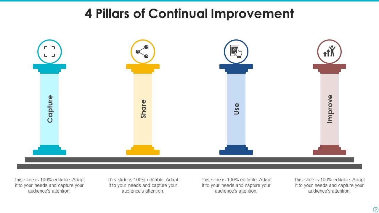
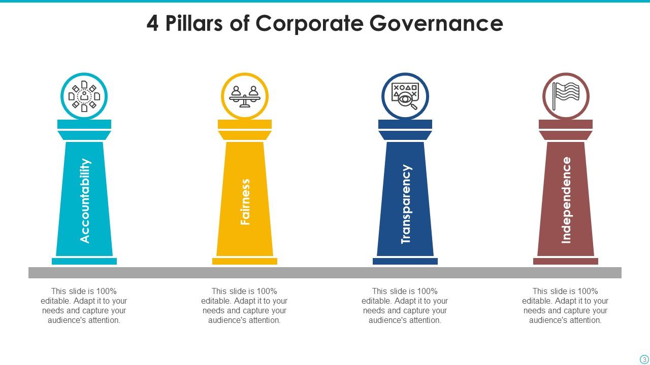
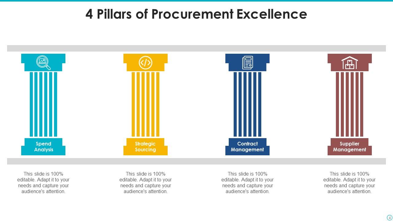
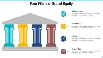
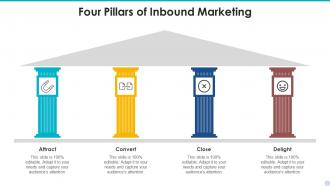
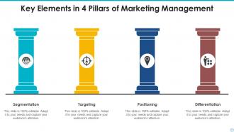
4 Pillars Powerpoint Ppt Template Bundles

Rating:
90%
4 Pillars Powerpoint Ppt Template Bundles
Slide 1 of 17
Favourites Favourites

Try Before you Buy Download Free Sample Product

Audience Impress Your
Audience
Editable 100%
Editable
Time Save Hours
of Time
The Biggest Sale is ending soon in
0
0
:
0
0
:
0
0
Rating:
90%
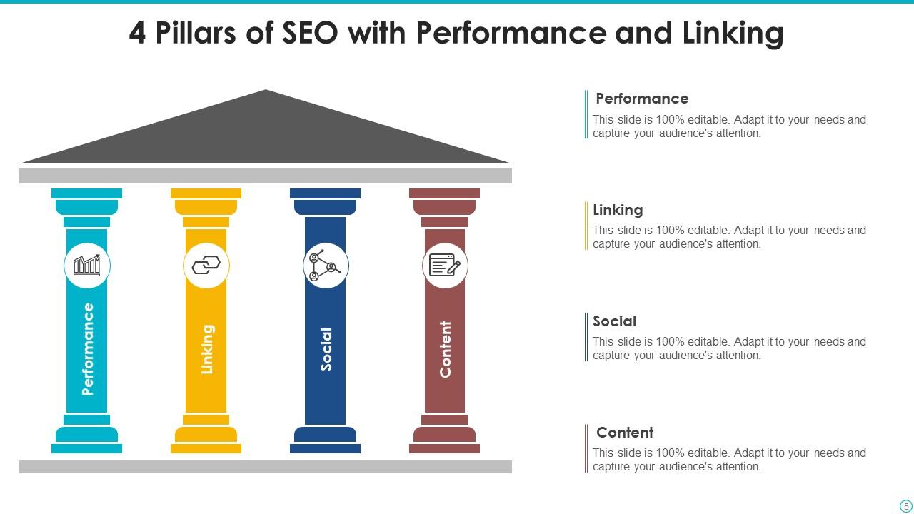
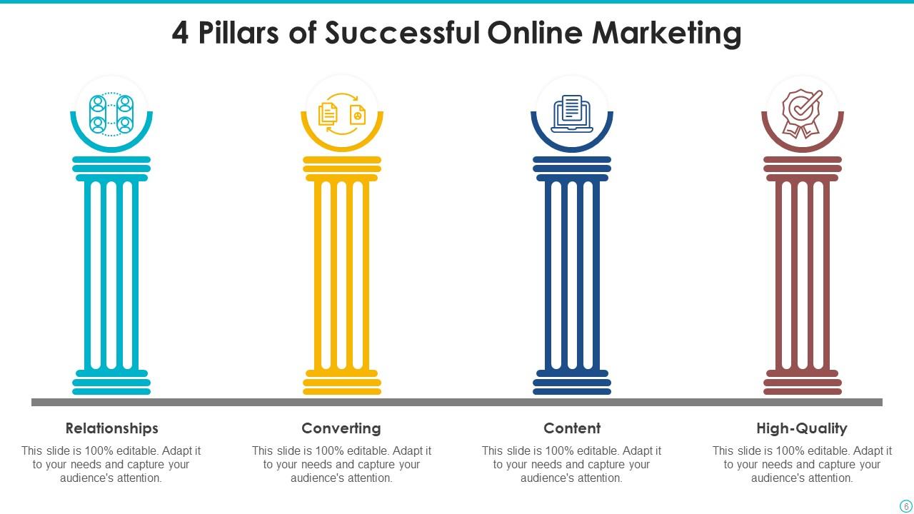
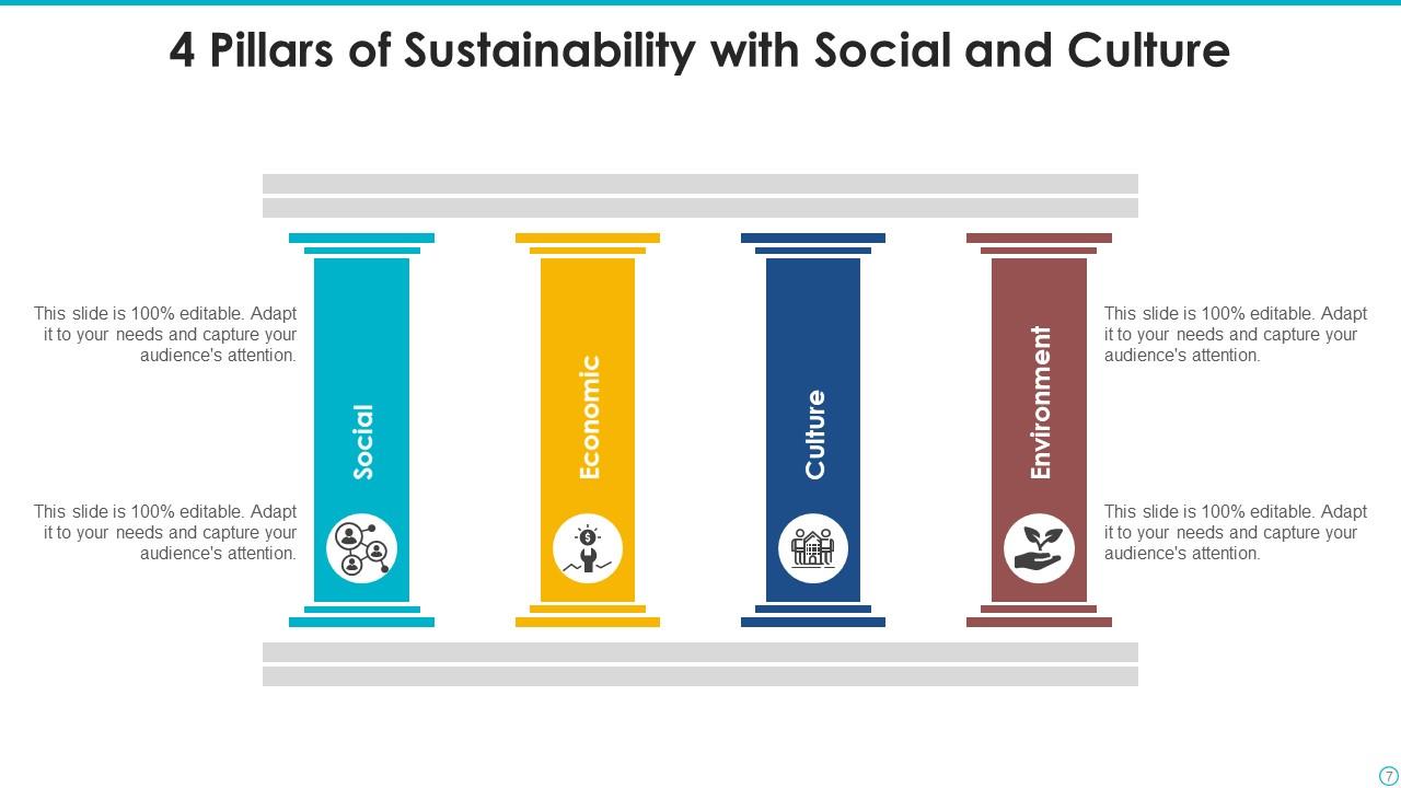
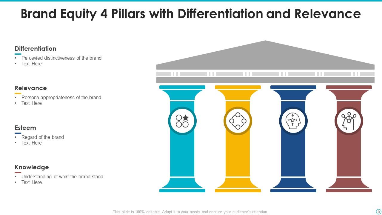
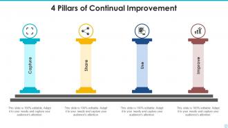
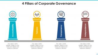
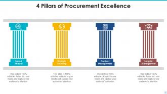
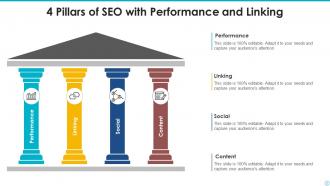
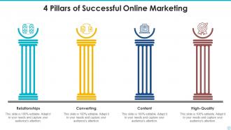
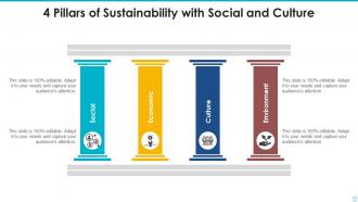
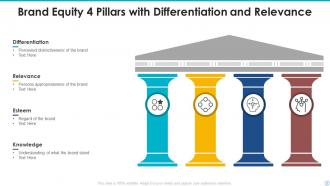
If you require a professional template with great design, then this 4 Pillars Powerpoint Ppt Template Bundles is an ideal fit for you. Deploy it to enthrall your audience and increase your presentation threshold with the right graphics, images, and structure. Portray your ideas and vision using twelve slides included in this complete deck. This template is suitable for expert discussion meetings presenting your views on the topic. With a variety of slides having the same thematic representation, this template can be regarded as a complete package. It employs some of the best design practices, so everything is well-structured. Not only this, it responds to all your needs and requirements by quickly adapting itself to the changes you make. This PPT slideshow is available for immediate download in PNG, JPG, and PDF formats, further enhancing its usability. Grab it by clicking the download button.

FAQs for 4 Pillars Powerpoint

Honestly, just focus on making each pillar visually equal - same size, consistent fonts, that kind of thing. Different colors or icons help distinguish them without looking messy. Don't cram everything together though, white space is your friend here. I learned this the hard way lol. Test it with real content first because you'll probably need to adjust spacing when one pillar has way more text than the others. Pick fonts people can actually read from the back of the room. The whole thing should look cohesive but not boring - there's definitely a balance there.

So basically the 4 Pillars thing works because it gives your story actual structure. Each pillar flows into the next one naturally - way better than just throwing random points at people and hoping something sticks. You can build up tension or reveal stuff progressively, kind of like chapters but without making everyone fall asleep. Plus the visual part keeps your audience from getting totally lost (which happens more than you'd think). Just put one key story element in each pillar and you'll see how much cleaner everything gets. Honestly makes presenting so much less stressful.

Oh, the 4 Pillars thing is perfect when you've got complex stuff to explain - like strategic plans or product launches. Basically you're giving people four solid reasons why something matters. Works great for business cases and marketing strategies too. I use it way too much honestly, but it keeps me from going off on tangents (which I definitely do). Your audience can actually follow along instead of getting lost. Short sentences mixed with longer ones make it flow better. Next time you have four distinct points to cover, try it out - people love when presentations actually make sense for once.

Yeah definitely do four sections with equal spacing - strong headings and maybe some icons if you're feeling it. I'd pick one accent color per pillar but don't go nuts with the rainbow thing, looks amateur honestly. Sketch out your four main points first, that's way easier than jumping into design. You want something central that ties them all together too. Balance is key here - each section needs to feel equally weighted. Oh and keep the formatting consistent across all four, otherwise it'll look messy. Start simple then build around those core ideas.

Hey! So for your 4 Pillars thing, definitely reveal each pillar one by one - keeps people from jumping ahead and getting distracted. Fade-ins work great, or you could do those slide-in effects. Just don't get crazy with it, you know? I saw someone use these spinning transitions once and it was honestly painful to watch. Smooth animations work best. Maybe add a tiny delay between each pillar appearing, then throw in some emphasis effects when you're diving into the details. The goal is guiding their attention naturally through your points. Keep it clean but with purpose.

Honestly, just keep it simple with your 4 Pillars thing. Navy, gray, and white never fails - or try dark green with light gray. Trust me, I've sat through way too many presentations where someone went crazy with neon colors and you can't focus on anything. Blues are solid because they feel trustworthy, which is perfect for "foundational" stuff. You could do different shades of the same color too, that usually looks clean. Oh, and obviously make sure your text actually shows up against whatever background you pick - sounds dumb but you'd be surprised how many people mess that up.

Oh, customizing that template is super straightforward! First thing - swap those colors to match your brand by selecting elements and hitting up the format menu in PowerPoint. Replace their fonts with yours, toss in your logo, and update all that placeholder text with your actual messaging. The icons are usually editable too, which is nice because you can find better ones that actually fit your four points. I always mess around with templates way more than I probably should, but this one's pretty forgiving. Just don't go crazy restructuring the whole flow - you want people following along pillar by pillar.

Ugh, the worst thing you can do is make uneven pillars - like three super detailed ones and then one sad little afterthought. I've done this myself and it's so obvious when presenting! Also watch out for pillars that basically say the same thing or don't actually back up your main point. People try cramming everything into neat little boxes and it gets messy fast. Each pillar should feel necessary and carry similar weight. Don't overload the slides with text either - nobody wants to read paragraphs. Quick test: remove one pillar. Does your argument still work? If yes, you don't need it.

Oh, the 4 Pillars thing? It's actually pretty straightforward - you keep the same visual setup but just change what goes in each pillar. Healthcare might use patient care, safety, costs, and compliance. Finance companies would probably do risk management, profits, customer happiness, and regulations instead. Honestly, it works because every industry has those four make-or-break areas that need to balance each other out. That's kinda the whole point of why this template caught on in the first place. Just figure out what four things absolutely have to click together in your field and you're set.

Definitely add some icons and infographics to connect each pillar to your actual results. Progress bars and comparison charts work really well too. I'd throw in some photos or illustrations to make the concepts less abstract - people remember visual stuff way better. Oh, and definitely break up those text-heavy slides because nobody wants to read paragraphs during a presentation. Keep your colors and style consistent though, or it'll look messy. I'd stick to maybe 2-3 visual types max so you don't go overboard with it.

So I treat each pillar like its own mini-story chapter. Hook them right away, then build up tension through each section. Before/after stories work crazy well with this format - honestly one of my favorite tricks. Real customer examples make everything click better than abstract concepts. Oh, and don't skip those transition slides between pillars! They're what tie everything together. I always start with something like "What if..." or drop a customer problem right upfront. Gets people leaning in immediately instead of checking their phones.

Honestly, your 4 Pillars won't mean much without solid data backing them up. Numbers and visuals are what separate real strategy from corporate BS - and people can tell the difference instantly. Charts and graphs make complicated stuff actually understandable. Stats prove your points while visuals tell the story. I learned this the hard way in my first big presentation (total disaster). Each pillar needs relevant metrics woven in. Otherwise you're just throwing around buzzwords. Short version: data builds credibility, visuals make it stick.

Four pillars are perfect for this! You get natural breaking points instead of one marathon session. Drop in a quick poll after the second pillar, maybe start a discussion before the fourth one. People's brains actually crave this kind of structure - it's wild how much better they focus. Each pillar becomes its own mini-presentation with a specific hook. Don't just blast through all four back-to-back though. Use them as checkpoints too - you can see who's getting it and who needs clarification. Way smarter than the old "talk for 30 minutes straight" approach.

Yeah, the 4 Pillars thing works great for remote stuff - honestly maybe better than in-person. Each pillar becomes like a mini chapter, which keeps people engaged since virtual audiences have the attention span of... well, you know. You can build in natural pause points for questions between pillars, which is clutch when you can't see if people are confused or zoning out. Oh, and it stops you from rambling - happens to everyone on video calls. I'd keep each section around 5-7 minutes tops and throw in some quick interactions. The structure just makes everything flow better.

So there's a bunch of good spots to find those. SlideModel and SlideSalad have solid pre-made ones you can just customize. PowerPoint's built-in gallery isn't terrible either - though sometimes their designs look kinda dated tbh. If you're broke or just want to DIY it, rectangles and cylinders in PowerPoint work surprisingly well. Canva's got some too, but you'd have to export to PowerPoint after. Oh, and SmartArt graphics can work if you're building from scratch. Honestly? I'd grab a template first. Way easier than starting from nothing, then you can mess with colors and fonts later.

Ratings and Reviews

90% of 100
Review Form
Write a review
Most Relevant Reviews
  1. 80%

    by Edwardo Wheeler

    Design layout is very impressive.
  2. 100%

    by Chong Richardson

    I discovered this website through a google search, the services matched my needs perfectly and the pricing was very reasonable. I was thrilled with the product and the customer service. I will definitely use their slides again for my presentations and recommend them to other colleagues.

2 Item(s)

per page: