7 limitations icon ppt slides download

Rating:
80%
7 limitations icon ppt slides download
Slide 1 of 5
Favourites Favourites

Try Before you Buy Download Free Sample Product

Audience Impress Your
Audience
Editable 100%
Editable
Time Save Hours
of Time
The Biggest Sale is ending soon in
0
0
:
0
0
:
0
0
AI-Ready
Upload this template to AI and ask it to make any changes to content or color
100% editable Powerpoint Template for AI-assisted presentations. Finish your work in less time. ​
Works with
Microsoft PowerPoint
Microsoft 365
Claude for PowerPoint
ChatGPT
Google Slides
Microsoft Copilot
Rating:
80%
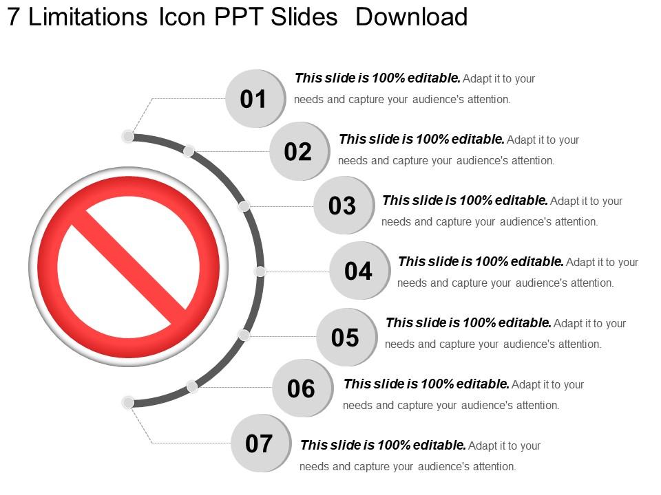
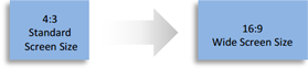
SlideTeam would like to present to all of you its totally user-friendly 7 limitations icon PPT slides download. You can make a number of changes to the predesigned set of slides. The font style, font color and font size of the text used in the slides are also customizable. The PPT template is very easy to use as it is compatible with Google Slides and can be viewed in widescreen display ratio of 16:9 or standard size display ratio of 4:3.

People who downloaded this PowerPoint presentation also viewed the following :

FAQs for 7 limitations icon

Ugh, templates can be so annoying tbh. You always end up wrestling with the layout because your content never fits right - cramming text here, weird stretched images there. Also everyone uses the same ones so your presentation looks exactly like everyone else's. The fonts and colors are usually pretty locked down too which is frustrating when you want to customize. Oh and don't even get me started on trying to match your brand colors. I'd say use them as a starting point but then go wild modifying everything. Break their rules completely - it's your presentation anyway.

Ugh, bad templates are the worst - they make everything look so generic that people just zone out. Your audience can tell when you're using some basic template everyone's seen a million times. The layouts are usually terrible, you can't add good visuals, and honestly? It just screams lazy. I've been there though - sometimes you get stuck with clunky navigation or templates that don't even support videos properly. People lose interest fast when your content feels forced into some awkward structure. Just customize the hell out of it or find something better that actually works for what you're presenting.

Honestly, I just layer my own stuff right on top - custom graphics, different colors, tweaking layouts while keeping the basic structure. Work with what the template gives you instead of totally fighting it. Import whatever fonts you want, mess with the slide masters, or even grab pieces from different templates to frankenstein something cool together. Sometimes though? The template's just too locked down and you're better off starting fresh. I always try to pick ones that seem flexible from the start - saves me so much headache later when I'm trying to make it actually look like my brand.

Dude, templates can totally backfire if you don't think about culture first. Colors are a huge one - red screams "danger" here but it's lucky in China, so there's that. Plus some cultures love tons of text while others want everything super visual. The hierarchy thing matters too - like how direct or formal you should be. Honestly? Just ask someone local what actually works in their market. Way better than guessing and looking like an idiot later. Different places have totally different comfort levels with layout density and communication styles anyway.

Honestly, the biggest pain will be regulations - healthcare can't just wing it with HIPAA hanging over them. Your generic wording probably won't match how different industries actually talk or work either. Budget stuff gets tricky too since cost structures are all over the place between sectors. Tech readiness varies like crazy - some industries are still stuck in 2010 while others are way ahead. Oh, and compliance requirements will definitely trip you up if you don't research them first. I'd start by looking up the main regulatory stuff for whatever industry you're targeting, then tweak your language accordingly.

Dude, this stuff totally matters! Warm colors like red create urgency, blues feel trustworthy. Sans-serif fonts look modern, serif adds that traditional authority vibe. I literally watched someone kill their presentation with neon green text on purple - my eyes are still recovering lol. Your visuals either help your message or completely sabotage it. Match your colors and fonts to your audience's expectations and your content's tone. Oh, and always check if people can actually read it before you worry about making it look cool.

Yeah, using templates too much messes with your head. People can tell when something feels cookie-cutter, even if they can't put their finger on it. Makes your stuff feel fake and disconnected. But here's the thing that really bugs me - you start getting trapped in those same patterns yourself. Your brain stops working as hard to come up with ideas that actually match what you're trying to say. It's like... why bother being creative when you've got this template, right? I'd say use them to get started, then mess around with them until they don't feel templated anymore.

Honestly, templates work great until they don't. Your data gets messy and suddenly you're wrestling with these rigid structures that weren't built for your weird edge cases. They're designed for generic stuff, not whatever bizarre requirements your users dream up. The flexibility just isn't there - you get stuck with their preset layouts when you really need something custom. I've been there, it's frustrating. My take? Use them for quick prototypes to get started, but expect to build your own components once things get interesting. Templates are like training wheels - helpful at first but you'll outgrow them.

Ugh, UI problems are the worst for template stuff. Bad editing tools mean you're basically stuck doing text swaps instead of actually customizing layouts. Finding templates becomes a nightmare when navigation sucks - I swear some apps just throw everything in one giant folder. Short sentences kill the flow too. Most software honestly feels like they added templates as an afterthought, which makes the whole thing clunky. Test out how easy it is to actually modify templates before you pick something for your team. Trust me on that one.

Dude, when your template feels stale, just throw in some stories. I'm talking real examples, quick case studies, whatever makes your data actually mean something to people. Short sentences work. But you can also weave longer narratives around your boring bullet points - honestly works way better than I expected. My best presentation last year? Scrapped like half the template slides for one good story that tied everything together. The template's still there as your backbone, but stories are what people remember walking out. Find one solid example that backs up your main point and just build from that instead of wrestling with the format.

Honestly, templates can be a nightmare for accessibility. They lock you into weird structures - like you're stuck with tiny fonts or terrible color contrast that you can't change. Most assume everyone uses websites the same way (they really don't). Screen readers often hate the navigation too. The worst part? Sometimes the code is so restrictive you literally can't fix the important stuff. Oh, and don't even get me started on mobile responsiveness issues. Before you pick one, definitely run it through some accessibility checkers first. Make sure you can actually customize the features that matter.

Honestly, sticking to the exact same style for everything kills your creativity. You end up trapped with identical fonts and colors even when your content needs something completely different. It's like wearing a suit to the beach, right? Your audience starts tuning out because everything looks predictable. You can't highlight important stuff or adjust things for different topics. Oh and you totally miss chances to create those standout moments that actually grab attention. I'd say build some wiggle room into your brand rules. That way you stay consistent but don't bore everyone to death.

Look, most templates are just starting points anyway. I usually grab design elements from like 2-3 different ones instead of trying to make one work perfectly. Replace all their boring generic examples with your actual data and case studies that matter to your audience. The visual layout stuff is what you really want to keep - that hierarchy and structure is solid. Start with the slides that absolutely need custom content first. Those generic placeholder slides? Toss 'em. Focus on adapting their design principles rather than using everything exactly as-is. Way more flexibility that way.

Honestly, you'll probably run into file format issues first - like your fancy fonts disappearing or animations breaking. Memory's another pain point if you're using tons of graphics or high-res stuff. PowerPoint versions can be weirdly inconsistent too, especially older ones that just can't handle complex layering. Oh, and compatibility between different presentation software? Total nightmare sometimes. Processing power becomes a real bottleneck when you're working with larger files. Definitely test everything on whatever device you'll actually be presenting with. Trust me, always keep a stripped-down backup version handy just in case everything goes sideways.

Honestly, just ask everyone who touches the thing - users, your team, stakeholders, whoever. Quick surveys after people use it work great. Anonymous feedback forms are clutch because people actually tell you what sucks instead of being polite. Oh, and check your usage numbers too - if nobody's using it, that's a red flag right there. Set up some way for people to report issues as they happen, don't wait for scheduled reviews. We do little retrospectives with our team which helps spot the patterns. The whole point is making it continuous so you can figure out what to fix first.

Ratings and Reviews

80% of 100
Review Form
Write a review
Most Relevant Reviews
  1. 80%

    by Dick Ryan

    Illustrative design with editable content. Exceptional value for money. Highly pleased with the product.
  2. 80%

    by Oscar Davis

    Great designs, Easily Editable.

2 Item(s)

per page: