

6 limitations icon ppt slide templates





Try Before you Buy Download Free Sample Product
 Impress Your
 Audience
 100%
100% Editable
 Save Hours
 of Time


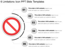
Arrange your ideas in a persuasive fashion with our 6 limitations icon PPT slide templates. We have shown here the visuals of a business limitation icon colored in red and white. Include this design to show your business limitations or to display your obstacles in your current business project. Professionals from a diverse background can use this system limitation PPT layout for any business presentations. This 3d PowerPoint layout allows you to show the information confidently through a captivating high-quality template. Predesigned formats save time and make it easier to display the company information. Get ready for a Professional experience with our PowerPoint layout. Develop your strategic planning and business architecture through this PowerPoint design and reflect on significant topics. Download our, our 6 limitations icon PPT slide templates and show a new approach to reach the potential audience. Comprehensively analyze critical concerns with our 6 Limitations Icon Ppt Slide Templates. Address each one completely.
People who downloaded this PowerPoint presentation also viewed the following :
6 limitations icon ppt slide templates with all 5 slides:
All will hail you with our 6 Limitations Icon Ppt Slide Templates. You will always generate a big cheer.
FAQs for 6 limitations icon
Honestly, the main problem is you get stuck with whatever look they picked. Templates force you into their colors, fonts, layouts - might not match your vibe at all. And they're super generic too. I swear everyone at my last conference had the same boring blue template lol. Your content probably won't fit their structure either, so you end up cramming stuff in weird places. Best bet? Grab one as a base then change it up enough that it actually feels like yours.
Honestly, your template choice matters way more than most people think. Colors and fonts carry serious psychological weight - like imagine trying to present financial data in comic sans with hot pink backgrounds. Total disaster, right? Cluttered designs make everything feel chaotic. But go too formal and you'll kill the vibe of a creative pitch. I've seen good presentations totally bombed by bad templates. The trick is matching your template's vibe to what you're actually saying. They should work together, not fight each other. It's kinda like picking an outfit - you wouldn't wear a tux to a beach party.
Templates are honestly pretty rigid - you'll get stuck trying to force your content into layouts that just don't work. Like when your text is way longer than expected and suddenly everything's crammed together looking terrible. Or you have this weird empty space because you don't have enough content. The flow gets super awkward too since templates basically decide how your message should be structured. I always map out what I actually want to say first, then see if the template even makes sense for it. Saves so much headache later when you're rushing to finish.
Oh man, this is such a real problem! Colors alone will trip you up - red means danger here but it's lucky in Asia. Then you've got reading patterns to worry about since some cultures go right-to-left, which totally flips your whole visual layout. Your font choices matter way more than you'd think too. What feels clean and minimal to us might seem empty to other audiences, or vice versa. Honestly, I learned this the hard way on a project last year. Just grab someone from that culture and have them eyeball your template before you present. Way easier than explaining why half the room looked confused.
Don't rely just on visuals - it'll cause major problems. Screen readers can't interpret images, so visually impaired users get completely lost. When images fail to load (happens more than you'd think), people have zero context about what they're supposed to do. Search engines can't read visual content either, so your SEO takes a hit. You're basically shutting out a huge chunk of your audience. Always add alt text and clear written instructions alongside your visuals. Honestly, it's just good design practice that makes everything work better for everyone.
Yeah, market trends will totally mess with your templates if you're not paying attention. Like, something that crushed it last quarter could look ancient now. Say everyone's going minimal but your stuff is still loaded with graphics and crazy layouts - you're basically selling flip phones in the iPhone era, you know? Industry shifts hit hard too, like when sustainability became huge or new regulations popped up that nobody saw coming. I'd say audit your template collection pretty regularly. Some you can refresh, others just need to die. Your audience expects current stuff, not museum pieces.
Oh man, screen size differences are gonna be your biggest headache. What looks amazing on your laptop will probably look like garbage on phones - text gets chopped off, images go weird, buttons stop working. Font rendering is also super annoying between different operating systems. Plus older devices just can't handle fancy animations without lagging or straight up crashing. Honestly, I learned this the hard way on my first project. You really need to test on at least 2-3 different devices before calling it done, trust me.
Yeah so basically you can't just grab any template you want because of copyright stuff. Like, they might have fancy fonts or stock photos that cost money to use legally. I've seen people get takedown notices for this - not fun. Even some "free" templates are sketchy because whoever made them probably didn't have permission for all the elements. Honestly? Stick with legit sites that say everything's royalty-free, or just make your own with assets you actually have rights to. Better safe than dealing with legal drama later.
Honestly, the worst part is template rigidity. You get locked into their layouts and color schemes that never match your brand. Fighting against those pre-built sections is so annoying - modify one thing and the whole design breaks. Some have hardcoded elements that make customization a nightmare. The irony? Heavily customizing it defeats the whole point of buying a template anyway! I'd preview their customization options first - like really dig into them. Or maybe just start with a flexible framework instead. Way less headache in the long run.
Ugh, templates are the worst for engagement honestly. Your audience can totally tell when you're just filling in preset slides - it screams "I didn't put real effort into this." People want to feel like you're actually talking TO them, not reading some generic deck that could be about anything. Plus the rigid layouts mess with your whole story flow. You end up cramming ideas into boxes that don't fit. I'd say pick your most important slides and ditch the template completely for those ones. Or at least customize the hell out of it so it doesn't look like everyone else's presentation.
Honestly, most people get way too hung up on sticking with one template when mixing different ones works so much better. Figure out what's actually missing first - like what specific thing your current template can't handle. Then you can either hack the code directly or just stack other tools on top of it. I've done this tons of times and it usually turns out better than expected. You could build little modular pieces that work across different templates, or frankly just Frankenstein together the good parts from multiple options. Don't try forcing something that clearly doesn't fit though - flexibility beats stubbornness every time.
Yeah, templates can really mess with UX if you're not careful. They force you into these weird layouts that don't always make sense for what you're trying to say. Like, you'll have important info that just doesn't fit the flow they want. The worst part? Everyone ends up with the same boring, cookie-cutter look - honestly makes me want to zone out immediately. You need templates that bend to YOUR content, not ones that make you squeeze everything into their little boxes. Find flexible ones or you'll just frustrate your audience trying to follow awkward information layouts.
Your audience will call out stuff you totally missed. Like "couldn't see the text from the back" or "that transition was weird" - things that seem super obvious after they say it. Watch for confused faces or people mentally checking out during your talk. Those reactions tell you way more than how your slides look. I always do a quick survey after, even if it's just 2-3 questions. People are surprisingly honest about what didn't work, and honestly? That feedback is gold for fixing your next presentation.
Yeah, so template designers have to follow industry standards, which means they play it super safe. Everything needs to work on different devices and software versions, so they stick with basic fonts and proven layouts. That's literally why half the templates out there look identical - it's honestly annoying! They also have accessibility rules to follow, like proper color contrast and readable fonts. The good news? Your presentation won't randomly break. Bad news is you're stuck with less creative freedom. I'd look for templates that meet standards but still give you decent customization options for your branding.
Oh man, bad templates are presentation killers. Your content might be amazing, but if you're using some janky free template with Comic Sans and clipart, people will think you threw it together last minute. I've watched brilliant presentations get completely undermined because the slides looked like they came from 2003. People start questioning if you actually prepared, even when your research is spot-on. Either spend money on decent templates or customize the hell out of free ones. Make them yours somehow. Generic = amateur, and that's not the vibe you want.
-
Unique and attractive product design.
-
Easily Understandable slides.