


Limitations and scope template example of ppt




Try Before you Buy Download Free Sample Product
 Impress Your
 Audience
 100%
100% Editable
 Save Hours
 of Time


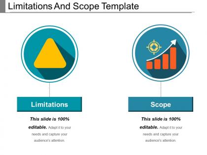
Choose this limitations and scope template example of PPT PowerPoint diagram if you are going to present a business presentation on researching the scope of the given problem or subject which has been planned to study. The scope limitation PowerPoint shape may also be chosen as a design layout for defining the factors that a researcher encounters. The applicability of the scope project management PowerPoint shape extends to the auditor's report as well that may arise from the inability to obtain sufficient appropriate evidence about a component in the financial statements by superseding the necessary changes arises either by circumstances, engagement and / or client limitation. Furthermore, the template can also be selected for adopting the alternative procedures that can overcome the risk of the auditor's qualified or disclaimer opinion and to provide sufficient evidence which will be necessary for the auditor to adhere to US GAAP. The scope of the template has two distinct uses: project scope and product scope for getting information which are required to start a project and the features of the product that would meet its stakeholders requirements. Be the jewel in the crown with our Limitations And Scope Template Example Of Ppt. You will draw an immense amount of attention.
People who downloaded this PowerPoint presentation also viewed the following :
Limitations and scope template example of ppt with all 5 slides:
Consolidate your gains with our Limitations And Scope Template Example Of Ppt. Establish better control over your assets.
FAQs for Limitations and scope template
Honestly, templates can be pretty limiting. Your content never fits their predetermined structures - like when you've got 6 main points but they only designed for 4. Design-wise, you're stuck with their colors, fonts, and layouts which might clash with your brand. And here's the thing that bugs me most - half the people at any conference are using the same PowerPoint template, so everything looks identical. My advice? Always swap out their colors and fonts at minimum. Break their layout rules when you need to. Otherwise you'll just blend into the template crowd, which defeats the whole purpose of presenting something unique.
Oh totally, templates can mess with your message more than you'd think. You end up tweaking your content to fit their weird color schemes or rigid layouts instead of the design serving YOUR point. It's like... imagine trying to give a speech but someone else already decided which words you can emphasize, you know? Sometimes the template's layout will highlight random stuff while burying your main message. Honestly, I learned this the hard way on a project last year. Figure out what you actually want to say first, then hunt for a template that works with it. Not the other way around.
Honestly, your audience can totally make or break your template. Engineers love those dense charts and technical stuff, but show that same template to a sales team? They'll zone out immediately. Cultural backgrounds play a huge role too - colors and layouts hit differently depending on where people are from. Plus age matters way more than you'd think. Younger crowds expect interactive elements while older folks usually want the traditional approach. My advice? Test it with a few actual people from your audience first. Way better than bombing during the real presentation.
Honestly, most templates are way too bloated anyway, so just gut the stuff that doesn't matter for your specific audience. Remove slides that don't actually support your main point - or combine them if they're sorta related. Then tweak how detailed you get based on who you're presenting to and how much time you have. Don't feel locked into using their exact headers and bullet points either. Change those to match your narrower focus instead of their generic broad stuff. Think of the template more like... a loose starting point, not some sacred document you have to follow completely. It's your presentation after all.
Start by figuring out your main themes, then swap out all the generic stuff - icons, images, colors, whatever. For a marketing deck, use actual product shots instead of stock photos. Analytics presentation? Data visualizations work way better than random charts. The text structure usually translates fine across topics, but you might need longer sections if your audience wants more detail. Honestly, just delete slides that don't fit your story. And definitely customize the examples to match your industry - that's what makes templates stop looking like, well, templates. Generic case studies are a dead giveaway.
Honestly, your slide design can make or break the whole thing. Clean layouts with good colors and white space? Your audience actually pays attention to your message. But those crazy animated templates with busy backgrounds? Total distraction - people end up staring at the flashy stuff instead of listening to you. I learned this the hard way once, lol. You want something that looks professional but doesn't steal the spotlight from what you're saying. Quick test: stand at the back of the room and see if you can easily read everything. If not, your audience is definitely struggling too.
Honestly? Your presentations start looking like everyone else's. Templates make you shove content into boxes that don't actually work for what you're trying to say. Plus your audience has seen those same boring PowerPoint designs a thousand times - makes you look kinda lazy tbh. The real problem is templates focus on making things look "nice" instead of helping you communicate clearly. You end up with pretty slides that don't actually get your point across. My advice: use them as rough starting points, then completely rework them so they actually fit your message and style.
Honestly, go custom when the stakes matter - investor pitches, C-suite meetings, technical deep-dives. Templates scream "generic" in those moments. You'll need it when incorporating their actual data or addressing specific pain points in their industry language. Competitive situations? Definitely customize - everyone else is probably using the same boring templates anyway. Quick rule of thumb: if this presentation could seriously impact something important, spend the extra time. Oh and specialized audiences always notice when you've done your homework vs. just swapped out logos on slide 1.
Yeah totally! Colors and fonts are your best bet for customizing without screwing things up. Switch the color scheme to match your brand, pick fonts that feel right (but don't get crazy with script fonts - nobody can read those). You can move stuff around too, just don't mess with the basic layout structure. Oh and please don't go nuts with animations like my coworker did last month. That was painful to watch. Keep your spacing consistent and start small - maybe just colors first? See how it looks before you do anything major.
Look, templates are just the bones - storytelling is what makes people actually care about your presentation. I always tell people to figure out their main story first, then worry about filling in the slides. You can turn any boring template into something memorable by connecting your data to real examples or walking through an actual customer's journey. The prettiest slides in the world won't save you if there's no narrative thread holding everything together. Honestly, I've sat through way too many presentations that looked great but put me to sleep because they felt like reading a spreadsheet. Templates give you structure, but stories give you that emotional hook that sticks.
Dude, this is actually a bigger deal than most people realize! Colors and layouts hit totally different depending on where your audience is from. What looks "sleek and professional" to us might seem lazy or incomplete to other cultures. Right-to-left reading patterns will completely screw up your visual flow too. Some audiences expect way more text upfront while others want everything super minimal. Honestly, I'd just make a few different template versions if you can. Or at least run it by someone from that background first - saves you from looking clueless later.
So I'd go with high-contrast colors and stick to readable fonts - Arial or Calibri work great. Skip anything fancy that's hard to read. Body text should be 24pt minimum, headers even bigger. Alt text is super important for screen readers, so actually describe your images properly. Most default templates kinda suck for accessibility tbh, so you'll need to customize them. Structure your slides logically with clear headings. Don't just use color alone to show information - some people can't see those differences. Here's what I always do: try navigating through using only your keyboard. If that feels smooth, you're golden.
Honestly, just watch people's faces - are they scrolling Instagram or actually paying attention? That's your best gauge right there. Beyond reading the room though, track the usual stuff: how many questions you get, participation during interactive parts, survey responses afterward. I always set 2-3 clear goals beforehand so I know what I'm aiming for. Follow-up quizzes work great for seeing if your main points actually stuck. Oh, and check if people follow through on action items later - that tells you way more than any template rating. The template's just the vehicle anyway. What really counts is whether your message landed with the audience.
Ugh, templates are such a pain when you switch platforms. Your nice PowerPoint design will look completely broken in Google Slides - fonts get weird, formatting goes haywire, interactive stuff just dies. Each platform has different aspect ratios too, which is annoying. Canva does its own thing entirely. You'll spend forever trying to fix everything instead of actually working on your content. I learned this the hard way last month with a client presentation. Just pick one main platform and stick with it. Maybe create separate versions for backup platforms if you absolutely need them.
Honestly, presentation templates are getting crazy good with AI stuff now. You can literally just record yourself talking or throw in some bullet points and boom - full slideshow generated. There's VR/AR template options too, but like... who's actually using those yet? The real game-changer is how interactive everything's becoming. Templates now adjust based on who's watching and how engaged they are. Pretty wild if you ask me. Definitely check out Gamma or Tome when you get a chance - they're AI-powered and will save you so much time. Plus you'll look like you're ahead of the curve.
-
Colors used are bright and distinctive.
-
Excellent template with unique design.