

Scope template illustrations powerpoint slide design ideas





Try Before you Buy Download Free Sample Product
 Impress Your
 Audience
 100%
100% Editable
 Save Hours
 of Time


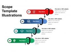
The scope template illustrations PowerPoint slide design ideas are used to present the step by step strategic approach towards the achievement of business goals. Crafted by the expert professionals the provided business scope PPT model is a flawless high-resolution PowerPoint template. Being a thoroughly editable slide design it provides the ease and comfort of modification, customization, and personalization. The visual presentation in the form of step by step diagram is also useful in illustrating the concept of business process or the strategic approach towards growth. Such slides are a visual treat for the audience when the audience is able to easily comprehend the subject of the presentation. This creative illustration is sure to keep the audience engaged throughout the session of your presentation. Add some glamour with our Scope Template Illustrations Powerpoint Slide Design Ideas. Be the cynosure of every eye around.
People who downloaded this PowerPoint presentation also viewed the following :
Scope template illustrations powerpoint slide design ideas with all 5 slides:
Expose the harm caused by divisive forces with our Scope Template Illustrations Powerpoint Slide Design Ideas. It will encourage integration.
FAQs for Scope template illustrations powerpoint
Honestly, just focus on four main things for your scope template. First - project boundaries, like what's in vs what's definitely out. Then break down your deliverables into actual specific stuff, not vague nonsense. Timeline with milestones is obvious but people forget it anyway. Oh, and who's doing what - stakeholder responsibilities matter way more than you'd think. I always add a risks section because future you will thank present you. Make it visual though - boxes, arrows, colors, whatever. Walls of text kill presentations. Test it on someone random first too.
Okay so visual hierarchy is basically your secret weapon for scope templates. Put the biggest, most important stuff at the top - like your main deliverables. Make those headers bold and large. Then use smaller text for all the nitty-gritty details underneath. Color coding different phases or workstreams helps too, though don't go crazy with rainbow colors (learned that the hard way). The whole point is creating a clear path for people's eyes to follow. Otherwise they'll stare at your template and have no clue where to start. Think of it like a roadmap - you want them hitting the major stops first.
Honestly, navy blue and white with some orange or teal accents is my go-to - looks professional but not soul-crushing boring. Gray with green or blue pops works too. Just don't go crazy with bright colors or your stakeholders might think you're not serious (learned that one the hard way lol). Dark backgrounds look cool but readable text is everything. Stick to 2-3 colors max and use different shades throughout. Oh, and definitely test it on a projector first! Colors always look totally different when you're actually presenting.
Honestly, icons are a game-changer for scope templates. Your brain processes visuals way faster than text - it's just basic psychology. Use checkmarks for deliverables, calendar icons for timelines, that kind of stuff. Dense bullet points are brutal to scan through. I always do green circles for what's included and red X's for exclusions - keeps things super clear. Warning symbols work great for the tricky bits too. The key is staying consistent so people can follow your logic. Colors help categorize everything without making it look like a rainbow threw up on your document.
Your slides will be trash if you cram too much text on them - seriously, people just zone out. Break stuff into smaller chunks instead of dumping everything on one slide. Be specific about what you're actually delivering too, not just "various activities" or whatever. Oh and stick to 3 colors max unless you want it looking like a unicorn exploded. Keep your bullet points consistent. Here's something I learned the hard way: test everything on the actual projector you'll use. Your laptop screen lies to you about how readable things actually are.
Start with picking your colors and fonts - that's basically your whole foundation right there. I always make a little style guide first because I'm terrible at remembering what I used two slides ago lol. Your headings, bullets, spacing - keep all that stuff matching. Same icons too if you're using them. Build everything in one PowerPoint file so you can just copy formatting around instead of starting from scratch each time. Honestly, the grid layout thing makes a huge difference even though it sounds boring. Just think of each template as pieces of the same puzzle instead of random separate things.
Honestly, typography can totally make or break your scope templates. Sans-serif fonts are your friend here - way more readable than those fancy ones. Make your main scope items bigger than the sub-bullets so people actually know what's important. I swear, half the scope slides I see look like everything's the same size and stakeholders just gloss over the critical stuff. Stick with maybe 2-3 font weights max, otherwise it gets messy. Also check your contrast against the background - sounds obvious but you'd be surprised. Bottom line: if someone can't read it from the back of the room, you've lost them.
Honestly, less is more with animations. I always go for simple "appear" or "fade in" effects – nothing fancy. Those spinning text boxes are the worst, right? Your audience should focus on what you're saying, not get dizzy from your slides. Try timing them about 0.5-1 seconds apart so you can build your scope items one by one. It's actually pretty helpful for controlling information flow when you're presenting complex stuff. Just don't go overboard with it. Oh, and definitely practice the timing beforehand! Nothing's worse than frantically clicking through slides during the real presentation.
So I'd totally look at what other companies in your space are doing first. Tech companies nail the clean, minimal thing - lots of white space, simple icons, very Apple-esque. McKinsey and those consulting types love their structured frameworks with numbered sections everywhere. Construction projects are obsessed with timelines (makes sense though) so you'll see tons of Gantt charts. Healthcare gets weird about compliance stuff and stakeholder mapping. Honestly, just find scope templates from similar industries and steal their visual style. Then tweak it based on how complex your project actually is. Way easier than starting from scratch.
Honestly, you gotta tailor everything to who's sitting there. Execs just want the big picture - budget, timeline, business impact. Don't bog them down with technical stuff. But your dev team? They need all the nitty-gritty details, dependencies, the whole methodology breakdown. I actually keep two different templates because - and this might sound extra - but mixed audiences almost never work. The visual stuff matters too. Charts and milestone timelines for the C-suite, detailed task lists for technical folks. Figure out who you're really presenting to first, then cut everything that doesn't serve their needs.
Oh definitely! Gradient overlays are way better than flat colors - adds some depth without being annoying. Ditch the clipart for clean, minimal icons (seriously, those cartoon people were the worst). Try asymmetrical layouts instead of centering everything perfectly. White space is your friend here, gives everything room to breathe. I've been playing around with subtle fade-in animations for each scope point too, looks pretty slick. Just don't go crazy with all the trends at once or you'll overwhelm people. Maybe start with one per slide?
Honestly, user feedback is where the magic happens with template design. People complain about cluttered slides? Time to clean up those layouts. Getting the same questions after every presentation? That's your cue that something's not working - maybe info needs to be moved around or labeled better. I watched one team totally redo their timeline visuals because everyone kept getting confused (happens way more than you'd expect, btw). Don't ignore the small stuff either - comments about colors or fonts add up. Just track feedback after presentations and look for patterns. You'll be surprised what people actually notice versus what you think they care about.
Look, minimalist scope templates are honestly a lifesaver. Your audience won't get lost in a bunch of flashy graphics when they're trying to figure out project boundaries. Clean designs are way easier to read whether you're printing them or sharing digitally. The best part? When scope changes hit (and trust me, they always do), updating simple templates doesn't make you want to scream. I learned this the hard way after watching stakeholders squint at cluttered slides for like 10 minutes trying to find basic deliverables. Keep it simple - everyone stays focused on what actually matters.
Just use your brand colors for headers and bullet points - don't go crazy and make everything that color or it'll look messy. Stick your logo in a corner somewhere, not front and center competing with your actual content. I've seen people totally overdo this and honestly it just looks amateur. Your brand fonts work great for headings, but keep the body text simple so people can actually read it. Throw in some subtle icons that match your style. The whole thing should feel natural, not like you just slapped stickers everywhere. Maybe test it on a few slides first?
Honestly, the biggest pain is making sure your templates actually work on everyone's screens. What's crystal clear on your monitor becomes microscopic when someone joins from their phone. Plus you can't just point at stuff or gesture anymore - everything has to be way more obvious. People won't interrupt to ask "wait, what section is this?" like they would in person. So bump up those font sizes, add more contrast, and test your screen share first (learned that one the hard way). Your templates basically need to do all the talking since you lose that natural back-and-forth.
-
Design layout is very impressive.
-
Very well designed and informative templates.