


Key benefits icon powerpoint slide designs




Try Before you Buy Download Free Sample Product
 Impress Your
 Audience
 100%
100% Editable
 Save Hours
 of Time


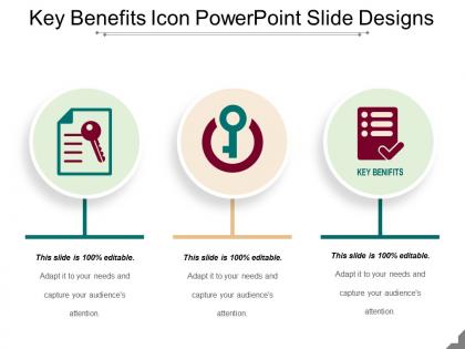
Are you still looking for ideas to depict your plans or want to know how the audience will embrace your messages? Then the key benefits icon PowerPoint slide designs is specifically crafted for you. Three key benefits PPT icon presentation model lets you convey the message to your audience using the alternate symbols of a key. By use of such graphics in your presentation, you give your entire presentation a lively effect. Key graphics lets you visualize your ideas using pre-designed slide model as the audience can easily grasp visual information than the verbal one. Using key benefit infographics PowerPoint illustration you can communicate your point impactfully. These graphics relate your ideas or the concept to real-life events or design so as to make your points clear and comprehensible. The use of these small graphics gives a unique touch to your presentation. Irrespective of the topic of your presentation one would definitely find related slides to define the concept. Inform folks about the core constituents with our Key Benefits Icon Powerpoint Slide Designs. Indicate the essential elements.
People who downloaded this PowerPoint presentation also viewed the following :
Key benefits icon powerpoint slide designs with all 5 slides:
Our Key Benefits Icon Powerpoint Slide Designs can be of great help. Just try them out and you will be thrilled.
FAQs for Key benefits icon
Dude, seriously start using more icons in your slides. People process visuals like 60,000 times faster than text - which honestly blew my mind when I first heard that stat. Icons are just universal language, you know? Everyone instantly gets what a lightbulb or checkmark means. Your slides will look way cleaner too instead of those awful text walls that make everyone's eyes glaze over. I've been doing this for all my decks lately and the difference is huge. Next time you're putting something together, swap out those boring bullet points for icons. Makes everything feel more modern and polished.
Honestly, icons are game-changers for presentations. People's brains process visuals way quicker than text - like a lightbulb instantly screams "ideas" without any reading. Walls of text? Total snooze fest. Icons break that up and give your slides room to breathe. They're also clutch for anyone who doesn't speak English as their first language since symbols are pretty universal. Oh, and stick with the same icon style throughout - mixing different styles looks messy. Trust me on that one. Your audience will actually pay attention instead of mentally checking out halfway through your deck.
Totally! Icons are actually great for helping people remember your slides. Your brain processes visuals way faster than text - something crazy like 60,000 times faster. When you add icons next to your main points, people get the info both visually and through reading, which makes it stick better. They work like little memory triggers. I always throw them in when I have too much text on a slide - makes everything look less overwhelming. Just swap out some bullet points for simple icons that match what you're talking about. Works every time.
Clean line icons are your best bet - charts, lightbulbs, gears, arrows, that kind of stuff. Tech presentations? Go with sleek outlined icons that look modern. Finance executives though... they're honestly pretty conservative, so skip anything too trendy or playful. Creative teams can handle way more color and fun styles. Match your icons to whoever's in the room and your company vibe. Oh, and definitely check how they look projected! I've seen so many presentations where thin lines just vanish from the back seats. Super annoying when you can't see half the slides.
Icons basically replace chunky text with simple visuals your audience gets right away. Like instead of bullet points about "efficiency and cost reduction," you'd use a speedometer and dollar sign - way cleaner. Road signs vs written directions, you know? People don't have to work as hard to understand what you're saying. Honestly, I think most presentations have way too much text anyway. The trick is picking icons that actually make sense for your concepts. Find your main points first, then match them with symbols that are pretty obvious to most people.
Oh totally! So first thing - don't mix filled and outlined icons, it looks super weird. Make them big enough that people in back can actually see them (learned this the hard way lol). Only use 2-3 per slide or it gets chaotic. Pick icons that actually make sense for what you're talking about - not just random lightbulbs for every "idea." Line everything up properly with your text. Oh and if you're using the same icons throughout, maybe add a little legend so people know what they mean. Trust me, consistency is everything here.
Icon colors are huge for getting your point across fast. Red and orange scream urgency, which is great for grabbing attention. Blues and greens? Way more chill and trustworthy. I once watched this guy totally confuse everyone by using red icons for "good news" – people were like, wait, what? Green's your safe bet for positive stuff, red means danger or stop, blue builds trust. Oh, and yellow's tricky – can look cheap if you're not careful. Stick with what feels natural and people won't have to decode your meaning.
Honestly, this is what makes or breaks a presentation. Mixed icon styles scream "amateur hour" - like when people throw together outline icons with filled ones. Your audience's brain gets distracted by the visual chaos instead of listening to what you're saying. I've sat through way too many decks where someone clearly grabbed icons from five different websites. Pick one style at the beginning and don't deviate. Same weight, same colors, same overall look. It sounds picky, but consistent visuals make you look way more credible and trustworthy.
Honestly, customizing icon slides is way simpler than it looks. First thing I'd do is nail down your color scheme - then just recolor all the icons to match your brand. PowerPoint makes this super easy, like two clicks max. Swap out boring generic icons for stuff that actually fits your industry. Oh, and definitely update the fonts to match what you normally use. You can resize icons however you want or group them differently too. I always throw my logo in as a watermark because why not? Just keep everything consistent so it doesn't look messy.
Ugh, the worst thing you can do is mix different icon styles - like having some outlined and some filled ones all jumbled together. Looks messy as hell. Also, people go crazy with tiny icons that nobody can actually see. Seriously, if someone in the back row is squinting, you messed up. Don't just scatter icons around because they're pretty either. Each one needs a real purpose - explaining something or backing up your point. Skip the super detailed ones too since they'll look like blobs on the projector. Pro tip: stand across your room and see if you can still tell what each icon is supposed to be.
Honestly, icons are a game-changer for making data actually readable. I throw dollar signs next to revenue numbers, little people for headcount - stuff like that. You can also build whole charts where each icon equals a certain amount, which looks way cooler than boring spreadsheets. What I really love doing is the before/after thing with icons to show changes. Way more interesting than those generic bar charts everyone's tired of. Just pick icons that make sense immediately - you don't want people squinting trying to figure out what that weird symbol means, you know?
The Noun Project is my absolute favorite - seriously, they have icons for literally everything and the vector quality is perfect. Flaticon works great too, especially when you need a whole set that matches. PowerPoint's built-in library actually doesn't suck anymore, which surprised me. Icons8 has some really slick premium stuff if you want to get fancy. Just whatever you do, pick one style and stick with it throughout your whole presentation. Nothing looks worse than mixing chunky icons with thin ones - it's so distracting. Oh, and grab SVGs when you can so they don't get pixelated.
Animated ones are way better for keeping people engaged, trust me. The movement naturally catches your eye and stops your brain from wandering off - especially during those brutal Zoom presentations where everyone's probably checking email anyway. Static icons get the job done, but they're kinda boring? The animated stuff creates these little moments that actually make info stick. Don't go crazy though - subtle entrances or soft pulses work best. I learned this the hard way after using way too many bouncy animations in one deck. Swap out a few static ones next time and you'll see the difference immediately.
Honestly, I've heard great things about using icons in presentations. People say their audiences actually pay attention instead of checking their phones - which is huge. The visual breakdown thing really works for complex stuff too. Icons basically create this roadmap that guides people through your content without them realizing it. Most feedback I see mentions how much more polished everything looks, but not in that try-hard corporate way. Oh, and apparently icons work better with different types of audiences since everyone gets the visual cues. Definitely swap out one of your text-heavy slides and test it.
Oh totally! Icons are actually perfect for virtual stuff. People are watching on tiny phone screens or crappy laptop displays, so simple bold icons show up way clearer than busy text slides. Plus everyone's so burned out from staring at screens - honestly anything that isn't another wall of bullet points is a win. Just make them big enough and use colors that pop, even when someone's connection is being weird. I'd definitely test it in presentation mode first though, because what looks good in edit mode can be totally different when you're actually presenting.
-
Best way of representation of the topic.
-
Wonderful templates design to use in business meetings.