


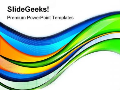
Abstract colorful waves background powerpoint templates and powerpoint backgrounds 0311




Try Before you Buy Download Free Sample Product
 Impress Your
 Audience
 100%
100% Editable
 Save Hours
 of Time


Our Abstract Colorful Waves Background PowerPoint Templates And PowerPoint Backgrounds 0311 have a global outlook. Transmit your thoughts to the citizens of the world.
People who downloaded this PowerPoint presentation also viewed the following :
Abstract colorful waves background powerpoint templates and powerpoint backgrounds 0311 with all 3 slides:
Live life large with our Abstract Colorful Waves Background PowerPoint Templates And PowerPoint Backgrounds 0311. Give a boost to your growth factor.
FAQs for Abstract colorful waves background powerpoint templates and
Start with flow and rhythm - waves need to feel dynamic, not stiff as cardboard. For colors, stick to 2-3 max that actually complement each other. I've learned this the hard way after creating some truly hideous rainbow monstrosities lol. You'll want good contrast between layers so they don't turn into visual soup. Balance is key too - mix up your wave heights and curves for interest. Oh, and don't forget negative space! It's tempting to fill everything but restraint makes the whole piece stronger. Build complexity gradually once you nail the basics.
Honestly, those wavy backgrounds are a game-changer for boring slides. They add movement that catches people's attention without being too much. Your presentations instantly feel more dynamic instead of just flat text blocks. You can go subtle with them in the background or make them pop as accent pieces - totally depends on what you're presenting. The way they flow actually mirrors how good presentations should move from point to point, which I never really thought about before. Just don't let the colors clash with your text or brand stuff. Nobody wants to squint at purple text on bright orange waves, you know?
Hey! So waves + color psychology is pretty cool stuff. Blue waves hit different - super calming, like staring at the ocean. Red gets your heart pumping with all that intensity. Warm colors like yellow and orange feel optimistic, but don't go crazy bright (trust me on this one lol). Purple's got that fancy, mysterious vibe going on. Green just feels... balanced? Natural? The wave motion actually makes whatever emotion the color already has way stronger. Start with the mood you want, then pick your colors from there. Works every time.
Honestly, wave patterns make such a difference in presentations! Smooth, flowing ones help people stay focused on heavy material. Sharp dynamic waves? Perfect when you need to pump up the energy - especially those brutal post-lunch meetings where everyone's dying. Just don't go crazy with chaotic patterns during data slides or you'll lose them completely. Though for brainstorming, chaotic works great actually. Match your waves to what you're saying basically. I'd test a few different intensities with some colleagues first - what works for one crowd might totally flop with another.
Honestly, I'd go with Figma first since it's free and handles gradients really well. Illustrator's great too for vector waves that scale nicely. Photoshop works but the pen tool gets annoying for smooth curves - I always end up fighting with it. If you're on iPad, Procreate is actually pretty solid for this stuff. Canva has wave templates that aren't terrible if you need something super quick. The trick is layering gradients or using gradient meshes to get those smooth color flows. Start simple and build up the complexity.
Yeah, they can totally work! Just don't go overboard with them. I'd use waves as background elements or to separate sections - not as the main focal point competing with your actual content. Tech companies and creative agencies especially love this stuff since it shows they're innovative. Keep the colors matching your brand and make them pretty transparent so people can actually read your text. Oh, and maybe limit yourself to one wave per 3-4 slides? Otherwise it gets overwhelming. Honestly, I'd test them out in internal meetings first to see how people react before using them with clients.
Honestly, the biggest trap is overdoing it with too many colors or crazy busy patterns. Your waves should complement your content, not fight with it for attention. Stick to 2-3 colors max from your brand palette. Also watch your contrast - I've seen so many designs where you literally can't read the text because of those flowing shapes underneath. Position them strategically to guide people's eyes toward what matters. And definitely check how they look on mobile since what works on desktop can turn into a hot mess on smaller screens. Start with lower opacity first, then build up if needed.
Wave size totally changes how you can lay out content. Big horizontal ones? Perfect for splitting sections - headline up top, details below. Vertical waves look cool but honestly they're a pain because they fight with your text for attention (trust me, bombed a client pitch doing this). Diagonal waves have nice flow though. Smaller waves work better as subtle background texture since they won't compete with your message. Oh, and here's what I always do - follow the wave's curve to lead people's eyes right to your main point or CTA. It's like a visual roadmap.
Okay so waves are getting crazy sophisticated now. Designers are layering multiple patterns with semi-transparent stuff to make these almost 3D backgrounds that look insane. The color thing shifted too - everyone's doing muted, earthy tones instead of those neon combos from like 2021 (though ngl I still think electric blue hits different). Interactive ones are everywhere now, especially hero sections that move when you scroll or hover. Oh and CSS animations on wave SVGs? Game changer. Even tiny movements make everything feel way more alive. Definitely worth playing around with!
Honestly, work with your waves instead of against them. Follow their flow with your text direction, or go completely perpendicular if you want some drama. Sans-serif fonts are usually your best bet - they won't clash with all those curves. Though I've seen some clean serifs look amazing too. Color-wise, keep it simple. Pull from your wave colors or just go neutral. The trick is finding those calm spots between the wave peaks - that's where your text will actually be readable. Nobody wants to squint at words riding a tsunami, you know?
Dude, animated waves are seriously underrated for presentations. They make your slides flow way better between points and actually help tell your story. Perfect for showing growth or walking through processes - like quarterly numbers or whatever you're presenting. I swear they make everything look more professional than those boring static slides everyone uses. The movement pulls people's eyes exactly where you want them looking, which is clutch for complex data. Pro tip: match the wave speed to your vibe. Fast colorful ones for exciting stuff, slower waves for steady progress. Makes a huge difference.
Oh totally! Apple's those flowing wave backgrounds in every keynote - honestly they've made it their whole thing and it just works. Spotify does something similar with their yearly Wrapped campaigns, super vibrant and music-y. Google I/O uses waves too, plus most design conferences go for that abstract wave vibe to look innovative. The trick is matching your wave style to whatever energy you're going for. Like, don't make them too crazy if you're presenting serious data or whatever. They should just complement your main points, not steal the show. Works best when the waves actually fit your brand instead of just being random pretty colors.
So gradients basically trick your eye into seeing depth - they copy how light naturally fades across real surfaces. Darker areas sink back while bright spots jump forward. It's the same thing painters figured out ages ago, just digital now. Warm colors like reds and yellows come toward you, cool blues and purples recede. Honestly, layering multiple gradient directions in one wave is where things get really interesting - that's when you start getting actual 3D vibes. Way more effective than I expected when I first tried it.
Honestly, less is more with wave designs. Stick to 2-3 bold colors and give them room to breathe with white space. I've made this mistake before - went crazy with rainbow gradients and it looked like a mess. Your wave shapes should flow nicely, but make those colors really pop and saturated. That's where the magic happens, when you have simple forms but rich color. Oh and don't cover your whole canvas with waves either. Pick one spot to focus on instead of going wall-to-wall with them. The restraint is what makes it work.
Color meanings are all over the place depending where you're designing for. Like, red screams luck in China but spells danger here in the West. White's tricky too - we see purity, but it means mourning in parts of Asia. At least blue stays pretty consistently calming everywhere (seriously, imagine if that changed too). Before you finalize anything, dig into what colors actually mean in your target regions. Build different palettes for different markets. And honestly? Test them with real people from those communities first - you'll catch stuff you never would've thought of otherwise.
-
Best way of representation of the topic.
-
Graphics are very appealing to eyes.
-
Eye catching design...good....