


Achievements Template Powerpoint Ppt Template Bundles




Try Before you Buy Download Free Sample Product
 Impress Your
 Audience
 100%
100% Editable
 Save Hours
 of Time


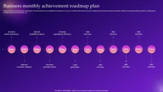
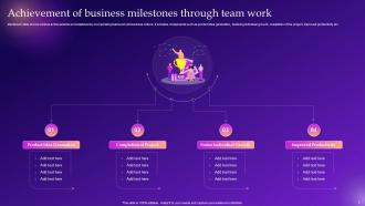
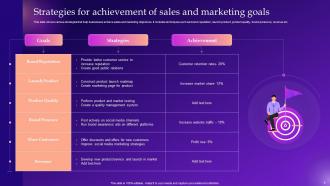
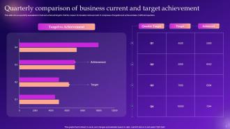
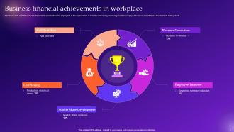
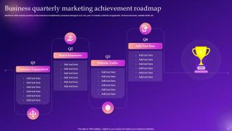
Introducing our powerful PPT on Achievements the ultimate tool to showcase your success This dynamic presentation template is designed to highlight your remarkable accomplishments, whether it is sales achievements, strategic goal accomplishments, business milestones, or your comprehensive achievement plan. With a sleek and professional design, our PPT empowers you to captivate your audience and demonstrate the heights you have reached. Seamlessly present your data, charts, and statistics to illustrate your remarkable journey and inspire others. Whether you are presenting to clients, colleagues, or stakeholders, this versatile PPT is your secret weapon to showcase your achievements with impact and confidence. Elevate your success story today with our achievement presentation template.
People who downloaded this PowerPoint presentation also viewed the following :
Achievements Template Powerpoint Ppt Template Bundles with all 17 slides:
Use our Achievements Template Powerpoint Ppt Template Bundles to effectively help you save your valuable time. They are readymade to fit into any presentation structure.





FAQs for Achievements Template Powerpoint
So for your achievements template, focus on three things: what you did, the actual results, and why it mattered. Use the STAR method but strip it down - situation, your action, measurable outcome. Numbers are clutch here, they make everything way more believable. Include timeframes when you can and mention specific tools or skills you used. Each achievement should be 1-2 lines tops - any longer and people zone out. Start with your biggest wins since those grab attention first. Oh, and always give context about what problem you were solving. Makes the whole thing feel less random and more intentional, you know?
Dude, achievement templates are honestly game-changers. They take all your random wins and turn them into an actual story people want to hear. No more boring bullet points that make everyone zone out - been there! The visual stuff looks way more professional too, without you having to mess around with design for hours. What's cool is they force you to focus on the numbers and real impact, not just "I did this thing." I always start with my biggest win first because it hooks people right away. Then you can work backwards and show how everything connects. Trust me, it's so much better than just listing stuff.
Make your big wins stand out with bigger fonts - save the small text for less important stuff. Don't cram everything together; white space actually helps a ton. I'm a huge fan of using little icons instead of boring bullet points (just don't get too crazy with it). Stick with maybe 2-3 colors so it doesn't look messy. You could try subtle borders around your best accomplishments too. People scan resumes super fast, so they need to spot what matters instantly. Here's a quick test: squint at your resume. Can you still see the important parts? If yes, you're good to go.
So basically, you just swap out the generic stuff for what actually matters in your field. Tech companies care about project impact and technical skills. Healthcare? Patient outcomes and safety certs. Sales teams are all about those revenue numbers - no surprise there. Education focuses on student progress instead. The trick is matching your template to whatever KPIs your industry obsesses over. Like, don't use "increased efficiency" when you could say "reduced patient wait times" in healthcare. Start with something basic, then replace the boring metrics with ones that'll actually make sense to people in your field. It's way more effective than trying to force generic language.
Dude, you gotta turn those boring stats into actual stories. Like instead of "increased sales 30%" - tell them HOW you did it. Maybe you spotted this gap nobody else saw and created a whole strategy around it. Context first, then BAM - hit them with the numbers. I swear people's brains just shut off when they see random percentages with no story behind them. It's way more memorable when they can picture you actually solving a problem. Think about it - would you rather read a resume bullet point or hear about someone crushing a real challenge?
Numbers are everything on your resume - seriously, they make such a huge difference. Instead of "improved sales performance," try "increased quarterly sales by 23%." Way more impressive, right? Hiring managers love concrete proof over vague claims, plus it's easier for them to stack you against other people. When you're prepping for interviews later, you'll actually remember the specifics too (trust me on this one). Percentages, dollar amounts, timeframes - throw them in wherever you can. Go back through what you've got and add at least one number to each point.
Ugh, the worst thing you can do is cram everything onto one slide. Makes my eyes glaze over every time. Also skip the vague stuff like "boosted revenue" - give me actual numbers or don't bother. Pick achievements that actually matter to whoever you're presenting to. Don't randomly mix percentages with dollar amounts either, looks sloppy. Here's what works better: choose your top 2-3 wins and actually tell the story behind them. Way more powerful than just rattling off a laundry list. Give those key moments some space to really land.
Honestly, it's all about knowing your crowd. Younger people love that gamey stuff - badges, levels, casual language that doesn't sound corporate. But if you're dealing with professionals, go formal with proper certificates and industry jargon they actually use. One thing that trips people up though - some cultures hate being singled out individually, so group recognition works way better. Makes total sense once you realize it. Also tweak your difficulty levels based on who you're working with. Oh, and definitely survey a few people first to see what actually gets them excited about achieving stuff.
Honestly, Canva's your best bet to start - crazy easy with tons of templates you can tweak fast. Adobe stuff like Photoshop gives you way more freedom if you're already comfortable with design tools. PowerPoint's actually not bad for basic certificates (I know, I know, sounds boring but it works). Google Slides is clutch when multiple people need to mess with drafts. My move would be starting with Canva since you'll have something decent in like 20 minutes, then graduate to the fancier programs once you figure out what you actually need.
So basically, achievement templates help you organize all your wins with actual numbers and context before reviews. Your manager will love you for it - nobody wants to dig through rambling stories to figure out what you actually did. Templates stop you from forgetting the good stuff and keep everything consistent across projects. Honestly, self-evaluations are awkward enough without stumbling over what to say. The format makes those conversations way less painful. Just start collecting your recent wins now so you're not panicking later trying to remember what you accomplished six months ago.
Honestly, you've gotta connect your wins to what the company actually cares about. When you do that, suddenly everyone gets why your work matters. It's way better than just rattling off a bunch of tasks you finished. Think about it - if you can show how your stuff helped hit their big goals, you're basically proving your worth in dollars and cents. Plus it makes you look like someone who gets the business, not just your little corner of it. Before your next presentation, I'd map out which company goal each of your achievements actually moved forward. Trust me on this one.
Dude, storytelling makes your accomplishments actually stick with people instead of sounding like a resume nobody remembers. Don't just say "increased sales 30%" - explain how you figured out what was broken, what got in your way, and how you fixed it. Way more engaging than bullet points, honestly. People want to see how your brain works, not just what you did. Structure it simple: here's what was happening, here's what I did about it, here's what changed. It's basically turning your work into something people can picture instead of just... facts, I guess?
Honestly, you don't have to stick with boring bullet points. Try grouping your wins by category - like "Leadership" stuff in one column, "Results" in another. Timeline layouts are pretty slick for showing progression too. I actually found some decent ideas on Pinterest (weird, I know, but whatever works). You could throw in some visual elements - icons, progress bars, maybe highlight key numbers dashboard-style. Just match it to your field though. Creative industries? Go wild. Banking or law? Keep it clean and structured. Short story: make each achievement flow into the next one.
Colors are honestly a game-changer for achievement badges - users get it instantly without reading anything. Gold screams premium, bronze works for beginner stuff. Blue feels trustworthy, so it's perfect for consistency rewards. Red gets people hyped for competitive milestones, green feels positive for progress tracking. Purple always looks rare and exclusive (games abuse this one constantly). The trick is staying consistent with your color meanings throughout the whole system. Once users pick up on the pattern, they'll subconsciously know what each color means in your app.
Grab feedback right after each presentation - that's when it's still fresh. Ask specific stuff about clarity and visuals, plus whether your achievements actually felt impactful or just like another boring checklist (we've all been there). Write down what people say and watch for patterns. Multiple people saying the same thing? That's what you fix first. Update your template with the most common suggestions before the next round. Oh, and keep a running doc of improvements - way better than rebuilding everything each time. You'll actually see progress instead of spinning your wheels.
-
Illustrative design with editable content. Exceptional value for money. Highly pleased with the product.
-
Informative design.