


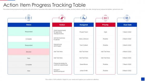
Action Item Progress Tracking Table




Try Before you Buy Download Free Sample Product
 Impress Your
 Audience
 100%
100% Editable
 Save Hours
 of Time


This slide shows progress tracking table with action items. It provides information such as responded, complete, blocked, actions, priority, due date, design layout, prepare templates, upload icons, etc.
People who downloaded this PowerPoint presentation also viewed the following :
Action Item Progress Tracking Table with all 6 slides:
Use our Action Item Progress Tracking Table to effectively help you save your valuable time. They are readymade to fit into any presentation structure.





FAQs for Action Item
Stick with simple progress bars or percentages - everyone gets those instantly. For project stuff, Gantt charts are solid, and milestone markers show the big wins. I swear, half the dashboards I see are just visual noise that confuses everyone. Color code everything: green for done, yellow for working on it, red for "oh crap we're behind." Make your biggest priorities actually look bigger or bolder on screen. Oh, and always throw the real numbers in there too, even with all the pretty visuals. People will want those concrete stats later when they're writing reports or whatever.
Okay so here's the thing - when people can actually see what's getting done, they suddenly care way more about hitting their deadlines. It's wild how that works! No more hiding behind "yeah I'm working on it" when there's a dashboard showing you're behind. Weekly check-ins are clutch too because you catch problems early instead of everything blowing up later. Honestly, just get everyone updating their status once a week and watch how fast the whole vibe changes. People hate looking lazy in front of their teammates.
Honestly, just pick 3-4 metrics that matter and stick with them. Schedule stuff is obvious - are you hitting deadlines or not? Budget variance tells you if you're hemorrhaging money. I always track quality metrics too because nothing's worse than delivering garbage and having to fix it later. Resource utilization is clutch - shows if your team's burnt out or sitting around. Oh, and stakeholder happiness. Seriously, one angry client can torpedo everything fast. Check these weekly, maybe bi-weekly if things are stable. Don't go crazy with dashboards though - too much data just makes you overthink everything.
So basically, templates keep you from starting from scratch every damn time. You'll track the same stuff - deadlines, completion rates, deliverables - in the same format across all projects. Makes comparing things super easy when you're in those weekly status meetings trying to figure out which projects are actually on track. Your team won't have to guess what needs updating either. Oh, and pick like 3-5 key things that actually matter for your type of work first. Then just build those into something you can reuse. Trust me, you'll thank yourself later when you're not scrambling to create new tracking sheets constantly.
Don't overcomplicate your progress slides - that's the fastest way to lose people. Stick to 2-3 metrics max and make the fonts readable (I've seen way too many presentations where you need a magnifying glass). Be honest about delays and roadblocks too. Your credibility goes out the window when you sugarcoat everything and then reality hits. Also, numbers without context are basically useless. Like, saying "we hit 500 users" means nothing if I don't know if that's good or terrible compared to your goal. Start with one clean chart that actually tells the story, then go deeper if they want details.
Start with sprint planning templates and daily standup boards - they're like your team's pulse check. Kanban boards work great too, just don't go overboard with the bureaucracy (we've all been in those soul-crushing meetings). Track velocity with story points per sprint, and honestly? Simple sprint goal templates usually get more buy-in than fancy dashboards. Burndown charts give you that visual feedback loop agile needs. Oh, and definitely do team health checks during retros - you'll catch issues before they blow up. Keep it straightforward and your team won't hate you for adding more process.
Honestly, stakeholder feedback is like your sanity check - it tells you if your tracking actually matters or if you're just making useless dashboards. Ask them what metrics they care about and how they want updates. Then adjust accordingly. I've watched teams obsess over numbers that look impressive but help zero people make decisions (super frustrating to see). You want a feedback loop going where you're tweaking things based on what they need. Otherwise you'll spend forever tracking stuff that sounds important but doesn't help anyone stay informed or make good project calls.
Dude, color coding is a game changer for tracking stuff. Green for good, yellow for "eh maybe watch this," red for "oh crap we're behind" - works like a charm. You'll spot problems instantly instead of hunting through boring spreadsheets. Just pick your colors once and use them everywhere, otherwise your team gets confused. I learned this the hard way when I kept switching between different color schemes and nobody knew what anything meant anymore. Way better than staring at plain black text trying to figure out what's actually happening with your projects.
You'll want templates with KPI sets that actually match your industry's rhythm. Healthcare needs patient outcomes and compliance stuff. Tech companies? Sprint cycles and feature releases. Manufacturing focuses on production quotas and quality benchmarks - totally different priorities. Generic templates are honestly pretty worthless for this. Each industry has its own terminology too. A marketing agency's "campaign launch" milestone looks nothing like construction's "foundation complete." I'd start by figuring out the 3-5 metrics your field actually obsesses over, then build everything around those. Don't forget the approval workflows either since those vary wildly between industries.
Honestly, real-time tracking is a game changer because you catch stuff as it's happening. Budget going sideways? Deadline slipping? You'll know right away instead of finding out in some useless weekly meeting. Think of it like GPS - would you rather get rerouted around traffic or just hear about the jam after you're already stuck? The trick is only tracking what actually affects your decisions (I learned this the hard way). Pick your top 3 things that really matter and build dashboards for those first. Don't go crazy tracking everything.
Honestly, there are so many good options for this! Tableau and Power BI are solid for real-time dashboards. Project management stuff like Asana or Monday can auto-generate reports too. Google Data Studio works surprisingly well - I've seen some really clean presentations come out of it. Miro's great if you want something more interactive for team reviews. The trick is not overthinking it though. Just pick whatever meshes with what you're already using daily. No point adding another tool that'll just sit there collecting digital dust, you know?
Honestly, visualizing your data is a total game-changer. Raw spreadsheets are impossible to read - like, who has time to stare at numbers trying to figure out if things are getting better? Charts make everything obvious instantly. You'll spot trends, bottlenecks, weird seasonal stuff you never noticed. Line charts show if you're building momentum. Bar charts let you compare different time periods easily. I'm obsessed with simple trend lines - they reveal so much about what's actually working versus what you think is working (those two things are rarely the same, trust me). Start there and work up to fancier dashboards later.
Honestly, visibility is everything with remote work. Get a shared dashboard going so people can check progress without bothering anyone. I've found written daily check-ins work way better than video calls - seriously, we're all burned out on Zoom by now. Set up notifications to push updates into Slack automatically. Instead of one massive weekly meeting, create smaller touchpoints throughout the week. Oh, and this might sound obvious but pick a tool your team will actually use first, then build everything around that. No point having fancy tracking if half the team ignores it.
Oh totally, cultural stuff makes a huge difference with progress updates. Like your Asian teammates might wait to mention problems until they've got solutions ready, while Europeans will probably flag issues right away. Some people want daily check-ins, others think that's way too much. Honestly, the constant reporting thing can feel like micromanagement depending on where someone's from. I'd just ask each person directly how they like to communicate progress - sounds obvious but people rarely do it. Then you can find something that doesn't drive anyone crazy.
So I've been looking into this stuff, and honestly some companies are crushing it with progress tracking. Microsoft's team cut project delays by 40% just by doing weekly visual dashboards that caught problems early. Pretty smart move. Spotify does these bi-weekly showcases that actually boost morale - turns out people really dig seeing their work laid out visually. Buffer switched to monthly progress videos instead of boring reports and kept 25% more clients around. The pattern I'm seeing? Make it visual, do it regularly, and focus on what you actually accomplished rather than just checking boxes. Start simple with some before/after stuff in your next update.
-
Graphics are very appealing to eyes.
-
What an exhaustive collection of templates you guys have there in slideteam. Impressive!!!