


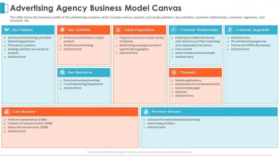
Advertising agency pitch deck advertising agency business model canvas




Try Before you Buy Download Free Sample Product
 Impress Your
 Audience
 100%
100% Editable
 Save Hours
 of Time


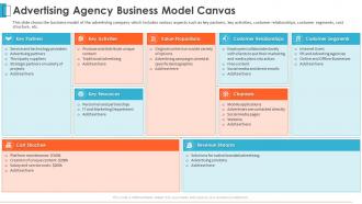
This slide shows the business model of the advertising company which includes various aspects such as key partners, key activities, customer relationships, customer segments, cost structure, etc.
People who downloaded this PowerPoint presentation also viewed the following :
Advertising agency pitch deck advertising agency business model canvas with all 6 slides:
Use our Advertising Agency Pitch Deck Advertising Agency Business Model Canvas to effectively help you save your valuable time. They are readymade to fit into any presentation structure.





FAQs for Advertising agency pitch deck advertising agency
Okay so first things first - actually research their brand or you'll look like an idiot. Start your deck by showing you get their specific challenge, not some generic problem everyone has. Show your creative concept and how you'd tackle it strategically. Case studies are gold - throw in real ROI numbers because clients eat that stuff up. People buy from people they trust, so include team bios. Budget breakdown and timeline are obvious musts. Keep it visual instead of cramming text everywhere. I always end with concrete next steps and paint a picture of what success looks like in six months. Makes it feel real, you know?
Dude, most agency pitches are so boring they put people to sleep. Here's the thing - you gotta tell stories instead of just rattling off what you can do. Take a client problem, walk them through how messy it was, then boom - show your solution and the killer results. Way more memorable than some dry capabilities list. I always start with the client's pain point because that hooks them right away. Think of it like "here's the drama, here's how we fixed it, here's why they loved us." You're not just another vendor anymore - you're the person who actually gets their struggles and knows how to solve them.
Stick to 2-3 colors tops and embrace white space - seriously, it's a game changer. Bold, clean fonts beat fancy ones every time since people actually need to read this stuff from the back. High-quality images and icons should match throughout your deck. Oh, and way less text per slide than you think you need. I always forget this part but test it on a big screen first - you'll catch readability issues you totally missed on your laptop. Subtle brand touches work best. Create visual hierarchy so people know where to look first instead of scanning randomly.
Dude, you gotta completely swap your examples to match their industry. Healthcare clients? Skip the trendy consumer stuff and show pharma campaigns instead. Language matters too - tech people say "user acquisition" but retail folks talk about "foot traffic." I totally bombed a B2B pitch once by leading with lifestyle brand work... awkward. Budget expectations are crazy different across industries, so adjust those ranges. Oh, and timeline stuff too. Research a few campaigns from companies in their space first - like 3 or 4 solid ones before you even open your template.
Honestly, data is what separates you from every other agency walking in there with pretty slides. Start with 2-3 killer data points that make them lean forward - audience insights, competitor stuff, metrics from campaigns you've run before. I've watched so many pitches crash because people just made up personas on the spot (seriously, why do agencies do this?). Your research needs to connect directly to their actual business problems. Don't just dump numbers everywhere though. Tell a story with it. Show them you get their world, then walk them through how your strategy fixes what's broken.
Don't just slap your USPs on one slide and call it a day. Weave them through the whole presentation instead. Open strong with what actually makes you different, then prove it with real case studies. Honestly, I die a little inside when agencies go "we're creative AND strategic" - like yeah, so is literally everyone else. Show concrete examples of results only your approach could've delivered. Get client testimonials that speak to your specific strengths. Your creative work should visually scream what sets you apart. Wrap it up with a summary slide tying everything together.
Start with the numbers - show them actual results that moved the needle. Before/after visuals are gold, especially for engagement or sales bumps. Honestly, I can't stand when agencies just throw pretty designs at people without any context! Pick 2-3 solid case studies instead of showing off your entire portfolio. Structure it like: problem, what you did, results. Client quotes help too - there's something about hearing it from someone else that just hits harder. Keep each one short, maybe two slides tops. Make sure they're actually relevant to what this prospect needs. Always end with how this applies to them specifically.
Hook them right away, then go problem-solution-proof. Show you actually understand their brand first - don't just dump pretty visuals on them (honestly, that's the fastest way to look amateur). Present your big concept, then prove it works with case studies and team stuff. One key point per slide or you'll lose them. Oh, and timelines are crucial - clients love knowing what happens when. End with clear next steps and maybe budget ranges if that's appropriate. The whole thing should flow like you're telling a story, not just showing off work.
Don't just stick all your testimonials on one slide at the end - that's boring. Sprinkle them throughout when they actually make sense. Got a quote about how your analytics boosted someone's revenue? Perfect for your data section. Video testimonials are gold if you can swing it, though good luck getting clients to sit in front of a camera lol. Make sure they're specific too - nobody cares about generic "great team" nonsense. Oh, and always include their actual name, job title, and company logo. Makes it way more believable than some random quote floating there.
Go bold with high-contrast visuals - vibrant colors and clean fonts you can read from the back row. Skip those awful stock photos (seriously, the handshake ones are the worst) and use real shots of your actual audience instead. Bar charts and simple infographics beat complex spreadsheets every time. Animation's great for revealing key points, just don't get carried away. Here's the thing though - every visual needs to back up your story, not just look nice. Oh, and test it on a big screen first so you don't end up with blurry mess.
Go way deeper than just age and gender stuff. Dig into their actual pain points, what they watch/read, how they behave online - basically show you really get these people. Too many agencies slap together boring personas and then act shocked when they lose. Find out where your audience hangs out digitally, what drives their decisions, what keeps them up at night. The key part? Connect all those insights directly back to your creative approach. That's honestly what separates the winners from everyone else just rehashing the client's brief back to them.
Dude, you HAVE to tell people what to do next or they'll just sit there like deer in headlights. I can't tell you how many solid pitches I've watched just... die because there was no clear direction afterward. People need you to spell it out for them. "Let's book a 30-minute call this Thursday" hits way harder than some vague "reach out if interested" nonsense. Time-bound stuff works too - gives them urgency. Honestly, most prospects want to move forward but they're waiting for you to make it stupidly easy for them.
Get ahead of their worries before they even bring them up. Show ROI numbers and different pricing tiers right away - budget's always their first panic point. For timeline stress, build in extra time and walk them through how you actually manage projects. Here's the thing though - clients are terrified you'll ghost them once you get paid. So really emphasize your support team and how long people have been there. Use case studies from their exact industry, not just the flashy stuff that looks good. Oh, and after each big section? Ask "what questions do you have about this?" Gets everything out there so you can actually deal with it.
Market research literally makes or breaks your pitch deck. Clients can tell when you're faking it - they want to see you actually get their audience and competitive landscape. Your creative concepts need those consumer insights backing them up, otherwise you're just another agency with fancy graphics. I learned this the hard way once, honestly. Start with their target demo data before you even touch design. The research shapes your messaging strategy and proves you did the homework. Pretty slides don't mean anything if there's no substance underneath.
OK so objections are actually a good thing - means they're paying attention. First thing: don't panic or get defensive (I still mess this up sometimes). Just acknowledge what they said, then ask questions to figure out what's really bugging them. Like "help me understand..." or whatever feels natural. Skip the immediate sales pitch - that's where most people screw up. Make it conversational instead of some weird battle. Oh, and definitely have backup slides ready because you'll need different angles. The whole point is showing you actually care about solving their problem, not just closing a deal.
-
Enough space for editing and adding your own content.
-
Presentation Design is very nice, good work with the content as well.