

Agile Metrics Powerpoint Ppt Template Bundles





Try Before you Buy Download Free Sample Product
 Impress Your
 Audience
 100%
100% Editable
 Save Hours
 of Time


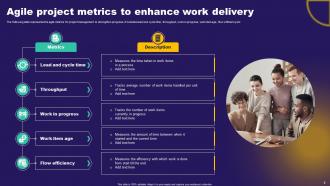
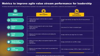
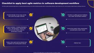
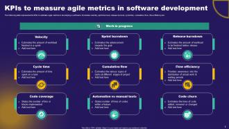
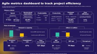
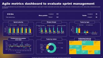
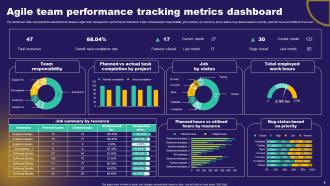
This comprehensive presentation explores the world of agile methodologies and provides valuable insights into measuring and improving team performance. Discover the key performance indicators KPIs that drive success and track progress effectively. Dive into the concept of velocity, measuring the amount of work completed in a given timeframe, and leverage sprint burndown charts to visualize progress and anticipate project completion. Gain a deep understanding of cycle time and lead time, essential metrics that highlight efficiency and time to market. With our Agile Metrics PPT, youll equip your team with the knowledge and tools needed to optimize performance, enhance decision making, and deliver exceptional results.
People who downloaded this PowerPoint presentation also viewed the following :
Agile Metrics Powerpoint Ppt Template Bundles with all 19 slides:
Use our Agile Metrics Powerpoint Ppt Template Bundles to effectively help you save your valuable time. They are readymade to fit into any presentation structure.










FAQs for Agile Metrics Powerpoint
Start with velocity and burndown charts - they're dead simple and show if your team's actually hitting their targets. Cycle time's good too, especially for Kanban flows. I used to hate cumulative flow diagrams because they look crazy complicated, but they're actually pretty helpful once you figure them out. Sprint burndowns are like the gold standard everyone uses. Lead time matters for measuring how efficiently stuff moves through your process. Oh, and track escaped defects if you can - nobody wants bugs slipping through. Sprint goal achievement rates are worth watching too. Honestly just pick velocity first, then add others as you go.
Track story points your team finishes each sprint - do this for like 3-6 sprints to get a decent average. Individual sprints will be all over the place (sick days, holidays, random fires to put out), so just look at the overall trend. Your team needs to estimate stories consistently and actually wrap them up during sprints. Here's the thing though - use velocity for planning, not as some weapon to judge performance. That's how you kill morale fast. Start tracking now and you'll have solid planning data in about a month. Way better than guessing.
So lead time and cycle time are basically your go-to metrics for tracking flow. Lead time is the whole journey - from when you commit to work until it's actually delivered. Cycle time? Just the active work portion. The food analogy works pretty well here - lead time covers placing your order to taking that first bite, while cycle time is purely cooking time. Want to improve them? Cut down your work-in-progress limits and break those massive stories into smaller chunks. Also, those annoying handoffs between teammates kill your flow. Honestly, just measure where you're at first, then go after whatever's creating the biggest jam.
Honestly, burndown charts are game-changers for tracking sprints. You'll see right away if you're falling behind or cruising ahead of schedule. No more awkward standups where everyone pretends their tasks are "90% done" for three days straight. Spot problems early, tweak scope when needed, celebrate wins when you're crushing it. Stakeholders actually get what's happening without you explaining every detail. Just stick it somewhere everyone can see and update daily - I swear the transparency alone keeps people more honest about their progress.
NPS shows if customers would actually recommend your product - way more useful than just counting story points or velocity. You're shipping code constantly in agile, but are those releases making people happy or just driving them crazy? That's what NPS tells you. I'd survey a small group after major sprints to catch trends before they become problems. It cuts through all the process noise and shows whether you're building stuff people genuinely want. Pretty much the only metric that matters if you think about it.
Track 2-3 key metrics like velocity and cycle time first. But here's the thing - numbers only show what happened, not why. You need team feedback too. Do retrospectives and quick surveys about workload and code quality. I've watched teams nail every sprint goal while secretly dying inside, and the metrics looked perfect on paper. The qualitative stuff explains those weird dips or spikes in your data. Ask how people are feeling about collaboration and stress levels. Combine both and you'll actually know if things are sustainable or just looking good temporarily.
Focus on velocity, burndown patterns, and team happiness - that's what actually matters. Your velocity doesn't need to go up constantly, just stay predictable. Burndowns shouldn't look like crazy zigzags every sprint either. But honestly? The people stuff is huge. Watch retros - are folks actually talking or just going through the motions? Track cycle time too, from start to finish on stories. Oh, and completion rates - how often do you actually deliver what you promised? I'd throw in a monthly team survey or something. Catches problems before everything goes sideways.
Honestly, don't get too caught up in the numbers game. Metrics help point you in the right direction, but they miss all the human stuff that actually matters. I've watched teams totally manipulate their velocity just to hit targets - spoiler alert, that backfired spectacularly. What really works? Mix your data with real conversations from retros and one-on-ones. Pay attention to how people actually feel about the work. When something looks weird in the numbers, dig deeper and ask why. The spreadsheet might say everything's fine while your team's burning out.
Burndown charts work really well for tracking sprint progress, and cumulative flow diagrams show how work's moving through your board. Velocity charts are honestly my favorite though - super helpful when you're planning sprints with the team. Keep dashboards simple (nobody wants to squint at a cluttered screen). Pick maybe 2-3 metrics that actually matter to your goals and put them somewhere visible. We used to throw ours on a TV in our workspace, or you could make them your first standup slide. The trick is making them instantly readable so people don't have to think too hard about what they're seeing.
Honestly, agile metrics are game-changers because they replace guessing with actual data. Velocity trends help you forecast realistic delivery dates. Cycle time shows where your team's getting stuck. Customer satisfaction scores? Those tell you which features people actually want. Burndown charts are clutch - you'll know instantly if you're on track or need to cut scope. Pick maybe 3-4 metrics that match your goals and check them during retros. Oh, and don't overthink it at first. Start with something basic like story points per sprint, then add more as you get comfortable with the process.
NPS is huge for tracking satisfaction, plus customer feedback frequency and how much they're actually using new features. Support tickets are a dead giveaway too - volume spikes when people are pissed. Retention rates matter more than anything though, since happy customers stick around. After each sprint demo, throw out quick pulse surveys. Waiting until project end is basically useless for fixing anything. Oh, and check your metrics weekly - I learned that one the hard way. Setting up feedback loops early saves you from nasty surprises later. Resolution time on tickets tells you loads about whether your support game is solid too.
So CI/CD basically gives you tons more data in real-time instead of waiting for sprint reviews. You'll see deployment frequency and lead times constantly flowing in. Story points matter way less now - focus on stuff like recovery time and how often deployments actually work. Honestly, the visibility is insane compared to traditional agile tracking. Your dashboards need an overhaul though. Track pipeline metrics next to your usual sprint stuff. Oh, and failure rates become super critical since you're pushing code so much more often. It completely shifts what metrics actually matter.
Honestly, retros are like your team's bullshit detector for all those metrics you're tracking. Sure, velocity looks great on paper, but if everyone's complaining they're burned out during retrospectives? Those numbers are lying to you. Same goes if customers hate what you're shipping - doesn't matter how fast you delivered it. The real gold is using retro feedback to figure out which metrics actually matter and which ones are just making you feel good about nothing. I've seen teams obsess over burndown charts while completely missing that they're building the wrong thing. Use what comes up in retros to fix both what you measure and how you read those measurements.
Honestly, treat metrics like conversation starters, not scorecards. Track stuff like cycle time or how often stories get blocked - it helps spot patterns your team might totally miss. I'd focus on asking "what's this data actually telling us?" rather than just throwing numbers around. Skip the vanity metrics though, they're useless. During retros, dig into what the numbers reveal, then try small experiments and see what happens. The whole point is helping your team get better at using data to improve themselves. Just don't go overboard with it.
Honestly, benchmarks are all over the place depending on what you're building. Most teams hit around 70-85% sprint commitment accuracy, which sounds low but is actually pretty decent. Lead times under 2-3 weeks are solid for regular features. Your velocity should be stable-ish - doesn't need to be crazy high, just consistent. Here's the thing though: comparing your story points to another team's is totally pointless. It's like... their "5" could be your "2," you know? Track your own trends instead. Pick 2-3 metrics, watch them for a few sprints, then see how you're improving against yourself. Way more useful than stressing about some industry average.
-
The service is fast, and I could access any presentation after buying the subscription. I don’t think I’ll ever have to worry about a presentation in my life.
-
Mesmerized with the fantastic collection! Super sleek, relevant infographics.