


AI Chatbot Powerpoint Ppt Template Bundles




Try Before you Buy Download Free Sample Product
 Impress Your
 Audience
 100%
100% Editable
 Save Hours
 of Time


AI chatbot is a friendly, helpful assistant designed to understand and respond to questions. It uses advanced technology to learn from conversations, providing accurate and relevant information tailored to needs. While seeking advice, information, or just a friendly chat, chatbot is here 24 7 to assist individuals. It respects privacy and confidentiality, ensuring a safe and secure interaction. With continuous learning and improvement, AI chatbot aims to make users experience enjoyable and effortless, simplifying tasks and enhancing interaction with technology.
People who downloaded this PowerPoint presentation also viewed the following :
AI Chatbot Powerpoint Ppt Template Bundles with all 34 slides:
Use our AI Chatbot Powerpoint Ppt Template Bundles to effectively help you save your valuable time. They are readymade to fit into any presentation structure.








FAQs for AI Chatbot Powerpoint
Start with the user journey - walk them through how someone actually uses your chatbot. Screenshots help a ton here, plus show off some real conversations that highlight your bot's personality (nobody wants to chat with something that sounds like a user manual, trust me). Cover the technical stuff too - NLP features, integrations, whatever AI models you're running. Metrics are key: response accuracy, user satisfaction, all that good data. Oh, and definitely include clear use cases so people can actually picture where this thing fits into their daily work. Makes the whole presentation way more convincing.
Honestly, colors make a huge difference when explaining chatbot stuff. I'd go with blue for user messages, green for bot replies - keeps things super clear. Red works great for errors too. Blues and grays give off that techy vibe, but throw in some warmer accent colors to highlight the cool features. Pick maybe 3-4 colors max and stick with them. Random colors everywhere just confuse people, trust me. The whole point is helping your audience follow along without their brain working overtime. Oh, and consistent color patterns? Total game-changer for keeping people engaged.
Stick with clean visuals and lots of white space - makes everything way more readable. Blues and greens are solid choices for AI stuff since they feel trustworthy. Sans-serif fonts all the way for that sleek tech vibe. Definitely throw in some interactive elements like chat bubble mockups or conversation flows. Makes it feel way more legit than just talking about AI in abstract terms. Structure your slides problem → solution, and honestly, having template slides ready for demos and ROI stuff will save you so much headache later. Start with a good master template first though.
Oh, start with entrance animations - have the user message pop up first, then show that little processing dot thing, then the bot's response. Makes it feel way more natural. Those morph transitions are perfect for showing how responses change with different inputs. I'm honestly obsessed with smooth slide effects, they make everything feel like an actual conversation! Fade effects work well for decision trees too. And definitely add pathway animations when you're showing how bots route different queries. Just don't rush the timing though - let each step actually breathe so people can follow along without getting motion sick.
Dude, visuals are a game-changer for chatbot presentations. People zone out the second you mention "machine learning algorithms" or whatever. But throw in a flowchart showing how conversations actually work? They get it immediately. I always swap out half my boring bullet points for infographics - especially those before/after comparisons that make the benefits super obvious. Icons work great too for breaking down different AI features. Honestly, I learned this the hard way after watching too many audiences check their phones during tech-heavy slides. Your presentation will be so much better.
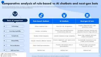
Make comparison slides with side-by-side layouts - different colors and icons work great. I'd use gears for rule-based bots, maybe brain icons for AI ones. Flowcharts really help show how rule-based follows set paths while AI adapts. The visual contrast honestly makes people understand right away. Throw in real examples they've used before. Oh, and definitely add a decision matrix slide at the end - helps them figure out which type actually fits their situation. Sometimes people get stuck on the technical stuff when it's really about matching needs.
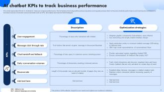
Track the usual suspects first - completion rates, satisfaction scores, resolution time, how often people bail to human agents. Monthly active users matters too, plus session duration (tells you if people actually stick around or nope out immediately). Business-wise you'll need cost savings per chat, lead gen numbers if that's relevant, conversion rates. Oh and definitely throw in some weekly/monthly trend slides - stakeholders eat that stuff up, they love seeing those upward curves. Maybe I'm cynical but the pretty charts sometimes matter more than the actual numbers.
Oh definitely do persona slides upfront! Pick 2-3 users with names, photos, actual pain points they'd have. Sarah the busy mom who hates tech vs. Mike the early adopter type - you know? Show their communication styles and comfort levels. When you demo features later, just say "remember Sarah would need this because..." It's so much better than boring tech specs. Honestly this approach saved my last presentation - stakeholders actually cared once they could picture real people using it. One slide per persona works great.
So I'd go with Sephora's makeup matching bot - that one's actually pretty impressive. Bank of America has Erica for basic banking stuff, and honestly Domino's pizza ordering through Messenger is kind of genius. For B2B examples, HubSpot's lead qualifier works well, or H&M's style assistant that suggests outfits based on what you like. Pick maybe 3-4 that match your audience's industry though. Makes the whole presentation feel way more relevant instead of just random examples thrown together.
Start with a real customer pain point, then make your AI chatbot the hero that swoops in. I'd structure it like a story - show the mess before AI, walk through implementation, then celebrate the win with actual metrics. Before/after screenshots of conversations work amazingly well, trust me on this. Turn your users into characters and follow their journey step by step. Oh, and throw in some plot twists about deployment headaches you solved along the way. End each section with a cliffhanger that teases what's next - keeps people engaged instead of scrolling Instagram under the table.
Oh man, people have some wild ideas about chatbots. The biggest ones? That they're either gonna steal every job or they totally get humans like we do. Neither's true obviously. Small businesses think they cost a fortune and are way too complicated - I used to think that too honestly. Here's the thing though: they're terrible with emotional stuff and definitely aren't some magic fix for every customer problem. Most people swing between "chatbots are useless" or "they're taking over." Reality's somewhere in the middle. Set realistic expectations about what they actually do well versus what they suck at.
So the template's pretty flexible - you can adjust complexity based on who's listening. Skip the technical stuff for beginners and stick to basics, use cases, benefits. Advanced crowd? Throw in the architecture slides and implementation details. My favorite part is the "optional detail" backup slides. Super handy when someone inevitably asks that one crazy technical question during Q&A (there's always that person, right?). Survey your audience's AI knowledge beforehand though. Makes customizing way easier than guessing what they know.
Honestly, skip the boring explanations and just show them the chatbot working live - way more engaging. Practice clicking between slides beforehand because watching someone struggle with PowerPoint is painful for everyone. The interactive stuff in your template? Actually use it to demo real conversations. Ask people how they'd use this tech at their jobs - gets them thinking practically. Simple explanations work best here. After each section, tie it back to actual business benefits they'll care about. Oh and definitely have a backup plan ready because technology loves to fail at the worst possible moments.
So for showing off your chatbot's success, definitely go with before/after metrics - response times, satisfaction scores, that kind of thing. Numbers are honestly your best friend here. Pull quotes from customers work great too, especially with their logos if you can swing it. Oh and do that problem-solution-results format for case studies, people eat that up. Cost savings data is huge if you have it. Maybe add a whole section just for success stories? The annoying part is always getting permission to use company names, but it's worth the hassle. Any awards or recognition stuff should go in there too.
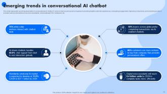
Okay so definitely hit multimodal AI - bots handling text, voice, images all at once. Emotional intelligence is huge right now too. AR/VR integration sounds fancy but it's legit happening everywhere. Oh and personalization that actually learns from each user over time, not just basic stuff. Industry-specific agents for healthcare and finance are taking off. I know "metaverse" sounds cringe but conversational AI in virtual spaces is real. Autonomous bots making transactions without human approval - that's wild but coming fast. Don't skip ethics and transparency since everyone's freaking out about that lately. Update quarterly though because this field moves insanely quick.
-
I am a big fan of their newsletters because that is how I found my perfect requirement at the time of urgency. Thank God, I kept opening those.
-
Excellent Designs.