


Apresentação do relatório anual em PowerPoint com slides





Try Before you Buy Download Free Sample Product
 Impress Your
 Audience
 100%
100% Editable
 Save Hours
 of Time


Apresentar um relatório anual A apresentação em PowerPoint ficou ainda melhor com nosso arquivo de amostra PPT pré-fabricado. A única coisa que resta agora é fazer o download do nosso show em PowerPoint e lançar os holofotes sobre as atividades, realizações, relatório do auditor e contas anuais da sua empresa do ano anterior. Além disso, nosso modelo de relatório anual de negócios PPT ajuda as partes interessadas e parceiros a compreender a posição financeira, demonstração de resultados, perspectivas de mercado, objetivos e direções futuras de uma empresa. A melhor parte aqui são os nossos modelos de slides exclusivos, como história e marcos da empresa, nossa herança, presença global, realizações, destaques de vendas, crescimento da distribuição, etc., incluídos para dar uma nova dimensão às promoções de uma empresa. Em suma, com o apoio da apresentação do nosso relatório anual PPT você pode enfatizar o plano estratégico completo da sua empresa de forma a construir uma imagem empresarial firme. Em suma, dar um toque artístico ao relatório anual de uma empresa neste deck de apresentação é o que você não pode perder. Vá além das expectativas do cliente com nosso relatório anual completo em PowerPoint com slides. Eles ajudam a fornecer aquele bit extra.
People who downloaded this PowerPoint presentation also viewed the following :
Conteúdo desta apresentação em PowerPoint
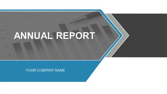
Slide 1 : Este slide apresenta o Relatório Anual com uma imagem para acompanhar. Indique o nome da sua empresa e comece.
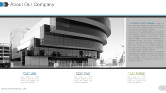
Slide 2 : Este slide apresenta Sobre Nossa Empresa. Estabeleça aspectos da empresa, especificações aqui.
Slide 3 : Este slide também apresenta Sobre Nossa Empresa. Estabeleça aspectos da empresa, especificações aqui.
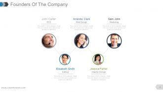
Slide 4 : Este slide mostra os Founders Of The Company para indicar nomes, designação e respectiva imagem para acompanhar.
Slide 5 : Este slide apresenta a mensagem do nosso CEO. Indique qualquer mensagem, etc. aqui.
Slide 6 : Este slide também apresenta a mensagem do nosso CEO. Indique qualquer mensagem, etc. aqui.
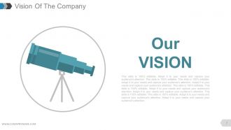
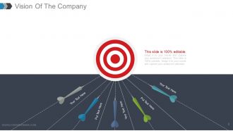
Slide 7 : Este é o slide Nossa Visão. Declare aqui a Visão da empresa.
Slide 8 : Este também é o slide Nossa Visão com imagens do alvo. Declare aqui a Visão da empresa.
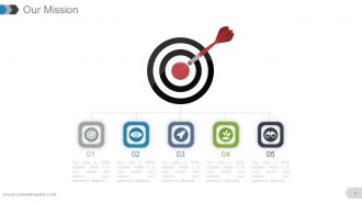
Slide 9 : Este é o slide Nossa Missão. Declare a missão da empresa aqui.
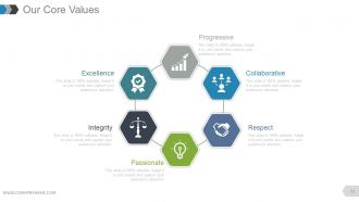
Slide 10 : Este slide mostra Nossos Valores Fundamentais. Alguns exemplos dados são- Progressivo, Colaborativo, Respeito, Apaixonado, Integridade, Excelência.
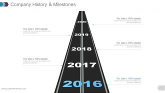
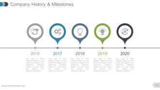
Slide 11 : Este slide apresenta a história e os marcos da empresa em uma imagem de roteiro.
Slide 12 : Este slide apresenta o histórico e os marcos da empresa a serem apresentados com ícones e caixas de texto.
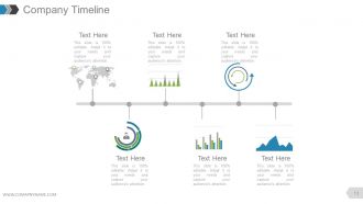
Slide 13 : Este slide apresenta a linha do tempo da empresa a ser apresentada com ícones, gráficos e caixas de texto, etc.
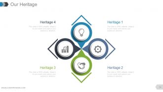
Slide 14 : Este slide mostra a nossa herança da empresa.
Slide 15 : Este slide mostra a nossa herança da empresa.
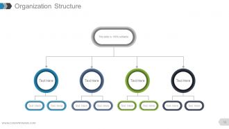
Slide 16 : Este slide mostra a Estrutura Organizacional da empresa a ser apresentada.
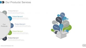
Slide 17 : Este slide apresenta Nossos Produtos / Serviços para indicar as especificações de Produto / Serviço.
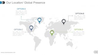
Slide 18 : Este slide mostra Nossa Localização / Presença Global na imagem do mapa mundial.
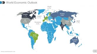
Slide 19 : Este slide mostra o World Economic Outlook com uma imagem de mapa mundial.
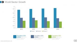
Slide 20 : Este slide apresenta o Crescimento do Setor Mundial em forma de gráfico de barras.
Slide 21 : Este slide exibe as Conquistas com imagens e caixas de texto para acompanhar.
Slide 22 : Este slide exibe as Conquistas com diferentes imagens e caixas de texto para acompanhar.
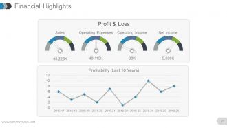
Slide 23 : Este slide mostra os Destaques Financeiros em forma de gráfico de linha e escala métrica para Lucros e Perdas, Vendas, Despesas Operacionais, Receita Operacional, Receita Líquida e Rentabilidade.
Slide 24 : Este slide mostra os destaques financeiros. Indique aqui os aspectos financeiros.
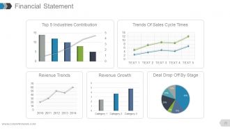
Slide 25 : Este slide mostra uma demonstração financeira com os seguintes subtítulos - Tendências da receita, Crescimento da receita, Queda de negócios por estágio, Tendências dos tempos de ciclo de vendas, 5 Principais contribuições dos setores.
Slide 26 : Este slide mostra os Destaques de Vendas em diferentes gráficos com os seguintes pontos - Total de Vendas de Oportunidades por Probabilidade, Total de Vendas por Mês - Ganho: Perda de Perda de Leads Origens da Receita.
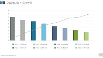
Slide 27 : Este slide mostra o Crescimento da Distribuição em forma de gráfico.
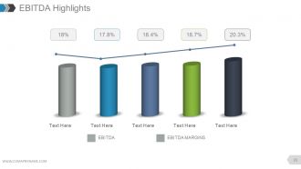
Slide 28 : Este slide mostra os Destaques do EBITDA em forma de gráfico.
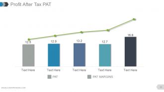
Slide 29 : Este slide apresenta o Lucro após impostos PAT em forma de gráfico.
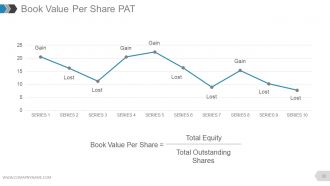
Slide 30 : Este slide mostra o valor contábil por ação PAT em forma de gráfico de linha em termos de - Ganho perdido
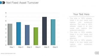
Slide 31 : Este slide mostra a Rotatividade Líquida do Ativo Fixo em forma de gráfico.
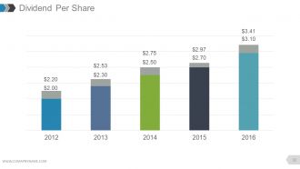
Slide 32 : Este slide mostra o Dividendo por Ação em forma de gráfico de barras.
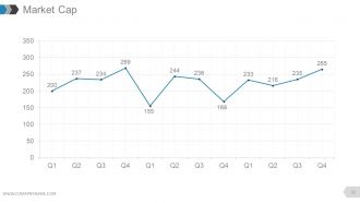
Slide 33 : Este slide mostra o valor de mercado em forma de gráfico de linhas.
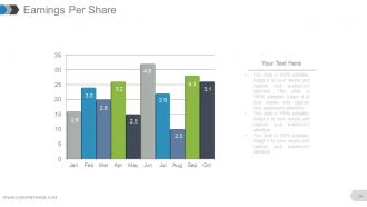
Slide 34 : Este slide mostra os ganhos por ação em forma de gráfico.
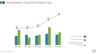
Slide 35 : Este slide apresenta o Fundo do Acionista e a Capitalização de Mercado em gráfico de linha e gráfico de barras exibindo o seguinte conteúdo - Capitalização de Mercado como Percentual da Capitalização de Mercado de CSE, Capitalização de Mercado, Fundos de Acionistas.
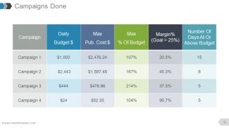
Slide 36 : Este slide mostra uma tabela de Campanhas Concluídas.
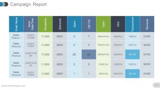
Slide 37 : Este slide mostra o Relatório de Campanha em formato tabular.
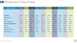
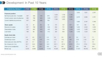
Slide 38 : Este slide mostra o Desenvolvimento nos últimos 10 anos em forma de tabela.
Slide 39 : Este slide também mostra o Desenvolvimento nos últimos 10 anos em forma de tabela.
Slide 40 : Este slide mostra a taxa de inflação em forma de gráfico.
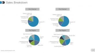
Slide 41 : Este slide apresenta a Distribuição de Vendas dividida em Por Canal e Por Região.
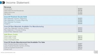
Slide 42 : Este slide apresenta a tabela da Demonstração de Resultados.
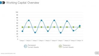
Slide 43 : Este slide mostra a Visão Geral do Capital de Giro em forma de gráfico de dispersão com - Ativos Correntes Temporários Ativos Correntes Permanentes como pontos de marcação.
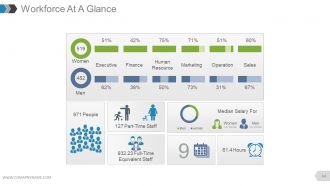
Slide 44 : Este slide apresenta uma Visão Geral da Força de Trabalho contendo os seguintes pontos - Executivo, Finanças, Recursos Humanos, Marketing, Vendas, Operação, Mulheres, Equipe de Meio-período, Equipe Equivalente de Tempo Integral, Pessoas, Horas, Salário Médio Para, Mulheres , Homens.
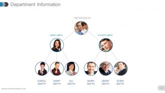
Slide 45 : Este slide apresenta as Informações do Departamento como uma imagem de hierarquia com nomes.
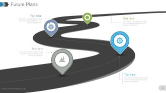
Slide 46 : Este slide apresenta Planos Futuros a serem mostrados em um roteiro.
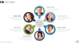
Slide 47 : Este slide mostra as especificações de Nossa Equipe com caixas de nome, designação e imagem.
Slide 48 : Este slide apresenta um Perfil de Membro com nome, habilidades, etc.
Slide 49 : Este slide é intitulado Slides adicionais para prosseguir.
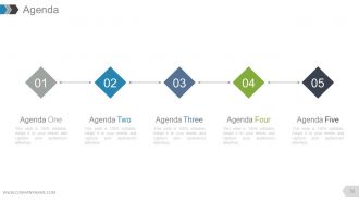
Slide 50 : Este é um slide da agenda. Declare suas agendas aqui.
Slide 51 : Este é um slide Nosso Objetivo. Estabeleça metas etc. aqui.
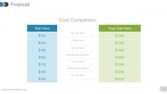
Slide 52 : Este é um slide da tabela de pontuação financeira. Indique aqui os aspectos financeiros.
Slide 53 : Este é um slide de cotações para transmitir mensagens da empresa, crenças, etc.
Slide 54 : Este é um slide do painel para mostrar kpis, métricas, etc.
Slide 55 : Este é um slide de localização da imagem do mapa mundial para mostrar a presença global, crescimento, etc.
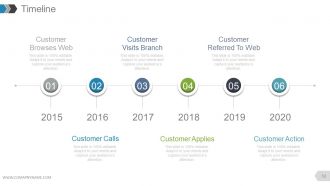
Slide 56 : Este é um slide de linha do tempo com o seguinte conteúdo - Cliente navega na Web, Cliente visita filial, Cliente referenciado para Web, Chamadas do cliente, Aplicação do cliente, Ação do cliente.
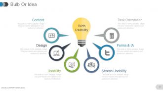
Slide 57 : Este é um slide Bulbo ou Ideia com o seguinte conteúdo - Pesquisa de usabilidade, usabilidade, formulários e IA, design, orientação de tarefa, conteúdo, usabilidade na web.
Slide 58 : Este é um slide de imagem de lupa com SEO segregado em - Específico do local, Específico do destino, Específico do produto
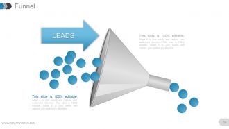
Slide 59 : Este slide mostra o Funil exibindo LEADS.
Slide 60 : Este é um slide de agradecimento pelo reconhecimento.
Relatório Anual Apresentação em PowerPoint com slides com todos os 60 slides:
Mostre a compreensão de todos os aspectos com nosso relatório anual. Eles ajudam a exibir grande destreza.














FAQs for Annual report complete powerpoint
Okay so for your annual report deck - start with exec summary showing your biggest wins right up front. Then hit financial highlights like revenue and profit. Major accomplishments come next, plus where you stand in the market now. Charts and graphs over walls of text, trust me on this one. Most decks totally bomb because they throw every random metric at people instead of focusing on what actually matters to stakeholders. Oh and don't forget the forward strategy piece. The whole thing needs to flow together as one story - not just "here's what happened" but why it sets you up for what's coming next.
Dude, charts and graphs beat bullet points every time for showing trends. But here's the thing - infographics can actually connect your metrics to show cause and effect, which is pretty cool. I'm obsessed with timeline visuals (maybe too much?) because they help people follow your company's whole year. Real photos of employees or customers make those numbers feel human instead of just... numbers. Don't just slap visuals everywhere though. Try storyboarding first so you know where they'll actually make a difference. You want them supporting your story, not just looking pretty.
Pick your colors and fonts first - stick to 2-3 colors max and one main font. Seriously, I've watched so many presentations crash because someone went crazy with like 8 different colors. Just don't. Keep everything consistent - same spacing, logo in the same spot every time, matching chart styles. Oh, and make a master template before you start building slides. Trust me on this one, it'll save you hours of tweaking later. Use the same icon style throughout too. Simple stuff but it makes a huge difference in how professional it looks.
Make your charts tell a story instead of just throwing numbers at people. Line graphs work great for showing growth over time, bar charts are perfect for comparisons. Pie charts? Honestly skip them most of the time - they're so overdone. Keep colors simple and consistent with your brand. Here's the thing though - your chart titles should literally state the main point. Don't make people guess what they're looking at! Each visual needs to back up something specific you're saying. Oh, and definitely test your charts on someone fresh. They'll spot confusing stuff you totally missed.
Honestly, less is way more with these presentations. Your slides shouldn't look like a Wikipedia page - people's eyes just glaze over. Tell a story that connects everything instead of jumping around randomly. Nobody wants to watch you read bullet points out loud either (seriously, we can all read). Pick maybe 3-5 big wins and problems to focus on rather than trying to cover every tiny detail from accounting to HR. I always think the best presentations feel more like a conversation anyway. Make sure each section ends with actual next steps so people know what you're planning to do, not just what already happened.
Honestly, just make different versions of the same deck for each group. Investors want to see all the money stuff - growth numbers, ROI projections, that kind of thing. Board members care about governance and risk management. Employees? They want culture updates and what's coming next (they zone out during financial slides anyway lol). For customers, lead with innovation and how you're making their lives better. Same basic content, just shuffle the order and change what you emphasize. Start with a master version, then customize from there. Way easier than starting from scratch each time.
Definitely don't skip branding in your annual report - it's the difference between looking professional vs like you cobbled slides together last-minute. Stick to your company colors, fonts, and logo on every slide. I've seen so many decks that look like someone went crazy with random templates (yikes). Your brand guidelines should control everything - layouts, icons, even how charts look. Oh and create a master template first with all your brand stuff, then build from there. That visual consistency is what makes the whole thing feel polished instead of messy.
Dude, less text = better slides. Trust me on this one. I made the mistake of cramming way too much info on slides during a board meeting last year and watched everyone's eyes glaze over. Super awkward. One main point per slide, that's it. Charts and visuals work way better than bullet points anyway - people actually pay attention to those. If you absolutely need text, make it huge. Like, can-the-person-in-the-back-row-read-this huge. All your detailed stuff should go in your speaker notes, not on the actual slides. Your audience will thank you for it.
Honestly, start with Canva's annual report templates - they're surprisingly good and will save you hours. PowerPoint has some decent ones too if you poke around the "New" section. Beautiful.ai and Slidebean are worth the money though, especially since they auto-adjust layouts when you dump in all that financial stuff. Visme's cool for infographics if you need those. Oh, and whatever you do, don't switch templates halfway through like I did last year. Looked like a mess and I had to redo everything. Just pick one style and commit to it from the start.
Charts beat tables every time - way easier to read. I go with bar charts for comparing stuff, line graphs when I'm showing trends. Honestly, my first presentation was a disaster because I threw too much data at everyone. Now I always add percentage changes next to the raw numbers so people get it immediately. Don't pack everything onto one slide either. Same colors throughout helps too. The big thing though? Write quick bullet points explaining what your charts actually mean for business. Nobody wants to play detective with your numbers.
Dude, interactive stuff will totally save your annual report from being a snoozefest. Hyperlinked menus let people jump around to what they actually care about. Throw in some polls with Mentimeter or animated charts that build as you talk - way better than static slides. Video testimonials work great too, and I've seen people do this cool "choose your own adventure" thing where stakeholders can dig deeper into specific topics. Honestly, even just clickable navigation makes people pay attention. Don't go crazy though - start with maybe two interactive elements and see how it goes.
Start with your best numbers upfront - revenue growth, profit margins, cash flow. That's what they're looking for immediately. Market share and customer acquisition metrics are gold if they're solid. The debt-to-equity thing is super dry but you can't skip it unfortunately. For annual decks, year-over-year beats quarterly comparisons every time. Don't forget operational wins like cost cuts or efficiency gains - those actually matter more than people think. One metric per slide with clean visuals. Investors get cranky with messy charts. Hook them early with your strongest stuff.
Grab feedback right after each presentation - formal stuff AND those random hallway chats (honestly those are gold). Toss everything into a basic spreadsheet and watch for patterns. Like if everyone keeps saying "way too much text" or "where are the visuals?" - write that down. When you're prepping the next deck, actually look at your notes. Executive summary too wordy last time? Chop it. People wanted more industry data? Add it upfront this time. I swear, keeping a simple "worked/didn't work" list saves so much time. No point starting from scratch every year when you already know what lands.
Think of your deck like telling a story - start with whatever mess your company was dealing with this year, then show how you tackled it and what actually happened. Honestly, I picture it like making a mini-documentary or something. Each slide should build toward your main points, and don't just dump a bunch of data everywhere. Use charts and visuals that actually support what you're saying. Keep your language consistent so everything flows together. Oh, and end each section with a clear "so what does this mean" moment that sets up the next part of your story.
Loop in your legal team early - seriously, they'll save your ass later. Double-check that all your financial numbers match exactly what's in the annual report. No forward-looking stuff without disclaimers, I've watched people get completely wrecked by the SEC over this. Yeah, disclosures make slides ugly but include them anyway. Have legal review the ENTIRE deck, not just slides you think matter. Oh, and make yourself a checklist of industry requirements - trust me, you'll forget something obvious when you're scrambling at 2am before the presentation.
-
Great product with highly impressive and engaging designs.
-
Presentation Design is very nice, good work with the content as well.
-
Excellent Designs.
-
Qualitative and comprehensive slides.
-
The Designed Graphic are very professional and classic.
-
Best Representation of topics, really appreciable.
-
Awesome presentation, really professional and easy to edit.
-
Perfect template with attractive color combination.
-
Visually stunning presentation, love the content.
-
Excellent Designs.