


Presentación de PowerPoint del informe anual con diapositivas





Try Before you Buy Download Free Sample Product
 Impress Your
 Audience
 100%
100% Editable
 Save Hours
 of Time


Presentación de un informe anual La presentación de PowerPoint ha mejorado con nuestro archivo de muestra PPT prefabricado. Lo único que queda ahora es descargar nuestro programa de PowerPoint y destacar las actividades, los logros, el informe de auditoría y las cuentas anuales de su empresa del año anterior. Además, nuestro modelo PPT de informe anual empresarial ayuda a las partes interesadas y socios a comprender la situación financiera, el estado de resultados, la perspectiva del mercado, los objetivos y las direcciones futuras de una empresa. Lo mejor aquí son nuestras plantillas de diapositivas exclusivas, como la historia y los hitos de la empresa, nuestro legado, presencia global, logros, ventas destacadas, crecimiento de la distribución, etc., que se incluyen para dar una nueva dimensión a las promociones de una empresa. En definitiva, con el apoyo de nuestra presentación PPT del informe anual, puede enfatizar el plan estratégico completo de su empresa para poner una imagen firme de la empresa. En resumen, dando un toque artístico al informe anual de una empresa, esta plataforma de presentación es la que no puede permitirse perderse. Vaya más allá de las expectativas del cliente con nuestro Informe anual completo Presentación en PowerPoint con diapositivas. Ayudan a ofrecer ese poco más.
People who downloaded this PowerPoint presentation also viewed the following :
Contenido de esta presentación de Powerpoint
Diapositiva 1 : Esta diapositiva presenta el Informe anual con una imagen para acompañar. Indique el nombre de su empresa y comience.
Diapositiva 2 : Esta diapositiva presenta Acerca de nuestra empresa. Aspectos de la empresa estatal, especificaciones aquí.
Diapositiva 3 : Esta diapositiva también presenta Acerca de nuestra empresa. Aspectos de la empresa estatal, especificaciones aquí.
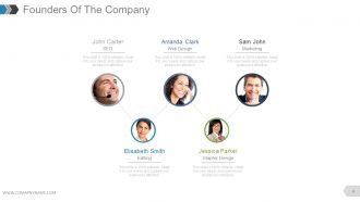
Diapositiva 4 : Esta diapositiva muestra a los fundadores de la empresa para indicar los nombres, la designación y la imagen respectiva para acompañar.
Diapositiva 5 : Esta diapositiva presenta el mensaje de nuestro CEO. Indique aquí cualquier mensaje de este tipo, etc.
Diapositiva 6 : Esta diapositiva también presenta el mensaje de nuestro CEO. Indique aquí cualquier mensaje de este tipo, etc.
Diapositiva 7 : Esta es la diapositiva de Nuestra visión. Indique la Visión de la empresa aquí.
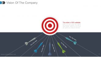
Diapositiva 8 : Esta es también la diapositiva Nuestra visión con imágenes de destino. Indique la Visión de la empresa aquí.
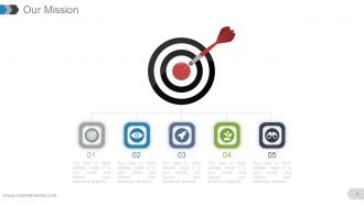
Diapositiva 9 : Esta es la diapositiva de Nuestra misión. Indique aquí la misión de la empresa.
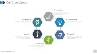
Diapositiva 10 : Esta diapositiva muestra nuestros valores fundamentales. Algunos ejemplos dados son: Progresivo, Colaborativo, Respeto, Apasionado, Integridad, Excelencia.
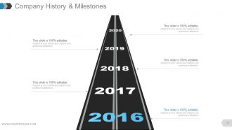
Diapositiva 11 : Esta diapositiva presenta la historia y los hitos de la empresa en la imagen de la hoja de ruta.
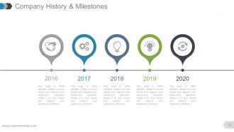
Diapositiva 12 : Esta diapositiva presenta la historia y los hitos de la empresa que se presentarán con iconos y cuadros de texto.
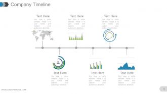
Diapositiva 13 : Esta diapositiva presenta el cronograma de la empresa que se presentará con iconos, gráficos y cuadros de texto, etc.
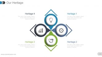
Diapositiva 14 : Esta diapositiva muestra Nuestro legado de la empresa que se mostrará.
Diapositiva 15 : Esta diapositiva muestra Nuestro legado de la empresa que se mostrará.
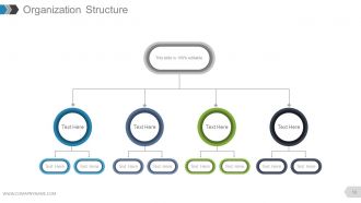
Diapositiva 16 : Esta diapositiva muestra la estructura organizativa de la empresa que se presentará.
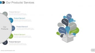
Diapositiva 17 : Esta diapositiva presenta Nuestros Productos / Servicios para establecer especificaciones de Producto / Servicio.
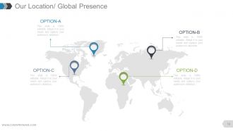
Diapositiva 18 : Esta diapositiva muestra Nuestra ubicación / Presencia global en la imagen del mapa mundial.
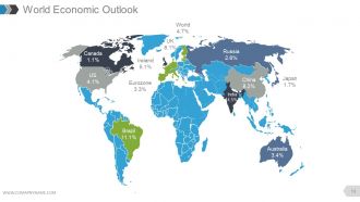
Diapositiva 19 : Esta diapositiva muestra Perspectivas de la economía mundial con una imagen de mapa mundial.
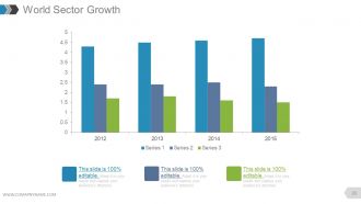
Diapositiva 20 : Esta diapositiva presenta el crecimiento del sector mundial en forma de gráfico de barras.
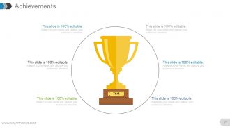
Diapositiva 21 : esta diapositiva muestra Logros con imágenes y cuadros de texto para acompañar.
Diapositiva 22 : Esta diapositiva muestra Logros con diferentes imágenes y cuadros de texto para acompañar.
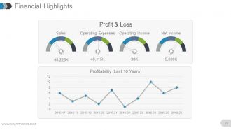
Diapositiva 23 : Esta diapositiva muestra los aspectos financieros destacados en forma de gráfico lineal y escala métrica para pérdidas y ganancias, ventas, gastos operativos, ingresos operativos, ingresos netos y rentabilidad.
Diapositiva 24 : Esta diapositiva muestra los aspectos financieros destacados. Indique aquí los aspectos financieros.
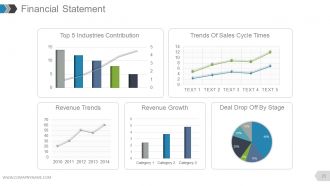
Diapositiva 25 : Esta diapositiva muestra un estado financiero con los siguientes subtítulos: Tendencias de ingresos, Crecimiento de ingresos, Reducción de acuerdos por etapa, Tendencias de los tiempos del ciclo de ventas, Contribución de las 5 industrias principales.
Diapositiva 26 : Esta diapositiva muestra los aspectos destacados de las ventas en diferentes gráficos con los siguientes puntos: Ventas totales de oportunidades por probabilidad, Ventas totales por mes, Ganado: Reparto de ingresos de fuentes de clientes potenciales perdidos.
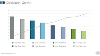
Diapositiva 27 : Esta diapositiva muestra el crecimiento de la distribución en forma de gráfico.
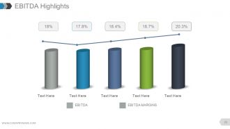
Diapositiva 28 : Esta diapositiva muestra los aspectos más destacados del EBITDA en forma de gráfico.
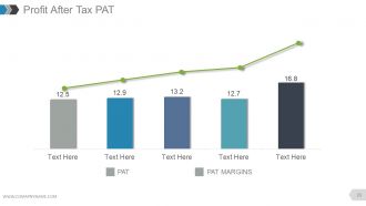
Diapositiva 29 : Esta diapositiva presenta la PAT de ganancias después de impuestos en forma de gráfico.
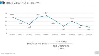
Diapositiva 30 : Esta diapositiva muestra el PAT de valor contable por acción en forma de gráfico lineal en términos de - Ganancia perdida
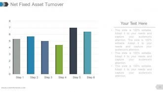
Diapositiva 31 : Esta diapositiva muestra la rotación neta de activos fijos en forma de gráfico.
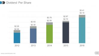
Diapositiva 32 : Esta diapositiva muestra el dividendo por acción en forma de gráfico de barras.
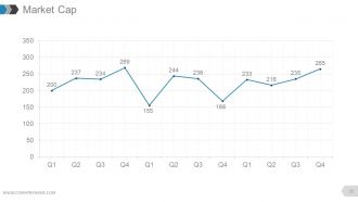
Diapositiva 33 : Esta diapositiva muestra la capitalización de mercado en forma de gráfico de líneas.
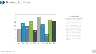
Diapositiva 34 : Esta diapositiva muestra las ganancias por acción en forma de gráfico.
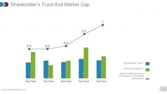
Diapositiva 35 : Esta diapositiva presenta el fondo de los accionistas y la capitalización bursátil en forma de gráfico de líneas y gráfico de barras que muestra el siguiente contenido: capitalización bursátil como porcentaje de la capitalización bursátil de CSE, capitalización bursátil, fondos de los accionistas.
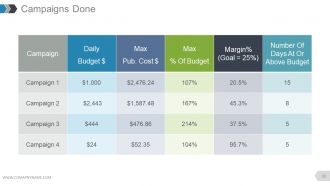
Diapositiva 36 : Esta diapositiva muestra una tabla de Campañas terminadas.
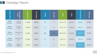
Diapositiva 37 : Esta diapositiva muestra el Informe de campaña en forma tabular.
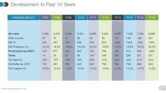
Diapositiva 38 : Esta diapositiva muestra el desarrollo en los últimos 10 años en forma de tabla.
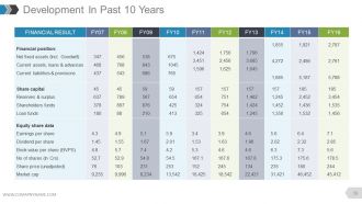
Diapositiva 39 : Esta diapositiva también muestra el desarrollo en los últimos 10 años en forma de tabla.
Diapositiva 40 : Esta diapositiva muestra la tasa de inflación en forma de gráfico.
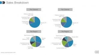
Diapositiva 41 : Esta diapositiva presenta el desglose de ventas dividido en Por canal y Por región.
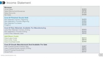
Diapositiva 42 : Esta diapositiva presenta la tabla Estado de ingresos.
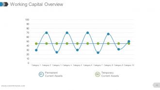
Diapositiva 43 : Esta diapositiva muestra la descripción general del capital de trabajo en forma de gráfico de dispersión con: Activos corrientes temporales Activos corrientes permanentes como puntos de marcado.
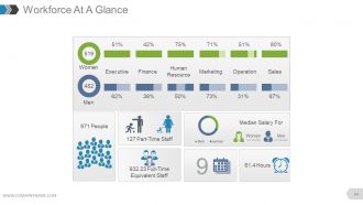
Diapositiva 44 : Esta diapositiva presenta Resumen de la fuerza laboral que contiene los siguientes puntos: Ejecutivo, Finanzas, Recursos humanos, Marketing, Ventas, Operación, Mujeres, Personal a tiempo parcial, Personal equivalente a tiempo completo, Personas, Horas, Salario medio para, Mujeres , Hombres.
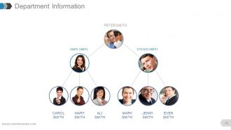
Diapositiva 45 : Esta diapositiva presenta la información del departamento como una imagen de jerarquía con nombres.
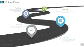
Diapositiva 46 : Esta diapositiva presenta los planes futuros que se mostrarán en una hoja de ruta.
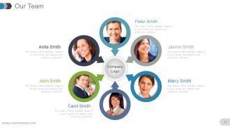
Diapositiva 47 : Esta diapositiva muestra las especificaciones de Nuestro equipo con cuadros de nombre, designación e imagen.
Diapositiva 48 : Esta diapositiva presenta un perfil de miembro con nombre, habilidades, etc.
Diapositiva 49 : esta diapositiva se titula Diapositivas adicionales para continuar.
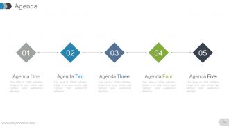
Diapositiva 50 : Esta es una diapositiva de Agenda. Exprese sus agendas aquí.
Diapositiva 51 : Esta es una diapositiva de Nuestro objetivo. Indique los objetivos, etc. aquí.
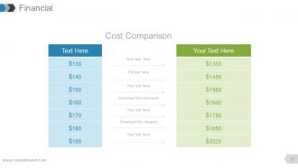
Diapositiva 52 : Esta es una diapositiva de la tabla de puntuación financiera. Indique aquí los aspectos financieros.
Diapositiva 53 : Esta es una diapositiva de Cotizaciones para transmitir mensajes de la empresa, creencias, etc.
Diapositiva 54 : Esta es una diapositiva del Panel para mostrar kpis, métricas, etc.
Diapositiva 55 : Esta es una diapositiva de ubicación de la imagen del mapa mundial para mostrar la presencia global, el crecimiento, etc.
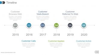
Diapositiva 56 : Esta es una diapositiva de la línea de tiempo con el siguiente contenido: el cliente navega por la web, la rama de visitas del cliente, el cliente remitido a la web, las llamadas del cliente, el cliente solicita, la acción del cliente
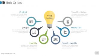
Diapositiva 57 : Esta es una diapositiva de bombilla o idea con el siguiente contenido: usabilidad de búsqueda, usabilidad, formularios e IA, diseño, orientación a tareas, contenido, usabilidad web.
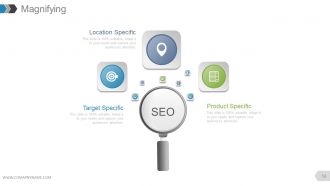
Diapositiva 58 : Esta es una diapositiva de imagen de lupa con SEO segregado en: Específico de ubicación, Específico de destino, Específico de producto.
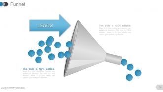
Diapositiva 59 : Esta diapositiva muestra el embudo que muestra LEADS.
Diapositiva 60 : Esta es una diapositiva de agradecimiento como agradecimiento.
Presentación de PowerPoint del informe anual con diapositivas con las 60 diapositivas:
Muestre comprensión de todos los aspectos con nuestro Informe anual completo Presentación en PowerPoint con diapositivas. Ayudan a exhibir una gran destreza.










FAQs for Annual report complete powerpoint
Okay so for your annual report deck - start with exec summary showing your biggest wins right up front. Then hit financial highlights like revenue and profit. Major accomplishments come next, plus where you stand in the market now. Charts and graphs over walls of text, trust me on this one. Most decks totally bomb because they throw every random metric at people instead of focusing on what actually matters to stakeholders. Oh and don't forget the forward strategy piece. The whole thing needs to flow together as one story - not just "here's what happened" but why it sets you up for what's coming next.
Dude, charts and graphs beat bullet points every time for showing trends. But here's the thing - infographics can actually connect your metrics to show cause and effect, which is pretty cool. I'm obsessed with timeline visuals (maybe too much?) because they help people follow your company's whole year. Real photos of employees or customers make those numbers feel human instead of just... numbers. Don't just slap visuals everywhere though. Try storyboarding first so you know where they'll actually make a difference. You want them supporting your story, not just looking pretty.
Pick your colors and fonts first - stick to 2-3 colors max and one main font. Seriously, I've watched so many presentations crash because someone went crazy with like 8 different colors. Just don't. Keep everything consistent - same spacing, logo in the same spot every time, matching chart styles. Oh, and make a master template before you start building slides. Trust me on this one, it'll save you hours of tweaking later. Use the same icon style throughout too. Simple stuff but it makes a huge difference in how professional it looks.
Make your charts tell a story instead of just throwing numbers at people. Line graphs work great for showing growth over time, bar charts are perfect for comparisons. Pie charts? Honestly skip them most of the time - they're so overdone. Keep colors simple and consistent with your brand. Here's the thing though - your chart titles should literally state the main point. Don't make people guess what they're looking at! Each visual needs to back up something specific you're saying. Oh, and definitely test your charts on someone fresh. They'll spot confusing stuff you totally missed.
Honestly, less is way more with these presentations. Your slides shouldn't look like a Wikipedia page - people's eyes just glaze over. Tell a story that connects everything instead of jumping around randomly. Nobody wants to watch you read bullet points out loud either (seriously, we can all read). Pick maybe 3-5 big wins and problems to focus on rather than trying to cover every tiny detail from accounting to HR. I always think the best presentations feel more like a conversation anyway. Make sure each section ends with actual next steps so people know what you're planning to do, not just what already happened.
Honestly, just make different versions of the same deck for each group. Investors want to see all the money stuff - growth numbers, ROI projections, that kind of thing. Board members care about governance and risk management. Employees? They want culture updates and what's coming next (they zone out during financial slides anyway lol). For customers, lead with innovation and how you're making their lives better. Same basic content, just shuffle the order and change what you emphasize. Start with a master version, then customize from there. Way easier than starting from scratch each time.
Definitely don't skip branding in your annual report - it's the difference between looking professional vs like you cobbled slides together last-minute. Stick to your company colors, fonts, and logo on every slide. I've seen so many decks that look like someone went crazy with random templates (yikes). Your brand guidelines should control everything - layouts, icons, even how charts look. Oh and create a master template first with all your brand stuff, then build from there. That visual consistency is what makes the whole thing feel polished instead of messy.
Dude, less text = better slides. Trust me on this one. I made the mistake of cramming way too much info on slides during a board meeting last year and watched everyone's eyes glaze over. Super awkward. One main point per slide, that's it. Charts and visuals work way better than bullet points anyway - people actually pay attention to those. If you absolutely need text, make it huge. Like, can-the-person-in-the-back-row-read-this huge. All your detailed stuff should go in your speaker notes, not on the actual slides. Your audience will thank you for it.
Honestly, start with Canva's annual report templates - they're surprisingly good and will save you hours. PowerPoint has some decent ones too if you poke around the "New" section. Beautiful.ai and Slidebean are worth the money though, especially since they auto-adjust layouts when you dump in all that financial stuff. Visme's cool for infographics if you need those. Oh, and whatever you do, don't switch templates halfway through like I did last year. Looked like a mess and I had to redo everything. Just pick one style and commit to it from the start.
Charts beat tables every time - way easier to read. I go with bar charts for comparing stuff, line graphs when I'm showing trends. Honestly, my first presentation was a disaster because I threw too much data at everyone. Now I always add percentage changes next to the raw numbers so people get it immediately. Don't pack everything onto one slide either. Same colors throughout helps too. The big thing though? Write quick bullet points explaining what your charts actually mean for business. Nobody wants to play detective with your numbers.
Dude, interactive stuff will totally save your annual report from being a snoozefest. Hyperlinked menus let people jump around to what they actually care about. Throw in some polls with Mentimeter or animated charts that build as you talk - way better than static slides. Video testimonials work great too, and I've seen people do this cool "choose your own adventure" thing where stakeholders can dig deeper into specific topics. Honestly, even just clickable navigation makes people pay attention. Don't go crazy though - start with maybe two interactive elements and see how it goes.
Start with your best numbers upfront - revenue growth, profit margins, cash flow. That's what they're looking for immediately. Market share and customer acquisition metrics are gold if they're solid. The debt-to-equity thing is super dry but you can't skip it unfortunately. For annual decks, year-over-year beats quarterly comparisons every time. Don't forget operational wins like cost cuts or efficiency gains - those actually matter more than people think. One metric per slide with clean visuals. Investors get cranky with messy charts. Hook them early with your strongest stuff.
Grab feedback right after each presentation - formal stuff AND those random hallway chats (honestly those are gold). Toss everything into a basic spreadsheet and watch for patterns. Like if everyone keeps saying "way too much text" or "where are the visuals?" - write that down. When you're prepping the next deck, actually look at your notes. Executive summary too wordy last time? Chop it. People wanted more industry data? Add it upfront this time. I swear, keeping a simple "worked/didn't work" list saves so much time. No point starting from scratch every year when you already know what lands.
Think of your deck like telling a story - start with whatever mess your company was dealing with this year, then show how you tackled it and what actually happened. Honestly, I picture it like making a mini-documentary or something. Each slide should build toward your main points, and don't just dump a bunch of data everywhere. Use charts and visuals that actually support what you're saying. Keep your language consistent so everything flows together. Oh, and end each section with a clear "so what does this mean" moment that sets up the next part of your story.
Loop in your legal team early - seriously, they'll save your ass later. Double-check that all your financial numbers match exactly what's in the annual report. No forward-looking stuff without disclaimers, I've watched people get completely wrecked by the SEC over this. Yeah, disclosures make slides ugly but include them anyway. Have legal review the ENTIRE deck, not just slides you think matter. Oh, and make yourself a checklist of industry requirements - trust me, you'll forget something obvious when you're scrambling at 2am before the presentation.
-
Great product with highly impressive and engaging designs.
-
Presentation Design is very nice, good work with the content as well.
-
Excellent Designs.
-
Qualitative and comprehensive slides.
-
The Designed Graphic are very professional and classic.
-
Best Representation of topics, really appreciable.
-
Awesome presentation, really professional and easy to edit.
-
Perfect template with attractive color combination.
-
Visually stunning presentation, love the content.
-
Excellent Designs.