


Artificial intelligence data visualization ppt powerpoint presentation summary images cpb





Try Before you Buy Download Free Sample Product
 Impress Your
 Audience
 100%
100% Editable
 Save Hours
 of Time


Everyone's feelings are considered by our Artificial Intelligence Data Visualization Ppt Powerpoint Presentation Summary Images Cpb. It enables balanced decisions.
People who downloaded this PowerPoint presentation also viewed the following :
Content of this Powerpoint Presentation
Description:
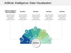
This image is a PowerPoint slide template titled "Artificial Intelligence Data Visualization." It features a segmented circular diagram in the center, which is often used to represent a process cycle or to break down components of a strategy or analysis.
Each segment of the circular diagram is numbered from 01 to 05, with a corresponding icon within each segment to visually represent different aspects or stages of a concept related to artificial intelligence. The segments appear to be color-coded, which typically helps to distinguish between the various parts of the process or categories being presented.
Above and below the diagram, text placeholders are saying "Text Here," indicating where a presenter would add their specific content related to the diagram. These placeholders suggest that the slide is designed to be fully customizable to the user's needs. The slide also emphasizes that it is "100% editable" to adapt to specific needs and to capture the audience's attention.
On the left side, there is an additional text box with the title "Artificial Intelligence Data Visualization," which matches the main title at the top. This could be used to provide a detailed description or introduction to the topic being discussed within the context of the diagram.
The slide is structured to be straightforward and visually engaging, making it useful for presenters who need to convey complex AI data visualization concepts in an accessible manner to an audience, perhaps during a business meeting, an academic lecture, or a tech conference.
Use Cases:
This AI data visualization slide is perfect for sectors aiming to simplify complex data, showcasing AI's role in optimizing and understanding diverse datasets.
1. Healthcare:
Use: Demonstrating AI's impact on patient data analysis and treatment plans.
Presenter: Medical Researcher
Audience: Healthcare Providers, Medical Students
2. Automotive:
Use: Outlining the role of AI in vehicle telematics and autonomous driving technology.
Presenter: Automotive Engineer
Audience: Product Developers, Automotive Executives
3. Finance:
Use: Explaining AI algorithms in risk assessment and fraud detection.
Presenter: Data Scientist
Audience: Bank Managers, Investment Analysts
4. Retail:
Use: Presenting AI trends in customer behavior and inventory management.
Presenter: Market Analyst
Audience: Retail Managers, Supply Chain Specialists
5. Energy:
Use: Illustrating AI's application in predictive maintenance and energy consumption forecasting.
Presenter: Operations Manager
Audience: Utility Managers, Environmental Engineers
6. Agriculture:
Use: Showing AI's benefits in crop yield prediction and precision farming.
Presenter: Agro-technologist
Audience: Farmers, Agricultural Business Owners
7. Technology:
Use: Mapping the evolution of AI in software development and application integration.
Presenter: Tech Company CEO
Audience: Software Developers, IT Professionals
Artificial intelligence data visualization ppt powerpoint presentation summary images cpb with all 2 slides:
Highlight critical features with our Artificial Intelligence Data Visualization Ppt Powerpoint Presentation Summary Images Cpb. Concentrate the focus on important aspects.
FAQs for Artificial intelligence data visualization ppt powerpoint presentation
Interactive dashboards, heatmaps, network diagrams, predictive trend charts, and real-time analytics displays effectively present AI-generated insights to stakeholders. These visualization techniques streamline complex pattern recognition, automate anomaly detection, and enhance decision-making processes, with many financial services and healthcare organizations finding that dynamic visual representations ultimately deliver faster strategic responses and competitive advantage.
Data visualization enhances AI model interpretability by transforming complex algorithms into understandable charts, heat maps, decision trees, and interactive dashboards that reveal how models make predictions. These visual tools enable data scientists and stakeholders to identify patterns, detect biases, and validate model behavior across different scenarios, ultimately delivering greater transparency and trust in AI-driven decision making.
Interactivity transforms AI data visualization by enabling real-time exploration, dynamic filtering, drill-down capabilities, and personalized dashboard customization, allowing users to manipulate complex datasets intuitively. These interactive features significantly enhance engagement by empowering stakeholders to uncover insights independently, with financial services and healthcare organizations finding that interactive AI dashboards increase user adoption rates and accelerate data-driven decision-making processes.
Common AI data visualization pitfalls include oversimplified model representations, misleading correlation displays, inadequate uncertainty communication, biased dataset visualizations, and overwhelming complexity that obscures insights. These challenges can be avoided by implementing clear statistical context, transparent uncertainty indicators, and balanced visual storytelling that emphasizes both model limitations and capabilities, ultimately delivering more accurate decision-making tools for stakeholders.
Visualizations aid in identifying AI dataset biases by revealing patterns in data distribution, demographic representation, feature correlations, and outcome disparities across different groups. Through heat maps, scatter plots, and demographic breakdowns, data scientists can detect underrepresented populations, skewed sampling, and algorithmic discrimination, ultimately enabling more equitable model development and fairer decision-making processes.
Best practices for AI performance dashboard design include clear metric hierarchies, real-time data feeds, intuitive visual encodings, contextual benchmarking, and interactive drill-down capabilities. These approaches streamline monitoring by presenting complex algorithms through simplified charts, enabling comparative analysis across models, and delivering actionable insights, with many data science teams finding that well-designed dashboards significantly accelerate model optimization and decision-making processes.
Storytelling transforms AI data visualizations by creating narrative frameworks that guide viewers through complex insights, using sequential charts, contextual annotations, and progressive disclosure techniques. Through narrative-driven dashboards, organizations in healthcare, finance, and retail can communicate AI findings more effectively, helping stakeholders understand patterns and predictions while ultimately driving data-informed decision-making and strategic action.
Recommended AI data visualization tools include Tableau, Power BI, Python libraries like Matplotlib and Seaborn, R's ggplot2, and specialized platforms like TensorBoard for neural networks. These tools streamline complex AI datasets by offering interactive dashboards, real-time analytics, and customizable visual formats, with many organizations finding that strategic visualization enhances decision-making and accelerates AI model optimization.
Neural network architectures can be visualized through interactive flowcharts, layer-by-layer activation maps, weight matrices, and real-time training dashboards that display loss functions and accuracy metrics. These visualization approaches streamline model interpretation by revealing decision pathways, identifying bottlenecks, and enabling data scientists to optimize performance, ultimately delivering faster deployment cycles and enhanced predictive accuracy across industries.
Geographic data visualization can illustrate AI's impact through heat maps showing adoption rates, choropleth maps displaying economic benefits, network diagrams revealing AI infrastructure distribution, and comparative regional dashboards tracking implementation progress. These visualizations enable organizations to identify opportunity gaps, benchmark performance across markets, and strategically allocate AI resources, with many enterprises finding that regional impact mapping ultimately delivers targeted investment decisions and competitive geographic advantages.
AI automates data visualization through intelligent chart selection, automated insight generation, natural language processing for query interpretation, and dynamic dashboard creation based on data patterns. These technologies streamline visualization workflows by eliminating manual chart building, automatically highlighting key trends, and enabling conversational data exploration, ultimately delivering faster analytical insights and enhanced decision-making capabilities for organizations.
Line charts, area charts, heatmaps, scatter plots, and candlestick charts are most suited for AI time-series analysis, each revealing different temporal patterns and trends. These visualizations enable financial institutions to track market fluctuations, healthcare systems to monitor patient vitals, and manufacturing plants to analyze equipment performance, ultimately delivering faster insights and more accurate predictive modeling capabilities.
Color and design choices significantly influence how audiences interpret AI data visualizations by affecting attention, comprehension, and emotional response to complex datasets. Strategic color palettes enhance pattern recognition, guide focus to critical insights, and reduce cognitive load, while thoughtful design elements like contrast and spacing help viewers process machine learning outputs more effectively, ultimately delivering clearer communication and faster decision-making across organizations.
Ethical considerations include ensuring data privacy and consent, avoiding algorithmic bias representation, maintaining transparency in model interpretations, protecting sensitive personal information, and preventing misleading visualizations that could perpetuate discrimination. These practices enhance trust and accountability by promoting fair representation, enabling informed decision-making, and ensuring responsible AI deployment, with many organizations finding that ethical visualization frameworks ultimately deliver better stakeholder confidence and regulatory compliance.
Visualizations enhance decision-making in AI-driven industries by translating complex algorithms into interpretable charts, dashboards, and interactive displays that reveal patterns, trends, and anomalies. Through real-time data visualization, organizations in healthcare, finance, and manufacturing can quickly identify AI model performance, detect bias in predictions, and communicate insights to stakeholders, ultimately enabling faster strategic decisions and improved operational efficiency.
No Reviews