


Bar graph powerpoint ideas





Try Before you Buy Download Free Sample Product
 Impress Your
 Audience
 100%
100% Editable
 Save Hours
 of Time


Employ this Bar Graph PowerPoint Ideas template for the presentation of your organizational data. Take advantage of this bar chart PowerPoint template and represent numerical data in the simplest manner possible. Utilize this bar PPT visual to show the types of bar graphs including vertical graph, horizontal bar graph, double bar graph, and dot graph. Take the assistance of this business chart PowerPoint infographic to showcase the comparison of data such as population growth, market share, business performance, etc. This dot PPT slide will enable you to represent information pictorially such as rates of enrolment including others. This background PPT image is completely adaptable, so you can add additional data or replace the preloaded data with your own relevant information. This PPT graphic is suitable for entrepreneurs, educational institutions, government bodies, economists, etc. Hence, download this bar graph PowerPoint layout to effectively depict your data in an interesting way and captivate your audience with impressive graphics.
People who downloaded this PowerPoint presentation also viewed the following :
Content of this Powerpoint Presentation
Description:
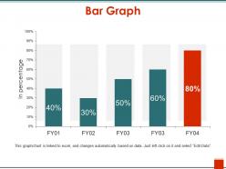
The image depicts a PowerPoint slide with a bar graph titled "Bar Graph." It shows data for four fiscal years (FY01 to FY04), with each bar representing a percentage value. The values rise incrementally from 40% in FY01 to a peak of 80% in FY04. The graph is interactive and linked to an Excel spreadsheet, as indicated by the note at the bottom, which states that the chart updates automatically based on data. Users can edit the data by clicking on the chart and selecting "Edit Data."
Text Elements:
"Bar Graph" is the slide title, indicating the nature of the content.
Percentages are labeled on each bar, demonstrating the data points for each fiscal year.
The note at the bottom provides instructions on how to interact with the graph for editing purposes.
Use Cases:
This type of slide can be used in various industries:
1. Finance:
Use: Displaying annual financial growth or performance.
Presenter: Financial Analyst
Audience: Investors, company stakeholders
2. Sales:
Use: Illustrating sales trends over multiple years.
Presenter: Sales Manager
Audience: Sales team, marketing department
3. Education:
Use: Teaching students about data representation and analysis.
Presenter: Educator
Audience: Students, academic researchers
4. Healthcare:
Use: Showing patient improvement rates over time.
Presenter: Healthcare Administrator
Audience: Medical staff, management
5. Marketing:
Use: Visualizing campaign effectiveness across different years.
Presenter: Marketing Director
Audience: Marketing team, executives
6. Manufacturing:
Use: Reporting on production efficiency or defect rates.
Presenter: Operations Manager
Audience: Production team, quality assurance staff
7. Retail:
Use: Tracking yearly customer satisfaction or retention rates.
Presenter: Customer Service Manager
Audience: Retail management, customer service representatives
Bar graph powerpoint ideas with all 5 slides:
Put the dark days behind you with our Bar Graph Powerpoint Ideas. Experience the exhilaration of a bright future.
FAQs for Bar
Okay so first thing - make sure people can actually tell what you're measuring! I've seen way too many graphs where the labels are just gibberish. Start your y-axis at zero or you'll accidentally make things look way more dramatic than they are. Stick to one color scheme and don't go crazy with more than 7-8 bars or it gets messy. If the exact numbers matter, slap some data labels on there. Oh and rotate your x-axis text if it's getting cramped - nobody wants to tilt their head to read "Q3 Regional Sales Performance" or whatever. Add a source note at the bottom so you look legit.
Contrasting colors work great for highlighting key stuff - throw a bright red bar in with your blues to make outliers pop. For related data, stick with colors that sit next to each other on the color wheel since they show connection. Honestly, I used to go crazy with random colors and it looked terrible. Simple is definitely better. Oh, and avoid red/green combos - colorblind people can't tell them apart. PowerPoint's built-in themes are actually pretty solid since someone already figured out what works together. You'll save yourself a lot of trial and error.
Make your axis labels super clear - no weird abbreviations that'll confuse people. Don't forget units like "$" or "%" and bump up that text size so folks in the back can actually read it. Honestly, I'd skip legends if you can and just label each bar directly. Way less annoying than making people look back and forth constantly. Round those numbers too - "2.1M" beats "2,087,459" every time. Oh, and stick with consistent colors that actually mean something. Makes a huge difference in how professional it looks.
Select your chart first, then hit the Animations tab. "Wipe" or "Fade" work great - they look professional without being distracting. Here's the trick: go to Effect Options and animate by series instead of the whole chart. Each bar pops up individually while you talk through your data. "Grow & Turn" is honestly my favorite if you want something a bit more fun. Set everything to "On Click" so you control the timing. That way you can pause between points and not rush through everything. Oh, and stick to one animation per data series - keeps people focused.
Honestly, bar graphs are perfect when you're comparing different categories - like sales by region or survey results by department. They make it super easy to spot which one's winning at a glance. Line charts work better for continuous stuff (stock prices, etc.), and pie charts... ugh, don't get me started on those. They're usually just confusing. The thing about bar graphs is they're so straightforward - your audience immediately sees what's highest, what's tanking, whatever. Quick test: if you're comparing distinct things that don't really flow into each other, bars are your friend.
Just right-click on any part of your chart and hit format options. Colors are super easy to change - go to "Fill" settings and pick whatever matches your brand. For fonts, click the text and swap in your company typeface. Honestly, the design tab has some okay presets if you're being lazy about it. Don't forget the background and gridlines though - sounds boring but it actually makes things look way more professional. Oh, and save it as a template once you're done! You'll thank me later when you don't have to redo everything.
Okay so first thing - use contrasting colors for your different data series. Nobody wants to guess which bar is which. Throw data labels right on the bars too, saves people from having to decode your axis. Oh and those gridlines? Either ditch them completely or make them super light gray, they're just visual clutter most of the time. Your chart title and axis labels matter more than you think - I know they seem obvious to you but your audience needs that context. There's this "Format Data Series" thing where you can mess with bar width and spacing. Trust me, small tweaks make a huge difference.
Grouped bars are your go-to when you want to compare individual values side by side. Stacked ones show part-to-whole relationships better. Don't go crazy with categories though - 3-4 max or it'll look like a rainbow exploded. Same colors for each data series across groups, obviously. Stacked bars are trickier since people can't read exact values as easily, so arrange segments in a way that makes sense and throw in some data labels. Oh, and your legend better be clear or people will just stare at it confused. Clean axis labels and a decent title that actually explains what's happening - you'll thank yourself later.
Honestly, the worst thing you can do is cram too much data onto one chart - it just looks messy. Skip the 3D effects too, they're so 2005 and actually make everything harder to read. Always label your axes clearly, and here's the big one: start your y-axis at zero unless you've got a solid reason not to. Otherwise you're basically manipulating people with your data. Keep bar widths the same throughout, and pick colors that contrast well (think about colorblind folks too). Less is more here - clean beats fancy every time.
Try animating your bars to grow one by one when you click - makes presentations way more engaging. Morph transitions are incredible for this btw. You can also add buttons that show/hide different data sets, or use hyperlinks to jump between charts. The zoom feature's great for diving into specific bars too. I always set up custom animations so bars appear while I'm explaining each point. Oh, and start simple with click-to-reveal stuff first. Once you get comfortable, then mess around with the fancier interactive elements.
Bar graphs work really well with pie charts - you get the individual numbers plus how everything fits together. Line graphs are clutch for showing trends over time. Scatter plots are honestly my favorite for relationships between variables, but people barely use them (which is weird because they're super effective). If you need exact numbers, just throw in a table. Oh, and infographics can make boring data way more interesting. The key is don't go overboard - pick whatever actually helps tell your story instead of just adding more stuff to look at.
Dude, you've gotta think about who's actually looking at your graphs. Colors are tricky - red screams "bad news" here but it's lucky in China, so that could totally backfire. Reading direction matters too since some cultures scan right-to-left instead of our left-to-right thing. What counts as "good" performance is super different everywhere. Like, a dip in numbers might be fine in one place but absolutely crushing somewhere else. Honestly, I'd run it by someone from that culture first - way better than finding out you messed up during the actual presentation.
Honestly, the best bar graphs tell a story! Start with the problem, then reveal your data like it's some big plot twist. Don't show everything at once - build it up bar by bar. I'm obsessed with that dramatic pause before dropping the most shocking number lol. Throw in some annotations so people know what they're looking at. Here's the thing though - your graph needs to answer a question your audience actually gives a shit about. Otherwise you're just showing pretty rectangles. Frame it around real tension, then let the bars deliver that "aha!" moment.
Animated bar graphs are your best bet - make each bar pop up one by one to show how things changed over months or years. Color gradients work great too, with darker colors for recent stuff so the timeline's super obvious. Animation totally beats boring static charts every time, trust me. For multiple datasets, try grouped bars that all grow at once, or just do separate slides for each time period (keep the scales the same though). Oh and definitely label your time periods clearly. Maybe throw in some arrows to show which direction things are heading.
Oh man, Census.gov and Bureau of Labor Stats are your friends here - super reliable government data. Pew Research is great too. Statista's amazing but you'll need to pay for the premium stuff (totally worth it though if you're doing this regularly). Your company or library might have access to academic databases with peer-reviewed datasets. Google's public data explorer works surprisingly well for quick searches too - I always forget about that one. Don't skip citing your sources on the slides, saves you from getting grilled later!
-
Excellent work done on template design and graphics.
-
Innovative and attractive designs.