


Bar Graphs And Pie Charts Sale Business Powerpoint Templates Themes
You must be logged in to download this presentation.




Try Before you Buy Download Free Sample Product
 Impress Your
 Audience
 100%
100% Editable
 Save Hours
 of Time


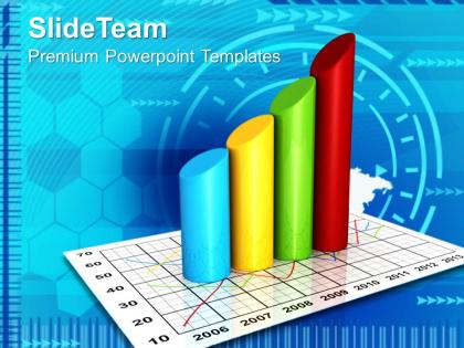
We are presenting this bar graphs and pie charts sale business PowerPoint templates themes PPT icon to help you get a better design. There may occur a lot of changes over the time, however every change need to be presented while trying to compare the parts of a whole. Bar graphs are used to make comparison between different groups and track the changes over time. When it comes to make comparisons between different values and categorize the data it become easy to communicate the results of data analysis. It actually helps your audience to understand the ideas representing the values. You may see flexible chart types and the different variation of the standard bar chart that may include the grouped component charts and the stacked bar charts. However entire data can be portrayed in a presentation with a very clear goal which is required for an organization to make it achieve its level.After years of experience we've realised that you don't need to read slides to your audience. That's why our Bar Graphs And Pie Charts Sale Business Powerpoint Templates Themes are the right blend of words and visuals.
People who downloaded this PowerPoint presentation also viewed the following :
Bar Graphs And Pie Charts Sale Business Powerpoint Templates Themes with all 3 slides:
Access to cutting edge design 24/7. Our Bar Graphs And Pie Charts Sale Business Powerpoint Templates Themes are always here to make your presentations shine.



FAQs for Bar Graphs And Pie Charts Sale Business
So bar graphs are perfect when you're comparing different things - like sales between regions or whatever. Pie charts? Those show how pieces fit into the whole picture, like budget breakdowns by department. Personally, I think pie charts get super cluttered once you have more than like 5-6 slices. Bar graphs just handle multiple categories so much cleaner. Plus they make it way easier to spot trends. Really comes down to this: comparing separate stuff = bar graph. Showing parts of a total = pie chart. Hope that helps!
Honestly, go with bar graphs when you're comparing stuff or showing trends over time. Pie charts turn into a hot mess once you hit like 5-6 data points - those tiny slices are impossible to read. Plus our brains are way better at judging bar heights than trying to figure out slice angles (which is kinda weird when you think about it). Bar graphs work great when your numbers don't need to add up to 100% or when you want people to spot the actual differences between categories. Save pie charts for the classic "parts of a whole" situations, but otherwise bars are your friend.
Honestly, color choice can totally screw up your whole chart if you're not careful. People won't be able to tell your categories apart if you pick colors that are too similar. Red and green are the worst combo - like 8% of people can't even distinguish them properly. Go for high contrast instead, and maybe throw in some patterns too just in case. Oh, and watch out for accidentally using red for good stuff or green for bad stuff (I've seen that mistake way too many times). Test it on a couple friends first. Short, simple, distinct - that's what works.
Dude, first thing - don't cram a novel onto your axes labels. Keep them short and sweet. If your x-axis labels are getting all bunched up, just rotate them 45 degrees (way better than that overlapping nightmare). Your y-axis needs to show what you're actually measuring, and honestly? Big numbers look cleaner with abbreviations like "K" for thousands. Always throw a decent title on there so people aren't staring at it confused. Oh, and here's what I always do - show it to someone else first. If they're squinting or asking "what am I looking at," you know your labels suck and need fixing.
Pie charts work best when you're showing parts of a whole - like budget breakdowns or survey results where everything adds up to 100%. They get you that quick visual of "what slice is biggest?" Bar graphs are your go-to for comparing amounts or tracking changes over time. Honestly, I see people overthinking this a lot. Simple test: if you're wondering about proportions, go with pie. If you're comparing quantities or asking "which one's bigger?" bars will do the trick. Both have their place, just depends what story you're trying to tell with your data.
Honestly, it all comes down to who you're talking to. Executives and analysts? Go with bar graphs - they love comparing exact numbers and spotting patterns quickly. But if you're dealing with regular people or mixed crowds, pie charts usually win because anyone can see "this slice is way bigger than that one" without doing math in their head. Age is weirdly relevant too. Younger people can handle more complex charts since they grew up with data everywhere. Older audiences often prefer simple pie charts, which makes total sense. Just figure out your crowd and use whatever clicks fastest for them.
Don't go crazy with slices - 5-7 max or it gets messy. Start your biggest slice at 12 o'clock and sort everything largest to smallest. Those 3D pie charts? Absolutely not. They look "fancy" but just make your data impossible to read. Keep slice sizes different enough that people can actually tell them apart. Use distinct colors and clear labels, and double-check your percentages add up to 100%. Oh, and if you're comparing multiple datasets, just use bar charts instead - pie charts suck for comparisons. Trust me on this one.
Honestly, it comes down to what your data represents. Pie charts are perfect when everything adds up to something meaningful - like how you're splitting your budget or market share percentages. Bar graphs shine when you're just comparing different things that don't need to equal 100%, like quarterly sales or survey results. One thing that drives me crazy? Pie charts with way too many slices. Nobody can read those tiny wedges. If you've got more than 5-6 categories, just go with bars. Way easier to compare precise values that way too.
Yeah, totally works! Pie charts are perfect for showing how things break down - like what percentage of your budget goes where. Bar graphs are better for comparing actual numbers or tracking changes over time. I actually use this combo a lot at work. The trick is don't just show the same data twice in different ways - that's annoying. Start with the pie chart so people get the overall picture first. Then use bar graphs to dig into the details or make specific comparisons. Works way better than trying to cram everything into one chart type.
Honestly just use Excel or Google Sheets - they're way better than they used to be and you probably already have them. Tableau Public is free and makes really pretty charts, but it takes forever to learn. Canva works too if you want it to look more "designed." I always waste like an hour picking the perfect shade of blue when I should just use a template lol. Oh and definitely save your charts as images before presenting - trust me on this one, live charts will mess up your formatting every single time.
Make sure everything adds up to 100% first - that's like the golden rule. Each slice needs to match its actual percentage, so you'll have to convert those percentages to degrees (just multiply by 3.6). Honestly, most software handles this automatically which is a lifesaver because doing all that math by hand is tedious. Quick tip: eyeball your chart when you're done to see if the slices look right proportionally. Sometimes tiny rounding errors make things look weird. Oh, and definitely label each slice with the category name plus percentage so people can double-check your work.
Bar graphs are honestly perfect for tracking trends over time. Just looking at the heights tells you if things are going up, down, or flat. What's really nice is when you're comparing multiple categories at once - like sales across different product lines each month. Way better than staring at endless spreadsheet rows, trust me. You'll spot patterns immediately that would've been buried in all those numbers. The visual aspect makes it super obvious when something tanks or suddenly takes off. Just arrange everything chronologically and you're good to go.
Okay so annotations are like little helpers that point people toward what actually matters in your charts. Callout boxes, arrows, text labels - whatever works to highlight the big stuff or explain weird spikes. A pie chart without labels is basically useless, right? For bar graphs, they're great for showing why something happened or comparing against goals. Oh and don't go nuts with them - I see people cluttering everything up. Just pick your top 2-3 points that tell the real story. Less is definitely more here.
Honestly, just think about what story you're trying to tell. Stacked bars are great for showing totals AND how each piece contributes - like breaking down sales by product type. But grouped bars? Way better for comparing specific values when the overall total doesn't matter much. Here's the thing though - stacked charts get super messy once you hit 3-4 subcategories. Those middle segments are impossible to compare. I learned this the hard way lol. My go-to rule: if you're squinting at your own chart, just switch to grouped bars instead.
Think of your charts as backup dancers for your main story - they should jump in right when you need to prove a point. Bar graphs are clutch for showing "before vs after" stuff or comparisons that actually matter. Pie charts? They're honestly perfect for those "here's exactly why this happened" moments. I always get a little excited when I see a well-placed pie chart breakdown, not gonna lie. Don't scatter them randomly though. Put them where readers are thinking "okay but show me the proof" - that's your sweet spot for maximum impact.
-
Nice and innovative design.
-
The content is very helpful from business point of view.