


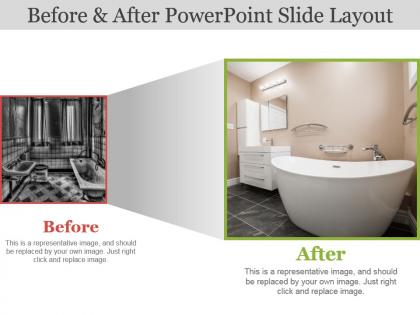
Before and after powerpoint slide layout




Try Before you Buy Download Free Sample Product
 Impress Your
 Audience
 100%
100% Editable
 Save Hours
 of Time


It’s often said images are even more powerful than words when used to describe things. Showcase this with the help of our before and after PowerPoint slide layout. Our creative and innovative designing team has made this presentation design possible for you. This comparison PPT diagram is perfect to demonstrate the key features of your company's products and services. To analyze the performance of any product, its key features must be checked and these can be displayed easily by including our before and after presentation slideshow. Certain factors need to be set based on which you can check the performance of your products and take effective actions such that they perform according to your expectations. So, with our before and after PPT visual, you can achieve what is required in an easy and time saving manner. Moreover, our slide design is fully modifiable. Our slide show comes with handy instructions that assist you to just download and insert the slide whenever required. Coming to your aid is the creed of our Before And After Powerpoint Slide Layout. They help out during any challenge.
People who downloaded this PowerPoint presentation also viewed the following :
Before and after powerpoint slide layout with all 6 slides:
Establish the correct course to be charted with our Before And After Powerpoint Slide Layout. It allows you to grab hold of the helm.
FAQs for Before and after
Visual hierarchy is everything - one main point per slide with big, readable fonts. I've sat through way too many presentations where I couldn't even see the text from the back row. White space is your friend. Stick to maybe 2-3 colors max, and honestly? Graphics should actually mean something, not just be there for decoration. Make sure there's good contrast between your text and background. Oh, and don't put your entire script on the slides - they should support what you're saying, not replace you. Start with your outline first, then build the visuals around it.
Dude, colors totally mess with people's heads in the best way. Red gets hearts pumping and creates urgency. Blue? Pure trust and calmness - that's why every bank uses it. I used to just throw random colors together until I learned this stuff actually works. Financial stuff needs blues and grays or you'll look sketchy. Marketing pitches though - go bold with oranges or purples. Green's great for anything growth-related. Honestly, once you start noticing it, you'll see these patterns everywhere. Just pick one main color that matches the vibe you're going for and stick with it.
Honestly, mix things up or you'll put everyone to sleep. Throw in some story slides between your data dumps, maybe toss in a quick poll. Don't make every slide look identical - I've done that and it's brutal. Change your layout every few slides, use animations but not like crazy. The rule of three works pretty well: after three heavy slides, do something interactive. Build in spots where you can actually check how people are doing. Oh and make it feel more like a conversation than you lecturing at them for an hour straight.
Stick with clean fonts like Arial or Helvetica - nothing fancy that'll make people squint. I learned this the hard way when half my audience couldn't read my "creative" font choice from the back row. Use 24pt minimum for regular text, 36pt+ for titles. Only pick two fonts max or it gets messy fast. Dark text on light backgrounds is your safest bet. Comic Sans is obviously still banned unless you're teaching kindergarten. Test everything by standing across the room first - what looks fine on your laptop screen might be terrible projected on a wall.
Visuals are seriously a game-changer for presentations. Your brain processes images way faster than text, so you're basically giving people two ways to absorb your message instead of one. Nobody wants to read walls of bullet points anymore - we've all been there! The trick is making sure your images actually support what you're saying. Random stock photos just become distracting clutter. When you nail it though, good visuals help complex stuff stick better and reduce mental overload. I learned this the hard way after bombing a presentation with too much text. Every image needs a reason to be there, or cut it.
Honestly, white space is a game changer for slides. Don't cram everything together - give your text room to breathe with decent margins and spacing between bullet points. I've sat through so many presentations that just assault your eyeballs with wall-to-wall text. Think of empty space as part of your design, not wasted area. It guides people's attention to the important stuff. Cut your content in half first (seriously, half!). Then add space around what's left. Your audience will actually be able to focus instead of feeling overwhelmed.
Ugh, don't cram a novel onto each slide - I see this constantly and it's painful. Big fonts only! One idea per slide max. Those spinning transitions look ridiculous, just skip them. Simple colors work better anyway. Here's the thing though - your slides aren't supposed to be your script. People hate when you just read everything word-for-word. Make sure there's contrast so people can actually see your text. Bullet points beat paragraphs every time. Oh, and you'll probably need fewer slides than you think. Trust me on that one.
Dude, cultural stuff totally changes how people see your visuals. Like red screams "danger!" to us but means good luck in China. White's pure and clean here, but in some Asian cultures it's about death and mourning - kinda heavy, right? Also think about reading flow. We scan left to right, but other cultures don't. Your slide layout needs to match how their eyes naturally move. Even personal space preferences show up in design somehow (weird but true). Bottom line: research your audience first. Swap out colors, flip your layout if needed, pick different images. Makes your presentation way more engaging when it actually clicks with them.
Honestly, less is more with slide transitions. Too many flashy effects just distract people from what you're actually saying. Those spinning cube things? Total cringe. But simple fade-ins for bullet points work great - they help guide where people look without being annoying. I'd stick with one transition style throughout so it feels cohesive. The gentle slide-to-slide transitions are pretty solid too. Just don't go overboard trying to make everything "pop." Your content should be the star, not some random animation. Oh, and definitely test it beforehand - nothing worse than your presentation lagging because of effects.
Honestly, charts and graphs just work better than walls of text. Your brain processes visuals way faster - like, we're talking milliseconds vs having to actually read through boring spreadsheet data. Nobody wants to sit through 47 bullet points of statistics anyway. A simple bar chart shows trends instantly while paragraphs of numbers make people's eyes glaze over. I learned this the hard way in college presentations, actually. Try swapping your next data-heavy slide for an infographic. People will actually pay attention instead of checking their phones.
Just go with 16:9, trust me. That's 1920x1080 if you want high res. Works perfectly for laptops, projectors, Zoom calls - basically everything. 4:3 is ancient at this point unless you're stuck in some terrible conference room from 2005 (been there, it sucks). Vertical 9:16 is technically a thing but honestly who does that for business stuff? Maybe if you're doing Instagram marketing content, consider square format. But seriously, design everything in 16:9 and you're good 95% of the time. Haven't run into issues with it yet.
Okay so virtual presentations are totally different - you gotta go way bigger with fonts, like 24pt minimum. People are staring at tiny laptop screens and squinting. High contrast colors too! Those pretty pastels? Forget it, they'll disappear on Zoom. Keep slides super simple because honestly, everyone's attention span is shot online (guilty as charged). In-person gives you more freedom - smaller fonts work fine since people can just lean in. Oh and here's the thing that saved me once: test your virtual slides on your actual laptop, not your big monitor. Trust me on this one.
Honestly, just pick one template and stick with it - trust me on this one. Your audience won't get distracted by random fonts or colors changing every slide. Everything flows better when you use the same layout throughout. Plus people can actually predict where info will be on each slide, which makes it way easier to follow along. I learned this the hard way after making presentations that looked like a mess lol. Consistency just makes you look like you actually planned things out. Your brand/message comes through cleaner too. Seriously saves you so much stress later when everything looks seamless together.
So basically, treat your slides like a story - hook them with a problem upfront, then build up the tension before hitting them with your solution. I always use the same visuals throughout to tie everything together (sounds obvious but you'd be surprised how many people don't). Make each slide move the story forward instead of just dumping random facts. Give your audience someone to root for - could be "typical customers like you" or whatever. Oh, and end sections on cliffhangers so they're actually curious about what's next. Most presentations are painfully boring, but this stuff really works.
Honestly, you gotta be brutal with cutting stuff out. Bullet points beat paragraphs every time. One idea per slide, max - I learned this the hard way after watching too many eyes glaze over during presentations lol. Visuals work way better than walls of text when you can swing it. Complex stuff? Split it across multiple slides instead of cramming everything together. People's brains need a second to actually process what you're saying before you hit them with the next thing. It feels weird using fewer slides at first, but your audience will thank you.
-
Awesomely designed templates, Easy to understand.
-
Nice and innovative design.