


Before and after slide interior architecture sample of ppt




Try Before you Buy Download Free Sample Product
 Impress Your
 Audience
 100%
100% Editable
 Save Hours
 of Time


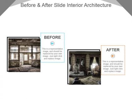
Interior architecture and design are an important technique that is given a high attention all over the world nowadays. Here is our before and after slide interior architecture sample of PPT design which is created by our team of dedicated designers to fulfil your business needs. Designers see things from different perspectives due to their studies and work atmosphere. They give special attention to details. By designing several places, designers gain very helpful information and feel creative in their thinking. By using our interior architecture comparison PPT template you can highlight all this and add the important features and description along with the images as the slide is completely amendable. So, make use of our expedient before and after interior design presentation layout and impress your viewers with the visually appealing design process. Be smart and start early with our PPT graphic. Deliver the goods with our Before And After Slide Interior Architecture Sample Of Ppt. Enhance your teams faith in you.
People who downloaded this PowerPoint presentation also viewed the following :
Before and after slide interior architecture sample of ppt with all 6 slides:
Become an effective game changer with our Before And After Slide Interior Architecture Sample Of Ppt. Alter conditions as per your convenience.


FAQs for Before and after slide interior architecture
So the main thing is walls vs. open space - old school design loved compartments and specific room functions. Now everything's about flexibility and multi-use areas. Traditional stuff was super formal with heavy, ornate furniture. Modern design? Clean lines, modular pieces you can actually rearrange when life changes. It's honestly night and day - like a stuffy Victorian house versus a bright loft. Oh, and natural light is huge now, plus that whole indoor-outdoor flow thing. When you're showing those before/after slides, just focus on how the changes make daily life easier.
So basically, where you are totally shapes how spaces look and feel. Climate, religion, social stuff - it all matters way more than you'd think. Japanese homes do that whole minimalist thing because of space issues and their cultural vibe around simplicity. Compare that to Middle Eastern places with all those crazy intricate patterns and courtyards, which makes sense for privacy and desert weather. Colors mean different things everywhere too. Honestly, just dive into the local culture before you start any project - you'll avoid looking like a total outsider who missed the point.
Oh man, the tech stuff happening in interior design right now is insane. Smart home systems let you control everything from your phone - lighting, temperature, even moving furniture around. VR and AR are total game-changers too. You can actually walk through your redesigned space before buying anything, which honestly should've existed years ago. Energy-efficient lighting and automated climate systems are pushing a lot of design choices now. Oh, and if you're doing any projects, the new 3D modeling software will save you so much time with client presentations. Way better than those old mood boards.
Hey! So for sustainable stuff, I always start with materials - reclaimed wood, bamboo floors, low-VOC paints when you can swing it budget-wise. Natural light is huge for cutting energy costs. But honestly? The real game-changer is designing spaces that won't look terrible in ten years. I've seen so many trendy projects that needed total redos way too soon - such a waste. Timeless layouts with durable finishes beat Instagram-worthy every time. Maybe audit your usual material specs and see where you can swap in greener options without breaking the bank.
Colors totally change how a room feels! Warm reds and oranges make everything cozy and energizing. Blues and greens? Super calming. I honestly think people underestimate how much this affects their mood daily. Neutrals give you that clean look but can feel kinda cold if you go overboard. Dark colors make rooms intimate (but smaller), light ones open everything up. Oh, and for your presentation - definitely do those before/after shots with different color schemes. Clients instantly get it when they see the same space transformed like that.
Honestly, good lighting is like magic for any room. Warm lights make everything feel cozy and intimate. Cool ones give you that sleek, modern look. I always tell people to think about layering - you want ambient, task, and accent lighting working together. It adds so much depth! You can also use directional lights to draw attention to artwork or whatever you want people to notice first. Oh, and ditch those harsh overhead fluorescents if you can - they make everything look terrible. Figure out the vibe you're going for in each room, then build your lighting around that mood.
Honestly, the biggest thing is not rushing straight into design mode. Measure everything twice and really think about how you'll actually live in the space first. I've seen so many people fall head over heels for some Pinterest aesthetic that makes zero sense with their actual house - like trying to do minimalist Scandi in a Victorian or whatever. Lighting gets overlooked constantly but it'll totally make or break everything. Take tons of before photos and sketch out floor plans before you do anything else. Maybe do some quick mockups too? I know it sounds boring, but I swear that planning time saves you from those awful "oh god what did we do" moments later.
Oh man, furniture placement can totally make or break a room! I learned this the hard way when I kept stubbing my toe on my coffee table for like 3 months straight. You want to think about how you actually walk through the space - can you get from the couch to the kitchen without doing some weird sideways shuffle? Good arrangement creates little zones too, like keeping your work desk away from where you chill and watch TV. Honestly, just do a quick walk-through test after moving stuff around. Your furniture should work with your daily routine, not against it.
Reclaimed wood and recycled metals are huge right now. Cork flooring's everywhere too - bamboo's making a comeback after getting trashed for years, but honestly the new stuff is way better quality. Bio-based materials like mycelium panels are pretty wild if you can get them. Low-VOC paints aren't even special anymore, they're just standard. Oh, and locally-sourced stone helps with the whole carbon footprint thing since you're not shipping it across the country. These materials look amazing in photos too because of all the natural texture. Just heads up though - start sourcing early because sustainable materials take forever to get.
So biophilic design is basically working with our natural love of nature to make spaces feel better. Start with natural light - that's huge. Then add plants, water features, wood textures, earthy colors. It's crazy how much calmer people get just from some greenery or natural materials. Don't just stick one sad plant in the corner though, you need to layer different elements. I mean, our brains are literally wired to respond to this stuff. Try maxing out whatever natural light you've got first, then add something living. You'll feel the difference right away - it's pretty amazing actually.
You'd be surprised how much historical stuff sneaks into modern design! Victorian details pop up in bold moldings and rich fabrics. Open floor plans? That's totally mid-century modern. Art Deco shows up in geometric tiles and cool light fixtures all the time. Honestly, even Scandinavian minimalism comes from old craftsmanship traditions - just way more pared down. Designers basically steal the best bits instead of copying whole eras (smart move, honestly). When you're planning your next room, try figuring out what historical vibes you're drawn to. It'll help you create something that actually feels intentional instead of random.
Dude, acoustics are SO underrated in design. Poor sound will totally ruin a gorgeous room - like, imagine trying to have a conversation while echoing off every hard surface. Nightmare. Soft furnishings help absorb sound, plus you can add acoustic panels or ceiling treatments. Wall placement matters too for controlling how noise flows between spaces. I always throw in an acoustic slide during client presentations now because people don't realize how much it affects comfort. Trust me, they'll thank you when they're not shouting over reverb in their new conference room.
So accessibility design is just making sure spaces work for everyone, no matter their physical abilities. Residential stuff includes wider doorways, accessible bathrooms, ramps - you know the drill. Commercial projects are way stricter though because of ADA requirements. They've got to have accessible parking, proper counter heights, clear pathways. Honestly should be standard everywhere by now! The main difference? Commercial has actual legal rules while residential depends more on what clients want. Oh and definitely check your local codes first - they vary more than you'd think. Universal design principles help everyone anyway.
Dude, it's a nightmare balancing what the city codes want vs. what the historical people will let you do. Honestly the approval process is brutal - so many agencies to deal with. Once you start tearing into walls you'll find all kinds of surprises too, like asbestos or weird structural problems nobody saw coming. Finding craftspeople who actually know old techniques? Good luck with that, and they're not cheap either. Oh and the paperwork will make you want to scream. Budget way more time and cash than you think because something always goes sideways.
So personal branding drives literally every choice you make in commercial design. Think of it like this - you're turning their company personality into a real space. Their values and target audience should show up in your colors, furniture, lighting, all of it. Honestly, it's way more complex than people think. When customers walk in, they need to instantly understand what the brand is about without reading anything. I always start with a mood board that captures their vibe first, then use that to guide material choices. The space becomes this 3D version of their identity, which totally changes how people interact with the business.
-
Very unique and reliable designs.
-
Nice and innovative design.