

 0 Comment
 Customer Reviews

The meeting starts in twenty minutes. Someone asks for the numbers.
Not the report—everyone's seen the report. They want the dashboard. The one that shows everything in one place, without five browser tabs and three Slack messages asking "wait, which version is this?"
That's the gap. And it's not a data problem. Most teams have plenty of data. The problem is access. The problem is that numbers live in silos—logistics here, sales there, HR somewhere else entirely—and pulling them together for a coherent picture takes longer than it should.
A hub dashboard changes this. It doesn't just collect metrics. It creates a single source of truth that anyone in the room can read without a guide. When a CFO asks about unfulfilled orders, they shouldn't need to wait for a logistics analyst to pull a separate file. When a COO wants fleet status, it shouldn't require a fifteen-minute deep dive into a spreadsheet.
The frustrating part is that most people already know what they want to show. They know the KPIs. They know the audience. They just don't have a structure that holds it together visually. So the data exists—accurate, current, relevant—but it doesn't land. Not the way it needs to in a boardroom.
This is why pre-designed hub dashboard templates exist. Not because building one from scratch is impossible, but because the structure itself is the hard part. Deciding where the KPIs go, how to show status at a glance, what a centralized dashboard looks like when you strip out everything unnecessary—that's the work nobody talks about but everyone feels.
SlideTeam's hub dashboard templates handle exactly that. They're content-ready frameworks built for real scenarios: logistics tracking, performance monitoring, operations oversight. You're not starting with a blank slide and a vague idea. You're starting with a layout that already knows what it needs to communicate.
Here are the templates worth your time.
Template 1: KPI Dashboard to Monitor Performance PPT Information
Tracking performance starts with knowing which numbers matter most. This PowerPoint slide gives teams a structured KPI dashboard built for clear, real-time performance monitoring. It organizes key metrics into a visual layout that executives and managers can read at a glance. Use it to present a centralized dashboard overview in stakeholder reviews or operations meetings. The layout separates signal from noise, so your audience focuses on outcomes. The template is 100% editable and customizable.
[product_image id=1542801]
Template 2: Dashboard to Track Logistics Hub KPIs Strategic Plan for Improving Efficiency
Logistics teams need visibility across orders, revenue, and processing without switching between systems. This PPT preset puts warehouse KPIs on a single, scannable slide for stakeholders who need to act fast. It covers unfulfilled orders and processing metrics—the numbers that actually drive efficiency decisions. For context, this slide works well in hub analytics reviews or operational planning sessions where multiple departments need a shared view. The template is 100% editable and customizable.
[product_image id=1220019]
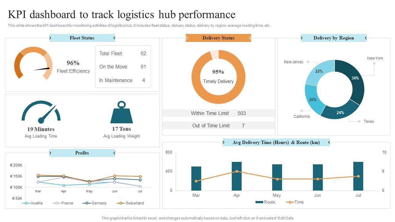
Template 3: KPI Dashboard to Track Logistics Hub Performance
Fleet status, delivery timelines, and regional performance are hard to communicate across a long report. This PPT template consolidates logistics hub KPIs into one structured view that operations leads can present with confidence. It covers delivery status, average loading time, and delivery by region—all on a single slide. Btw, this deck pairs well with hub and spoke diagram templates for broader supply chain presentations. The template is 100% editable and customizable.
Download this PowerPoint Template
Elevate Every Hub Dashboard Presentation with SlideTeam
SlideTeam's PowerPoint templates are the best in the industry for hub dashboard presentations. These content-ready slides give you a professional structure for KPI tracking, logistics monitoring, and centralized data visualization—without starting from scratch. Use these ready-made PowerPoint slides to present complex data clearly to executives, operations teams, and stakeholders. Deploy these pre-designed frameworks today and turn your dashboard metrics into decisions that drive results.
FAQs on Hub Dashboard
What are the essential components that make a hub dashboard effective for centralized data management?
An effective hub dashboard needs four things: a single data source, clear KPI groupings, visual status indicators, and role-based access. The layout must answer the most common question first—what needs attention right now. Avoid mixing operational and strategic metrics on the same view. Keep each section tied to a decision, not just a number.
How can a hub dashboard be designed to improve decision-making across multiple departments simultaneously?
Build the dashboard around shared KPIs that cut across departments—revenue, capacity, and fulfillment rate are common ones. Use consistent color coding so each team reads status the same way. Separate summary panels from department-specific drill-downs. When every team sees the same top-line view, cross-functional decisions happen faster and with less back-and-forth.
What distinguishes a hub dashboard from a traditional reporting dashboard in terms of functionality and purpose?
A traditional reporting dashboard shows historical data, usually in a fixed format. A hub dashboard is live and centralized—it pulls from multiple data sources and updates in real time. The key difference is purpose: reporting tells you what happened, while a hub dashboard tells you what's happening now and flags what needs a response.
How do presentation templates enhance the visual storytelling of hub dashboard data for executive audiences?
Pre-designed presentation templates give hub dashboard data a visual hierarchy that raw charts lack. Executives need context quickly—templates structure that context with consistent layouts, labels, and color signals. They reduce the time spent explaining the slide and increase the time spent on the decision. A well-laid-out template makes data credible before anyone speaks.
What metrics should be prioritized when building a hub dashboard for a marketing operations team?
Prioritize pipeline metrics, campaign ROI, cost per lead, and channel performance. These four tell a marketing operations team where budget is working and where it isn't. Add conversion rate and lead volume if the team manages demand generation. Avoid vanity metrics like impressions unless they're tied directly to a revenue outcome.
How can color coding and visual hierarchy be strategically applied in hub dashboard templates to reduce cognitive load?
Use three colors maximum: red for action required, yellow for watch, green for on track. Place the highest-priority KPIs in the top-left—eyes land there first. Group related metrics visually so the brain processes them as a unit. Consistent spacing and font size across panels cuts the mental effort of reading each section independently.
What role does real-time data integration play in maximizing the effectiveness of a hub dashboard?
Real-time data integration means the dashboard reflects current state, not yesterday's numbers. This matters most in logistics, sales, and IT operations—where a two-hour lag changes the decision. Connect live data feeds to the KPIs that require immediate response. For metrics that are reviewed weekly, a daily refresh is sufficient and reduces system load.
How should a hub dashboard be structured to support both high-level summaries and granular drill-down capabilities?
Start with a summary row at the top: three to five headline numbers with status indicators. Below that, place department or function panels that link to detail views. The top layer answers the executive question; the drill-down answers the operational one. Keep the two levels visually distinct so users always know which layer they're reading.