


Kpi Dashboard To Track Logistics Hub Performance




Try Before you Buy Download Free Sample Product
 Impress Your
 Audience
 100%
100% Editable
 Save Hours
 of Time


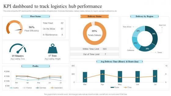
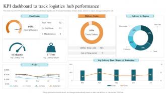
This slide shows the KPI dashboard for monitoring activities of logistics hub. It includes fleet status, delivery status, delivery by region, average loading time, etc.
People who downloaded this PowerPoint presentation also viewed the following :
Kpi Dashboard To Track Logistics Hub Performance with all 7 slides:
Use our Kpi Dashboard To Track Logistics Hub Performance to effectively help you save your valuable time. They are readymade to fit into any presentation structure.





FAQs for Kpi Dashboard To Track
Pick 4-5 metrics that actually matter to your business - more than that and you'll drown in data. Trend lines are clutch for seeing patterns over time. Red/green indicators work well, though honestly everyone does that now. Add little context notes explaining WHY numbers changed because raw data tells you nothing. Refresh timing depends on what you're tracking. Operations stuff? Daily makes sense. Strategic metrics can be weekly or monthly. Oh, and compare against your targets or industry benchmarks so you know if you're winning or losing. The whole point is spotting issues quickly without having to dig through spreadsheets.
Honestly, turning your KPI numbers into visuals is a game changer - your brain just gets it instantly instead of staring at boring spreadsheets. Use color coding for the good vs bad stuff, progress bars when you're tracking goals, and trend lines to show what's actually happening over time. Match your chart type to what you're measuring though. Gauges work great for single metrics. Heat maps are perfect when you're comparing different departments (we use these at work and they're so much clearer). Start with whatever data confuses you most and just try different chart types until it clicks. Trust me, a good chart beats a table of numbers every time.
Start with the big four: revenue, conversion rates, deal size, and how long your sales cycles take. Pipeline metrics are clutch too - they'll show you what's coming way better than what already happened. Don't forget lead sources either. The real trick is being able to break everything down by rep or territory, because those top-level numbers can be pretty misleading honestly. I learned that the hard way at my last job. Get your team actually using a basic dashboard first, then you can get fancy with more detailed stuff once they're checking it daily.
Know your audience first - that's everything. C-suite folks want the big picture stuff they can scan in 30 seconds, while your ops teams need all the nitty-gritty details because they're actually in there fixing things when stuff breaks. Your metrics, visuals, even how often data refreshes... it all comes down to who's using it and what decisions they're making. Honestly, just grab a few key users and ask them what questions they're trying to answer. That conversation will basically design your dashboard for you. Way easier than guessing what people want.
Dude, real-time dashboards are a game changer. You'll catch problems while they're happening instead of finding out about them way too late. Like if your conversion rates tank during a campaign, you know immediately rather than Monday morning when it's already screwed. Everyone trusts the data more too since it's actually current. I'm telling you, going back to static reports feels painful once you've had live data. Oh and don't try to make everything real-time at once - that's a nightmare. Pick your most important metrics that actually change throughout the day and start there.
Honestly, just pick 5-7 KPIs that tie directly to what you're trying to achieve. Like if retention matters, track churn rate instead of total signups. I've watched teams drown in data because they measured everything - total waste. Your KPIs should be things your team can actually impact day-to-day. Mix it up with leading indicators (stuff that predicts what'll happen) and lagging ones (results you already got). Here's my test: when a number goes bad, does everyone know what to do about it? No? Then drop that metric. Keep it actionable or don't bother.
Honestly, just talk to users throughout the whole process. Do interviews upfront to figure out what metrics different people actually care about - saves you so much headache later. Once you have wireframes, run some quick usability tests. I learned this the hard way after rebuilding a dashboard twice lol. Quick surveys after each update work great too. Ask specific stuff about clarity and navigation. Here's the thing though - watch the analytics of how people really use it. What they say vs. what they do can be totally different. Set up monthly reviews to tackle the biggest issues first.
Dude, mobile access is everything for dashboards. Your team can't always be at their computers when they need to check numbers - what about during meetings or when they're stuck on a train? I learned this the hard way when our CEO couldn't pull up sales data during a client lunch. Test yours on your phone right now. Can you see the main KPIs clearly in under 10 seconds without squinting or zooming around like crazy? If not, you've got problems. Fast loading is non-negotiable too.
Honestly? Check if people are actually using it daily - that's your biggest tell. Are your key metrics improving since launch? Teams responding to problems faster than before? The dashboards that really work become so critical that everyone freaks out during maintenance downtime lol. Survey users to see if they feel more confident making decisions now. But here's the real test: drop someone new in front of it. Can they figure out your business health in like 30 seconds? If they're squinting and asking questions, you've got work to do.
Don't cram everything onto one screen - seriously, less is more here. Pick maybe 5-7 metrics that actually matter for decisions, not just the flashy vanity stuff that looks good in meetings. Your KPIs should tie back to real business goals, even if they're harder to track than the obvious ones. Data quality is huge too - I've seen dashboards lose all credibility because someone was looking at last month's numbers thinking they were current. Always test the "so what?" question. If you can't quickly explain why someone should care about a specific metric, just ditch it.
Honestly, just ask each department what 3-5 numbers they actually care about day-to-day. Sales wants their pipeline and conversion rates, HR obsesses over turnover and satisfaction scores. Marketing's all about leads and campaign ROI - though they'll probably ask for way more metrics than they need. Set up role-based access so people don't get overwhelmed with irrelevant data. Also think about timing - some teams need daily updates while others work quarterly. Oh, and make sure the time frames are adjustable because that'll save you headaches later.
So for KPI dashboards, there's a bunch of good options out there. Tableau and Power BI are probably your best bet - super powerful but they'll hit your wallet hard once you scale. Google Data Studio won't cost you anything and works fine for basic stuff, just don't expect miracles. Excel can actually work too (I know, I know) but it turns into a nightmare with complex data. Oh, and if you're more on the technical side, Grafana's pretty solid or you could build something custom. My advice? Figure out where your data lives first, then grab whatever connects to it without making you want to pull your hair out.
Okay so instead of just throwing random numbers at people, tell a story with your KPIs. Like don't just show "Revenue: $500K, Conversion: 3.2%" - that's boring as hell. Structure it more like: "We got 10K visitors, 320 actually bought something (not terrible!), made $500K, but then retention tanked to 75%." Follow the customer journey or however your business actually works. People can see what caused what that way. I always arrange mine so there's a logical flow - makes way more sense to stakeholders. Your next dashboard should have one main story running through it.
Start with access controls - don't give everyone the same view. Role-based permissions work great so people only see their relevant KPIs. Financial stuff especially needs to stay locked down. If you're sharing with contractors or outside people, anonymize that data (trust me on this one). Your platform should have decent authentication built in. Watermarks help too if you're really paranoid about screenshots. I've seen too many companies just dump everything into one dashboard and wonder why sensitive info leaked. Be selective about who gets what access level.
Dive into your historical data to see how your team actually uses dashboards. Which metrics do they check constantly? What timeframes do they always pull up? Past performance data shows you which KPIs actually predicted success vs the fluff nobody cared about. I swear, old dashboard screenshots are gold if you saved any - you'll cringe at what seemed important back then. Focus on the metrics that matter first. Then arrange everything to match how your team naturally works instead of fighting their habits.
-
A beautiful, professional design paired with high-quality images and content that is sure to impress. It is a must-use PPT template in my opinion.
-
My presentations were a bit amateur before I found SlideTeam’s designs. I’ve been able to find slides for nearly every topic I’ve had to present. Thanks, Slideteam!