


KPI Dashboard To Analyze Impact Of Warehouse Management Adopting Digital Transformation DT SS





Try Before you Buy Download Free Sample Product
 Impress Your
 Audience
 100%
100% Editable
 Save Hours
 of Time


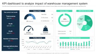
This slide covers KPI dashboard to assess performance of supply chain after implementing effective logistics strategies. It involves details such as delivery status, number of shipments and average delivery time.
People who downloaded this PowerPoint presentation also viewed the following :
KPI Dashboard To Analyze Impact Of Warehouse Management Adopting Digital Transformation DT SS with all 10 slides:
Use our KPI Dashboard To Analyze Impact Of Warehouse Management Adopting Digital Transformation DT SS to effectively help you save your valuable time. They are readymade to fit into any presentation structure.









FAQs for KPI Dashboard To Analyze Impact Of Warehouse Management Adopting Digital
Start with what decisions people actually need to make, then pick your KPIs from there. You'll want real-time data (or close to it) with simple visuals - charts and gauges work great. Include trend lines and target comparisons so users can see if they're winning or losing. Drill-down features are clutch when someone needs details. Here's the thing though - resist cramming everything in there. I see this mistake constantly. Stick to maybe 5-7 metrics tops, otherwise it just becomes visual chaos. Focus on clarity over completeness.
Match your KPIs to what you're actually trying to achieve. Growth mode? Track customer acquisition cost and revenue growth instead of those feel-good vanity metrics. I swear, half the dashboards I see are just digital clutter nobody looks at twice. Would this number actually change how you operate? If not, ditch it. Your CEO wants the big picture trends, but ops teams need the nitty-gritty details they can act on. Stick to maybe 5-7 metrics tops - any more and people's eyes glaze over. Test a few options first before you build the whole thing out.
Put your most important KPIs in the top left - that's where people look first. Colors should mean something consistent (green = good, red = problem), not just random pretty shades. I swear some dashboards look like a kindergarten art project! Group similar stuff together and give everything room to breathe with white space. Make your charts big enough that people don't need to squint. Oh, and definitely test it with a few actual users before you launch. Nobody wants to stare at something confusing every morning.
Honestly, it depends on your business and what you're tracking. Daily updates hit the sweet spot for most stuff - you get fresh data but don't drive everyone crazy with constant changes. Sales numbers or website traffic? Maybe hourly makes sense. Customer satisfaction scores can wait a week though. I've watched teams go nuts trying to make everything real-time and it just becomes white noise. Match your update frequency to how fast you can actually do something about it. Like, what's the point of minute-by-minute reports if you only review strategy monthly? Start daily and see what actually gets used.
Dude, don't cram everything onto one screen - I've seen dashboards with like 40 widgets and it's just chaos. Stick to maybe 5-7 metrics that actually matter for decisions. Pick stuff your team will genuinely use, not vanity metrics that just look cool. Fresh data is crucial too - nothing's worse than making calls based on last week's numbers. Oh, and make sure everyone knows what they're looking at. Half the dashboards I see fail because people don't understand the metrics. Start basic, then build from there.
Honestly, charts and graphs are total game-changers for KPI stuff. Your brain just gets it instantly instead of squinting at boring spreadsheets. Heat maps show you patterns right away, and those little progress bars actually make sense of your targets. Line charts work great for tracking trends over time - bar charts are better when you're comparing different things. I mean, let's face it, people actually look at data when it doesn't look terrible. Dashboard cards are perfect for single metrics too. The trick is picking visuals that immediately answer "okay, so what does this mean?" You'll save yourself so many headaches.
Honestly, user feedback is what makes or breaks a KPI dashboard. Skip it and you'll build something that looks great but sits there collecting digital dust. Been there, seen that happen way too often! Quick surveys work well, or just throw a feedback button somewhere obvious. People will tell you which metrics actually matter and what's confusing them. Business priorities change constantly too - like, way more than you'd expect - so regular check-ins help you stay on track. The dashboards that actually get used? They're the ones built around how people really work, not some perfect theoretical version.
Here's the thing - every KPI needs a direct line to your actual business goals. Can't connect them? Ditch it. Most teams I've worked with just dump everything onto their dashboard and wonder why nobody uses it. Stick to maybe 5-7 metrics that leadership actually gives a damn about. Mix leading indicators (the stuff that predicts what's coming) with lagging ones (what already happened). Oh, and review these quarterly because priorities change faster than you think. Honestly, if your dashboard isn't helping you make real decisions, you're just staring at fancy graphs.
Map out your KPIs first - that's the key step everyone skips. Tableau and Power BI are the big names if you need something robust. Google Data Studio is actually pretty decent if your data's in Google Sheets, and it won't cost you anything. I've built some solid dashboards there in under an hour, no joke. Grafana works great for technical teams, though the learning curve's steeper. Custom D3.js builds are overkill unless you're really particular about design. Bottom line: match the tool to your team's skill level or you'll just end up frustrated.
Honestly, get a KPI dashboard set up - it's like finally turning the lights on. You'll see what's actually happening across your whole business instead of guessing. Sales can track their conversion rates while ops watches delivery times, all in one place. No more department silos or arguing over whose Excel file is correct (we've all been there). The best part? You catch problems way faster and everyone's looking at the same data. Just make sure you track metrics that actually matter, not just numbers that make you feel good but don't change anything.
Start with NPS - that's your north star for customer happiness. Churn rate matters way more than people think since it shows who's actually leaving. Track daily/monthly active users and how long they stick around in sessions. Support ticket volume is a dead giveaway too - nobody engaged is constantly complaining. Feature adoption rates help you see what's working. If you're e-commerce, repeat purchases are clutch. Honestly, customer sat scores from surveys give you the full picture. Don't go crazy with too many metrics right off the bat though - these basics will tell you everything you need to know first.
Honestly, once you start checking your KPIs on mobile, you'll be hooked. I can spot sales dropping during lunch or see production numbers spike while I'm stuck in meetings. Your team stops reacting days later when everything's already gone sideways. Instead, you're making decisions right when stuff happens. Pretty wild how much faster you move when everyone's not waiting to get back to their desk. Oh, and definitely set up notifications for your biggest metrics - saves you from constantly refreshing like some kind of data addict.
Honestly, data quality is gonna be your biggest headache - stuff's scattered everywhere, totally inconsistent, and building dashboards becomes impossible. Getting teams to agree on what metrics actually matter? Good luck with that mess. Different departments will argue endlessly about KPIs and how to measure them. Technical integration is another pain if your systems hate each other. But here's what worked for me: pick one department first. Focus on their top 2-3 metrics, get those rock solid, then use that success to convince other teams. Way easier than trying to boil the ocean from day one.
So you've got a few ways to tackle this. APIs are probably your best bet - most systems have them and you can pull data straight through. ETL tools like Talend work well for the heavy-duty stuff, extracting and loading everything into one spot. Database connectors are solid if you're working with SQL sources. Zapier's pretty nice for simpler integrations, honestly saves you from coding. Power BI and Tableau have built-in connectors too that'll do most of the work. I'd map out all your sources first though - helps you figure out what approach makes sense for your budget and how technical you want to get.
Track how often people actually log in and which metrics they're checking out most. But honestly, the real test is whether your key numbers are getting better over time. If your dashboard shows sales tanking and everyone's just ignoring it, you've got issues. Also throw out quarterly surveys to users - they'll tell you what's useful vs total clutter. Usage stats only tell half the story though. You need to see if people are actually doing something with the data they're seeing. Set up reviews every few months to check both the tech side and business impact.
-
Amazing product with appealing content and design.
-
Innovative and creative templates with high-quality designs. Helped me with my presentation as the slides were easy to edit.