


Warehouse KPI Dashboard For Business Management




Try Before you Buy Download Free Sample Product
 Impress Your
 Audience
 100%
100% Editable
 Save Hours
 of Time


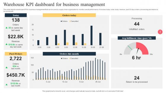
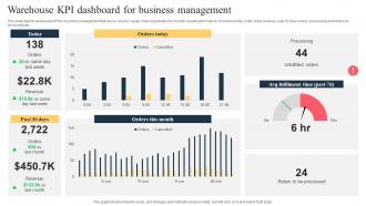
This slide depicts warehouse KPI for business management that can be used by supply chain organization to monitor overall performance. It involves today order, today revenue, past 30 days orders, processing and returns to be processed.
People who downloaded this PowerPoint presentation also viewed the following :
Warehouse KPI Dashboard For Business Management with all 10 slides:
Use our Warehouse KPI Dashboard For Business Management to effectively help you save your valuable time. They are readymade to fit into any presentation structure.








FAQs for Warehouse KPI Dashboard
Start with inventory accuracy and order fulfillment rate - those are your bread and butter. Picking accuracy matters too, obviously. Warehouse capacity utilization tells you if you're actually using your space well or just hoarding stuff everywhere. Timing is huge though - track order processing time and how fast you move from receiving to putaway. Trust me, you'll thank yourself during busy season. Cost per shipment and labor productivity hit your profits directly. Oh, and safety incidents because nobody wants that headache. These cover most of what you need. Add more later if your team starts obsessing over other random metrics.
Dude, real-time dashboards are seriously a lifesaver. Instead of waiting until the next day to discover your picking rates tanked or you're almost out of stock, you'll catch issues while they're actually happening. Like, you can watch bottlenecks form at specific stations and fix them right away. Way better than those useless end-of-shift reports we used to rely on. The visual stuff makes trends super obvious too - your team spots problems fast and can shuffle people around or tweak processes immediately. Honestly just start with your biggest 3-4 headaches first, don't overthink it.
So inventory turnover is clutch for seeing how fast you're actually moving products. Calculate it by dividing cost of goods sold by your average inventory value. Higher numbers mean you're not stuck with a bunch of stuff just sitting there forever - which honestly drives me crazy when I see warehouses do that. Low turnover usually means you've got dead stock or your demand forecasting is off. Maybe your picking process sucks too. I'd check it monthly and compare against what others in your industry are doing. Catches problems before they get ugly.
So basically you take correct picks divided by total picks, times 100 for the percentage. Most places shoot for 99%+ which honestly sounds crazy high but makes sense when you think about it. Track it daily because picking errors are expensive as hell - returns, angry customers, reshipping costs, the whole mess. I'd also break it down by individual picker and product type so you can spot if certain people or SKUs are causing issues. When accuracy drops, dig into whether it's training problems or maybe your product labels suck. Set up alerts when it dips below target.
Pick your top 5-7 KPIs first - stuff like inventory accuracy, fulfillment rates, labor productivity. Any more than that and people's eyes just glaze over, trust me. Real-time data is clutch for things like dock utilization and cycle times. Red/yellow/green color coding works great so your team can instantly see what's broken. Oh, and make sure different people see dashboards that actually matter to their job - warehouse guys don't need the same view as managers. Bottom line: if a metric doesn't help someone do something about a problem, toss it. Keep everything visual and simple.
Dude, these dashboards are game-changers for cutting costs. They show you exactly where money's disappearing - like overtime that's gotten out of hand or inventory just sitting there burning cash. Real-time data means you catch problems early instead of finding out months later when it's too late. Honestly, most warehouse managers are just flying blind without one. You can finally optimize your staffing and stop the guesswork. My advice? Start small with your biggest 3-4 cost problems first. Once you see those numbers improve, you'll want to track everything.
Keep it simple - bar charts and gauges work best for showing picker rates and accuracy. Heat maps are perfect for seeing which warehouse zones are killing it. Don't cram too much on there though, maybe 4-5 key metrics max. I always add trend lines because seeing improvement over time is honestly pretty motivating for the team. Set it to refresh every 15-30 minutes so people can actually adjust during their shift. Oh, and make sure the visual stuff is clear - nobody wants to squint at tiny numbers when they're trying to figure out what's going wrong.
Honestly, Power BI is probably your easiest win here - especially if you're already using Microsoft stuff. Tableau's solid too but gets expensive fast (learned that one the hard way). Looker's decent as well. If you want something built specifically for warehouses, Manhattan Associates and Blue Yonder have pre-made dashboards which is kinda nice since you don't have to build everything from scratch. But really, I'd just start with Power BI. It's user-friendly and you can throw something together pretty quickly to see if it works for your needs.
Set up automated checks that flag weird outliers or missing data points - seriously saves you from major headaches down the road. Pull from clean source systems and make sure someone actually owns each KPI (otherwise it's just chaos). I'd do weekly spot checks too, manually comparing dashboard numbers against real warehouse ops. Real-time validation catches most issues, but you want multiple layers so nothing slips through. Oh, and don't forget data governance - sounds boring but it's what keeps everything from falling apart when you're not looking.
Dude, warehouse layout is basically everything when it comes to your KPIs. Bad layout = workers walking around forever instead of actually picking stuff. That kills your pick rates and makes fulfillment painfully slow. Plus you get these awful bottlenecks that crush throughput and jack up labor costs. Good layout though? Travel time drops, congestion disappears, fewer safety issues. I've seen places move a couple rack sections and suddenly their numbers jump like crazy. Honestly, if your metrics suck, don't overthink it - check your layout first before you start blaming everything else.
Honestly? Weekly reviews work best for most warehouse ops. Check your numbers daily to catch trends, but don't go crazy adjusting targets every time something dips - learned that the hard way. Monthly is when you'll actually see real patterns and seasonal shifts without freaking out over every little blip. Save quarterly reviews for the big picture stuff - like whether your KPIs even make sense anymore for what you're trying to achieve. I'd start with weekly performance checks against your targets. Then do monthly sit-downs to figure out if those targets need tweaking.
Don't cram everything onto one screen - people get overwhelmed and can't focus on what matters. Skip the vanity metrics too (like "we picked 10,000 items!" without showing if that's good or terrible). Real-time data needs to actually BE real-time, otherwise you look incompetent when the numbers are wrong. Here's the thing - ask your warehouse folks what they need daily, not what the C-suite thinks looks cool. I've seen so many dashboards that are basically executive eye candy. Start with maybe 5-7 metrics and add more based on what people actually use.
Track your average shipping times and on-time delivery rates with line charts and gauges. Honestly, setting up automated pulls from your WMS is a game changer - saves you from doing manual updates every week. Color code everything (green/yellow/red) so you can spot problems fast. Break it down by shipping zones or carriers if you want more detail. Oh, and set realistic benchmarks first before you start measuring variance. I learned that one the hard way. Start with just 2-3 key metrics though - don't go crazy adding everything at once or you'll drown in data.
Honestly, color coding is your best friend here - green for good stuff, red when things are broken, yellow for "hey, pay attention." Make your charts big enough that people aren't squinting like they need glasses. Critical metrics go right up front where everyone can see them. Group similar stuff together so it actually makes sense. Real-time updates are non-negotiable - there's literally no point if the data is stale. Keep fonts consistent throughout (sounds boring but trust me on this one). Your team needs to glance at it and immediately know what's happening without playing detective.
Honestly, dig into your past data to see what metrics actually mattered versus the ones that just looked impressive in meetings. I've watched teams get totally fixated on picking rates while their real problem was crappy inventory accuracy the entire time. Check which KPIs flagged your worst periods fastest - seasonal spikes, bottlenecks, whatever crushed you. Look for patterns between metrics and your biggest wins too. Your managers probably remember which numbers gave them the best heads-up when things went sideways. Pull those top 3 disaster periods and work backwards from there.
-
Informative design.
-
One word for SlideTeam–Versatile!