

 0 Comment
 Customer Reviews

The dashboard is built. The numbers are in. And now someone has to explain what they mean.
Not to economists. To the board. To the regional director who keeps asking why the trade balance slide looks different from last quarter. To the CFO who wants GDP per capita in the same frame as unemployment rate, but also wants it to look clean.
Economic metrics are, on paper, precise. Fixed formulas. Agreed definitions. And yet every time you have to present them, something goes wrong—not with the data, but with the telling of it. The inflation rate means one thing to a macro analyst and something else entirely to a business owner watching input costs. The same number lands differently depending on how you frame it.
That's the actual problem. Not access to data. Everyone has access to data. The problem is structure—figuring out which numbers belong together, what narrative they support, and how to put that on a slide without it looking like a spreadsheet that learned to breathe.
Finance teams tend to default to tables. Economists go dense. Strategy decks skip the context entirely and just drop a chart labeled "GDP Growth Rate" with no axis label and a prayer. None of these work. The audience disengages. The point gets lost. The meeting runs long.
And the stakes aren't small. When you're presenting economic performance measures to decision-makers—government planners, investors, C-suite, development organizations—a poorly structured deck doesn't just confuse people. It makes the underlying analysis look weak, even when it isn't.
So the templates exist because this is a recurring problem with a recurring shape. Economic metrics presentations follow patterns. Comparisons, trend lines, regional breakdowns, inclusion indicators, environmental overlays. People figured that out and built frameworks around it.
SlideTeam's economic metrics templates handle the part that takes the longest—structure. Pre-designed layouts that let you drop in the numbers and focus on what to say about them, not how to arrange them on a slide. That's what these are for.
Here are the ten that work.
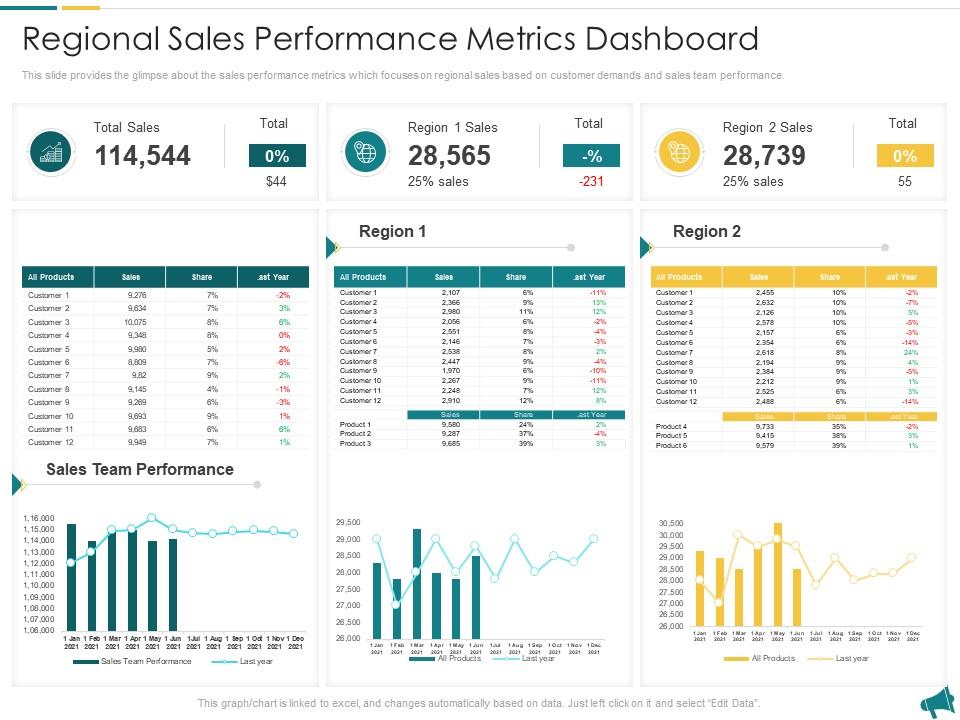
Template 1: Regional Sales Performance Metrics Dashboard Approach for Local Economic Development Planning
Regional sales performance data rarely sits in one clean place. This PowerPoint slide is built for local planners and economic development teams who need to connect customer demand signals with sales team output. It works well when presenting regional economic health indicators to stakeholders who need a geographic lens on business activity. The dashboard format keeps multiple variables readable at once — useful for business cycle analysis across territories. The template is 100% editable and customizable.
Download this PowerPoint Template
Template 2: Measuring Economic Inclusion Metrics for Communities and Businesses PPT Presentation
Economic inclusion is one of those topics that gets discussed broadly but measured poorly. This PPT template is built for researchers, policy teams, and CSR leads who need to present inclusion metrics for both communities and businesses in a single, coherent frame. It suits national income statistics reviews and equity-focused economic performance assessments. Explore more economic development metrics templates to complement this deck. The template is 100% editable and customizable.
[product_image id=1453158]
Template 3: Integrating Economic and Environmental Metrics PPT Demonstration
Separating economic output measures from environmental cost is increasingly hard to justify in board-level reporting. This PPT preset is for sustainability leads and policy analysts who need to present both dimensions together — without losing either audience. It fits well in government spending metrics reviews and ESG reporting contexts where the two data sets must coexist. So yeah, if your brief requires integrating financial performance KPIs with environmental benchmarks, this deck does that work clearly. The template is 100% editable and customizable.
[product_image id=1447887]
Template 4: Measuring Economic Growth Beyond GDP Metrics
GDP alone misses too much. This deck captures economic growth statistics that go beyond the headline number — covering welfare, inequality, and sustainability measures that GDP per capita simply doesn't reflect. Compelling visualizations make complex macroeconomic variables persuasive for mixed audiences. You can build strong economic forecasting presentations that hold up in boardrooms and policy briefings alike. Transform your economic growth presentations today. Download this dynamic template now and unlock the full picture of national progress.
[product_image id=1762341]
Template 5: GDP vs GNP Location Based vs Ownership Based Metrics PPT Summary
The GDP vs. GNP distinction trips up more presentations than it should. This template delivers instant visual clarity on location-based versus ownership-based economic output metrics. Striking side-by-side layouts capture the conceptual difference without requiring the audience to read footnotes. You can build compelling macroeconomic variables comparisons for academic, policy, and investor audiences with equal confidence. Transform your economic analysis presentations today. Download this dynamic template now and unlock sharper, more credible GDP and GNP comparisons.
[product_image id=1769614]
Template 6: Measuring Innovation Impact on Sustainable Economic Development PPT Outline
Innovation's contribution to sustainable economic development is genuinely hard to quantify — and harder to present. This slide is for economists, R&D leads, and development planners who need to show cause-and-effect between innovation inputs and long-term economic growth statistics. For context, it fits naturally into fiscal policy metrics discussions where justifying spending on innovation programs requires clear evidence framing. The template is 100% editable and customizable.
[product_image id=1665643]
Template 7: Mapping Metrics and Economic Buyer Identification
B2B sales conversations often stall because teams can't identify who actually holds the economic decision. This PPT template is for sales leads and revenue analysts who need to map their metrics directly to economic buyer profiles. It supports revenue growth rate reviews and purchasing power parity discussions in market entry planning contexts. See related economic metrics templates and samples for additional framing options. The template is 100% editable and customizable.
[product_image id=1564726]
Template 8: Metrics to Measure Financial Inclusion
Financial inclusion KPIs are specific — account ownership rates, usage of financial services, savings behavior — and they need to be presented that way. This PowerPoint slide is for economists and development finance teams tracking inclusion progress across an economy. It covers eight measurable stages, making it practical for cost of living index discussions and economic health indicator reviews at the country or regional level. The template is 100% editable and customizable.
[product_image id=1137798]
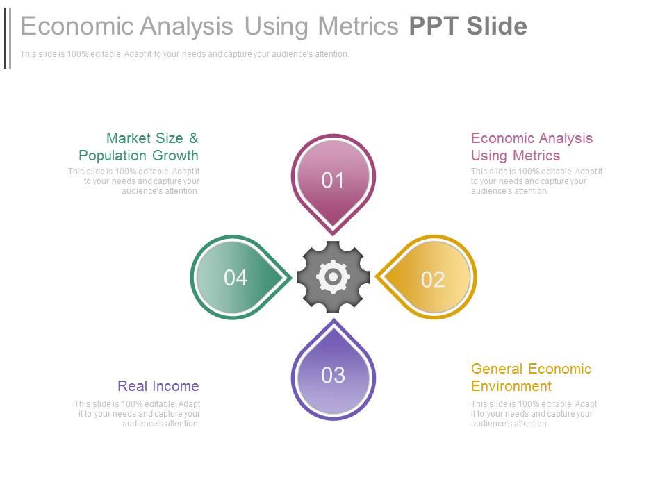
Template 9: Economic Analysis Using Metrics PPT Slide
Economic analysis gets unwieldy fast when the framework isn't clear. This PPT preset uses a four-stage structure to keep the analysis readable — separating technology drivers from business outcomes in a way that non-specialist audiences can follow. It suits market economic data presentations where clarity of method matters as much as the findings themselves. The template is 100% editable and customizable.
Download this PowerPoint Template
Elevate Every Economic Metrics Presentation with SlideTeam
SlideTeam's PowerPoint templates are the best in the industry for presenting economic metrics clearly and credibly. These content-ready slides give you professional structure across GDP growth rate comparisons, inflation rate breakdowns, and fiscal policy metrics — without starting from scratch. Use these pre-designed PowerPoint slides to turn dense macroeconomic data into decisions your audience can act on. Deploy these templates today and make every economic performance presentation land with authority.
FAQs on Economic Metrics
How does GDP growth rate differ from GNP in measuring a nation's economic health?
GDP measures all output produced within a country's borders, regardless of who owns the production. GNP counts output produced by a country's residents, regardless of where that production happens. For an open economy with large overseas investments or foreign workers, the two numbers diverge significantly. GDP is better for measuring domestic activity; GNP is better for measuring national income.
What role does the Consumer Price Index play in shaping monetary policy decisions?
The Consumer Price Index tracks the cost of a fixed basket of goods over time. Central banks watch it closely because rising CPI signals inflation — which typically triggers interest rate increases. When CPI stays persistently above target, monetary policy tightens. When it falls below, policy loosens. It's the single most-watched number in rate-setting decisions by bodies like the US Federal Reserve or the European Central Bank.
How can businesses use purchasing power parity to evaluate international market entry strategies?
Purchasing power parity tells you what a currency can actually buy in a given market, not just its exchange rate value. Businesses use it to compare real operating costs, wage levels, and consumer spending capacity across target markets. If PPP-adjusted income is high but the exchange rate is weak, local purchasing power may still support a premium product. It prevents entry decisions based on misleading nominal data.
What are the limitations of using unemployment rate as a standalone indicator of labor market strength?
The unemployment rate only counts people actively looking for work. It misses discouraged workers, part-time workers who want full-time roles, and those in low-quality jobs. A falling unemployment rate can coexist with stagnant wages and rising underemployment. Policymakers pair it with labor force participation rate, wage growth data, and job vacancy numbers to get a fuller picture of actual labor market conditions.
How does the Gini coefficient help policymakers identify income inequality trends across regions?
The Gini coefficient runs from 0 (perfect equality) to 1 (maximum inequality). Policymakers use it to compare income distribution across regions and track whether growth is broad-based or concentrated. A rising Gini alongside GDP growth signals that gains aren't reaching lower-income groups. It directly informs decisions on tax policy, social transfers, and targeted development spending in high-inequality areas.
What distinguishes leading economic indicators from lagging indicators in forecasting business cycles?
Leading indicators move before the economy does — stock prices, building permits, and new orders are classic examples. Lagging indicators confirm what already happened — unemployment rate and corporate profits are typical ones. For business cycle analysis, leading indicators help forecast turning points. Lagging ones validate that a trend is real. Using both together is the standard approach; neither alone is reliable enough.
How does the Human Development Index provide a more comprehensive view of economic progress than GDP alone?
GDP measures output. The Human Development Index measures life expectancy, education, and income together. A country can have high GDP per capita but low literacy or short life expectancy — the HDI surfaces that gap. For policymakers, it reframes economic progress as human outcomes, not just production. It's especially useful when comparing countries at similar income levels but with very different living standards.
What impact does the velocity of money have on inflation projections in a quantitative easing environment?
Velocity of money measures how often each unit of currency changes hands in a given period. In a quantitative easing environment, central banks expand money supply — but if velocity falls (people save rather than spend), inflation may not follow. This is why large asset purchase programs haven't always produced proportional inflation. Velocity collapsing offsets the money supply increase, keeping price levels relatively stable despite expansion.