

 0 Comment
 Customer Reviews

The report's already been shared. Somebody's going to ask what the numbers mean.
That's the part nobody rehearses. You have the data—headcount by department, turnover by quarter, absence rates, satisfaction scores. All of it. But the moment someone in the room asks "so what does this tell us?"—that's when the silence starts.
HR statistics aren't hard to collect. Most teams have dashboards, exports, and spreadsheets they haven't fully read. The actual problem is presentation. Turning raw workforce analytics into something a leadership team can act on—without losing the nuance, without drowning people in tables—that's where things break down.
And it compounds. Finance wants the cost story. Operations wants the productivity angle. The CEO wants one slide. You have fourteen. Nobody told you which fourteen to cut, and the meeting's in two hours.
Employee stats matter because the decisions attached to them are real. Hiring targets. Retention budgets. Performance improvement plans. Compensation reviews. The wrong framing doesn't just confuse people—it delays decisions, or worse, drives the wrong ones.
That's why templates exist. Not because the data is complicated—it is, but that's not why. They exist because structuring HR KPIs and staff performance indicators for a mixed audience is genuinely hard. You need a visual logic that works whether you're presenting to an HR committee or a board.
SlideTeam's employee stats templates handle exactly this. Pre-designed slides built for the specific formats that workforce data actually lives in—dashboards, department breakdowns, turnover summaries, demographic overviews. Ready to populate with your numbers, not starting from scratch.
Here's what's available.
Template 1: Employees Turnover Rate Stats Summary Report by Departments
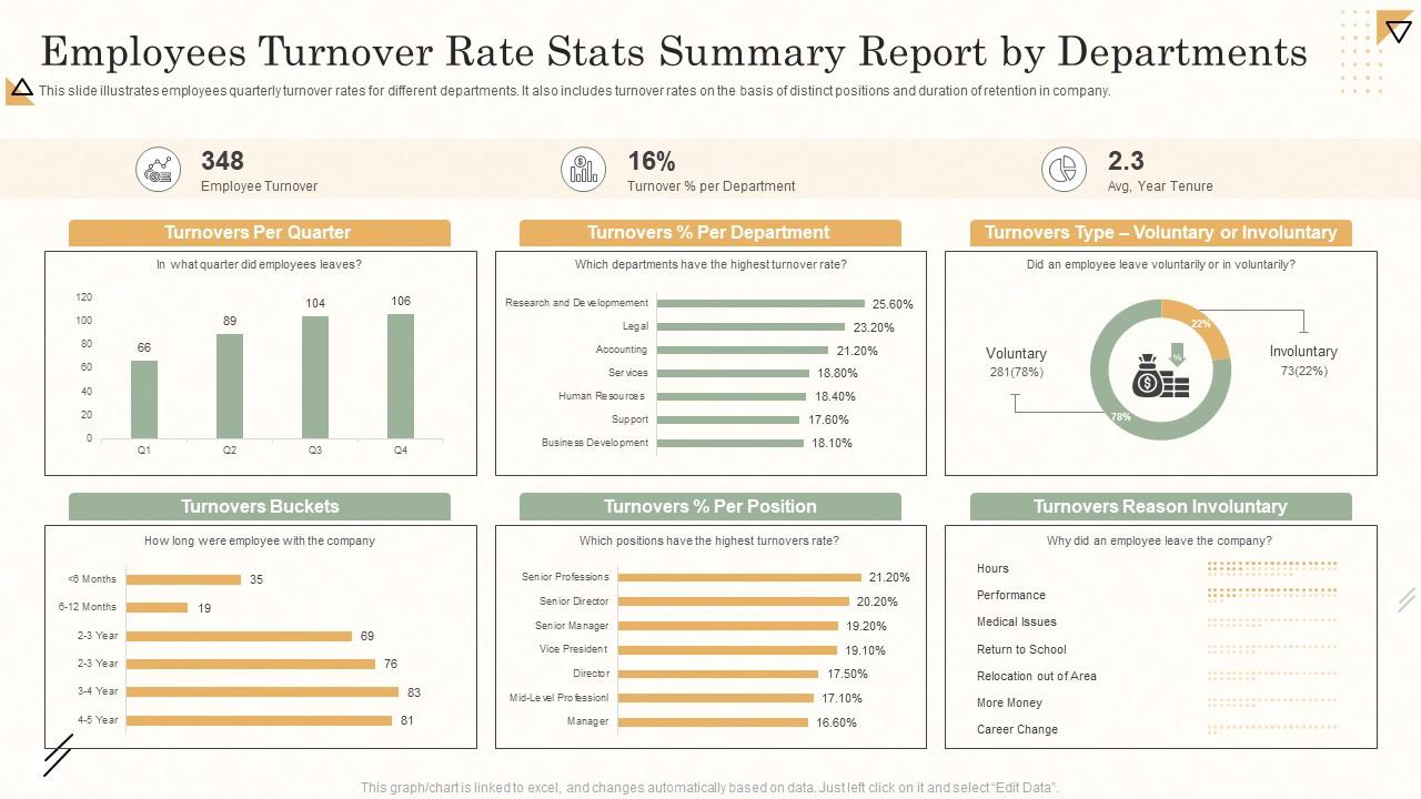
Departmental turnover is rarely uniform, and that unevenness tells a story. This PPT template helps HR teams break down quarterly employee turnover rates by department, position, and retention duration. Practitioners presenting staff retention statistics to leadership will find the structure does the heavy lifting. It surfaces where attrition concentrates—and why—without burying the audience in raw numbers. The template is 100% editable and customizable.
Download this PowerPoint Template
Template 2: HR Analytics to Track Employees Information
Good workforce decisions start with clean, readable data. This deck covers employee overview, monthly analysis, performance metrics, historical trends, occupancy rates, and headcount—all in one place. HR managers tracking employee stats across departments and tenure ranges will find this PPT preset genuinely useful for headcount reporting. It supports data-driven HR management without requiring a data science background. The template is 100% editable and customizable.
[product_image id=1123067]
Template 3: Safety Performance Dashboard with Employee Stats
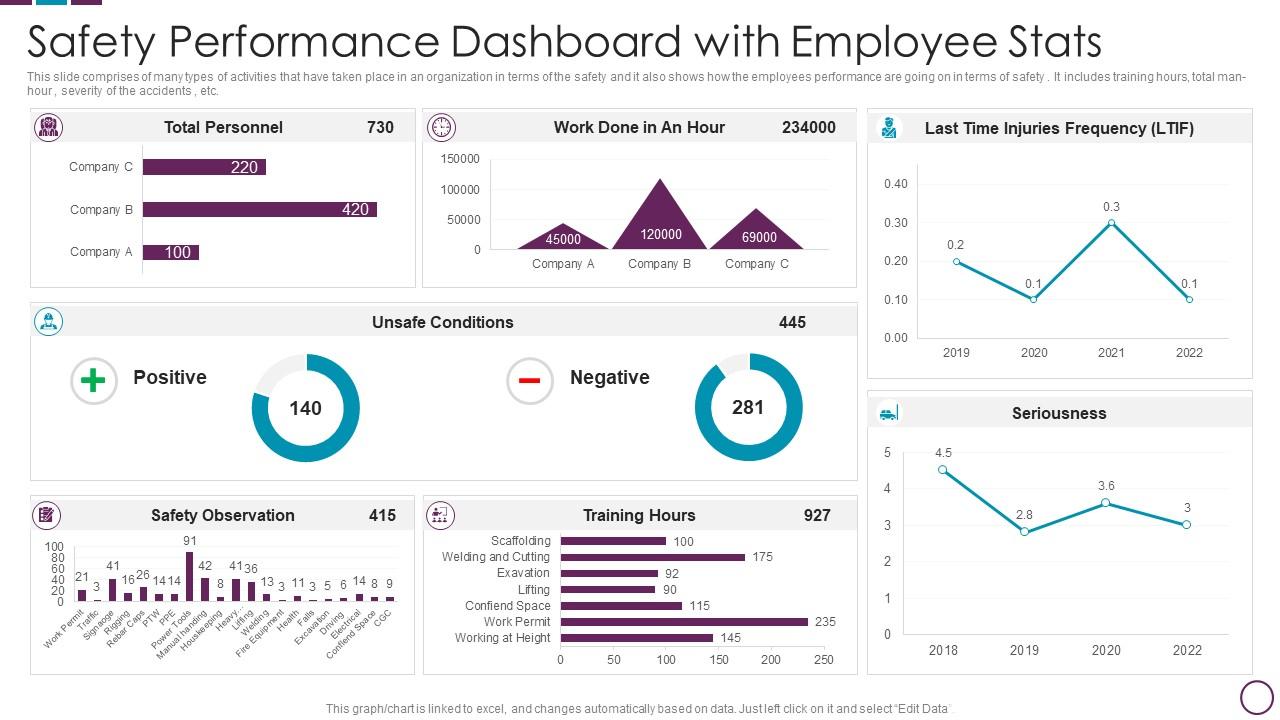
Safety performance is often reported in isolation from broader employee stats—this slide changes that. This PowerPoint slide brings together training hours, total man-hours, and accident severity in a single dashboard view. Safety managers and HR leads presenting to operations or compliance teams reach for this deck when they need workplace data to read clearly at a glance. It connects safety outcomes to workforce management statistics in a way that stands up in boardroom reviews. The template is 100% editable and customizable.
Download this PowerPoint Template
Template 4: Profiles Comparison between Employees Statistics
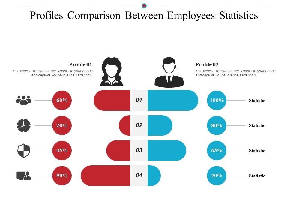
Side-by-side employee profile comparisons are harder to present clearly than they look. This PPT template is built for exactly that—structured differentiation across two employee profiles, useful when HR teams are making promotion, transfer, or role-fit decisions. Practitioners who need to show a committee why one candidate profile outperforms another will find this slide keeps the argument visual and grounded. The template is 100% editable and customizable.
Download this PowerPoint Template
Template 5: Company Employees Demographics over the Years
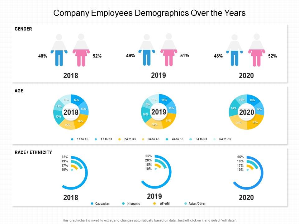
Workplace demographics shift slowly—but tracking them over time reveals patterns that single-year snapshots miss. This deck covers ethnicity, gender, and age distribution across the company, year on year. HR leaders and diversity officers presenting organizational workforce data to boards or regulators reach for this PPT when they need the trend line, not just the current state. It makes multi-year demographic reporting readable without oversimplifying the data. The template is 100% editable and customizable.
Download this PowerPoint Template
Template 6: Employee Productivity Stats of an Organization
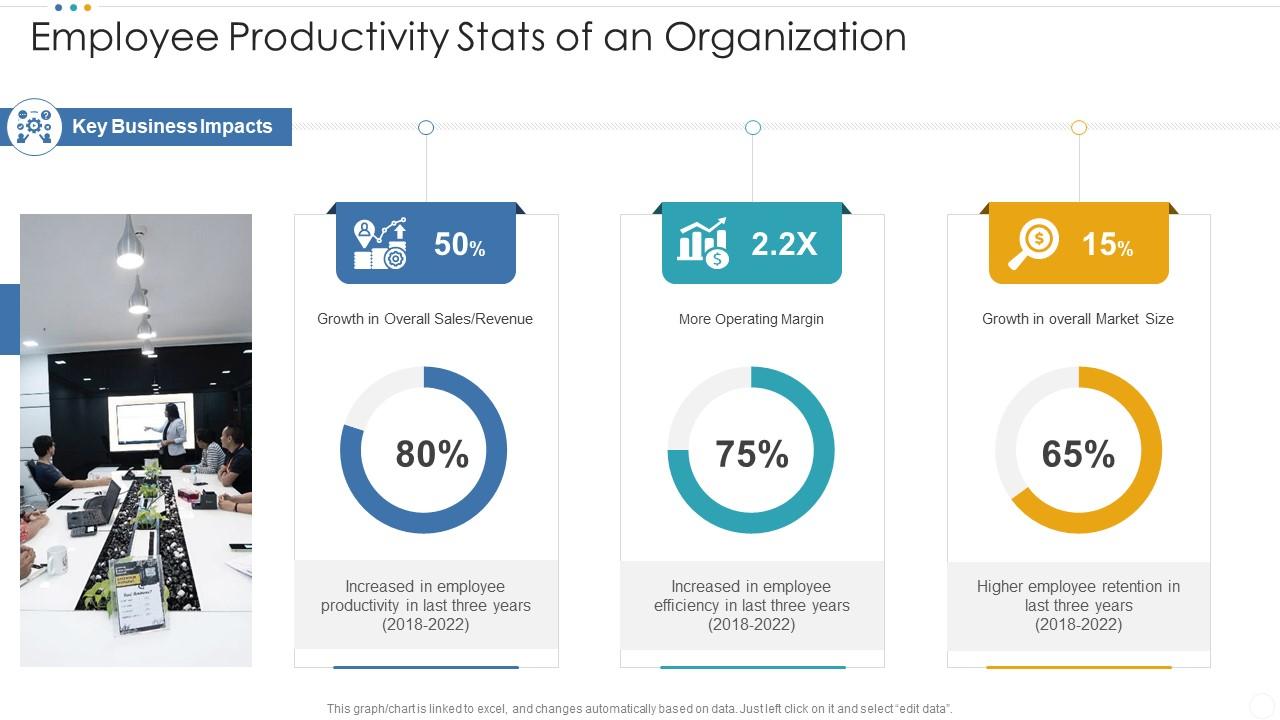
Productivity data rarely tells a clean story without context—this template provides the structure. Covering key business impacts, overall market growth, and operating margin, it gives leaders the analytical frame to connect employee output to financial outcomes. You can build compelling employee productivity analysis presentations that tie staff performance directly to business results. Transform your workforce reporting today. Download this dynamic template now and unlock your organization's performance narrative.
Download this PowerPoint Template
Template 7: Department Wise Employees Turnover Rate Stats Report
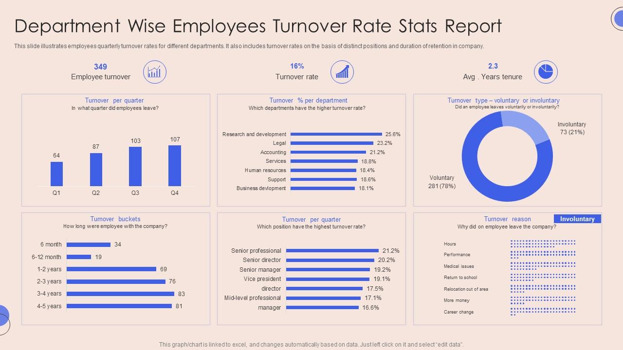
Turnover reason matters as much as turnover rate. This PowerPoint slide breaks down quarterly employee turnover by department, position bucket, and stated reason—giving HR teams the specificity they need to act, not just report. Workforce planners presenting to senior leadership will find this PPT template far more useful than a single attrition percentage. For more on employment status reporting formats and examples, this deck fits neatly into that workflow. The template is 100% editable and customizable.
Download this PowerPoint Template
Template 8: Complete Statistical HR Annual Report of Employees
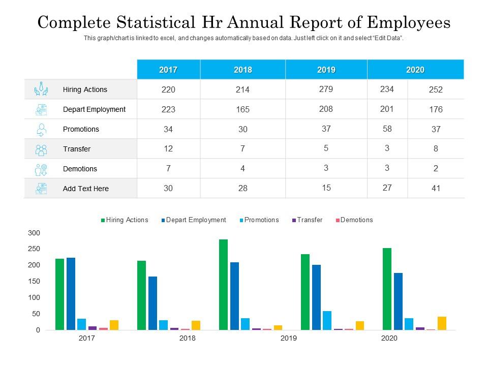
Annual HR reporting covers a lot of ground—transfers, demotions, actions taken, headcount changes. This PPT preset brings that full picture into a structured statistical format. HR directors and CHROs presenting a year-end workforce review to the board will find this slide gives the data the credibility it needs. It handles the breadth of a complete HR annual report without losing clarity on the individual data points that matter. The template is 100% editable and customizable.
Download this PowerPoint Template
Template 9: Employee Management Issues PPT
Employee management issues rarely surface cleanly in meetings—they tend to come out sideways. This PowerPoint slide is built for practitioners who need to present workforce challenges clearly, whether that's absenteeism, performance gaps, or team-level friction. HR managers and operations leads use this deck when the conversation requires structure before it can produce decisions. It keeps the discussion grounded in data rather than anecdote. The template is 100% editable and customizable.
[product_image id=1715051]
Template 10: Employee Stats Dashboard to Analyze Organization Workforce
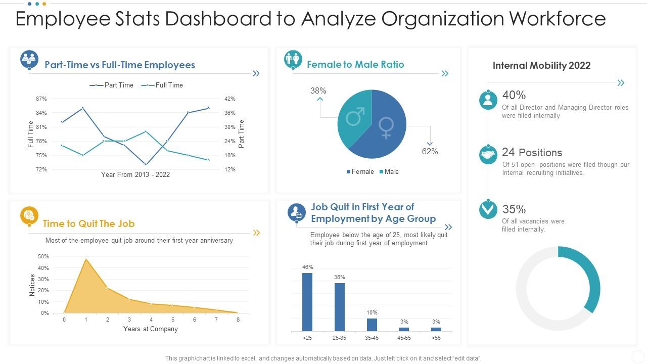
Workforce composition data—gender ratio, internal mobility, full-time headcount—is often buried in spreadsheets. This PPT template surfaces it as a readable HR dashboard, designed for the kind of review where leadership needs a quick organizational picture. HR analysts and workforce planning teams reach for this slide when preparing quarterly or annual workforce reviews. So yeah, if your audience needs the full workforce snapshot in one view, this deck delivers. The template is 100% editable and customizable.
Download this PowerPoint Template
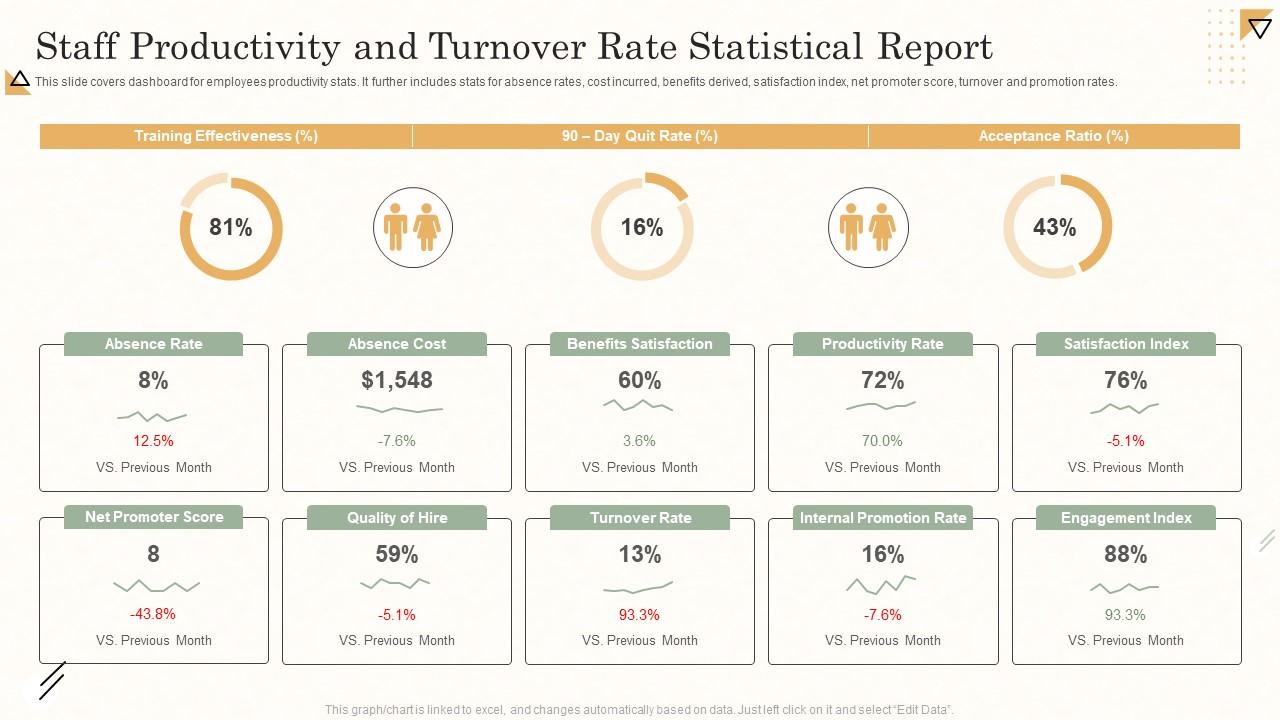
Template 11: Staff Productivity and Turnover Rate Statistical Report
A productivity dashboard is only useful if it captures the right indicators. This template covers absence rates, cost and benefit data, satisfaction index, net promoter score, turnover, and promotion rates—all in one structured view. You can build compelling staff productivity presentations that give decision-makers a complete picture without multiple decks. Transform your HR reporting today. Download this dynamic template now and unlock your workforce performance clarity.
Download this PowerPoint Template
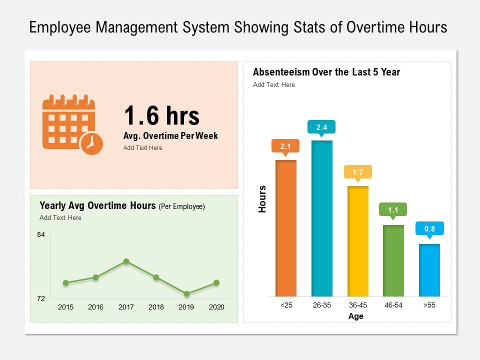
Template 12: Employee Management System Showing Stats of Overtime Hours
Overtime hours are an early signal—of understaffing, of deadline pressure, of burnout risk. This PowerPoint slide tracks overtime data at the employee management level, giving HR and operations teams a visual record they can present to leadership before the situation becomes a retention problem. Practitioners who monitor employee attendance tracking and workload distribution will find this PPT preset a practical addition to their regular reporting cycle. The template is 100% editable and customizable.
Download this PowerPoint Template
Template 13: Employee Stats PowerPoint PPT Bundles
When a single slide won't cover the scope of a workforce review, a full bundle does. This deck brings together stats, figures, and data charts across twelve slides—built for HR teams that need to present a comprehensive picture of employee data in one cohesive package. Analysts and HR leads who present across multiple workforce dimensions—headcount, performance, turnover—reach for this PPT when the topic demands range. The template is 100% editable and customizable.
[product_image id=459566]
Template 14: Tracking Total Workplace Incidents and Injury Rates PPT Summary
Incident and injury tracking is a compliance requirement, but it's also a workforce health signal. This PowerPoint slide helps safety and HR teams present total workplace incidents and injury rates in a format that reads clearly to both operational and executive audiences. For context, injury rate trends are one of the more underused inputs in broader employee efficiency metrics reviews. This PPT preset makes that connection visible. The template is 100% editable and customizable.
[product_image id=1551623]
Template 15: HR and Workforce Analytics PPT Mockup
Workforce analytics presentations often try to do too much—this deck keeps it focused. Built for HR and people analytics teams, this PPT mockup covers the core analytical views that leadership actually asks for: headcount, performance trends, and workforce composition. It's the kind of slide that works in a quarterly business review or an HR reporting cycle without needing to be rebuilt each time. The template is 100% editable and customizable.
[product_image id=1545097]
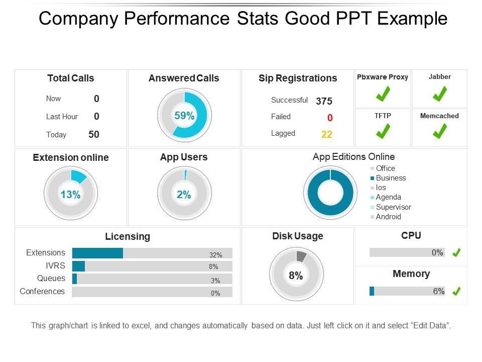
Template 16: Company Performance Stats Good PPT Example
Company performance stats are most persuasive when the visual does the arguing. This data-driven PowerPoint slide supports linked Excel data, meaning charts and graphs update as the underlying numbers change. Business managers and sales leads presenting performance outcomes to stakeholders will find this PPT keeps the focus on results, not formatting. It handles company logo placement and text adjustment without losing visual coherence. The template is 100% editable and customizable.
Download this PowerPoint Template
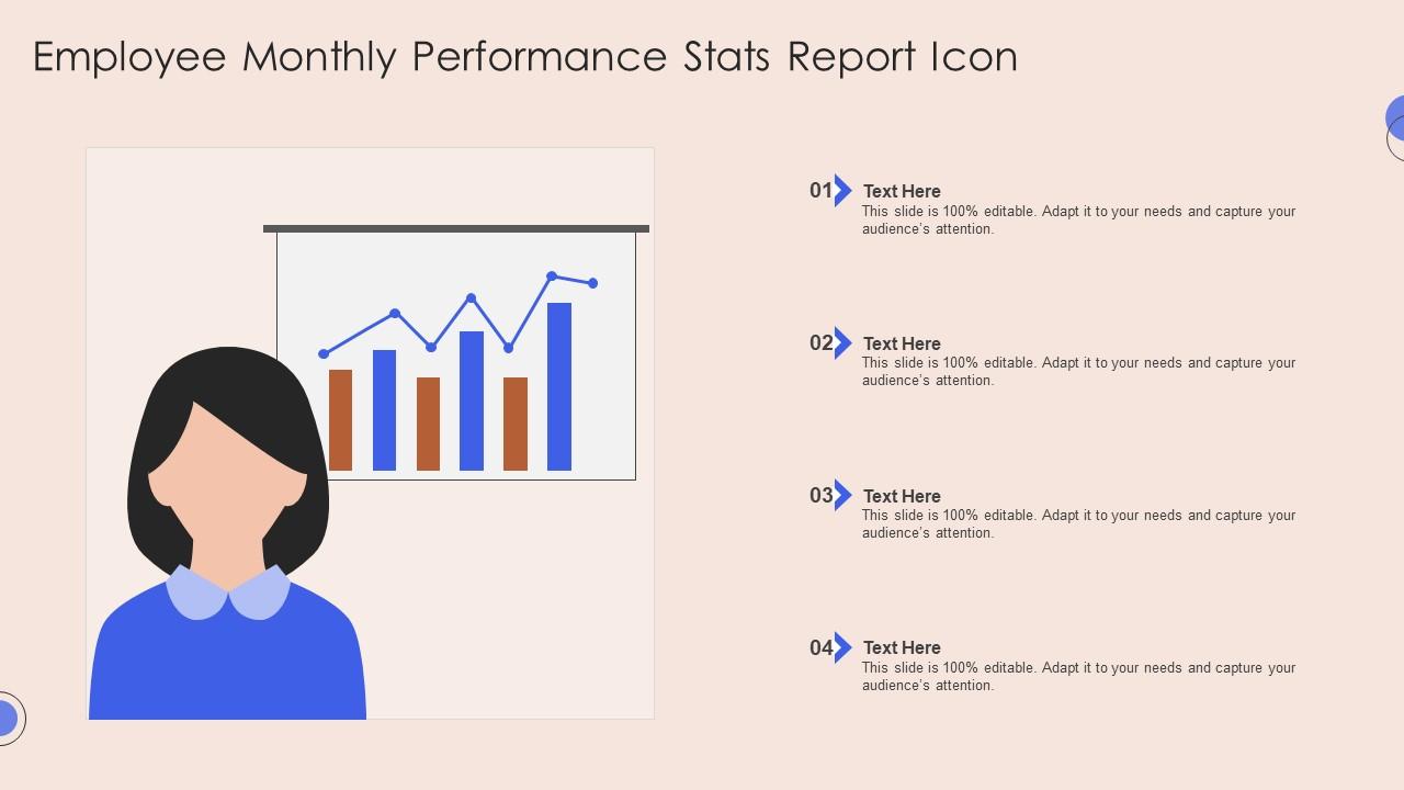
Template 17: Employee Monthly Performance Stats Report Icon
Monthly performance reporting needs a consistent format—one that doesn't have to be rebuilt every reporting cycle. This PowerPoint slide covers four key stages of employee monthly performance, giving HR managers a repeatable structure for presenting staff performance indicators over time. Practitioners who track performance at the individual or team level will find this PPT preset a reliable foundation for monthly reviews. The template is 100% editable and customizable.
Download this PowerPoint Template
Template 18: Parameters of Employee Turnover Rate in Company Stats
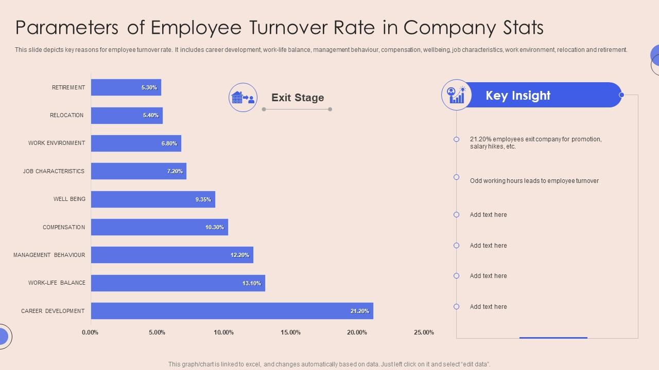
Understanding why employees leave is the first step to reducing attrition. This template maps nine key turnover parameters—from career development and work-life balance to compensation, well-being, and management behavior. You can build compelling employee turnover analysis presentations that give HR leaders a structured view of root causes. Transform your retention conversations today. Download this dynamic template now and unlock a clearer picture of what's driving your attrition rate.
Download this PowerPoint Template
Template 19: Employee Growth and Promotion Stats Report Icon
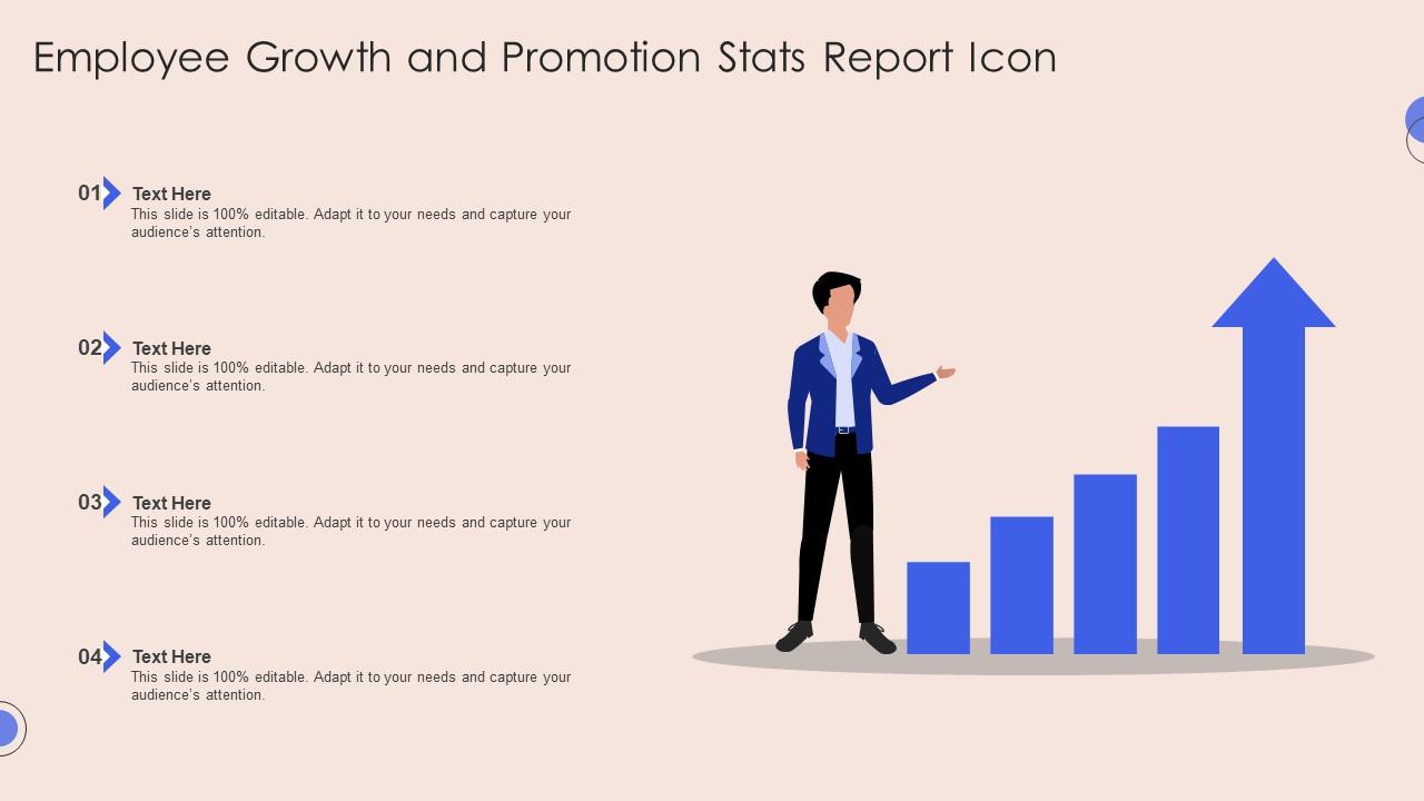
Promotion and growth data tells a workforce story that raw headcount numbers can't. This PowerPoint slide covers four stages of employee growth and promotion, giving HR teams and people managers a visual format for tracking career progression at scale. Practitioners presenting internal mobility data or succession planning outcomes will find this PPT preset keeps the narrative grounded and readable. The template is 100% editable and customizable.
Download this PowerPoint Template
Elevate Your Workforce Reporting with SlideTeam
SlideTeam's PowerPoint templates are the best in the industry for presenting employee stats clearly and credibly. These content-ready slides cover everything from HR KPIs and employee turnover rate summaries to workforce analytics dashboards—saving your team hours of formatting work. Use these PowerPoint slides to turn raw workforce data into decisions leadership can act on. Deploy these ready-made templates and make every HR presentation count.
FAQs on Employee Stats
What percentage of employees worldwide report feeling disengaged at work, and how does this impact organizational productivity?
Roughly 85% of employees globally report feeling disengaged, according to Gallup data. Disengaged workers produce less, miss more days, and leave faster. The direct cost shows up in output per head and in turnover expense. Organizations with high engagement consistently outperform peers on revenue growth and customer retention.
How do employee turnover rates differ across industries, and what are the hidden costs businesses often overlook?
Hospitality and retail see turnover rates above 70% annually; professional services sit closer to 10–15%. The hidden costs most businesses miss are recruitment fees, onboarding time, and the productivity gap during the first 90 days of a new hire. Lost institutional knowledge is rarely counted but often the most expensive part.
What does the data reveal about the correlation between employee recognition programs and retention rates?
Companies with structured recognition programs report 31% lower voluntary turnover than those without. Recognition works best when it is frequent, specific, and tied to real output—not just tenure. Peer recognition programs tend to outperform manager-only models on retention impact. The data is consistent: people stay where their work is seen.
How have remote work statistics shifted employee performance metrics since the rise of hybrid work models?
Remote and hybrid models have shifted performance measurement from hours logged to output delivered. Teams now track project completion rates, meeting attendance, and collaboration tool activity instead of desk time. Employee performance metrics have become more outcome-focused. However, hybrid workers report higher engagement but also higher burnout risk when boundaries aren't set.
What are the most common reasons employees cite for leaving their jobs within the first 90 days?
The top three reasons are: the role didn't match what was described in hiring, the manager relationship started poorly, and onboarding felt disorganized or unsupportive. Most 90-day exits are predictable. The signals appear in the first two weeks. Fix the gap between job description and reality, and early attrition drops sharply.
How do gender pay gap statistics vary across different sectors, and what measurable progress has been made in the last decade?
The gender pay gap sits at roughly 16–18% globally, but varies widely—finance and tech gaps exceed 25%, while education and healthcare are closer to 8–10%. Over the past decade, the gap has narrowed by about 3–5 percentage points in most OECD countries. Progress is real but uneven, with senior leadership roles showing the slowest movement.
What percentage of companies track employee well-being metrics, and how do these organizations perform compared to those that don't?
Around 42% of companies actively track employee well-being metrics. Those that do report 25% lower absenteeism and stronger scores on job satisfaction surveys. The performance gap between well-being-focused and non-focused organizations widens over a three-to-five-year horizon. Well-being tracking works best when it feeds directly into manager action, not just HR reporting.
How does employee tenure correlate with customer satisfaction scores in service-based industries?
In service industries, employees with over three years of tenure consistently deliver higher customer satisfaction scores—typically 10–15% above new-hire averages. Longer tenure builds product knowledge and relationship skills that directly affect service quality. Reducing turnover in customer-facing roles is one of the clearest levers for improving customer experience outcomes.