

 0 Comment
 Customer Reviews

The CFO sends the deck at 11 PM. Everyone's supposed to review it before the board meeting.
Nobody does.
Not because they don't care. Because opening a financial dashboard you didn't build yourself is a specific kind of work. You don't know where to look first. You don't know if the numbers on slide three connect to the chart on slide seven. You don't know if the cash position shown is this quarter or last. And so you skim it, nod in the meeting, and hope someone else asks the right question.
That's the real problem with most financial reporting. Not the data—the presentation of it. The numbers exist. The analysis probably happened. But somewhere between the spreadsheet and the boardroom, the story gets lost. People stop reading. Decisions get made on gut feel instead of the income statement dashboard sitting right in front of them.
What makes it worse is the pressure. Budget reviews, investor updates, quarterly check-ins—each one requires a version of the financial position story that's slightly different. Different audience, different depth, different set of KPIs. And every time, someone's rebuilding the deck from scratch, arguing about whether the cash flow analysis goes before or after the balance sheet numbers.
There's also the credibility problem. An inconsistent layout makes solid financials look shaky. A cluttered chart makes a clean profit margin look suspicious. Executives don't consciously notice bad design—but they do lose confidence in it. The wrong visual can make a healthy business look uncertain.
So the templates exist. Not because finance teams lack skill—they don't—but because structure is the thing that takes forever to get right. A well-built financial position dashboard already knows what needs to go where. The KPIs, the trend lines, the variance flags—they're arranged in a logic that makes sense to the person in the audience, not just the person who built it.
SlideTeam's pre-designed financial position dashboard templates handle exactly this gap. Ready-made layouts that carry the visual logic your data needs, without the three-hour formatting detour.
Here are twenty templates worth knowing about.
Template 1: Performance KPI Dashboard to Measure Financial Position of Organization Ultimate Guide to Financial Planning
Commanding financial clarity starts with the right KPI framework on screen. This template merges comprehensive KPI tracking with instant visual readability for finance leaders. Key metrics like quick ratio, current ratio, cash balance, and Days Sales Outstanding are all surfaced cleanly. Color-coded indicators deliver immediate insight into organizational health at a glance. You gain a structured view of Inventory Outstanding and Payable Outstanding without digging through raw data. Ideal for financial planning reviews, executive briefings, and quarterly performance presentations. Transform your financial position presentations with this powerful, content-ready framework. Download this dynamic template now and unlock sharper financial decision-making.

Download this PowerPoint Template
Template 2: Dashboard for Business Financial Performance Management
Consolidating business financial performance into one cohesive view has never been more efficient. This template surfaces accounts receivable, accounts payable, equity ratio, debt ratio, and current ratio in a single, well-structured dashboard. Each metric is positioned for maximum audience comprehension during high-stakes performance reviews. The layout drives confident conversations about financial health without overwhelming stakeholders with clutter. Perfect for business financial performance management presentations and CFO-level reporting sessions. Use this template to anchor your next financial metrics discussion with undeniable clarity. Download this dynamic template now and elevate your financial performance management presentations instantly.

Download this PowerPoint Template
Template 3: Financial Analysis Dashboard of Corporate Financial Institution
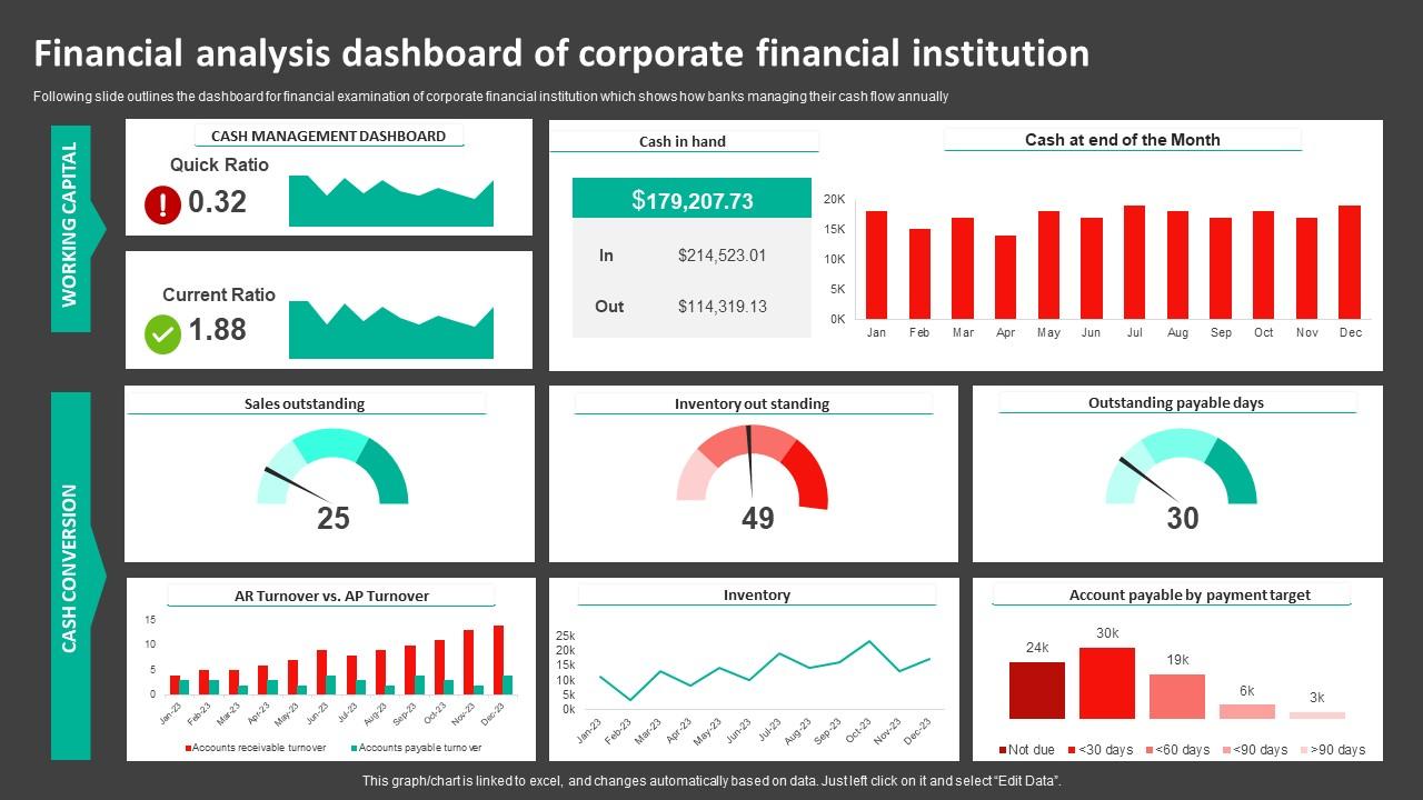
Banks and corporate financial institutions face a specific challenge: communicating annual cash flow patterns clearly to mixed audiences. This PowerPoint slide is built for financial analysts and treasury teams who need to present cash management data with structure and credibility. It covers Cash Management Dashboard metrics, Sales Outstanding, and Inventory Outstanding in one readable layout. So yeah, it's useful for both internal reviews and external stakeholder briefings on financial analysis presentations that demonstrate a company's financial position. The template is 100% editable and customizable.
Download this PowerPoint Template
Template 4: Performance KPI Dashboard to Measure Position Evaluating Company Overall Health Financial Planning
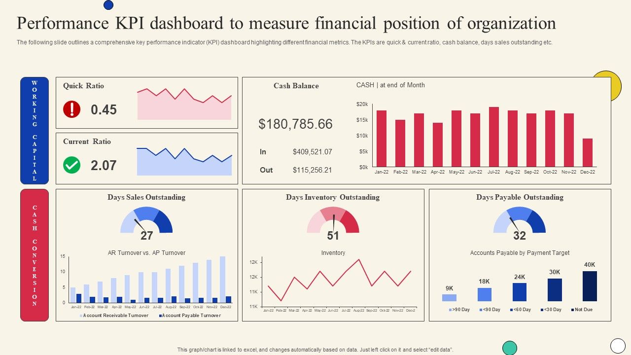
Evaluating company-wide financial health demands a dashboard that speaks clearly across all departments. This template delivers a comprehensive KPI layout covering quick ratio, current ratio, cash balance, and Days Sales Outstanding for complete organizational oversight. Each indicator is presented in a format that drives discussion rather than confusion in leadership forums. Finance teams gain a reliable framework for measuring position across short and long-term planning cycles. Ideal for company financial overview reviews and annual financial health assessments. Transform the way you present organizational financial position. Download this dynamic template now and make every executive conversation count.
Download this PowerPoint Template
Template 5: Financial Management Dashboard for Healthcare Providers
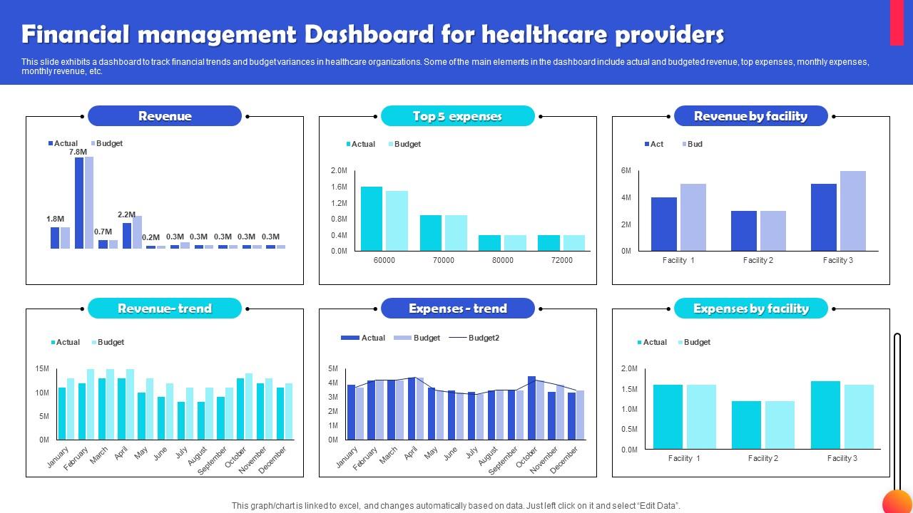
Healthcare finance is one of the harder reporting contexts — budget variances are political, and revenue trends shift fast. This PPT template is built for healthcare CFOs and finance directors who need to track actual versus budgeted revenue side by side. It covers monthly expenses, monthly revenue, and top expense categories in one clean financial tracking layout. For context, it works well in budget management reviews or operational performance sessions with clinical and administrative leaders alike. The template is 100% editable and customizable.
Download this PowerPoint Template
Template 6: Financial Environment Dashboard for Tracking Growth in Banking Industry
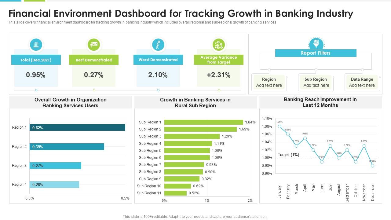
Regional banking growth is rarely uniform, and presenting that complexity clearly is where most financial decks fall short. This PPT preset is built for banking sector analysts and finance teams who need to map overall, regional, and sub-regional growth in a single view. It gives executives a grounded picture of how banking services are expanding across geographies — useful for both internal strategy sessions and board-level financial environment reviews. This slide fits naturally into corporate financial dashboard presentations where geographic segmentation matters. The template is 100% editable and customizable.
Download this PowerPoint Template
Template 7: Financial Position Dashboard PPT Mockup
Visual credibility is half the battle in any financial position presentation. This mockup deck captures audience attention immediately with a polished, professional aesthetic that reinforces the authority of your data. Customizable color schemes let you align every slide with your brand identity in minutes. The pre-designed structure eliminates formatting guesswork so you focus entirely on the financial story. Ideal for executive financial dashboard presentations, investor briefings, and board-level financial status reports. Transform your financial position visuals today with this striking, ready-made deck. Download now and outshine every competitor in the room.
[product_image id=1551976]
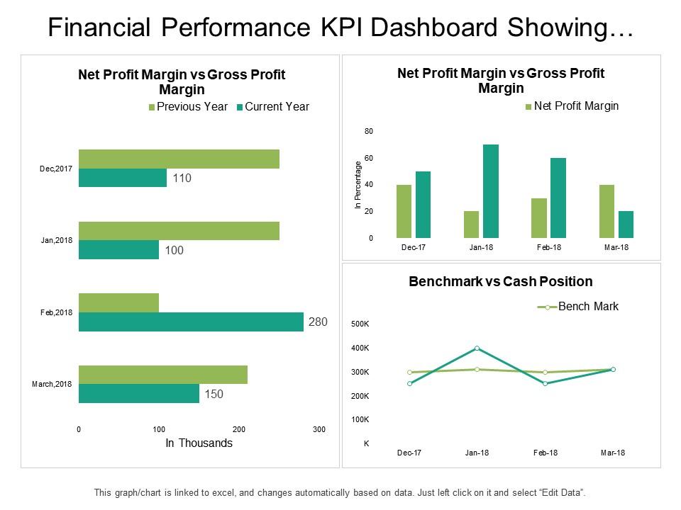
Template 8: Financial Performance KPI Dashboard Showing Benchmark vs Cash Position
Benchmark comparisons matter most when cash position is under scrutiny. This PPT template is built for finance professionals who need to present performance KPIs alongside benchmark targets in a four-stage visual process. It covers Financial Performance, Financial Report, and Financial Review stages with clear visual separation between actual and target cash positions. To be clear, this slide is particularly useful in financial position dashboard presentations where benchmark tracking drives the narrative. The template is 100% editable and customizable.
Download this PowerPoint Template
Template 9: Using Financial Dashboards to Improve Decision Making PPT Guidelines
Decision-making quality rises when financial dashboards are built for clarity, not just completeness. This deck empowers finance leaders to present data-driven insights in a format that drives action rather than confusion. A flexible color theme adapts instantly to audience expectations—boardroom-conservative or investor-bold. The content-ready structure removes the guesswork from organizing complex financial data across multiple slides. Perfect for financial analysis dashboard presentations and business intelligence sessions where stakeholder confidence is on the line. Transform your decision-making presentations with this powerful, ready-made framework. Download this dynamic template now and elevate your financial reporting impact.
[product_image id=1705674]
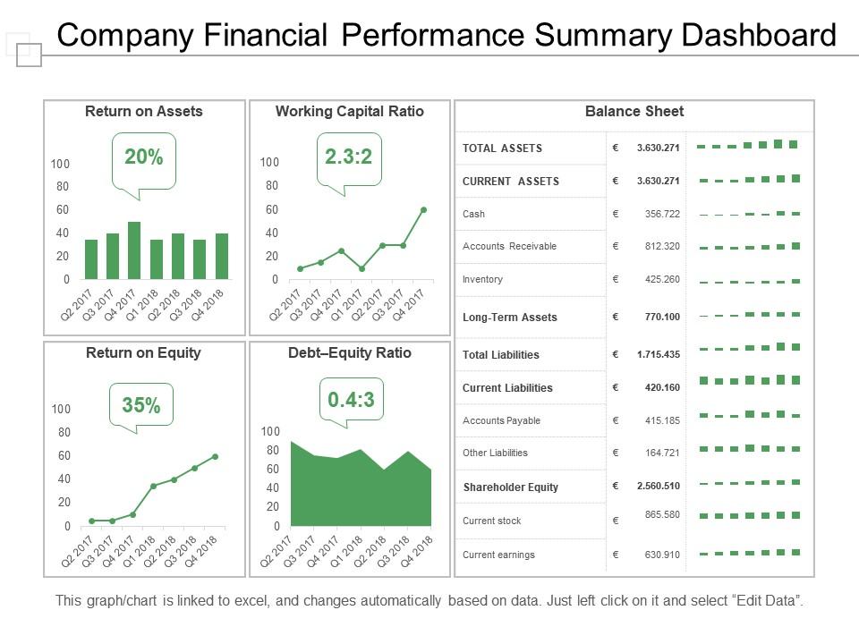
Template 10: Company Financial Performance Summary Dashboard Presentation Slides
Summarizing company financial performance for a mixed audience is harder than it looks. This deck is built for finance leads who need a clean, structured summary view that travels well from boardroom screens to printed handouts. It captures performance data in a format that non-finance stakeholders can read without a guide. Btw, it works equally well for quarterly financial summary reports and annual performance wrap-ups. The template is 100% editable and customizable.
Download this PowerPoint Template
Template 11: Dashboard to Track Organizational Cash Flow Management Position PPT Outline
Cash flow storytelling requires a deck that keeps the audience anchored to the numbers, not the formatting. This complete deck captures organizational cash flow data in a structured, audience-ready format that adapts to any reporting context. A flexible color theme means you can match stakeholder preferences without rebuilding layouts from scratch. Finance teams gain a reliable framework for presenting cash flow management position across review cycles. Ideal for cash flow dashboard presentations, quarterly financial reviews, and leadership briefings on operational liquidity. Transform your cash flow presentations today with this engaging, content-ready deck. Download now and make your financial data impossible to ignore.
[product_image id=1716798]
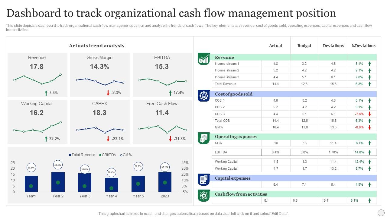
Template 12: Dashboard to Track Organizational Cash Flow Management Position
Understanding where cash actually goes requires a dashboard that shows the full picture, not just the headline number. This template delivers a structured view of revenue, cost of goods sold, operating expenses, capital expenses, and cash flow from activities in one cohesive layout. Trend analysis built into the design gives finance teams an instant read on cash flow direction across reporting periods. Actuals and trend data sit side by side for immediate variance recognition during executive reviews. Perfect for cash flow dashboard presentations, operational finance briefings, and CFO-level quarterly updates. Transform your cash management presentations today with this powerful, ready-made template. Download now and drive sharper financial conversations.
Download this PowerPoint Template
Template 13: Financial Management Dashboard for Executives PPT Summary
Executives need financial dashboards that respect their time and sharpen their focus. This deck delivers a clean, innovation-forward design that lets CFOs and finance directors present KPIs without drowning the audience in detail. A flexible color scheme adapts instantly to corporate branding standards across any organization. The pre-built structure eliminates slide-building delays so leadership teams can focus on the conversation. Perfect for executive financial dashboard presentations, board pack preparation, and investor relations updates. Transform your executive reporting today with this polished, ready-made deck. Download now and leave a lasting impression in every high-stakes financial review.
[product_image id=1480709]
Template 14: Illustrating Financial Position Overview PPT Summary
Giving stakeholders a clear financial position overview without overloading them is a design problem as much as a data problem. This PPT preset is built for finance professionals who need to present company financial overview data in a format that's immediately readable by non-specialists. It combines creative layout with functional structure, making it suitable for investor decks, lender briefings, and internal leadership reviews. So, it's a practical choice when the audience ranges from CFOs to department heads in the same room. The template is 100% editable and customizable.
[product_image id=1470248]
Template 15: Financial Dashboard for Startups and SMEs PPT Structure
Startups and SMEs face a different financial reporting challenge—making limited data look credible and growth-oriented. This deck delivers a polished financial dashboard structure built for founders, finance leads, and small business operators who need investor-ready slides fast. The adaptable color theme ensures every presentation matches brand identity without custom design work. Pre-built layouts mean your key financial metrics are framed professionally from the first slide. Ideal for startup financial planning reviews, SME budget management presentations, and early-stage investor pitches. Transform your startup financial presentations today with this powerful, content-ready deck. Download now and give your numbers the presentation they deserve.
[product_image id=1832265]
Template 16: Financial Dashboard for Startup Success PPT Graphics
Startup success hinges on presenting financial traction as convincingly as achieving it. This deck delivers a visually compelling financial dashboard layout built for founders and growth-stage finance teams who need to impress quickly. Effortless element adjustment means you can tailor every slide to reflect the specific financial metrics your investors care about. The structured design keeps audiences focused on ROI, burn rate, and growth trajectory without distraction. Perfect for startup financial dashboard presentations, seed round pitches, and accelerator demo day financial reviews. Transform your startup's financial story today with this engaging, ready-made deck. Download now and make your financial position undeniable.
[product_image id=1641095]
Template 17: Financial Performance Tracking Dashboard for Professionals PPT Summary
Professionals tracking financial performance need a dashboard deck that matches the seriousness of the work. This template combines visual creativity with structural versatility to deliver financial performance tracking slides that hold audience attention through complex reviews. Customizable color schemes let you align instantly with corporate branding standards or client-specific requirements. The pre-designed layout ensures your financial KPI data is framed with the visual authority it deserves. Ideal for financial performance tracking reviews, professional financial reporting, and financial KPI dashboard presentations. Transform your financial tracking presentations today with this polished, professional deck. Download now and set a new standard for every financial performance update.
[product_image id=1576190]
Template 18: Financial Environment Dashboard for Tracking Growth PPT Structure
Tracking financial growth trends across environments requires a deck that holds structure while staying visually clear. This PPT preset is built for finance professionals and analysts who need to present financial environment data in a way that non-technical stakeholders can follow. It balances creative design with functional layout, making it suitable for annual financial review presentations and growth tracking briefings. So yeah, it works well when the audience includes both finance leads and operational decision-makers reviewing Real-Time Financial Data. The template is 100% editable and customizable.
[product_image id=1778014]
Template 19: Dashboard for Financial Portfolio Analysis PPT Summary
Portfolio analysis needs a visual format that makes asset allocation and performance patterns immediately readable. This PPT deck is built for investment analysts, wealth managers, and corporate finance teams who present multi-asset portfolio data to stakeholders. It pairs visual clarity with a flexible layout, making it suitable for both internal financial analysis dashboard reviews and client-facing portfolio briefings. For context, this slide fits naturally into broader financial data analytics presentations where comparative performance drives the narrative. The template is 100% editable and customizable.
[product_image id=1539634]
Elevate Every Financial Review with SlideTeam
SlideTeam's PowerPoint templates are the best in the industry for building a compelling financial position dashboard. These content-ready slides save hours of formatting time while delivering the professional structure that executives and investors expect. Whether you need a Balance Sheet Dashboard, a Cash Flow Dashboard, or a full Financial KPI Dashboard, these ready-made layouts have you covered. Deploy these PowerPoint slides to drive sharper decisions and ensure every financial review lands with authority.
FAQs on Financial Position Dashboard
What are the essential KPIs that should be included in a financial position dashboard for a mid-sized enterprise?
Focus on liquidity first: current ratio and quick ratio are non-negotiable. Add cash balance, Days Sales Outstanding, accounts receivable, and accounts payable for operational visibility. Then include debt-to-equity ratio and net profit margin for financial health context. These six to eight KPIs cover the core picture for most mid-sized enterprises without overloading the dashboard with noise.
How can a financial position dashboard differentiate between short-term liquidity metrics and long-term solvency indicators?
Group metrics visually by time horizon. Short-term liquidity — current ratio, quick ratio, cash balance — sits in one panel. Long-term solvency indicators — debt-to-equity, interest coverage, net asset value — sit in another. Use clear section labels and distinct color bands to signal the difference. Mixing them in one unstructured view is the most common source of stakeholder confusion.
What visualization techniques are most effective for displaying debt-to-equity ratios in a financial dashboard?
A horizontal bar chart works best for comparing debt-to-equity ratios across business units or time periods. Gauge charts are effective for showing where a single ratio sits relative to a benchmark. Avoid pie charts — they distort proportional relationships. Color coding (green for healthy range, red for breach) adds immediate context without requiring the viewer to read axis labels closely.
How frequently should financial position dashboards be updated to ensure accurate real-time decision-making?
For operational decisions, daily or weekly updates are standard. For board-level reporting, monthly is typical — with quarterly deep-dives for strategic reviews. The update frequency should match the decision cycle, not the data availability. Refreshing a dashboard daily when decisions are made monthly just creates noise and erodes trust in the numbers.
What role does cash flow analysis play in a comprehensive financial position dashboard?
Cash flow analysis answers the question that balance sheets don't: can the business meet its obligations right now? A complete financial position dashboard needs operating, investing, and financing cash flows shown separately. Trend lines across six to twelve months matter more than a single period snapshot. Without cash flow visibility, liquidity risk stays hidden until it becomes a crisis.
How can color-coding conventions be standardized across financial dashboards to improve stakeholder readability?
Set a firm three-color convention: green for on-target or above benchmark, amber for within an acceptable tolerance band, red for breach or alert. Apply it consistently across every metric, every dashboard, every team. Document the thresholds so any stakeholder can interpret any dashboard without a briefing. Inconsistent color logic is the fastest way to lose audience trust in a financial reporting tool.
What are the common pitfalls to avoid when designing a financial position dashboard for executive presentations?
Three mistakes dominate: too many metrics on one screen, inconsistent time periods across charts, and no clear hierarchy of information. Executives read dashboards in under two minutes. Lead with the three or four numbers that require a decision. Put context and detail behind them. A cluttered financial position dashboard signals that the presenter hasn't decided what matters — and neither will the audience.
How should a financial position dashboard handle multi-currency data for multinational corporations?
Choose a reporting currency and convert all figures to it before display — show conversion rates and the date they apply. Flag currencies that carry significant volatility risk with a visible marker. For regional breakdowns, display local currency alongside the converted figure. The goal is one consistent baseline for decision-making, with enough transparency that finance teams can trace any number back to its source.