

 0 Comment
 Customer Reviews

The deck's been sent. The meeting's in forty minutes.
And somewhere between the raw data exports and the slide you promised the CFO, there's a gap. Not a technical one—the numbers exist, the spreadsheets are updated, the team knows what's happening. The gap is presentation. Specifically, turning a wall of KPI data into something a room full of executives will actually absorb in under three minutes.
That's the part nobody talks about. KPI reporting dashboards aren't hard to build in theory. You pick your metrics, you pull your data, you arrange it logically. Simple. Except when you're staring at blank slides at 9 PM wondering whether revenue trends go left or right, whether the progress bars read clearly, whether the status colors make sense to someone who didn't build the thing.
And then there's the audience problem. A sales dashboard doesn't look like an HR dashboard. A project management dashboard reads differently from a financial one. What works for a Monday standup doesn't work for a board presentation. Every reporting context is a different visual language—and most people don't have time to learn each one from scratch.
That's what makes KPI reporting dashboard templates genuinely useful. Not because they do the thinking for you, but because they handle the part that burns the most time: structure. The layout decisions. The visual hierarchy. The choice between a bar chart and a gauge. Someone already made those calls, and made them well.
SlideTeam's pre-designed KPI dashboard templates exist for exactly this reason. They cover the full range—executive dashboards, operational dashboards, sales pipeline views, HR headcount reports, SLA tracking, e-commerce revenue monitoring. Ready-made frameworks that take the formatting burden off your plate so you can focus on the actual data story.
Here's what's available.
Template 1: KPI Dashboard for Tracking Project Brief Status
Empower project managers to track every critical project KPI in one unified view. This dashboard captures project title, tag, responsibility, assigned date, team, progress, deadline, and status. Color-coded progress indicators deliver instant visual clarity across all active projects. You gain complete oversight without toggling between multiple tracking tools. Every element is fully editable, ensuring seamless alignment with your project workflows. Built for professional presentations, it commands attention and drives faster decisions. Transform your project reporting with structured, data-driven clarity. Download this template now and take confident control of every project brief.

Download this PowerPoint Template
Template 2: KPI Dashboard for Service Level Agreement Report
Pinpoint SLA errors before they escalate with this focused KPI reporting dashboard. It captures critical, high, and overdue ticket categories while putting the spotlight on company overview. Visualizing SLA performance gaps drives faster corrective action and efficiency gains. Each metric translates directly into an improvement opportunity your team can act on. Fully editable in PowerPoint, it fits any reporting workflow without friction. Use it to present SLA performance reviews that stakeholders get. Transform your service reporting today. Download this dashboard template now and start identifying SLA gaps with precision.
[product_image id=1081995]
Template 3: Headcount Reporting KPI Dashboard Provided by Various Departments
Give HR leaders a clear view of workforce movement across every department. This dashboard tracks employee headcount, hires, terminations, turnover, and rate—all in one place. Departmental breakdowns make it easy to spot staffing imbalances at a glance. Employee persona data adds context. Fully customizable layouts mean you adapt it to your organization's exact structure. It's the kind of ready-made HR KPI framework that SlideTeam's dashboard template collection is built around. Transform your headcount reporting presentations today.
[product_image id=971130]
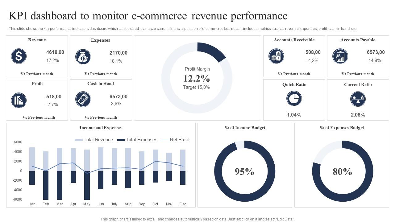
Template 4: KPI Dashboard to Monitor E Commerce Revenue Performance
Analyze your e-commerce business's financial position with this revenue performance dashboard. It surfaces key metrics including revenue, expenses, profit, and cash on hand instantly. Visual comparisons of accounts receivable against targets highlight cash flow risks early. Decision-makers get the financial snapshot they need without sorting through raw data. Every element is editable, letting you match the layout to your reporting cadence. It works equally well for weekly reviews and executive board presentations. Transform your e-commerce financial reporting today. Download this KPI dashboard template now and present revenue performance with confidence.
Download this PowerPoint Template
Template 5: Customizable KPI Dashboard For Reporting Needs PPT Information AT
Deliver KPI reports that hold attention from the first slide to the last. This fully customizable deck adapts to any reporting need without sacrificing visual impact. Elements adjust effortlessly across Microsoft PowerPoint and Google Slides workflows. Available in JPG, JPEG, PNG, and PDF formats, sharing and editing stay frictionless. Color theme controls let you match every slide to your brand identity precisely. It handles the structural complexity of KPI reporting so you focus on insights. Transform your reporting presentations today. Download this customizable KPI dashboard deck now and make every metric count.
[product_image id=1656567]
Template 6: KPI Dashboard PPT For Effective Reporting PPT
Present KPI data that captures and holds your audience's full attention. This effective reporting deck merges visual appeal with clear metrics communication. Compatibility with Microsoft PowerPoint and Google Slides ensures it fits your existing workflow. Download and adjust elements in minutes—no design expertise required. Color theme flexibility means the deck aligns with any organizational brand standard. Transform your KPI reporting presentations today. Download this effective dashboard deck now and elevate every performance update you deliver.
[product_image id=1445740]
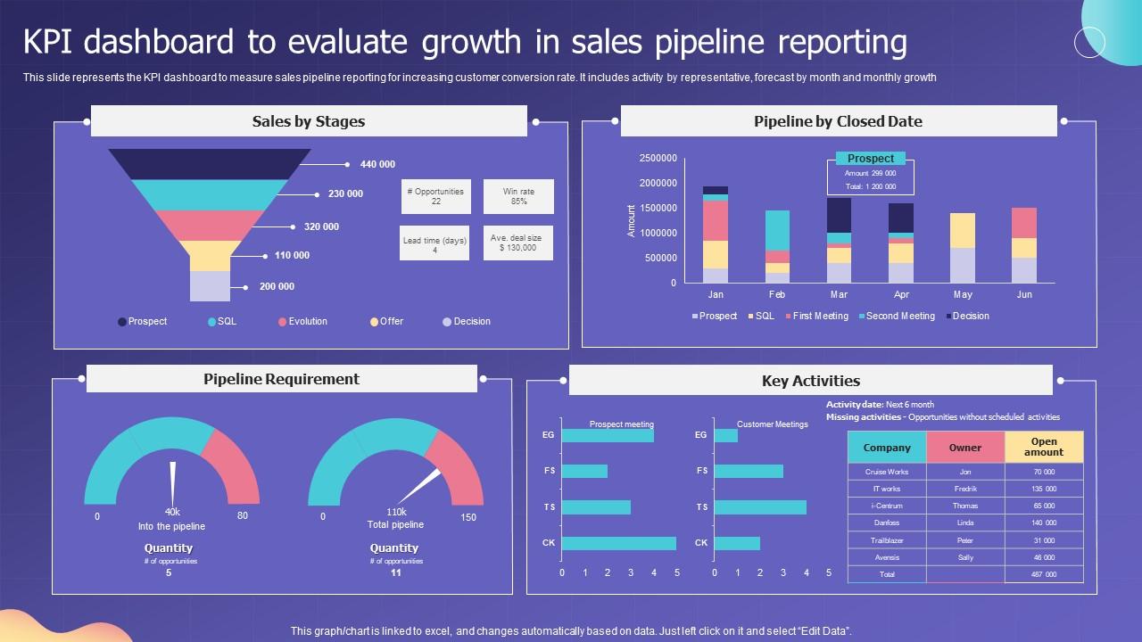
Template 7: KPI Dashboard to Evaluate Growth in Sales Pipeline Reporting
Accelerate sales pipeline decisions with this growth-focused KPI reporting dashboard. It tracks activity by representative, monthly forecast, and month-over-month pipeline growth. Sales-by-stage breakdowns reveal exactly where deals stall and conversions happen. Pipeline-by-closed-date views give managers the forward visibility they need to act. Every section is editable, so your sales team presents data in real-time reporting format. The structured layout drives faster pipeline reviews and sharper conversion strategies. Transform your sales dashboard presentations today. Download this template now and unlock growth visibility across your entire sales pipeline.
Download this PowerPoint Template
Template 8: Automated KPI Dashboard for Client Reporting Insights PPT Information
Automate your client reporting workflow with this high-impact KPI insights deck. The design merges creativity with data functionality, ensuring your metrics story lands clearly. Microsoft PowerPoint and Google Slides compatibility makes it a universal reporting tool. Adjust fonts, colors, and layout elements in minutes to fit each client's context. JPG, JPEG, PNG, and PDF export options make sharing fast and format-agnostic. From client pitches to management updates, it elevates every reporting touchpoint. Transform your client KPI reporting today. Download this automated insights deck now and deliver polished reports every single time.
[product_image id=1800631]
Template 9: Automated KPI Dashboard for Client Reporting and Insights
Combine visual design with full reporting functionality in this client KPI deck. Pre-designed layouts eliminate setup time while preserving complete customization freedom. Font, color, and layout adjustments take minutes—no design background needed. Compatibility with Microsoft PowerPoint and Google Slides keeps your workflow uninterrupted. It performs equally well in boardroom meetings and client pitch sessions. Transform your client reporting presentations today. Download this automated KPI dashboard deck now and leave a lasting impression on every audience.
[product_image id=1679571]
Template 10: Automated KPI Dashboard for Client Reporting and Analysis
Drive smarter client conversations with this analysis-focused automated KPI dashboard deck. The design balances visual clarity with data depth, keeping complex metrics readable. Pre-built layouts save significant time without limiting your reporting flexibility. Customize fonts, colors, and content to match any client's brand or preference. Microsoft PowerPoint and Google Slides compatibility ensures smooth delivery every time. Transform your client analysis presentations today. Download this KPI dashboard deck now and turn raw data into compelling client narratives.
[product_image id=1776926]
Template 11: KPI Dashboard for Effective Reporting PPT Designs
Engage every audience with a KPI reporting deck built for impact. This 100% editable design blends creativity with reporting precision across all slides. Color scheme and element customization align the deck perfectly with your brand identity. Microsoft PowerPoint and Google Slides compatibility removes any workflow friction. Pre-designed layouts save time while keeping your content front and center. Transform your KPI reporting presentations today. Download this effective dashboard deck now and outperform competitors with every slide you deliver.
[product_image id=1548502]
Template 12: Automated KPI Dashboard for Client Reporting and Insights PPT
Secure client trust with this polished automated KPI reporting insights deck. Visual design and functional layout work together to communicate metrics with clarity. Full font, color, and layout customization adapts the deck to any client context. Microsoft PowerPoint and Google Slides integration keeps your reporting process smooth. Pre-designed slides reduce preparation time without sacrificing professionalism or depth. Transform your client KPI presentations today. Download this automated template now and make your reporting the most memorable in the room.
[product_image id=1612160]
Template 13: Interactive KPI Dashboard for Executive Reporting PPT Presentation
Elevate executive reporting with this interactive KPI dashboard PowerPoint deck. Simplicity and innovation combine to create slides that hold senior stakeholder attention. Color theme adjustments let you match the deck to your company's exact identity. Ready-made design saves preparation time while delivering a polished, credible presentation. Compatible with Microsoft PowerPoint and Google Slides for flexible, cross-platform delivery. Download in JPG, JPEG, or PNG to share with executive teams instantly. Transform your executive dashboard presentations today. Download this interactive KPI deck now and impress the stakeholders who matter most.
[product_image id=1729346]
Template 14: Interactive KPI Dashboard PowerPoint for Effective Reporting
Command the boardroom with this interactive PowerPoint KPI dashboard reporting deck. The design strikes a precise balance between simplicity, clarity, and visual innovation. Adjust color themes and elements to align perfectly with your company's brand. Ready-made layouts eliminate hours of formatting work before key presentations. Transform your executive KPI reporting today. Download this interactive dashboard template now and outshine every competitor in your next high-stakes presentation.
[product_image id=1463931]
Template 15: Maintenance KPI Reporting and Dashboard PPT
Tackle maintenance KPI reporting with a deck built for operational clarity and speed. This template balances simplicity with innovation, making complex maintenance metrics accessible. Color theme flexibility ensures the deck reflects your organization's visual standards precisely. Ready-made design reduces preparation time without limiting your customization options. Microsoft PowerPoint and Google Slides compatibility keeps it practical across all teams. Download in JPG, JPEG, or PNG for easy sharing with maintenance and ops teams. Transform your maintenance reporting presentations today. Download this KPI dashboard deck now and present operational performance data with authority.
[product_image id=1548643]
Template 16: Executing Reporting KPI Dashboard Showing Revenue PPT Outline
Present revenue-focused KPI data with a deck designed for executive impact. This reporting dashboard highlights revenue performance in a visually compelling, data-driven format. Creative design and reporting functionality combine to make every metric stand out. Microsoft PowerPoint and Google Slides compatibility integrates it into any reporting workflow. Customize fonts, colors, and layouts to match stakeholder expectations and brand standards. Transform your revenue reporting presentations today. Download this executing KPI dashboard deck now and drive sharper financial decisions across your organization.
[product_image id=1777950]
Template 17: Automated KPI Dashboard for Client Reporting Needs
Streamline client reporting with this automated KPI dashboard mockup deck. Clean, functional design ensures your KPI metrics communicate to every audience. Element and color adjustments take minutes across Microsoft PowerPoint and Google Slides. Pre-built layouts remove the formatting burden so you focus on the data story. It adapts to any client's reporting preference without requiring extra design work. Transform your client KPI reporting today. Download this automated mockup deck now and deliver reports that clients trust and remember.
[product_image id=1688059]
Template 18: Automated KPI Dashboard for Client Reporting Ease
Make client KPI reporting faster without making it less impressive. This automated mockup deck merges ease of use with high-impact visual design. Color theme controls and element editing ensure every slide fits the client context. Microsoft PowerPoint and Google Slides compatibility keeps your reporting workflow agile. Thoughtfully crafted layouts grab audience attention from the first slide onward. Transform your KPI reporting ease today. Download this automated client dashboard deck now and reclaim hours spent formatting while delivering better results.
[product_image id=1718998]
Template 19: Automated KPI Dashboard for Client Reporting Efficiency
Maximize reporting efficiency without compromising on professional visual quality. This automated KPI dashboard deck captures audience attention from the opening slide. Customizable color themes and editable elements adapt the deck to any reporting context. Microsoft PowerPoint and Google Slides compatibility ensures delivery flexibility across all platforms. JPG, JPEG, PNG, and PDF export options keep distribution fast and format-agnostic. Transform your reporting efficiency today. Download this automated dashboard deck now and present KPI performance with the polish your audience expects.
[product_image id=1610482]
Template 20: Executing Reporting KPI Dashboard PPT Designs
Execute KPI reporting presentations that demand attention and deliver clarity. This deck balances design innovation with reporting simplicity for maximum audience impact. Color theme and element customization align every slide with your company's identity. Ready-made layouts work across Microsoft PowerPoint and Google Slides without modification. It's fully editable, giving you complete creative control over every reporting detail. Transform your executing KPI dashboard presentations today. Download this deck now and outshine competitors in every performance review you lead.
[product_image id=1797836]
Transform KPI Reporting with SlideTeam
SlideTeam's PowerPoint templates are the best in the industry for KPI reporting dashboards. These content-ready slides save hours of formatting work while delivering the professional clarity executives and stakeholders expect. From sales pipeline reviews to HR headcount reports, each ready-made dashboard template structures your data story instantly. Deploy these pre-designed frameworks now to drive smarter decisions and make every KPI presentation count.
FAQs on KPI reporting dashboard
What are the most critical KPIs that should be featured on an executive-level reporting dashboard?
Focus on four to six metrics that directly reflect business health. Revenue vs. target, operating costs, customer acquisition cost, and net promoter score cover most executive needs. Add one or two metrics specific to your industry or current business priority. Keep the dashboard to one screen — executives read dashboards, they don't study them.
How do you determine the right data visualization format for types of KPIs on a dashboard?
Match the format to what the KPI measures. Use bar charts for comparisons, line charts for trends over time, and gauges for targets with clear thresholds. Avoid pie charts for more than three categories — they lose clarity fast. The rule is simple: if the format needs a legend to explain itself, pick a different one.
What is the difference between a strategic KPI dashboard and an operational KPI dashboard?
A strategic KPI dashboard tracks long-term goals — annual revenue growth, market share, or ROI. An operational dashboard tracks daily or weekly activity — order volumes, ticket resolution times, or headcount. Strategic dashboards inform direction. Operational dashboards inform action. Most organizations need both, refreshed at different intervals.
How often should KPI reporting dashboards be refreshed to ensure data accuracy and relevance?
Refresh frequency depends on the KPI type. Operational KPIs — like sales activity or support tickets — need daily or real-time updates. Strategic KPIs — like quarterly revenue or annual retention — refresh monthly or quarterly. Stale data on an operational dashboard is more dangerous than no dashboard at all.
What are the common pitfalls to avoid when designing a KPI reporting dashboard for stakeholders?
The biggest mistakes are showing too many metrics, using inconsistent scales, and skipping context. A KPI without a target or benchmark is just a number. Stakeholders need to know if a metric is good or bad — not just what it is. Also avoid metrics that look impressive but don't connect to any decision.
How can color coding and visual hierarchy improve the readability of a KPI dashboard?
Use red, yellow, and green consistently for status — never decoratively. Place the most critical KPIs in the top-left; that's where eyes land first. Larger font size signals higher priority. Limit your color palette to three or four colors total. Visual hierarchy tells the reader what to look at first, second, and last.
What role does benchmarking play in making KPI dashboards more meaningful and actionable?
Benchmarking turns a raw number into a judgment. Knowing revenue is $2M means little without knowing the target was $2.5M or the industry average is $1.8M. Use internal benchmarks — prior period, annual target — for operational KPIs. Use external benchmarks — industry averages, competitor data — for strategic ones. Both types drive better decisions.
How do you balance the amount of data displayed on a dashboard without causing information overload?
Apply the one-screen rule: if it doesn't fit without scrolling, it's too much. Limit dashboards to eight to twelve KPIs maximum. Group related metrics together and let whitespace separate them. If stakeholders need more detail, link to a drill-down report — don't add it to the dashboard itself.