


17817797 style puzzles matrix 6 piece powerpoint presentation diagram infographic slide






Try Before you Buy Download Free Sample Product
 Impress Your
 Audience
 100%
100% Editable
 Save Hours
 of Time


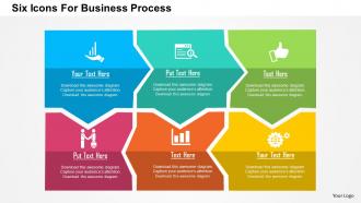
Completing specified tasks in a business setting on time is the most important aspect of any business. Without proper knowledge of the workflow technique, team members, colleagues or employees tend to sway away from the path, leading to loss of business objectives like revenue and market lead. An efficient tool is needed to inform them from time to time of these procedures so that mistakes can’t be repeated. Our six icons for business process Presentation deck is the right tool for this purpose. Whether you are a business owner or a team leader or a manager of a project team, everyone will benefit from this PPT design. This PPT example is geared to take your business operations to new heights. The attractive PPT infographics make complete use of the available space. The icons and PPT diagrams are evenly placed across the length and breadth of the PPT example file. Text boxes add more information to the meaning of the slide. Energy flow gets a big boost by our Six Icons For Business Process Flat Powerpoint Design. They contain the goodness of an elixir.
17817797 style puzzles matrix 6 piece powerpoint presentation diagram infographic slide with all 5 slides:
Bask in the warmth of our Six Icons For Business Process Flat Powerpoint Design. Enjoy the heartfelt glowing response of your listeners.
FAQs for 17817797 style puzzles matrix 6 piece powerpoint presentation
Oh those are just little graphics that show workflow steps - like arrows, gears, people, documents, whatever fits your process. They're honestly a game changer because nobody wants to read paragraph after paragraph to understand how something works. Way easier to scan icons and get it instantly. You can map out workflows, decision points, all that stuff. Just don't go crazy with them (I've seen some truly chaotic presentations). Stick to one style and use them strategically. Clean icons beat cluttered bullet points every single time, trust me on this one.
Those icons are honestly game-changers for mapping out workflows. You know how nobody wants to read through paragraphs of process descriptions? Icons fix that. A gear means process, diamond means decision point - boom, instant understanding. Your team can actually scan the whole flow in seconds instead of getting lost in text walls. Plus when you're training new people, they won't feel totally overwhelmed trying to decode everything. I swear it's like having visual cliff notes for your business processes. Next time you're documenting something complex, try icons first and watch how much faster people actually get it.
For business process icons, clarity beats everything else. Simple works best - complex icons turn into a blurry mess when they're small. Use stuff people already know, like gears for processes or arrows showing flow. I swear, half the icons I see look like someone's art project instead of actually helping users navigate. Keep your whole set styled the same way. Test them with real people who'll actually use your system - you might be surprised what confuses them. Good contrast matters for accessibility too. Bottom line: if someone has to think about what your icon means, you've already lost them.
Oh totally! Banks and finance companies always go super minimal - those clean line icons that look "professional and secure." Tech companies can be way more fun with colors and playful stuff. Healthcare keeps it dead simple since confusion = bad news there. Creative agencies? They go wild with custom illustrations that match their vibe. Manufacturing usually picks whatever's most functional over pretty. Honestly, I'd peek at what your competitors are doing first. Then either match that style or go completely opposite to stand out - both work, just depends on your goals.
Colors totally change how people read your process icons. Red/orange scream "problem!" or urgency. Blues and greens? They feel calm and efficient. I swear I've seen flowcharts that looked like someone went crazy with a highlighter set - just distracting mess. Keep it simple: 2-3 colors tops. Maybe blue for normal steps, green when something's done, orange for slowdowns. People pick up on these emotional signals before they even read your text, so don't overthink it but be consistent.
Totally! Custom icons make such a difference - your slides instantly look way more professional than everyone else's generic PowerPoint clipart. I've watched presentations go from meh to impressive just by switching to branded icons that match company colors. People notice that attention to detail, even if they don't realize it. But here's the thing - they actually need to help explain your content, not just be decoration. Otherwise you're basically putting lipstick on a pig, you know? I'd start small though. Pick maybe 5 core processes you present all the time and get custom icons made for those first.
Honestly, the worst thing you can do is mix different icon styles - like throwing flat icons next to 3D ones. Looks super messy. Also, those generic gear wheels for "process"? Nobody knows what that actually means. I learned this the hard way on a project last year. Stick with one visual style throughout, and pick icons that actually make sense. Test them on someone else first - if they're squinting and asking "what's this supposed to be?" then you need clearer ones. Simple beats fancy every time.
Dude, icons are like visual shortcuts for your brain. When you see that little gear symbol, you don't have to think "oh this must be settings" - you just know. Your audience won't waste mental energy reading labels when they could be focusing on the actual workflow instead. Business processes are already confusing enough without making people decode everything from scratch. Honestly, I started using them way more after realizing how much cleaner my diagrams looked. Just swap 2-3 text boxes for simple icons next time and you'll see what I mean.
Icons are like a shortcut for your brain - everyone instantly gets what a gear means (process step) without reading paragraphs of explanation. Super helpful when you're scanning project boards quickly to find bottlenecks. They work great with remote teams too since visuals translate across languages. Honestly, I used to think they were just decoration, but they actually make everything way more scannable. No more drowning in text walls trying to figure out project status. Just pick a consistent icon set and stick with it - your team will thank you later.
Yeah definitely! Canva and Figma are solid for this - Adobe Illustrator too if you're feeling fancy. But honestly? I've watched people waste entire afternoons tweaking tiny details on icons when they could've just used existing ones. Icon libraries like Flaticon or Noun Project are clutch - you can grab their business process sets and customize the colors to match your brand. Way faster than starting from zero. I'd check those template libraries first, see what's out there before you dive into creating everything yourself.
Dude, those animated process icons are honestly game-changers for presentations. You can show arrows growing between steps or make icons pulse when you're talking about that specific part. Way better than boring static slides that put people to sleep. Just don't go overboard with the animations - I've sat through some presentations that looked like a disco ball exploded. Focus on one icon at a time as you walk through each step. It keeps people's attention locked in and makes complicated workflows actually make sense. The movement should highlight your main points, not distract from them.
Dude, icons are game-changers for presentations. I used to bore people to death with text-heavy slides until I figured this out. Your brain processes visuals like 60,000 times faster than words, so people actually retain stuff better when you show instead of tell. Replace maybe 3-4 bullet points with clear icons next time - honestly, engagement can jump up to 30%. Just don't go overboard with random decorative ones (I've seen that disaster). Use them to guide people through your process flow. Trust me, you'll notice the difference immediately when folks aren't zoning out.
Dude, consistency is everything when it comes to icons. I learned this the hard way after throwing together a presentation with icons from like 4 different websites - it looked terrible. Mixing different styles and weights just creates this visual mess that pulls attention away from what you're actually trying to say. Pick one icon family and stick with it. Seriously, your whole deck will look way more professional. Nobody wants to sit through a presentation where the visuals are all over the place. It's such an easy fix but makes a huge difference.
Flat design is still your best bet for business icons - scales great everywhere. I'm seeing tons of thin line icons lately, especially in process flows. They just look so much cleaner than the chunky ones from a few years back. Rounded corners are everywhere now too. Sharp edges feel kinda harsh these days, you know? For colors, stick with monochromatic sets instead of rainbow stuff. Way more professional looking in docs. But honestly, the biggest thing is just being consistent. Pick one style and don't deviate. Maybe audit what you've got now? Some older icons probably stick out like a sore thumb.
Honestly, start by figuring out what your users already know. Check their daily tools - do they vibe with simple icons or more detailed stuff? Finance people expect totally different visuals than, say, designers do. Test a few options if you can because I've definitely created icons that made perfect sense to me but left users scratching their heads. Pretty embarrassing actually. Begin with the obvious symbols everyone recognizes, then tweak based on what people tell you. Don't spiral into overthinking mode though - you'll just confuse yourself.
-
Great experience, I would definitely use your services further.
-
Wonderful templates design to use in business meetings.