


55428247 style cluster stacked 3 piece powerpoint presentation diagram infographic slide




Try Before you Buy Download Free Sample Product
 Impress Your
 Audience
 100%
100% Editable
 Save Hours
 of Time


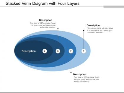
Gains escalate with our Stacked Venn Diagram With Four Layers. They flow in at a faster pace.
55428247 style cluster stacked 3 piece powerpoint presentation diagram infographic slide with all 5 slides:
Dare to dream bigger with our Stacked Venn Diagram With Four Layers. They help you achieve great feats.
FAQs for 55428247 style cluster stacked 3 piece powerpoint presentation
So basically a stacked Venn diagram is like taking regular Venn diagrams and layering them on top of each other - imagine transparent sheets stacked up. You can see how the same sets relate across different time periods or conditions all at once. Way more useful than flat ones, honestly. Regular Venn diagrams just show one scenario, but these let you spot patterns and compare trends across multiple variables. Perfect for when you're analyzing the same relationships but need to see how they change - like tracking customer overlap between products over different quarters or something. Makes complex data way easier to digest.
Stacked Venn diagrams are perfect when you need to show overlapping categories AND the actual size of each section matters. Like if you're analyzing survey data or customer segments - the regular ones just show relationships, but stacked versions reveal how much overlap you're actually dealing with. That quantity piece is huge for business decisions, honestly. They're great for market analysis too, especially when stakeholders need to grasp both the connections and the scale. I mean, there's nothing worse than making decisions based on tiny overlaps that look significant in a regular diagram. Use them when the "how much" question is just as critical as the "what connects" part.
So basically, stacked Venn diagrams save you from that deer-in-headlights look people get with complicated data. You layer stuff hierarchically instead of throwing everything at them at once. Start with 2-3 main categories first - let people actually digest that before adding more detail. It's like peeling an onion but without crying everywhere (terrible analogy but whatever). The whole point is your audience can follow along and spot patterns naturally. Once they get the foundation, then you stack on subcategories. Way better than those nightmare diagrams with like 50 overlapping circles that make zero sense.
Honestly, don't go crazy with too many circles - stick to 2 or 3 max because it gets confusing quick. Make sure your colors actually contrast well so people can see the overlaps clearly. Oh, and size matters! Your circles should reflect the actual data proportions. I can't tell you how many times I've seen diagrams where you're just guessing what each section means. Put your biggest overlap in the center if possible - makes it way easier to read. Definitely throw in a legend and maybe add percentages right on each part. Trust me, your viewers will thank you for not making them work so hard to understand it.
Honestly? Stacked Venn diagrams are kinda overkill for basic stuff, but they're perfect when you've got overlapping categories across different datasets or time periods. Like if you're comparing survey responses between age groups, or tracking how customer behaviors overlap across regions. Regular Venn diagrams just can't handle that complexity. You can layer geographic areas, time frames, different user segments - all while showing intersections. My old boss loved these things way too much lol. Just warning you though, they get messy fast. Make sure whoever's looking at it won't get overwhelmed, because trust me, they will if it's too complex.
Pick contrasting colors - blue and orange work great together. Avoid anything too similar or you'll end up like me trying to explain why my boss couldn't see the difference between two greens that looked identical to everyone else. Awkward. Different saturations of the same color can work too. Make sure colorblind people can actually read it though. Here's what I always do: convert the whole thing to grayscale first. If you can still tell the sections apart, you're good to go. Saves so much hassle later.
Honestly, regular drawing apps are gonna make you want to pull your hair out with stacked Venn diagrams. Lucidchart is probably your safest bet - their templates actually work and everything snaps together nicely. Draw.io is solid too and it's free. If you know any coding, R with ggplot2 handles the tricky overlapping parts way better than manual stuff. Canva works but you'll be doing everything by hand basically. Whatever you do, skip PowerPoint. Trust me on this one - I've been there and the alignment issues will drive you insane. Just try Lucidchart's free version first and see how it goes.
Yeah totally! Stacked Venn diagrams are actually perfect for qualitative stuff. Like when you're coding interview data for themes like "stress" and "work-life balance" - you can see exactly where they overlap instead of staring at those awful code matrices (ugh). The cool part is stacking multiple diagrams to compare different groups. Just define your categories first, then drop your codes into the overlapping sections. Oh, and they work great for comparing time periods too if that's relevant to your project.
Don't cram too many circles in there - three max or it looks like a mess. Your circle sizes should actually match your data proportions, otherwise what's the point? I've seen so many where the colors are horrible too. Pick ones that don't muddy together when they overlap. Label everything, especially those weird intersection parts where stuff crosses over. Colors can totally save or ruin the whole thing, honestly. Oh and start simple! You can always make it fancier later if you really need to, but most of the time simple works better anyway.
Honestly, stacked Venn diagrams work best when you build them layer by layer instead of just showing the whole thing at once. Start with your basic diagram, then animate new layers as you explain each point. Different colors help a ton - or play with transparency so people can actually follow along. They're perfect for comparing scenarios or showing how things change over time periods. Oh, and definitely explain what each new layer means before you reveal it, otherwise everyone just sits there trying to figure it out themselves instead of listening to you. I learned that one the hard way lol.
Market research teams use these all the time, plus data scientists when they're comparing multiple datasets. Survey analysis is huge for them too - demographic breakdowns become so much clearer. Healthcare folks use them for clinical trials, and product managers are obsessed with showing feature overlaps. I swear, once you try them for customer segmentation, you'll get why everyone's into them. Any data with overlapping segments that shift over time? Perfect use case. Worth testing out in your next presentation if you're dealing with that kind of complexity.
So here's what works: start with just the basic circles, then add overlaps one by one as you explain each bit. Animation stops people from getting totally overwhelmed by all that data hitting them at once. I've watched so many presentations where cluttered Venn diagrams just kill the whole room - nobody follows along. But when you control the timing? People actually get it. You can spotlight specific intersections while you're talking about them. Interactive stuff is cool too if you've got time - hover effects, click-to-filter, whatever. Honestly though, even basic progressive reveal beats dumping everything on screen at once.
Oh totally! McKinsey used stacked Venns to map customer segments across different product lines and found these crazy overlap patterns nobody expected - that's how they came up with their whole "adjacency growth" thing. Netflix did something similar with viewer data across genres and demographics, which honestly explains why their recommendations are so scary accurate now. Drug companies do this all the time for interaction studies too, though that's probably less exciting than the Netflix stuff. If you're thinking about trying it, just make sure you've got at least 3+ categories where you think there might be some hidden connections lurking.
So you're dealing with team arguments again? Try stacked Venn diagrams - they're weirdly effective. Map out everyone's viewpoints first, then layer them on top of each other. People can actually see where they agree instead of just yelling past each other. I watched one meeting go from total chaos to actual problem-solving once we put everything visual. The stacking thing forces people to be more specific about what they mean, which honestly should happen more often anyway. Short version: next time there's drama, get everyone to map their positions first. You'll find common ground way faster.
Yeah totally! Stacked Venn diagrams are great for this stuff. You can layer different things like who knows what, when people are free, project timelines - then see where everything overlaps. I watched one team figure out that Sarah's data background plus Mike's client connections plus their Q3 schedule lined up perfectly for something they hadn't even thought of. Makes it super obvious where you're wasting effort or missing gaps. Honestly wish more teams did this during kickoffs instead of just talking in circles. You'll spot collaboration chances that regular meetings totally miss.
No Reviews