


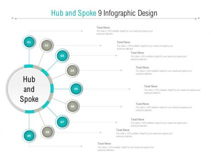
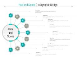
Hub and spoke 9 infographic design




Try Before you Buy Download Free Sample Product
 Impress Your
 Audience
 100%
100% Editable
 Save Hours
 of Time


Goals get clearly defined with our Hub And Spoke 9 Infographic Design. Every element acquires fine focus.
Hub and spoke 9 infographic design with all 5 slides:
Good deeds become a habit with our Hub And Spoke 9 Infographic Design. Everyone will benefit from your actions.

FAQs for Hub and spoke
Hub and spoke infographic designs offer centralized focus, visual clarity, hierarchical information organization, enhanced audience comprehension, and streamlined content flow in presentations. These layouts enable presenters to emphasize core concepts while supporting details radiate outward, with many organizations finding that this approach significantly improves information retention and audience engagement during strategic meetings and stakeholder communications.
Hub and spoke infographic designs enhance information retention by creating clear visual hierarchies, establishing logical information flow, and connecting related concepts through intuitive pathways. This structured approach enables audiences to process complex data more efficiently, reduces cognitive load through organized content clusters, and facilitates better recall by linking peripheral details to central themes, ultimately delivering improved comprehension and engagement across diverse learning styles.
Hub and spoke design proves most effective when presenting centralized systems with multiple interconnected components, such as supply chain networks, organizational structures, customer journey mapping, and technology ecosystems. This approach particularly excels in business scenarios like illustrating corporate hierarchies, distribution channels, and service delivery models, with many organizations finding that it streamlines complex relationships while maintaining clear visual hierarchy and strategic focus.
Color schemes significantly impact hub and spoke infographic effectiveness by enhancing visual hierarchy, improving information flow, and increasing audience engagement through strategic contrast and coordination. Well-chosen palettes guide viewers from the central hub to spokes seamlessly, while consistent color coding helps categorize information, ultimately delivering better comprehension rates and more memorable presentations that strengthen communication outcomes.
Central qualitative concepts with multiple related subcategories work best in hub and spoke formats, including organizational structures, project dependencies, customer journey touchpoints, strategic frameworks, and process workflows. This design excels with data showing clear hierarchical relationships, such as corporate divisions reporting to headquarters, product features connecting to core benefits, or marketing channels feeding into brand strategy, ultimately delivering visual clarity and enhanced comprehension.
Hub and spoke infographic designs adapt seamlessly to digital presentations through interactive elements, clickable spokes, animated reveals, and layered content that enhances audience engagement. These digital adaptations enable presenters to guide viewers through complex information systematically, create dynamic storytelling experiences, and deliver more impactful presentations that improve comprehension and retention rates.
Recommended software tools include Canva, Adobe Illustrator, Visme, Piktochart, and Lucidchart, each offering specialized templates and design capabilities for hub and spoke layouts. These platforms streamline infographic creation by providing pre-built frameworks, customizable icons, and professional typography options, with many organizations finding that tools like Adobe Illustrator deliver enhanced precision while Canva enables faster deployment for marketing teams.
Strategic element placement significantly influences hub and spoke infographic clarity through logical hierarchy, balanced visual weight, consistent spacing, and intuitive information flow from center to periphery. Effective positioning ensures the central hub commands attention while spoke elements remain easily scannable, with many organizations finding that proper alignment and proportional sizing ultimately delivers enhanced comprehension and stronger audience engagement across presentations.
Innovative animation approaches include sequential spoke reveals, rotating hub transitions, data-driven pulse effects, layered zoom animations, and interactive hover states. These techniques enhance audience engagement by creating visual storytelling flow, emphasizing relationships between central concepts and supporting elements, while maintaining professional credibility, with many presenters finding that strategic animation timing significantly improves information retention and presentation impact.
Storytelling integrates into hub and spoke designs by positioning the central hub as the main narrative theme, with each spoke representing sequential story chapters, character perspectives, or supporting plot elements. This approach enables organizations to guide audiences through complex narratives systematically, with many marketing teams and educational institutions finding that this structure enhances comprehension and retention.
Common mistakes include overcrowding the hub with excessive text, using inconsistent visual hierarchy between spokes, poor color coordination, and failing to maintain proportional spacing. These design flaws confuse audiences by creating visual chaos, reducing comprehension rates, and weakening message clarity, with many organizations finding that streamlined, balanced layouts significantly enhance information retention and stakeholder engagement across presentations.
Audience demographics significantly influence hub and spoke infographic design through color preferences, complexity levels, visual hierarchy, and terminology choices that resonate with specific groups. Different sectors like healthcare professionals, financial services clients, and retail customers require tailored approaches in layout density, iconography, and information flow, with organizations finding that demographically-aligned designs enhance comprehension and engagement rates.
Industries that benefit from hub and spoke designs include logistics and supply chain management, telecommunications networks, airline route planning, financial services architecture, and healthcare system coordination. These sectors leverage this model to streamline operations, reduce complexity, and enhance efficiency, with many organizations finding that centralized control with distributed endpoints delivers cost savings and improved service delivery.
Hub and spoke infographics enhance marketing strategies by visualizing customer journeys, product ecosystems, service offerings, brand touchpoints, and campaign workflows. These designs streamline complex marketing concepts for stakeholders while demonstrating interconnected value propositions, with many brands finding that centralized messaging radiating to targeted segments ultimately delivers clearer communication and stronger audience engagement across multiple channels.
Feedback from test audiences helps refine hub and spoke infographics by identifying unclear connections, confusing visual hierarchies, information gaps, and navigation difficulties within the design structure. Through targeted user testing, organizations can streamline content flow, enhance visual clarity, and optimize the central hub's effectiveness, with many finding that iterative refinements significantly improve audience comprehension and engagement rates.
No Reviews