


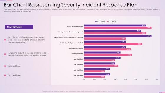
Bar chart representing security incident response plan




Try Before you Buy Download Free Sample Product
 Impress Your
 Audience
 100%
100% Editable
 Save Hours
 of Time


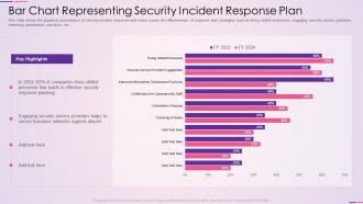
This slide shows the graphical presentation of security incident response plan which covers the effectiveness of response plan strategies such as hiring skilled employees, engaging security service providers, improving governance practices, etc.
People who downloaded this PowerPoint presentation also viewed the following :
Bar chart representing security incident response plan with all 7 slides:
Use our Bar Chart Representing Security Incident Response Plan to effectively help you save your valuable time. They are readymade to fit into any presentation structure.





FAQs for Bar chart representing security
Key components of an effective SIRP include incident identification and classification, containment and eradication procedures, communication protocols, forensic analysis capabilities, and recovery processes. These elements work together by enabling rapid threat detection, minimizing damage through structured response workflows, and ensuring business continuity, with many organizations finding that comprehensive planning significantly reduces incident resolution time and operational disruption.
A bar chart effectively displays security incident frequencies by categorizing incident types along the x-axis and showing occurrence counts on the y-axis, with time periods represented through grouped or stacked bars. This visualization enables security teams to identify trending threats, allocate resources strategically, and demonstrate incident patterns to stakeholders, ultimately enhancing organizational preparedness and response capabilities.
Key metrics include incident detection time, response time, containment duration, recovery time, and resolution accuracy rates. These measurements enable organizations to identify bottlenecks in their security processes, benchmark performance across different incident types, and demonstrate improved operational efficiency, ultimately delivering faster threat mitigation and enhanced organizational resilience.
Incident response time significantly impacts organizational security posture by determining damage scope, recovery costs, and business continuity levels. Faster response times minimize data breaches, reduce operational downtime, and preserve customer trust, with many financial institutions and healthcare organizations finding that sub-hour response capabilities deliver competitive advantages while meeting stringent regulatory requirements.
Defined roles and responsibilities in a Security Incident Response Plan ensure rapid, coordinated action during security breaches by eliminating confusion, streamlining communication channels, and establishing clear accountability structures. This organizational clarity enables faster threat containment, minimizes business disruption, and reduces response time, with many enterprises finding that well-defined incident teams deliver significantly better security outcomes.
Organizations can utilize bar charts to visualize response times, resolution rates, and incident volumes across departments like IT, HR, and operations, enabling clear performance comparisons. These visual comparisons help identify departmental strengths and bottlenecks, streamline resource allocation, and establish benchmarking standards, with many companies finding that this data-driven approach ultimately enhances overall incident response coordination and organizational preparedness.
**INPUT**: What tools are available for creating bar charts that effectively communicate SIRP data? **OUTPUT**: Available tools include Microsoft Excel, Tableau, Power BI, Google Charts, and specialized security platforms like Splunk. These visualization solutions streamline incident analysis by enabling real-time data mapping, automated threat categorization, and executive-level reporting, with many security teams finding that strategic dashboards ultimately deliver faster response coordination and enhanced organizational resilience.
Organizations should review and update their Security Incident Response Plans quarterly, with comprehensive annual assessments, following significant incidents, and after major infrastructure changes or regulatory updates. Through regular evaluation cycles, companies across sectors like healthcare, financial services, and manufacturing can identify gaps, incorporate new threat intelligence, and ensure team readiness, ultimately maintaining robust security postures in an increasingly complex threat landscape.
Common pitfalls when presenting SIRP data using bar charts include misleading scales, overcrowded categories, inconsistent time periods, poor color choices that obscure critical incidents, and failing to contextualize severity levels. These visualization errors can be avoided by standardizing measurement intervals, using clear categorical groupings, implementing intuitive color coding for incident types, and including baseline comparisons, ultimately delivering more accurate threat assessments and enabling security teams to make faster, data-driven response decisions.
The bar chart reveals incident frequency patterns, seasonal spikes, and recurring vulnerability types, enabling security teams to identify emerging threats and allocate resources strategically. By visualizing trends across timeframes and incident categories, organizations can implement preventive controls, enhance monitoring systems, and strengthen defenses proactively, ultimately reducing response times and minimizing potential damage.
Employee training significantly impacts Security Incident Response Plan success by reducing response times, improving threat detection accuracy, and minimizing human error during critical incidents. Through comprehensive training programs, organizations enhance their teams' ability to identify phishing attempts, execute proper escalation procedures, and coordinate effectively during breaches, with many financial institutions and healthcare providers finding that well-trained staff reduce incident resolution time by up to 40%.
Bar charts enable security teams to identify incident patterns, seasonal trends, attack frequency cycles, and vulnerability hotspots by visualizing historical data across timeframes, incident types, and threat vectors. Through pattern recognition and trend analysis, organizations can allocate resources proactively, strengthen defenses in anticipated vulnerable periods, and develop targeted mitigation strategies, ultimately reducing response times and minimizing potential damage.
Best practices for categorizing incidents in SIRP bar charts include grouping by severity levels, incident types, response times, affected systems, and business impact. These categorizations enhance analysis by enabling organizations to identify patterns, allocate resources more effectively, and prioritize response protocols, with many security teams finding that visual data segmentation ultimately streamlines incident management and improves overall organizational resilience.
Visualizing incident data in bar charts improves stakeholder communication by transforming complex security metrics into clear, comparative formats that highlight trends, frequency patterns, and severity distributions across different incident types. These visual representations enable executives and board members to quickly grasp security posture, resource allocation needs, and response effectiveness, while technical teams can demonstrate progress and justify investments, ultimately delivering enhanced transparency and more informed decision-making throughout the organization.
Industries tailor their Security Incident Response Plans based on regulatory requirements, threat landscapes, and operational priorities, with healthcare focusing on HIPAA compliance, financial services emphasizing fraud detection, and manufacturing prioritizing operational continuity. Bar charts effectively illustrate these differences by comparing response times, resource allocation, training frequencies, and compliance metrics across sectors, ultimately enabling organizations to benchmark their approaches and identify strategic improvements.
-
Great designs, Easily Editable.
-
Great product with effective design. Helped a lot in our corporate presentations. Easy to edit and stunning visuals.