


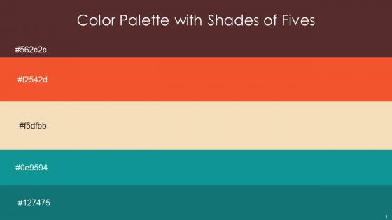
Color Palette With Five Shade Cowboy Flamingo Wheat Blue Chill Genoa




Try Before you Buy Download Free Sample Product
 Impress Your
 Audience
 100%
100% Editable
 Save Hours
 of Time


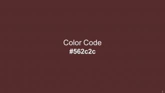
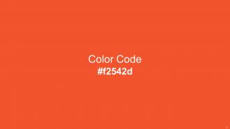
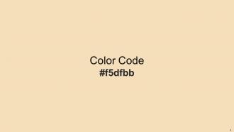
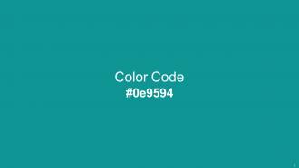
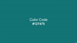
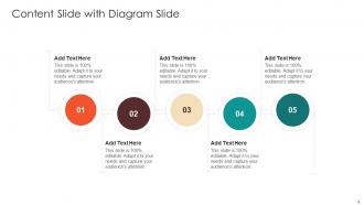
Heres a visually-pleasing color palette with Five Color Shades With Hex Code 562c2c, f2542d, f5dfbb, 0e9594, 127475. These colors are intuitively picked to ignite the spark of brilliance in your designs and creativity.
People who downloaded this PowerPoint presentation also viewed the following :
Color Palette With Five Shade Cowboy Flamingo Wheat Blue Chill Genoa with all 14 slides:
Use our Color Palette With Five Shade Cowboy Flamingo Wheat Blue Chill Genoa to effectively help you save your valuable time. They are readymade to fit into any presentation structure.






FAQs for Color Palette With Five Shade Cowboy Flamingo Wheat
Different colors evoke distinct psychological responses, with blue conveying trust and professionalism, red creating urgency and energy, green suggesting growth and stability, and yellow inspiring optimism and creativity. These color associations significantly influence audience perception and engagement, with many presenters finding that strategic color choices enhance message retention, emotional connection, and overall presentation effectiveness across corporate, educational, and marketing contexts.
A well-chosen color palette enhances audience engagement by creating visual hierarchy, improving comprehension, and evoking emotional responses that reinforce key messages. Through strategic color combinations, presenters can guide attention to critical information, maintain audience focus, and create memorable brand associations, with many organizations finding that consistent, purposeful color schemes deliver significantly higher retention rates and stronger audience connection.
**INPUT**: What are the best practices for selecting a color palette for corporate presentations? **OUTPUT**: Best practices include choosing brand-consistent colors, limiting palettes to 3-4 core colors, ensuring high contrast for readability, and selecting colors that convey appropriate emotions for your message. These strategic choices enhance audience engagement by improving visual hierarchy, maintaining professional credibility, and supporting key messaging, with many organizations finding that cohesive color schemes ultimately deliver stronger brand recognition and more impactful presentations. **Word count: 60 words**
Color contrast significantly impacts readability and information retention by ensuring clear text visibility, reducing eye strain, and creating visual hierarchy that guides audience attention. High contrast combinations, such as dark text on light backgrounds or white text on dark colors, enhance comprehension rates by up to 40%, with many presenters finding that strategic contrast choices ultimately deliver more engaging presentations and improved audience recall.
Color serves as a primary brand identifier in presentation templates, establishing recognition, emotional connection, and visual consistency across all communications. Strategic color choices reinforce brand personality, differentiate from competitors, and create memorable associations, with companies like Coca-Cola and IBM demonstrating how consistent color application across presentations builds instant brand recognition and professional credibility.
Cultural perceptions of color significantly impact presentation effectiveness by influencing audience interpretation, emotional response, and message reception across different regions and demographics. While red symbolizes luck in China but danger in Western cultures, and white represents purity versus mourning in various societies, strategic color selection enables presenters to connect authentically with diverse audiences, ultimately delivering clearer communication and stronger engagement.
Tools for creating harmonious color palettes include Adobe Color, Coolors, Paletton, ColorHunt, and Canva's palette generator. These platforms streamline color selection by offering algorithmic combinations, trend analysis, and accessibility testing, with many designers finding that systematic color tools ultimately deliver more cohesive visual branding and enhanced user experiences across digital and print applications.
Educational presentations benefit from calming, trustworthy colors like blues and greens that enhance focus and comprehension, while sales presentations leverage bold, energetic colors such as reds and oranges to create urgency and drive action. Through strategic color psychology, organizations can streamline audience engagement, enhance message retention, and ultimately deliver more impactful communications across different business contexts.
Common mistakes include using too many colors, selecting low-contrast combinations that reduce readability, ignoring brand guidelines, choosing overly bright or distracting hues, and neglecting accessibility considerations for colorblind audiences. These missteps can undermine professional credibility and audience engagement, with many organizations finding that strategic, limited palettes enhance message clarity, maintain visual consistency, and ultimately deliver more impactful presentations.
Color palettes guide audience attention through strategic contrast, hierarchy, and visual emphasis techniques. High-contrast colors naturally draw focus to critical information, while warm colors like red and orange create urgency for call-to-action elements. Through systematic color application, presentations enhance message retention, streamline information processing, and ultimately deliver more impactful communication, with many organizations finding that strategic color choices significantly improve audience engagement.
Current trending presentation color palettes include earthy neutrals with sage greens, warm terracotta and cream combinations, bold monochromatic schemes, and sophisticated navy-gold pairings. These palettes enhance visual engagement by creating professional cohesion, improving readability, and establishing brand consistency, with many organizations finding that strategic color choices significantly boost audience retention and presentation effectiveness.
Accessibility considerations significantly impact color palette choices by requiring high contrast ratios, avoiding problematic color combinations like red-green, and incorporating alternative visual cues beyond color alone. Organizations increasingly adopt accessible design principles, with many educational institutions and corporations finding that inclusive palettes enhance comprehension for all audiences while ensuring compliance with accessibility standards, ultimately delivering broader engagement and professional credibility.
Presenters can test color palette effectiveness through A/B testing with different audience segments, conducting focus groups for immediate feedback, analyzing engagement metrics across presentations, and soliciting direct feedback from colleagues or stakeholders. These methods enable presenters to evaluate visual impact, readability, and emotional response, with many organizations finding that systematic testing delivers more compelling presentations and stronger audience engagement.
Seasonal trends significantly influence presentation color palettes through psychological associations, cultural expectations, and business cycles that align with quarterly planning and marketing campaigns. Organizations in retail, hospitality, and consumer goods increasingly adapt their presentation aesthetics to match seasonal moods, with spring pastels enhancing creativity discussions, autumn earth tones supporting strategic planning sessions, and winter blues conveying stability during year-end reviews.
Monochromatic palettes create harmony, sophistication, and cohesive brand messaging, while complementary palettes generate energy, contrast, and attention-grabbing visual impact that enhances audience engagement. These strategic color approaches influence emotional responses differently, with financial institutions often favoring monochromatic schemes for trust-building, while retail and entertainment sectors leverage complementary palettes for dynamic customer experiences and competitive advantage.
-
World-class PowerPoint designs that are fully customizable!
-
Easily Editable.