


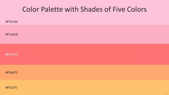
Color Palette With Five Shade Cupid Lavender Pink Bittersweet Atomic Tangerine Macaroni And Cheese




Try Before you Buy Download Free Sample Product
 Impress Your
 Audience
 100%
100% Editable
 Save Hours
 of Time


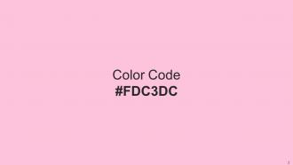
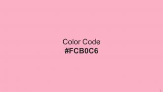
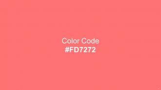
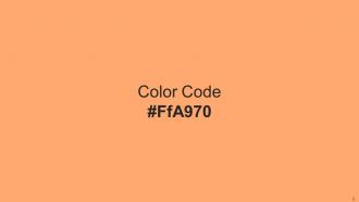
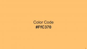
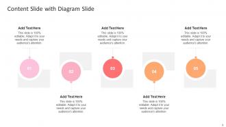
Heres a visually-pleasing color palette with Five Color Shades With Hex Code fdc3dc, fcb0c6, fd7272, ffa970, ffc370, . These colors are intuitively picked to ignite the spark of brilliance in your designs and creativity.
People who downloaded this PowerPoint presentation also viewed the following :
Color Palette With Five Shade Cupid Lavender Pink Bittersweet Atomic Tangerine Macaroni And Cheese with all 14 slides:
Use our Color Palette With Five Shade Cupid Lavender Pink Bittersweet Atomic Tangerine Macaroni And Cheese to effectively help you save your valuable time. They are readymade to fit into any presentation structure.






FAQs for Color Palette With Five Shade Cupid Lavender Pink Bittersweet Atomic Tangerine
Color psychology significantly influences audience perception by triggering emotional responses, enhancing memory retention, and guiding attention to key information. Strategic color choices enable presenters to build trust through blues, convey urgency with reds, and highlight important data points, with many organizations finding that consistent, psychologically-informed palettes ultimately deliver stronger audience engagement and message comprehension.
Best practices for selecting corporate presentation color palettes include maintaining brand consistency, ensuring sufficient contrast for readability, limiting colors to 3-5 primary options, considering audience demographics, and testing accessibility standards. These approaches streamline visual communication by reinforcing brand identity, enhancing comprehension, and creating professional cohesion, with many organizations finding that strategic color choices ultimately deliver stronger audience engagement and memorable presentation impact.
Contrasting colors effectively highlight key information by creating visual hierarchy through strategic color placement, using complementary color pairs, and ensuring sufficient contrast ratios for readability. Through techniques like bright accent colors against neutral backgrounds, high-contrast text combinations, and color-coded sections, presenters can direct audience attention to critical data points, calls-to-action, and key messages, ultimately enhancing comprehension and retention.
Cultural context plays a crucial role in international color selection, as colors carry different meanings, associations, and emotional responses across cultures and regions. Red signifies luck in China but danger in Western cultures, white represents purity in Western contexts but mourning in some Asian cultures, while green symbolizes nature globally but has religious significance in Islamic countries, requiring strategic adaptation for international brands and presentations.
Color palettes vary significantly between presentation types, with educational presentations favoring neutral blues, greens, and grays that enhance readability and minimize distraction, while marketing presentations utilize bold, brand-aligned colors that evoke emotion and drive action. These strategic color choices ultimately deliver improved comprehension in educational settings and increased engagement in marketing contexts, with many organizations finding that audience-specific palettes enhance message effectiveness.
Color palette creation tools include Adobe Color, Coolors.co, Canva's palette generator, ColorHunt, and Pantone's color tools, alongside accessibility checkers like WebAIM and Stark for contrast validation. These resources streamline design workflows by offering harmonious combinations, brand-specific palettes, and audience testing capabilities, with many presentation teams finding that systematic color testing ultimately delivers more engaging visual communication and stronger brand consistency.
Ensuring color accessibility involves using sufficient contrast ratios, avoiding color-only information conveyance, incorporating patterns or textures, and testing with colorblind simulation tools. These approaches enhance presentations by improving readability, ensuring critical information reaches all audiences, and demonstrating inclusive design practices, with many organizations finding that accessible color choices ultimately deliver broader audience engagement and professional credibility.
Common mistakes include using too many colors, selecting clashing combinations, ignoring brand guidelines, choosing colors with poor contrast, and neglecting accessibility considerations. These oversights undermine message clarity and professional credibility, with many presenters finding that limiting palettes to 3-4 harmonious colors while ensuring sufficient contrast ultimately enhances audience engagement and comprehension.
A presentation's color palette significantly reinforces brand consistency by establishing visual coherence, emotional connection, and immediate recognition across all touchpoints. Through strategic color alignment, organizations enhance brand recall by up to 80%, while maintaining professional credibility and trust, ultimately delivering stronger audience engagement and competitive differentiation in increasingly crowded marketplaces.
Warm colors like red, orange, and yellow evoke energy, excitement, and urgency, making them effective for motivating action and creating enthusiasm during sales pitches or product launches. Cool colors such as blue, green, and purple promote trust, calm, and professionalism, with many financial institutions and healthcare organizations finding these enhance credibility and focus during strategic presentations.
An effective color palette enhances storytelling by creating emotional connections, guiding audience attention, reinforcing key messages, and establishing visual hierarchy throughout the presentation. Strategic color choices help organizations communicate complex data more intuitively, with many companies finding that consistent palettes increase audience retention by up to 65%, ultimately delivering stronger engagement and more persuasive outcomes.
**INPUT**: What trends are emerging in color palettes for digital presentations in 2023? **OUTPUT**: Emerging color palette trends include muted earth tones, bold monochromatic schemes, gradient combinations, accessibility-focused high-contrast palettes, and brand-aligned sustainable colors. These approaches enhance visual engagement by reducing screen fatigue, improving readability, and creating memorable experiences, with many organizations finding that strategic color choices ultimately deliver stronger audience connection and competitive presentation advantage. [Word count: 55 words]
Adapting your color palette involves selecting colors that align with your presentation's emotional tone, industry context, and audience expectations, while maintaining brand consistency through strategic accent colors. Financial presentations often leverage blues and grays for trust, healthcare presentations incorporate calming greens, and creative pitches use vibrant combinations, with many organizations finding that thematic color adaptation enhances audience engagement and message retention.
Limited color palettes create visual consistency, stronger brand recognition, and enhanced readability by reducing cognitive load and maintaining design cohesion across materials. While expansive palettes offer creative flexibility, they can dilute brand identity and overwhelm audiences, with many organizations finding that strategic color constraints ultimately deliver clearer messaging, improved user experiences, and stronger market positioning.
Complementary colors create visual harmony by establishing balanced contrast that guides viewer attention without overwhelming content, using opposite hue pairings like blue-orange or red-green strategically across headers, accents, and backgrounds. Through careful application in corporate presentations, educational materials, and marketing decks, designers enhance readability, emphasize key messages, and maintain professional aesthetics while ensuring accessibility and audience engagement.
-
A fantastic collection of templates. I'll likely use this as my go-to resource for future templates and support.
-
Use of different colors is good. It's simple and attractive.