


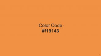
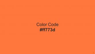
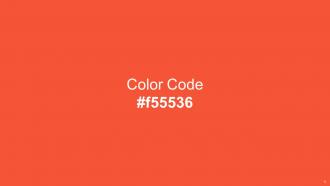
Color Palette With Five Shade Yellow Orange Yellow Orange Jaffa Burning Orange Flamingo




Try Before you Buy Download Free Sample Product
 Impress Your
 Audience
 100%
100% Editable
 Save Hours
 of Time


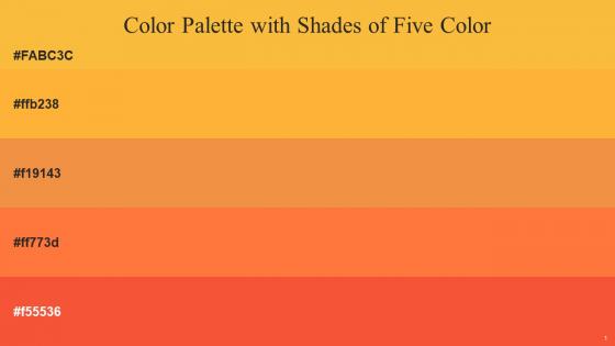
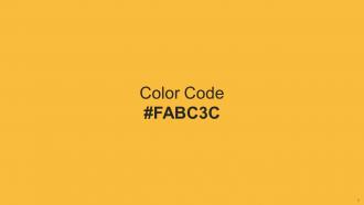
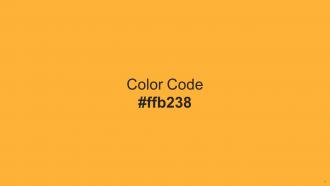
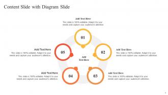
Heres a visually-pleasing color palette with Five Color Shades With Hex Code fabc3c, ffb238, f19143, ff773d, f55536. These colors are intuitively picked to ignite the spark of brilliance in your designs and creativity.
People who downloaded this PowerPoint presentation also viewed the following :
Color Palette With Five Shade Yellow Orange Yellow Orange Jaffa Burning Orange Flamingo with all 17 slides:
Use our Color Palette With Five Shade Yellow Orange Yellow Orange Jaffa Burning Orange Flamingo to effectively help you save your valuable time. They are readymade to fit into any presentation structure.









FAQs for Color Palette With Five Shade Yellow Orange Yellow Orange Jaffa
Colors trigger distinct psychological responses that significantly impact audience engagement and message retention. Red conveys urgency and passion, blue builds trust and professionalism, green suggests growth and stability, while yellow stimulates creativity and optimism. Strategic color selection enhances audience comprehension, emotional connection, and decision-making processes, with many presenters finding that aligned color psychology ultimately delivers stronger persuasion and memorable communication outcomes.
Color palette choice significantly influences audience perception, comprehension, and emotional response by establishing visual hierarchy, reinforcing brand identity, and supporting message clarity through strategic contrast and harmony. While cohesive palettes enhance professionalism and readability, poor choices can distract viewers, reduce accessibility, and undermine credibility, with many presenters finding that strategic color alignment ultimately delivers stronger audience engagement and message retention.
Color palette tools include Adobe Color, Coolors.co, Canva's color wheel, Paletton, and brand guideline generators. These platforms streamline palette creation by offering color harmony algorithms, accessibility testing, and export features, with many presentation designers finding that systematic color selection enhances visual consistency and audience engagement across corporate communications.
Cultural differences significantly influence color perception through varying symbolic meanings, religious associations, and psychological responses across different societies. While red symbolizes luck in Chinese culture but danger in Western contexts, and white represents purity in some cultures versus mourning in others, presenters increasingly adapt their color strategies for global audiences, ultimately delivering more culturally sensitive and effective communication experiences.
**INPUT**: What are the best practices for combining colors in a presentation to ensure readability? **OUTPUT**: Best practices for combining colors include establishing high contrast between text and backgrounds, using complementary color schemes, limiting palettes to 3-4 colors, and ensuring accessibility compliance. These approaches enhance readability by reducing eye strain, maintaining visual hierarchy, and creating professional consistency, with many organizations finding that strategic color combinations ultimately deliver clearer communication and stronger audience engagement across presentations. **Word count: 59 words**
Accessibility standards can be met by ensuring sufficient color contrast ratios, avoiding color-only information conveyance, and incorporating colorblind-friendly combinations like blues with oranges rather than reds with greens. These approaches enhance readability through high contrast text, alternative visual cues like icons or patterns, and universal color schemes, ultimately delivering inclusive presentations that engage all audiences while maintaining professional visual impact.
**INPUT**: What are the most popular color schemes for business presentations and why? **OUTPUT**: Popular business presentation color schemes include navy and white, charcoal and blue, monochromatic grays, and strategic accent colors like teal or orange. These combinations enhance professional credibility while maintaining visual clarity, with many organizations finding that conservative palettes with selective bright accents ultimately deliver stronger audience engagement and brand consistency across corporate communications.
Contrasting colors improve audience engagement by creating visual hierarchy, directing attention to key information, and enhancing readability across presentation materials. Through strategic color combinations, organizations can highlight critical data points, guide audience focus, and maintain viewer interest throughout lengthy presentations, with many companies finding that high-contrast designs increase message retention and comprehension significantly.
Branding plays a central role in color palette selection by establishing visual consistency, reinforcing brand identity, and creating professional credibility across all corporate communications. Strategic color alignment strengthens brand recognition, enhances audience trust, and differentiates organizations from competitors, with many companies finding that consistent brand-driven palettes increase presentation impact and stakeholder engagement significantly.
Color palettes require different approaches for digital versus print mediums due to varying color reproduction capabilities, viewing conditions, and technical constraints. Digital presentations benefit from brighter, more saturated colors that display well on screens, while print materials often need adjusted color values to account for paper texture, lighting conditions, and ink limitations, with many organizations finding that maintaining brand consistency across both mediums ultimately enhances professional credibility and audience engagement.
Common mistakes include using too many colors, selecting low-contrast combinations that reduce readability, ignoring brand guidelines, choosing colors based solely on personal preference, and failing to consider colorblind accessibility. These pitfalls often result in presentations that appear unprofessional, confuse audiences, and diminish message clarity, with many organizations finding that strategic color discipline significantly enhances audience engagement and brand consistency.
The emotional tone directly shapes color selection by aligning psychological color responses with intended audience feelings, with warm colors conveying energy and enthusiasm while cool colors project trust and professionalism. Strategic presenters leverage this connection to enhance message delivery, with corporate presentations favoring blues and grays for credibility, sales pitches utilizing energizing reds and oranges, and healthcare presentations employing calming greens, ultimately strengthening audience engagement and message retention.
Current presentation color palette trends include earthy naturals like sage and terracotta, bold jewel tones, high-contrast monochromatic schemes, and accessibility-focused combinations with strong readability ratios. These palettes enhance audience engagement by creating visual hierarchy, supporting brand authenticity, and ensuring inclusivity across diverse viewing environments, with many organizations finding that strategic color choices significantly improve message retention and professional credibility.
Color palettes guide audience attention by using high-contrast combinations for key points, warm colors for emphasis, and cool tones for supporting information. Strategic color hierarchy, consistent accent colors, and purposeful contrast help presenters direct focus seamlessly through slides, with many organizations finding that deliberate palette choices enhance message retention and audience engagement.
When designing color palettes for presentation infographics, consider brand consistency, audience preferences, cultural associations, accessibility requirements, and data hierarchy needs. These elements work together by ensuring visual coherence, enhancing readability through sufficient contrast, and guiding viewer attention strategically, with many organizations finding that well-planned palettes significantly improve comprehension and audience engagement across diverse business contexts.
-
Huge collection of high-quality templates. Worth each penny.
-
I am so thankful for all of the templates I've found on your site. They have saved me hours every week and helped make my presentations come alive. Keep up with these amazing product releases!