


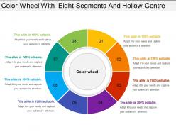
Color wheel with eight segments and hollow centre





Try Before you Buy Download Free Sample Product
 Impress Your
 Audience
 100%
100% Editable
 Save Hours
 of Time


Feed fertile brains with our Color Wheel With Eight Segments And Hollow Centre. They excel at handing down expertise.
People who downloaded this PowerPoint presentation also viewed the following :
Color wheel with eight segments and hollow centre with all 5 slides:
Your ideas have fascinating potential. Encash them with our Color Wheel With Eight Segments And Hollow Centre.

FAQs for Color wheel with eight segments
So red, blue, and yellow are your primaries - basically the colors you can't make by mixing anything else. They're like the foundation for everything. Mix two primaries and boom, you get your secondaries (green, orange, purple). Then you can keep going and create tertiaries from those. Honestly it's kind of crazy that just three colors can make literally every shade you see. Oh, and here's something that might help - when you're picking colors for whatever project, just start with one primary and work outward from there. Makes the whole process way less overwhelming.
So the color wheel is basically this circle that shows how colors work together. You've got your primary colors - red, blue, yellow - spaced out evenly. Then secondary colors like orange and green sit between them. Here's the cool part: colors across from each other are "complementary" and they make each other pop like crazy. Colors next to each other? Those are analogous and they vibe well together since they share undertones. Honestly, I used to just wing it with colors until I learned this. Now when you're choosing a palette, just look at where your colors sit on the wheel - saves so much guesswork about what'll actually look good.
Oh this is actually super interesting! So warm colors like reds and oranges literally make people feel energized and cozy - they pull you in. Blues and greens do the total opposite though. They're way more calming and professional feeling. I swear it's crazy how much this messes with people without them even realizing it. Use warm stuff when you want people to actually do something - like click buttons or feel comfortable. Cool colors are perfect for building trust or when you need that "we're reliable" vibe. Just don't go overboard with either one.
Oh totally! Contrast is huge for readability. Dark text on light backgrounds (or flip it) works best. I learned this the hard way when I made my text too light gray once - nobody could read anything without squinting. For regular text you want at least a 4.5:1 contrast ratio, and 3:1 for bigger text. Those minimal gray-on-gray designs look cool but they're brutal on your eyes after like 5 minutes. There are free contrast checker tools online that'll tell you if your colors actually work together before you commit to them.
So analogous colors are basically neighbors on the color wheel - like blue, blue-green, and green all hanging out together. They work because they share the same base color, which is why your eye doesn't get confused looking at them. I'd grab three of these and make the middle one your main color. Use the other two for accents and backgrounds. Way less chaotic than throwing random colors together (trust me, I've seen some presentations that looked like a rainbow exploded). Perfect when you want something polished but not too dramatic.
So basically your eye gets confused when you put opposite colors together - like red and green or blue and orange. Your brain can't decide which one to focus on, so it keeps jumping back and forth. Creates this weird vibrating effect that's honestly kind of annoying if you stare at it too long lol. But that's exactly why it works! Use it on stuff you want people to notice - buttons, headlines, whatever. Just don't go crazy with it or your whole design will look like a mess. It's one of those things that's super effective in small doses.
Honestly, it's crazy how much colors mess with our heads. Red makes everything feel urgent - that's why McDonald's and sale signs use it everywhere. Banks always go with blue because it screams "trust me with your money." Green feels healthy and natural (hence every organic brand ever). Yellow's attention-grabbing but too much makes people anxious, which is kinda ironic. Black just automatically looks expensive and classy. When you're picking colors for something, figure out what vibe you want people to feel first. Then work backwards from there.
Honestly, color theory is a game-changer for brand recognition. You know how you spot Coca-Cola red or that distinctive Tiffany blue from across the room? That's no accident. Different colors mess with people's emotions - warm stuff like orange feels friendly and energetic, while blues come off as trustworthy. Pick 2-3 colors that match your brand's vibe and use them everywhere. I mean everywhere - logo, website, packaging, social posts. The repetition is what makes people remember you instantly. It's kinda wild how much our brains connect specific colors to brands once you start paying attention to it.
So saturation and brightness? They totally change how people react to your visuals. Those crazy bright Instagram ads that make you stop mid-scroll? That's high saturation doing its thing. But don't go overboard - it gets overwhelming fast and makes text harder to read. Brightness sets the vibe. Dark feels fancy and expensive, light feels friendly. I always match this stuff to what I'm trying to say. Honestly, just experiment with your next project. Tone down the colors for serious stuff, crank up the brightness when you want energy. You'll see the difference right away.
So basically RGB is what you use for anything on screens - websites, apps, whatever digital stuff you're working on. It uses light to make colors (red, green, blue). CMYK is the printing one since that's literally what printers use - cyan, magenta, yellow, and black inks. Here's what sucks though: RGB can show way more vibrant colors than CMYK can actually print. Those super bright colors on your monitor? They'll look pretty meh when printed. I learned this the hard way lol. Just design in RGB for digital projects, then convert to CMYK before you send anything to the printer.
Oh man, colors are so weird across cultures! White means weddings here but in many Asian countries it's for funerals. Wild, right? China sees red as super lucky while we think danger or stop signs. Yellow gets me though - Americans think sunshine and happiness, Japanese think bravery, but French people? Jealousy. Makes no sense but whatever. You definitely want to check what colors mean to your audience before picking anything for branding. Don't want to accidentally tell people you're mourning when you meant celebration!
So triadic colors are basically three colors spaced evenly on the color wheel - like red, blue, yellow. They're perfect for presentations because you get that vibrant contrast without looking like a rainbow exploded. Pick one as your main color, then use the other two for accents. I swear this is foolproof - backgrounds in one color, headers in another, highlights in the third. Your slides will look professional but still have personality. Way better than those boring blue-and-white corporate decks everyone uses.
Honestly, learning color theory was a game changer for my infographics. I used to just wing it with whatever looked decent. Now I use contrasting colors to make important data pop, and complementary ones to show what's most important vs. secondary info. The 60-30-10 rule is clutch - dominant color takes up most space, secondary gets 30%, then a bright accent for that final 10%. Also, group related stuff with similar colors (analogous ones work best). Pro tip that saved me so many times: check your design in grayscale first. If the hierarchy doesn't work without color, you've got problems.
Yeah, so about 8% of guys and 0.5% of women can't see certain colors properly. Red-green is the big one - which means those red error messages? Totally useless to them. I learned this the hard way on a project once. Don't just rely on color for important stuff. Throw in some icons, patterns, or just plain text labels too. Check your contrast ratios and test with colorblind simulators. Stark and ColorBrewer are solid tools for picking better palettes. Basically, your design should work even if someone can't tell your colors apart.
Gradients work because they copy how light actually behaves - dark stuff looks farther away, bright stuff pops forward. Perfect for making text stand out against backgrounds or giving buttons that slightly raised look. Honestly, I've been using way too many subtle gradients lately but they just work so well! Warm-to-cool ones (think orange melting into blue) create the best depth effect for presentations. Don't go overboard though - keep it to 2-3 colors and dial down the opacity until it's not screaming at people.
-
Understandable and informative presentation.
-
Best way of representation of the topic.