


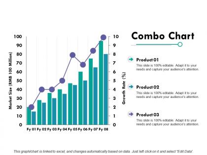
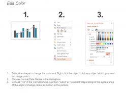
Combo chart finance ppt powerpoint presentation diagram graph charts




Try Before you Buy Download Free Sample Product
 Impress Your
 Audience
 100%
100% Editable
 Save Hours
 of Time


Get the group to collaborate with our Combo Chart Finance Ppt Powerpoint Presentation Diagram Graph Charts. They are great for creating cohesiveness.
People who downloaded this PowerPoint presentation also viewed the following :
Combo chart finance ppt powerpoint presentation diagram graph charts with all 5 slides:
Expose attempts to foment chaos with our Combo Chart Finance Ppt Powerpoint Presentation Diagram Graph Charts. Don't allow instigators to get a free hand.
FAQs for Combo chart finance ppt powerpoint presentation
Honestly, combo charts are lifesavers for financial stuff. You can throw revenue bars and profit margin lines on the same chart instead of making people jump between like 5 different visuals. Super annoying when dashboards do that. The best part? Different scales work together, so you're not trying to compare apples to oranges. Your stakeholders will actually see how metrics connect - like when volume spikes but margins tank. I always go for volume paired with percentages. That combo hits different and tells the real story fast.
Oh combo charts are perfect for this! You can throw different chart types on the same graph - like bars for revenue and a line for profit margin. Really handy when you're comparing stuff that has totally different scales or units. I always do marketing spend as bars with conversion rates as a line overlay. Just make sure you use dual y-axes or one metric will completely overshadow the other (learned that the hard way lol). Volume + percentages work great together. You'll start seeing patterns you never noticed before.
Oh, combo charts are perfect for when you've got related data but totally different scales. Like revenue in millions vs profit margins as percentages - you'd be squinting at one of those lines otherwise. Stock prices with trading volume works great too. I use them a lot for time-based stuff where I want to compare trends - sales growth rates next to actual sales figures, or budget vs what we actually spent. Honestly, if you're about to make two separate charts because the numbers are wildly different sizes, just throw them on a combo chart instead. Way cleaner. Just don't force random unrelated data together though.
So basically, bars work best for stuff like revenue or expenses - anything where you're comparing actual amounts. Lines are better for percentages and trends since they show movement over time way clearer. Just make sure your scales aren't totally off or you'll create a confusing mess. I learned this the hard way when I tried cramming too much into one chart last month. Start with whatever metric matters most to your audience, then add the rest around it. The combo usually works pretty well once you get the scaling right.
Okay so combo charts are tricky but totally doable. Only use two data series max - like revenue bars with a profit margin line. Label both y-axes super clearly since you'll have different units (dollars vs percentages or whatever). Pick complementary colors and make that line thicker so it doesn't disappear behind the bars. I learned this the hard way lol. Always add a legend and throw in data labels for your most important points. Oh, and test it on someone first - if they look confused even for a second, you need to simplify more.
Hey! So color schemes are huge for combo charts - they stop everything from looking like a mess. I always go with contrasting colors, like blue bars for revenue and orange lines for profit margins. That way people aren't squinting at your chart trying to figure out what's what. Oh, and stick with the same colors across all your charts - so if revenue is blue in one place, keep it blue everywhere. Trust me, I learned this the hard way after making a presentation where half the room couldn't tell the difference between my data sets. Makes such a difference for readability.
Dude, just go with Excel first. Most finance people live in that thing anyway and it handles combo charts pretty well. If your data starts getting massive or you need fancy real-time dashboards, then look at Tableau or Power BI. Google Sheets is fine for basic stuff but honestly feels clunky for anything complex. I've seen way too many people jump straight to expensive tools when Excel would've done the job perfectly. Try it out and see if it works - you can always upgrade later if you're hitting walls.
Honestly, combo charts can be a nightmare when your data scales are totally different - like trying to show millions in revenue next to 2% conversion rates. Just looks messy. If you're only tracking one thing over time, why complicate it? A basic line chart works fine. Plus most people aren't chart nerds like us, so throwing multiple datasets at them just creates confusion. I learned this the hard way in a client presentation once. When your metrics don't really relate to each other, separate charts make way more sense. Sometimes simple wins.
So combo charts are pretty cool - you can throw different data types on the same graph. Like bars for revenue with a line showing profit margins on top. Makes it way easier to see how things connect instead of flipping between separate charts (which honestly drives me crazy). The dual-axis thing means you don't have to do mental gymnastics comparing stuff. What's nice is spotting patterns fast - like if your margins hold steady even when revenue drops, that's actually solid. Try mixing volume data with percentages next time you're doing reports. Trust me, trends will pop out immediately.
You absolutely have to label combo charts properly or people will stare at them like they're broken. Both y-axes need clear labels, plus a legend that shows which data is bars vs lines. I learned this the hard way when my boss spent five minutes squinting at my chart during a presentation - super awkward. Each data series needs its own descriptive title too. The whole point is making it so obvious that anyone can read it instantly. Short sentences help. Test it on a coworker first because you'll miss obvious stuff when you've been staring at it too long. Trust me on this one.
Dude, combo charts are a game changer for budget stuff. You can throw your actual spending on there as bars, then add a line for future projections - gives you the whole picture at once. Way better than scrolling through endless Excel rows (seriously, who has time for that?). I love how you can layer everything together - revenue forecasts, expense targets, variance analysis. Makes it super easy to catch issues early. Oh and your presentations will look way more professional too. Trust me, once you start mixing historical data with forecasted numbers like this, you'll never go back to boring spreadsheets.
Don't mix weird metrics together - like putting revenue against customer count on the same chart. One line will look completely flat because the scales are so different. I see people do this constantly and it's painful to look at. Keep it to 2-3 related things max. Revenue + profit margin works great, or sales volume with conversion rate. Use colors that actually stand out from each other (not five shades of blue, please). Label everything so people aren't guessing what they're looking at. You want insights, not to flex your data access.
So combo charts are pretty clutch - you can throw two different data types on one chart instead of making separate ones. Say you want revenue as bars and profit margin as a line? Just overlay them. Regular charts make you pick one style, which honestly gets annoying when you're trying to tell the whole story. The cool part is spotting connections between metrics right away instead of flipping between multiple charts. I always use them when my data has different scales. Way cleaner than cramming everything into one format that doesn't really work.
Oh man, combo charts are perfect for this stuff! Retail companies use them all the time - bars for sales revenue, line for profit margins. That way you can see when you're selling tons but making no money, which honestly happens more than you'd think. Investment firms do the same thing with portfolio values and volatility. Manufacturing companies track production costs with efficiency metrics overlaid. Even healthcare places use them for patient volumes versus cost per patient. Way better than flipping between three different charts. I'd start with your biggest volume metric as bars, then add percentages or ratios as lines on top.
Hover tooltips are honestly where I'd start - they're super easy to add and make a huge difference when you're showing data to people. You can also do drill-down stuff where clicking a point shows more detail, plus dynamic filters for different time periods. Oh, and clickable legends to turn metrics on/off are pretty slick too. Zoom controls help when you want to focus on specific date ranges. I always forget how much cleaner it looks when you can toggle things instead of cramming everything on one chart. Start with tooltips and basic filtering though - that's where you'll see the most impact right away.
No Reviews