


Competitive Analysis Of Major Hospital Marketing Plan To Improve Patient Strategy SS V




Try Before you Buy Download Free Sample Product
 Impress Your
 Audience
 100%
100% Editable
 Save Hours
 of Time


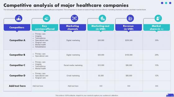
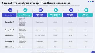
The following slide outlines comparative analysis of various healthcare companies. The comparison is drawn on basis of major services offered, marketing channels, revenue, and total market share.
People who downloaded this PowerPoint presentation also viewed the following :
Competitive Analysis Of Major Hospital Marketing Plan To Improve Patient Strategy SS V with all 9 slides:
Use our Competitive Analysis Of Major Hospital Marketing Plan To Improve Patient Strategy SS V to effectively help you save your valuable time. They are readymade to fit into any presentation structure.








FAQs for Competitive Analysis Of Major Hospital Marketing Plan To Improve Patient
Cover their profiles first - who they are, market share, positioning. Product comparisons and pricing come next. Marketing approaches matter too. SWOT analysis is kind of boring but your boss will expect it. Look for market gaps they're missing (this is where you can actually shine). Charts and comparison tables save you - nobody reads paragraph after paragraph. End with solid recommendations on how you're different. Oh, and don't just dump data on them. They want insights they can actually use to make decisions.
Honestly, visual stuff makes competitor research so much less painful than staring at endless spreadsheets. SWOT matrices and positioning charts are clutch - they help you actually see patterns instead of drowning in data. Your stakeholders will thank you too since charts are way easier to follow than bullet points (learned that the hard way). Try plotting competitors on a simple matrix first, like price vs features. Then drop your company on there to see how you stack up. Radar graphs work great too if you're comparing multiple factors. Makes it super obvious where the market gaps are.
Honestly, comparison tables are your best friend here - just line up pricing tiers and features side by side. Heat maps are clutch for showing price ranges, they make the patterns super obvious. I'm totally obsessed with those matrix charts where you can spot everyone's positioning instantly. Bar charts work too for basic price stuff, or try scatter plots to find gaps in the market. Oh, and make sure you're actually comparing the same things - package sizes, contract lengths, whatever. Grab like 3-5 competitors and focus on what your customers actually care about, not every tiny detail.
Honestly, the best thing you can do is grab real customer quotes from review sites or support tickets and drop them right into each competitor section. Like instead of saying "their interface sucks," show a screenshot next to an actual quote that says "Company X's dashboard makes me want to pull my hair out" - way more powerful. I'm obsessed with using customer language because it just hits different than corporate speak. Pull from your user research too if you have it. Then wrap up each section with what customers actually want, not what we think they want. Your stakeholders will eat this up since they're hearing the real voice of users, not just feature comparisons.
Think of market share data as your competitive report card - shows you who's dominating and who's falling behind. Great for spotting threats early or finding weak spots where you can swoop in. Pie charts are clutch for showing the current state of things. Bar charts work better when you're tracking changes over time. Those animated racing bar charts are kinda fun but honestly regular ones do the job just fine. Oh, and always slap your data source on there somewhere - trust me, someone will ask where you got those numbers and you don't want to look clueless.
Make one slide per competitor with a simple 2x2 grid - strengths, weaknesses, opportunities, threats. Keep everything super short, like "strong brand recognition" or "limited digital presence." Honestly, adding their logo at the top makes a huge difference for clarity. Format all the slides the same way so people can actually compare them easily. Oh, and be brutal about what makes the cut - if it doesn't fit cleanly in the grid, ditch it. I always finish with a summary slide that ranks them by how much of a threat they are. Works every time.
Honestly, bar charts are your best bet for comparing market share or revenue - you can instantly see who's crushing it. Line graphs work well when you need to track trends over time, like growth rates. I'm a big fan of scatter plots (people sleep on these) for showing relationships between two things, like price versus quality. Heat maps are solid too if you're looking at performance across different regions or categories. My old boss used to overcomplicate this stuff constantly. Just go with whatever makes the story jump out at your audience right away.
Dude, make your competitors the main characters in a story! Don't just dump features and prices on people - nobody cares about spreadsheets. Try something like "Company X bet everything on cheap prices, but then customers started caring more about quality." Way better, right? Start with the market setup, introduce the players and their weird strategies, then show where the drama is. I swear your audience will actually pay attention instead of scrolling Instagram. Oh, and kick off with a real customer situation that shows the competitive mess you found - works every time.
Don't get so obsessed with what competitors are doing that you forget your own strategy. Seriously, I've seen teams fall into this trap constantly. You'll lose everyone if you just throw data at them without explaining what it actually means for your business. Also, stop making competitors sound like they're crushing everything - that just scares people and kills any momentum you had. Focus on finding real gaps you can exploit instead of boring everyone with endless feature comparisons. Oh, and please don't present old research like it's breaking news. Keep everything recent and balanced. Most importantly? Always tell your team what they should DO with this info.
Honestly, case studies are your best friend here. Grab 2-3 real examples where companies actually battled it out - maybe a pricing war or when some startup shook things up. The "before/during/after" thing works great because people can actually follow what happened. Way better than drowning them in spreadsheets, trust me. You want clear cause-and-effect stuff. Like when Company A cut prices, Company B did this, then the market went crazy. Stories stick. Charts don't. Oh, and definitely throw in one where the big player got their butt kicked - those are always the most interesting ones anyway.
Oh man, this is huge - I learned that lesson when we completely missed a competitor dropping their prices for like 3 months. Markets move so fast your research becomes useless if you're not staying on top of it. Google Alerts are your friend for competitor mentions. I'd also peek at their job postings regularly - new hires usually mean they're planning something. Set up quarterly deep-dives into their websites and social. The trick is making it routine instead of this massive thing you put off forever. Maybe start with just 30 minutes a week updating one piece of your template? Way less overwhelming that way.
Honestly, start with the obvious stuff - Gartner, Forrester reports, TechCrunch. But here's what most people miss: patent databases are gold mines for seeing where competitors are actually putting their money. Social listening tools like Brandwatch show real customer reactions, not just what companies claim people want. LinkedIn job postings? Surprisingly revealing about strategic shifts. I always dig through earnings calls too - executives accidentally spill interesting details when analysts push them. Oh, and don't sleep on industry trade publications. Pick 2-3 sources per trend, then build out from there.
Totally flip your approach depending on who you're talking to. Executives want the big picture stuff - how this affects revenue, market position, competitive threats. Keep it strategic and connect everything to business results. Sales teams? They need the tactical details. Feature comparisons, pricing strategies, specific ways to handle objections. I've watched so many presentations crash and burn because someone gave strategic overview to salespeople who just wanted to crush their next pitch against the competition. Before you start, think about what decisions your audience actually makes. Then build everything around giving them what they need for those calls.
Honestly, I'd focus on the stuff that actually matters - market share, revenue growth, customer acquisition cost, and retention rates. Those show who's really crushing it vs just making noise. Website traffic and social engagement are pretty easy to track too since most of that data's public anyway. Oh, and definitely check review scores because people are brutal online and it shows brand health fast. Don't waste time on vanity metrics though, they're basically useless. Pick like 3-4 things that actually move the needle in your industry and stick with those instead of going crazy trying to monitor everything.
Build 2-3 realistic scenarios around whatever's hitting your industry - economic downturn, tech shake-ups, new regulations, that kind of thing. Then map out how each competitor would probably react based on their cash situation, how flexible they are, and what they've done before. Way more useful than those static competitor charts nobody looks at twice. Make simple "if X happens, then competitor Y does Z" slides for your stakeholders. Honestly, it's like strategic war-gaming but actually practical. Turns the whole analysis into something people can use for real decisions instead of just filing away.
-
Making a presentation has never been this easy for me. Thank you SlideTeam for offering a splendid template library.
-
SlideTeam just saved my project! Thank you so much. The variety of templates helped me showcase multiple perspectives easily.