

Competitive Analysis Of With Starbucks Marketing Strategy A Reference Strategy SS




Try Before you Buy Download Free Sample Product
 Impress Your
 Audience
 100%
100% Editable
 Save Hours
 of Time


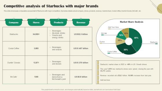
This slide showcases comparative assessment of Starbucks with major competitors. It provides details about company, stores, products, revenue, market share, Costa Coffee, Dunkin Donuts, McCafe, etc.
People who downloaded this PowerPoint presentation also viewed the following :
Competitive Analysis Of With Starbucks Marketing Strategy A Reference Strategy SS with all 10 slides:
Use our Competitive Analysis Of With Starbucks Marketing Strategy A Reference Strategy SS to effectively help you save your valuable time. They are readymade to fit into any presentation structure.









FAQs for Competitive Analysis Of With Starbucks Marketing Strategy A
Honestly, the automation stuff is what sold me - you can change colors and fonts with literally one click. Most other platforms make you do it manually which is annoying. We've got like 200+ templates that actually look current, not like something from 2015. The AI writing suggestions are surprisingly decent too, way better than just generic "insert text here" boxes. Real-time collaboration works without constantly freezing up (looking at you, Google Slides). Oh and there's way more industry-specific options compared to competitors who usually have maybe 30 templates max. Check the demo comparison page - it'll show you everything side by side.
Your templates are crushing it with 4.2-4.5 stars while competitors sit around 3.8-4.1. People love your design quality and how easy customization is - other platforms get roasted for clunky interfaces. Customer support is pretty much a wash across the board, nobody's winning there. Here's the thing though: pricing is where you're getting hit. Several reviews call out your premium costs compared to cheaper options. I'd check G2 and Trustpilot every quarter to keep tabs on sentiment shifts, but honestly you're in a solid spot overall.
Startups and marketing agencies are totally your goldmine here. Finance and healthcare barely touch our stuff, but SaaS companies? They're obsessed because they need fast customization without hiring designers. Agencies love bulk downloading templates to rebrand for their clients - completely different workflow though, which is kinda interesting. Our competitors mostly get stuck with enterprise clients wanting boring compliance templates. You'll want to hit up creative agencies and tech startups hard. Seriously, their conversion rates are insane compared to everyone else.
Honestly, most competitors are doing value-based pricing with different feature tiers - premium stuff runs about 20-30% more than basic. CompetitorX is being super aggressive though, basically undercutting everyone to steal market share. You're sitting pretty much in the middle right now, which isn't bad. The real difference is how you bundle features compared to them. I'd run pricing audits every quarter since this market moves crazy fast. Maybe try mixing up your premium features in different bundles? Could help you stand out more.
Your SEO's doing okay - better than 60% of your competitors for template keywords, which is solid given how crowded this market is. That 23% traffic bump quarter-over-quarter looks good too. But honestly? Two big competitors are still beating you on long-tail stuff for specific template types. Mobile optimization is pretty rough right now, and local SEO needs work. I'd hit those super-specific template searches first - way easier to overtake them there than trying to compete on the broad terms everyone's fighting over.
Honestly, presentations are getting way more interactive now - clickable hotspots, embedded polls, that kind of stuff. Bold colors are in. Those boring corporate blues? Out. Asymmetrical layouts are everywhere too, plus people are mixing font weights like crazy. Micro-animations between slides are huge right now (though some go overboard IMO). The coolest trend is modular templates where you can just drag sections around. I'd peek at 3-4 competitor decks this week to see what you're missing. There's probably some good inspiration there.
So our customization thing is actually pretty good. You get drag-and-drop plus custom CSS, which beats basic stuff like Canva but obviously can't touch Adobe (that's like comparing a Honda to a Ferrari though). Most other tools either give you barely any options or expect you to code everything yourself. We're kinda perfect for teams where people want real control but aren't developers. Oh, and definitely peek at what Competitor X just launched – they added some stuff that honestly makes me a little nervous we need to keep up.
Most companies stick to the usual stuff - email, chat, phone support. Response times are all over the place though, like 2-24 hours depending on who you pick. AI chatbots are everywhere now, and some even do video calls (kinda weird but people apparently dig it). Here's the thing - fancy features don't matter if you can't actually fix problems fast. Check how quickly you resolve tickets compared to competitors. Then train your team to nail it on the first try instead of that annoying ping-pong email chain everyone hates. Quick + competent wins every time.
So most of them drop new stuff every 2-4 weeks, but Canva's basically pumping them out weekly at this point. They're smart about timing too - always hitting holidays and whatever's trending. The successful ones aren't just randomly posting though. You can tell they're testing what works and actually watching their download numbers. Oh, and definitely stalk their social media because that shows you what they think will be their big hits. Honestly? Start a simple spreadsheet tracking when they release stuff. You'll start seeing patterns and gaps where you could totally jump in.
Your competitors are killing it with visual stuff - tons of template previews and before/after shots that actually show their designs working. Instagram Stories and LinkedIn carousels are their go-to for showcasing multiple slides. They're partnering with micro-influencers and business coaches who use the templates in real presentations, which honestly feels way more genuine than regular advertising. Plus they're constantly hopping on design trends to stay current. You should definitely peek at [competitor name]'s Instagram - they share user-generated content from customers who've tweaked their templates. That kind of social proof is pure gold.
Honestly, I just stalk their press releases and check their "partners" page every few months - works like a charm. Set up Google alerts for "[competitor name] + partnership" so you don't have to manually dig through everything. Watch for tech integrations, distribution deals, joint ventures (these are usually the big ones that actually matter). Industry publications are gold too. Oh, and trade show booth partnerships - sometimes you'll spot stuff there before it hits their website. Map out who they're already working with first, then track quarterly for anything new that might mess with your market positioning.
Totally! Dig into their customer reviews first - people literally tell you what's missing. Map out what each competitor sucks at vs what they're good at. You'll start seeing patterns pretty quick. Most companies either chase the premium market or race to the bottom, so there's usually sweet spots in between. Also look for customer segments everyone ignores - sometimes it's super niche stuff, but that can be gold. Oh and check if there are features people keep asking for that nobody's building yet. The gaps are usually right there in the complaints section, honestly.
Look at where your competitors are actually showing up first - social media, emails, partnerships, paid ads, all that stuff. But dig deeper too. Sometimes they're doing weird things like sponsoring random podcasts or working with tiny influencers you've never heard of. Those secondary spots are honestly where the magic happens because there's way less competition. I always make a messy spreadsheet of everything I find (probably overkill but whatever). Then pick 2-3 channels they're ignoring or barely touching and test those out first.
So I was looking at your competitor analysis - everyone's going after the same people, right? Tech-savvy early adopters and those mid-market businesses with decent budgets. But here's what's wild - they're all missing some pretty obvious gaps. Non-technical users who just want simple onboarding? Ignored. Budget-conscious startups only needing basic stuff? Also ignored. Enterprise teams desperate for better integrations? Yep, same story. Honestly, I'd hit that middle segment hard. They've got real money but nobody's really serving them well. Just map out 2-3 of these underserved groups and test some messaging with them first.
So most of them do multi-stage testing before launching anything. Design teams create the initial versions, then they test with focus groups to catch stuff we'd never think of internally. The smart companies crowdsource feedback from users who already love their platform. Some hire external consultants too - wish we had those budgets lol. A/B testing is huge for them, comparing layouts and tracking completion rates, time-to-finish, all that data. You should totally benchmark their best templates and figure out what design principles they're using. Might show us where our QA process is falling short honestly.
-
Innovative and Colorful designs.
-
I loved the hassle-free signup process. A few minutes and, I had this giant collection of beautiful designs.