


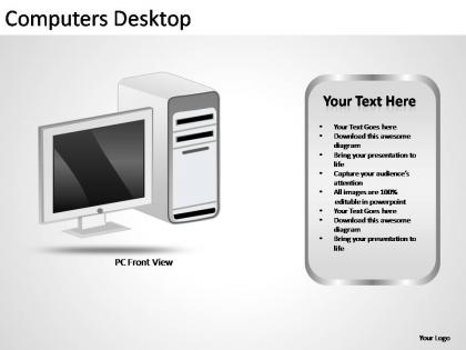
Computers desktop powerpoint presentation slides




Try Before you Buy Download Free Sample Product
 Impress Your
 Audience
 100%
100% Editable
 Save Hours
 of Time


No presentation is trivial. Make your important presentations say more with high quality Computers Desktop Powerpoint Presentation Slides design.
People who downloaded this PowerPoint presentation also viewed the following :
Computers desktop powerpoint presentation slides with all 8 slides:
Compelling professional designs at affordable prices. Computers Desktop Powerpoint Presentation Slides help your presentations write themselves.
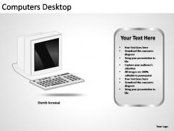
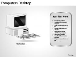
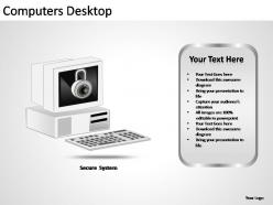
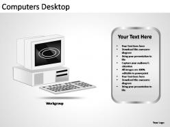
FAQs for Computers desktop
So first, outline your main message then build everything around that. Each slide needs one clear point - none of those corporate buzzword disasters that mean nothing. Good images matter way more than people think. Stick to 2-3 colors max and give your slides room to breathe with white space. Practice your timing beforehand so you're not scrambling. The story should flow naturally from one slide to the next. Oh, and pick fonts that don't suck - consistency is key. Honestly, less text is almost always better than cramming everything in there.
Dude, seriously - throw some visuals in there! People remember like 65% more info when you show them pictures instead of boring bullet points. I learned this the hard way after watching everyone zone out during my first work presentation lol. Charts and images just make everything click faster, especially weird concepts that are hard to explain. Nobody's trying to read paragraph after paragraph on a screen anyway. Here's what I do now: swap out at least half your text for actual diagrams or photos. Makes you look way more professional too. Trust me, you'll see the difference immediately.
Don't overload your slides with text - seriously, people just tune out. I stick to the 6x6 thing: 6 bullets max, 6 words each. Stories work way better than boring bullet points anyway. Ask questions to keep them awake! Move around instead of being glued to your laptop. Eye contact is huge, and use your hands when you talk. Every 5-7 minutes, throw in something interactive - polls work great, or just "who here has ever...?" Practice those slide transitions so you're not awkwardly clicking around. Oh, and don't forget to pause for questions. High energy helps but don't go overboard with it.
Look, it really depends on who you're presenting to. Consulting firms love cramming in data and charts - clients want proof, you know? Tech companies go the opposite direction with super clean, minimal slides. Healthcare presentations are honestly kind of a nightmare - so much research and compliance stuff packed in there. Sales teams? They're all about bold visuals and storytelling to seal the deal. Academic presentations tend to be dense with tons of detail. The trick is figuring out what your audience expects, not just copying someone else's format.
Honestly, color schemes can make or break your whole presentation. Poor choices will have people squinting or getting totally distracted - I learned this the hard way when my slides looked like a highlighter explosion lol. Good colors set the mood and make everything feel cohesive instead of chaotic. They also help your audience follow along better and actually remember your key points. Stick to 2-3 colors max. Make sure there's enough contrast so people can read your text without straining their eyes. Trust me, it makes a huge difference.
One main point per slide, seriously. Charts beat text dumps every single time - I bombed a presentation once by cramming too many numbers into paragraphs. People's eyes just died. Make your biggest stat pop with bold colors or bigger fonts. But here's the thing - you've gotta explain what those numbers actually mean for whoever's listening. Don't just throw data at them. Practice saying each chart out loud beforehand (sounds weird but works). The whole point is getting that lightbulb moment, not confused stares.
Don't cram tons of text on your slides - that's the biggest mistake I see. Also never read straight from them, you're not a human teleprompter lol. Those bouncy animations from like 2003? Skip them entirely. One idea per slide works best. Make your fonts big enough so people in the back can actually see. Oh and practice your timing beforehand so you're not scrambling. Colors should make sense together too. Most importantly though - always bring a backup on a USB drive because technology loves failing at the worst moments. Your slides should support what you're saying, not do all the talking for you.
Look, less is definitely more with animations. Stick to simple fade-ins or slides - nothing that bounces around like it's 2003. Your content should be the star here, not some flashy transition that makes people cringe. I usually reveal bullet points one at a time for important stuff, or do subtle emphasis animations for key data. The whole point is helping people follow along better. Oh, and seriously - test everything beforehand because technology loves to fail at the worst moments. Always have a backup without animations ready to go.
Oh dude, PowerPoint's collaboration stuff is actually pretty solid! Multiple people can edit at once without it getting weird. Comments are super helpful - you can leave feedback on slides and @mention people to bug them about changes. I love the version history thing because someone always messes something up lol. Also SharePoint/OneDrive sharing beats emailing files around any day - saves you from that nightmare where everyone has different versions. Real-time editing takes a sec to get used to but once your team figures it out, it's smooth.
Match your template to who you're presenting to - corporate stuff for business meetings, fun designs for marketing pitches. Clean layouts work best for academic content. Seriously, don't use comic sans in a boardroom (learned that the hard way). Data-heavy presentations get messy with busy templates, but simple topics can handle more visual stuff. PowerPoint's built-in templates are actually pretty solid, so check those first. Preview your real content in the template before you pick it. Colors and fonts? You can always tweak those later anyway.
Dude, go with something clean like Calibri or Arial - none of that fancy stuff that's impossible to read. I made this mistake once where everyone was squinting at my tiny text from the back. So embarrassing! Make your body text at least 24pt, headers even bigger at 36pt+. Two fonts max or it looks like a mess. Bold and italics work great for emphasis, just skip underlining since people think it's clickable. Oh and if you can, test your slides on the actual screen beforehand - saved me so many times.
Start with a problem your audience faces, then build up the tension with data and real examples. Most presentations are boring data dumps anyway - yours will actually tell a story. Use real customer stories instead of bullet points (way more engaging). Keep your visuals consistent with colors and images that match your story arc. Oh, and try that hero's journey thing where your audience is the hero and you're giving them the tools to win. Short sentences work. Then mix in longer ones that flow naturally when you're explaining the solution.
Dude, templates are lifesavers. You skip all the annoying design stuff - fonts, colors, layouts - and jump straight to your actual content. Your slides look way more professional than anything I could make from scratch, trust me. Plus everything stays consistent across slides instead of looking like a hot mess. Only real downside? Less room to customize, but honestly most people care more about what you're saying anyway. My cousin spent like 6 hours making custom slides once and they looked worse than a basic template lol. Just pick one that fits your topic and you're golden.
Okay so literally just talk through it out loud - that's what actually helps. Don't just read the slides in your head, like actually speak the words. Time yourself too because you'll probably go way over lol. I know it sounds dumb but practicing in front of a mirror works weirdly well. Then if you can find someone to listen, even better. Oh and definitely know how to get from slide to slide smoothly - nothing's worse than those awkward "um, next slide" moments. Test everything on the computer you'll actually use because tech always breaks at the worst times. Just keep going until it feels natural, not like you're reciting something.
Oh dude, PowerPoint's actually way more versatile than people think! You can make interactive dashboards by linking slides, or create infographics with all those SmartArt tools. The animation features are solid for basic videos too. I've seen people build digital portfolios, process guides, even rough app prototypes. Plus the drawing tools are surprisingly decent - way better than I expected. Social media graphics, flyers, visual reports that beat boring Word docs. Oh and definitely mess around with the morph transition if you haven't - it makes these smooth animations that look pretty slick.
-
Innovative and attractive designs.
-
Excellent design and quick turnaround.