

Conference Agenda Powerpoint Ppt Template Bundles




Try Before you Buy Download Free Sample Product
 Impress Your
Audience
 100%
Editable
 Save Hours
of Time


Our Conference Agenda Powerpoint Ppt Template Bundles are topically designed to provide an attractive backdrop to any subject. Use them to look like a presentation pro.
People who downloaded this PowerPoint presentation also viewed the following :
Conference Agenda Powerpoint Ppt Template Bundles with all 20 slides:
Use our Conference Agenda Powerpoint Ppt Template Bundles to effectively help you save your valuable time. They are readymade to fit into any presentation structure.












FAQs for Conference Agenda Powerpoint
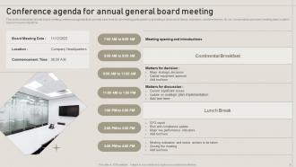
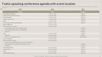
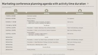
Start with the obvious stuff - date, time, location, what you're trying to accomplish. List each agenda item with how long it should take and who's presenting what. Honestly, I'd build in extra time between sessions because meetings always go over. Include breaks and lunch obviously. Add contact info for whoever's running it and leave space for notes. The networking bits are important too if that's your thing. Oh, and send this out like a week beforehand - people need time to prep and you don't want everyone hitting you up with questions the day before.
Honestly, having a solid agenda is a game-changer for keeping people actually engaged. Mix up your formats - don't just do presentation after presentation or everyone will mentally check out. I learned this the hard way at a conference last year where I nearly fell asleep during hour three of back-to-back talks. Break things up with workshops, Q&As, whatever keeps it interactive. Be specific about timing so people aren't constantly wondering what's next. Oh, and schedule your big important stuff for mid-morning when brains are still fresh. Build in some energy breaks too - trust me, you'll need them.
Definitely put your biggest sessions in the morning when everyone's actually awake. Post-lunch is when people turn into zombies, no joke. Keep presentations around 30-45 minutes tops - anything longer and you'll lose them. Build in 15-20 minute buffers because speakers *always* go over. Also, people need breaks every hour and a half or they get cranky. Oh, and work backwards from your must-have content first, then fill in the rest. Trust me on the morning thing though - I've seen too many important sessions crash and burn at 2pm.
QR codes are your best friend here - link them to speaker bios, materials, whatever. Throw in some live polling links and virtual meeting URLs if you're doing hybrid stuff. Real-time Q&A platforms work great too. Oh, and I've seen templates with embedded social feeds that actually keep people engaged (shocking, I know). Calendar integration buttons are clutch so attendees can sync everything to their phones without thinking about it. Basically, turn your agenda into a digital hub instead of just another boring schedule. Makes the whole event feel way more interactive.
Virtual stuff is totally different from in-person events. You'll want 15-20 minute breaks instead of 10, and honestly? People zone out way faster on screens so keep sessions under 45 minutes. Pack in more polls and breakout rooms - audiences disappear quick without constant interaction. Oh, and definitely add tech check slots to your agenda. Nothing's more awkward than someone fumbling with mute buttons for five minutes. In-person events can get away with longer presentations since people network during breaks and wander exhibit halls. But virtual attendees will literally close their laptop if you bore them. Also throw in clear timezone info because someone always miscalculates and misses half the day.
Honestly, I'd just make a separate "Speakers" section at the start or end with headshots and short bios. Way cleaner that way. You could also put one-liners right under their names in the schedule, but it gets messy fast when you have multiple people on panels - learned that one the hard way lol. If it's digital, hyperlinks are your friend. Click the name, boom, full bio on another page. Keep bios short though, like 50 words max or people won't bother reading them. Oh, and definitely include their current job title and company - people always want to know that stuff first.
Honestly, you NEED those 10-15 minute buffer zones between sessions. Most people skip this and then wonder why everything's a mess. Tell your speakers the transition timing upfront - like, way before the event starts. Get someone to actually walk people between rooms if you're using multiple spaces. People will get lost no matter how good your signs are, trust me. Your MC should keep announcing what's next and keep things moving. Oh, and pad your schedule way more than feels right. Sessions always run long and everyone needs bathroom breaks. You can always tighten things up for next time once you see how it goes.
Yeah, so what I'd do is literally build feedback breaks right into your schedule - like 5-10 minutes after each session for quick digital polls or comment cards. The conferences that actually DO something with feedback afterward are so much better than ones that just collect it and ignore it, you know? Throw in longer feedback sessions before lunch and at day's end too. Oh, and maybe set up a "feedback wall" somewhere - people love those things. Short sessions work better than long ones. Just make it feel natural, not like an obligation you tacked on last minute.
Honestly, topic prioritization is what makes or breaks your whole event. I always start by listing everything out, then rank by what'll actually matter to your audience - not what you think sounds impressive. High-impact stuff gets the prime slots when people are alert and paying attention. Don't make my mistake of sticking the most important session right after lunch when everyone's half-asleep! Speaker schedules and room logistics come after you've nailed down your priorities. Otherwise you'll end up with your biggest draw buried in some random breakout room.
Hey! So basically you'll want to scatter breaks and meals throughout instead of cramming everything back-to-back. Give people like 15-20 minutes for coffee breaks - trust me, that's where the magic happens. Longer lunch periods are key too. Roundtables work great for mixing people up. Oh, and group similar topics together so the right people end up in the same room naturally. I learned this the hard way at my last event - don't pack every single minute with presentations or people get burned out. Maybe throw in some dedicated mixer time if you can swing it.
Get the word out everywhere - email obviously, but also drop it in Slack channels and update your event page. People are honestly terrible at reading updates (myself included), so hit them multiple times. First announcement right when you know, then another reminder before the event. Make it crystal clear what changed and when it kicks in. Oh, and bold the actual changes or use a bright color - nobody wants to play detective with a wall of text to figure out what's different.
Oh definitely build in breaks - like every 90 minutes or so. People's brains just shut off otherwise and you'll catch them doom-scrolling Instagram mid-presentation lol. Coffee breaks are clutch for networking too. I learned this the hard way at a conference where they packed sessions back-to-back and everyone looked miserable by lunch. Give people 15-20 minutes to reset. They'll actually pay attention during sessions instead of mentally checking out. Your feedback scores will be way better, plus attendees won't feel like prisoners. Trust me on this one!
Okay so visual hierarchy is huge here. Make your headings bold and maybe color-code different tracks - way easier for people to spot what they actually want to attend. Time stamps need to be super obvious too, like in a left column or highlighted somehow. Bullet points are your friend! Dense paragraphs are the worst when you're frantically checking your schedule between sessions. Oh and white space - don't cram everything together. The whole point is someone should glance at it for like 10 seconds and immediately know where they need to be next.
Check who's coming first - that's everything. Executives want strategy talks and long coffee breaks for deal-making. Tech people need workshops they can actually dig into. Mixed groups? Mark your sessions by difficulty so nobody's lost. Timing matters too. Younger attendees will stick around late, but senior folks bail after 4 PM (learned that one the hard way). I've watched so many events crash because they pitched advanced stuff to beginners or vice versa. Send a quick survey with your save-the-dates asking about experience levels. Saves you from that awkward room of confused faces later.
I'd go with like 60-70% keynotes and 30-40% breakouts - keeps the energy up but still gives people options. Open strong with a keynote, then mix it up throughout the day. Four breakouts back-to-back will kill the vibe, seriously. Put your heavy-hitter speakers in late morning or right after lunch when people are actually awake. Breakouts work great as natural pause points between the big sessions. Oh, and make sure you've got enough variety in breakout topics - I've seen people literally argue over spots in popular sessions. Honestly? Just sketch it out first. You'll spot weird pacing issues way faster than trying to visualize it in your head.
-
I have been using SlideTeam for the past six months. Very happy and satisfied!
-
The designs are very attractive and easy to edit. Looking forward to downloading more of your PowerPoint Presentations.