


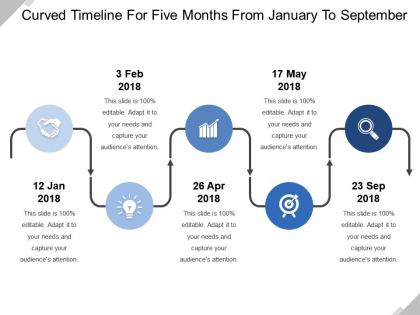
Curved timeline for five months from january to september




Try Before you Buy Download Free Sample Product
 Impress Your
 Audience
 100%
100% Editable
 Save Hours
 of Time


Our Curved Timeline For Five Months From January To September ensure they never falter. Hand down the benefit of your experience.
People who downloaded this PowerPoint presentation also viewed the following :
Curved timeline for five months from january to september with all 5 slides:
Ensure the focus doesn't falter with our Curved Timeline For Five Months From January To September. Handle any attempts at distraction.


FAQs for Curved timeline for five months from
Curved timelines enhance visual engagement, improve information flow, create dynamic storytelling, maximize space utilization, and emphasize key milestones through natural progression. These design elements streamline complex chronologies by guiding audience attention, reducing cognitive load, and creating memorable visual narratives, with many organizations finding that curved formats deliver stronger audience retention and clearer project communications.
A curved timeline enhances project management storytelling by creating visual flow, emphasizing milestone relationships, and highlighting project momentum through natural progression arcs. This approach transforms linear data into compelling narratives, with project managers in consulting, software development, and construction finding that curved timelines better communicate project evolution, stakeholder engagement increases significantly, and complex schedules become more accessible to executive audiences.
**INPUT**: What design elements should be considered when creating a curved timeline? **OUTPUT**: Key design elements for curved timelines include consistent spacing between milestones, readable text orientation, appropriate curve radius, strategic color coding, and clear directional flow indicators. These elements work together by maintaining visual hierarchy, ensuring information accessibility, and creating intuitive navigation paths, with many organizations finding that well-designed curved timelines enhance audience engagement while delivering complex project data more effectively. [Word count: 60 words]
A curved timeline visually differentiates project phases through color coding, varying segment widths, milestone markers, directional flow indicators, and strategic spacing between phases. This design approach enables project managers to showcase phase transitions, critical dependencies, and resource allocation patterns more intuitively than linear formats, with many organizations finding that curved timelines enhance stakeholder comprehension and project communication effectiveness.
Curved timelines enhance viewer engagement through improved visual flow, dynamic storytelling paths, and natural eye movement patterns that straight timelines cannot match. These designs create more compelling narratives by guiding attention seamlessly through content, with many organizations finding that curved formats increase information retention and audience interaction, ultimately delivering more memorable presentations and stronger stakeholder connection.
Curved timelines excel at representing cyclical data, seasonal patterns, recurring processes, project lifecycles, and evolutionary developments. These visual formats enhance understanding of data that follows natural progressions or repetitive cycles, with many organizations finding that curved presentations effectively communicate quarterly business cycles, product development phases, and annual planning processes, ultimately delivering clearer insights than linear formats.
Color selection significantly impacts curved timeline effectiveness by enhancing visual hierarchy, improving readability, and guiding audience attention through chronological progression. Strategic color choices help distinguish different phases, highlight critical milestones, and maintain visual flow along the curve, with many organizations finding that consistent color schemes ultimately deliver clearer communication and stronger audience engagement.
**INPUT**: What tools or software are recommended for designing curved timelines? **OUTPUT**: Recommended tools for designing curved timelines include Adobe Illustrator, Canva, PowerPoint, Lucidchart, and specialized presentation software like SlideTeam templates. These platforms streamline timeline creation by offering customizable curves, visual elements, and professional formatting options, with many organizations finding that template-based solutions significantly reduce design time while delivering polished, impactful visual presentations.
Common mistakes when creating curved timelines include overcrowding events, using inconsistent spacing, neglecting proper labeling, choosing poor color schemes, and ignoring visual hierarchy. These design flaws can confuse audiences and diminish impact, with many organizations finding that maintaining clear chronological flow, balanced proportions, and readable fonts ultimately delivers better stakeholder engagement and more effective project presentations.
Curved timelines integrate effectively into digital presentations through interactive design elements, smooth animations, and responsive layouts that adapt to different screen sizes. These visual storytelling tools enhance audience engagement by creating dynamic narrative flows, particularly in project management, company history, and product development presentations, ultimately delivering more memorable and impactful communication experiences.
Curved timelines excel when presenting cyclical processes, evolutionary progressions, or interconnected project phases where events loop back or influence each other. They're particularly effective for product development cycles, organizational change management, and historical narratives in sectors like healthcare, technology, and manufacturing, where linear formats can't capture the iterative nature and strategic dependencies that ultimately drive successful outcomes.
Historical events with natural progression, cause-and-effect relationships, or cyclical patterns work exceptionally well on curved timelines, including industrial revolutions, technological evolution cycles, political movements, and social transformations. These visual representations enhance understanding by showing interconnected developments like the rise and fall of civilizations, economic boom-bust cycles, or scientific breakthroughs, ultimately delivering more engaging educational experiences.
Animations and transitions enhance curved timeline presentations by guiding audience attention along the path, highlighting key milestones, and creating visual continuity between events. Through smooth reveals and progressive disclosure, presenters can control pacing while maintaining engagement, with many organizations finding that animated curved timelines significantly improve audience comprehension and retention of complex chronological information.
A curved timeline adapts to academic presentations by displaying chronological research developments, theoretical evolution, historical periods, methodological progressions, and case study sequences in a visually engaging format. This approach enhances student comprehension by breaking linear monotony, enabling professors to highlight key academic milestones, research breakthroughs, and scholarly transitions more effectively than traditional straight-line formats.
Best practices for labeling and annotating curved timelines include maintaining consistent text orientation, using strategic spacing between labels, implementing clear hierarchical typography, positioning annotations to follow the curve's natural flow, and ensuring readability at all curve points. These design principles enhance comprehension by creating visual harmony, reducing cognitive load, and guiding audience attention seamlessly, with many presenters finding that well-annotated curved timelines significantly improve information retention and engagement.
-
It saves your time and decrease your efforts in half.
-
Best way of representation of the topic.