


Dashboard Showing Project Portfolio Management




Try Before you Buy Download Free Sample Product
 Impress Your
 Audience
 100%
100% Editable
 Save Hours
 of Time


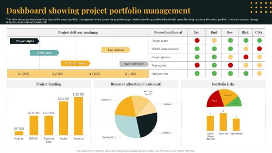
This slide shows the dashboard that depicts the project portfolio management which covers the quarterly project delivery roadmap and health card with project funding, resource allocation, portfolio risks such as open change requests, open risks and issues, etc.
People who downloaded this PowerPoint presentation also viewed the following :
Dashboard Showing Project Portfolio Management with all 7 slides:
Use our Dashboard Showing Project Portfolio Management to effectively help you save your valuable time. They are readymade to fit into any presentation structure.





FAQs for Dashboard Showing
Honestly, just focus on the basics first. Put your nav at the top and your most critical metrics where people will actually see them. Group related stuff together - seems obvious but you'd be shocked how many dashboards just throw everything at the wall. I hate when everything's the same size and competing for attention. Pick consistent colors, don't cram things together, and please make sure it works on mobile. Oh, and seriously sketch it out first! I used to jump straight into building and always regretted it. Way easier to move boxes around on paper than redo the whole thing later.
So basically, good visuals save people from squinting at spreadsheets all day. Color-coded status lights, trend lines, heat maps - stuff that makes patterns jump out immediately. Progress bars are underrated honestly. The trick is figuring out what decisions your users actually need to make, then building charts that answer their top questions at a glance. I always mess this up initially and make everything way too complicated. Heat maps work great for showing intensity, sparklines for quick trends. Match your visual style to the specific insight you're after. Short answer: make their eyes do the work, not their brain.
Pick metrics that actually connect to your business goals and show performance trends over time. Mix leading indicators (pipeline health, customer engagement) with lagging ones (revenue, churn). Biggest mistake I see? Cramming everything onto one screen - total information overload. Keep it to 5-7 key metrics max per view. Your team should be able to influence these numbers through their daily work, otherwise what's the point? Start with whatever's keeping leadership awake at night, then build around those issues. Oh, and definitely test with real users first - saves you from looking like an idiot later.
Your user personas totally change what data matters and how you show it. Busy exec? Stick to high-level KPIs they can scan quickly. Analysts need way more detail and filters to dig around. Think sports car dash vs airplane cockpit - completely different worlds. The persona affects everything from visual layout to how often you update stuff. Even colors matter more than you'd think. Here's what works: write down their top 3 daily decisions first. Then build your dashboard around supporting exactly those tasks. Makes the whole design process so much clearer.
So you know those awful static PDF reports we used to get? Dashboards are the complete opposite. You can actually click around, filter stuff, and dig deeper into the data right there in real-time. Instead of staring at boring predetermined charts, people can explore and ask "what if" questions on the spot. Your stakeholders won't bug you for custom reports anymore since they can just mess around with the data themselves. Honestly, it's a game changer for meetings. Just add some basic filters and clickable stuff to whatever you're already building.
Ask each team what decisions they're making every day - that's your starting point. Executives want the big picture stuff, KPIs and trends. Operations teams need real-time data they can actually dig into. Sales cares about pipeline, finance is obsessed with revenue forecasting. Honestly, trying to please everyone with one view is a nightmare. Set up role-based permissions so people see their stuff first. Most tools let you create different versions or users can tweak their own layouts. I'd focus on maybe 2-3 key groups initially, then expand from there.
Biggest thing? Don't jam everything onto one screen - users will bounce immediately. I've seen dashboards that look like someone threw up data everywhere. Keep your most critical metrics above the fold and give them room to breathe with plenty of white space. Loading speed matters more than you think, and honestly, stop defaulting to pie charts for everything lol. Pick colors that actually make sense together, not a rainbow explosion. Figure out the top 3 questions your users have, then build around those. Test it on someone who hasn't seen it before.
First thing - check your data sources aren't garbage. Set up automated checks to catch weird stuff early. I made this mistake once and our dashboard said we sold negative products lol. Document where everything comes from so people can actually verify it later. Use the same definitions for metrics across teams (this is huge tbh). Regular audits help too, plus alerts when numbers look totally off. Oh and definitely track your data lineage - sounds fancy but just means knowing where each number originated. Trust me, future you will thank you when someone questions your reports.
So the main ones everyone talks about are Tableau, Power BI, and Looker for bigger companies. Grafana's solid too if you're tracking technical stuff. Tableau is crazy powerful but man, it'll cost you and takes forever to learn. Power BI's way cheaper and works great with Microsoft - though it feels a bit janky sometimes, not gonna lie. If your team loves SQL, Looker's perfect but you need some tech skills. Google Data Studio is free and actually pretty good for basic stuff. I'd go with Power BI if you're already using Microsoft everything, or just mess around with Data Studio first.
So basically everyone looks at the same numbers instead of working off random spreadsheets from last month. Real-time data means you'll catch problems early and actually see wins happening. Honestly, it's like having a mission control setup for your metrics - makes meetings so much better when nobody's arguing over different data. You can set alerts too so it actually notifies you instead of just being another pretty screen nobody checks. Way better than the old days of emailing Excel files back and forth (which was honestly a nightmare).
Set up monthly or quarterly reviews - depends how fast your data shifts. Check if metrics still make sense, toss outdated widgets, verify data sources haven't gone stale. Users will definitely tell you when stuff isn't working (sometimes loudly lol). Gather their feedback and don't hesitate to rearrange layouts. Document changes and test before going live. Oh, and assign one person to own each dashboard. Seriously, orphaned dashboards turn into digital wastelands faster than you'd think. Nobody wants to touch something that isn't "theirs" when issues pop up.
Honestly, color theory can make your dashboard so much better if you're smart about it. I'd start with neutral colors as your base, then throw in some contrasting ones for your key metrics and buttons. Red and orange are perfect for grabbing attention on urgent stuff, while blues and greens work well for positive data - they just feel calmer, you know? Just don't go overboard with tons of colors. Looks messy and confuses people. Stick to maybe 2-3 main colors plus your neutrals. And definitely test it with real users to see what actually gets them to click!
So basically everyone wants real-time data viz and AI insights now. Mobile-first design is huge too. Dark mode? Literally every single client asks for it at this point lol. Interactive storytelling is getting popular - instead of just throwing charts at people, dashboards actually walk users through the data story. Voice stuff is coming up more where you can just say "show me Q3 revenue" rather than hunting through menus. Oh and progressive disclosure works really well - hit them with the big picture first, then they can dig deeper if they want. That approach has saved me so many headaches.
Mobile optimization opens up your dashboard to way more people. Touch-friendly buttons, readable text, layouts that actually work on phones - it all matters. People with motor disabilities especially benefit since they often rely on mobile assistive features. You'll also get better voice control and simpler gestures built in. Loading times improve too, which honestly helps everyone but especially users stuck on slow connections. Oh, and definitely test on real devices with accessibility settings turned on - you'd be surprised what breaks that looks fine in desktop preview.
Honestly, just throw a feedback widget right into your dashboard - makes it super easy for people to complain when something's broken. User interviews are gold too, but also watch what they actually do vs. what they say. Track where people click, which features get ignored (spoiler: probably half of them), and where they just give up entirely. The real magic happens when you actually fix stuff and tell users "hey, we heard you." People love feeling listened to and they'll keep giving you the good feedback. Oh, and in-app surveys work great if you keep them short - nobody wants to fill out a novel.
-
Wow, never been this impressed with any online service provider. Really appreciate the customer support all along from the navigation to purchasing the right products.
-
Thank you for showering me with discounts every time I was reluctant to make the purchase.