


Dashboard Total Loans And Deposits In Banking Company Digitalization In Retail Banking




Try Before you Buy Download Free Sample Product
 Impress Your
 Audience
 100%
100% Editable
 Save Hours
 of Time


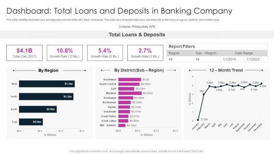
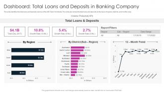
This slide identifies the total loans and deposits volumes of the ABC Bank Worldwide. This slide also shows the total loans and deposits on the basis of regions, districts, and monthly wise.
People who downloaded this PowerPoint presentation also viewed the following :
Dashboard Total Loans And Deposits In Banking Company Digitalization In Retail Banking with all 7 slides:
Use our Dashboard Total Loans And Deposits In Banking Company Digitalization In Retail Banking to effectively help you save your valuable time. They are readymade to fit into any presentation structure.





FAQs for Dashboard Total Loans And Deposits In Banking Company Digitalization
Put your account summaries right up top where people can see them immediately. Recent transactions should be super scannable - nobody wants to hunt for stuff. Quick transfers and payments are obvious must-haves. Spending insights are cool, but honestly? Those security alerts might be even more crucial since everyone's paranoid about fraud these days. Mobile needs to work flawlessly obviously. Budgeting tools could be nice if your users are the type who actually use them (lots aren't). Don't cram everything above the fold though - that just makes it messy. I'd definitely test with real users to see what they actually click on versus what you think they want.
So basically, good data viz takes all those confusing bank numbers and turns them into stuff you can actually understand at a glance. Like instead of staring at endless transaction lists, you get colorful charts showing your spending patterns. Progress bars for savings goals? Way better than just seeing "$247.83" sitting there. People can spot when they're blowing too much money on coffee (guilty!) or figure out realistic budgets without doing mental math. The whole point is making your financial picture as easy to read as your phone's battery - which honestly should be the standard for everything financial.
Cash flow visibility is huge - show current balance, pending stuff, and what's coming up payment-wise. These business owners are constantly stressed about timing, trust me. Transaction categories help them see where money's bleeding out (payroll, supplies, whatever). Low balance alerts are clutch too, plus any weird activity notifications. Maybe throw in a basic P&L if you can swing it? Oh and definitely payment processing stuff - pending deposits and those annoying fees they're always getting hit with. Hit those five things and you're golden for daily use.
Honestly, security runs the whole show when you're designing banking dashboards. Multi-factor auth, session timeouts, masked account numbers - all that stuff comes first. Those "quick balance" widgets? They blur out automatically when you're not actively using them, which is smart for shared computers. The annoying part is finding the sweet spot between being secure and not making customers jump through a million hoops every time they log in. People hate excessive verification steps. You'll want clear visual cues showing what's secure vs. not, plus obvious logout buttons everywhere. I'd start with mapping your auth flow first, then build the UI around those constraints.
Dude, mobile is everything for banking apps now. Most people literally never touch desktop anymore - they're constantly checking balances on their phones. Your dashboard has to work perfectly on smaller screens or people will just bounce to another bank. Make sure buttons are big enough for thumbs, pages load super quick, and everything's readable without squinting. I've seen so many apps fail because they treated mobile as an afterthought. Test on real phones too, not just those browser tools - they don't always show you the real deal. Bad mobile experience kills retention fast.
Okay so first thing - get heat mapping set up ASAP to see where people actually click vs where you think they will (spoiler: it's never where you expect). Then scatter feedback buttons throughout the dashboard and run real user tests with actual customers, not just your coworkers who already know how everything works. I'd do this at different stages too - wireframes, prototypes, and after launch. Don't ask vague stuff like "do you like this?" Ask specific questions about what's confusing or taking too long. Oh and definitely set up some way to sort through all the feedback you'll get, otherwise you'll just have a giant pile of opinions and no idea what to fix first.
So basically, AI in banking dashboards can predict your cash flow by looking at how you usually spend money. It'll warn you before you overdraft and catch weird transactions early - which honestly saves so much stress. The cool part? It gets better at reading your habits over time. You'll start getting savings tips and investment ideas that actually make sense for your situation. More data means better predictions, so after a few months it's like having a financial advisor who really knows your patterns. Pretty handy for avoiding money mistakes before they happen.
Honestly, having a digital banking dashboard is such a game changer for budgeting. You get real-time updates on spending and balances, which beats randomly checking your account and hoping for the best. The automatic expense categorization is clutch - you can set spending limits and get alerts before you blow past them. Visual charts make it painfully obvious where your money actually disappears (spoiler: probably more takeout than you realized). Goal tracking helps you see progress over time too. Just set up categories that match how you actually spend - way more useful than generic ones.
So everyone's going crazy for personalized insights right now - like actually showing spending patterns instead of just boring account numbers. Dark mode is huge too, obviously. Clean minimalist designs are everywhere because cluttered screens are the worst. Micro-interactions make everything feel snappy and responsive. Gamification is pretty smart actually - progress bars for savings goals, little achievement badges, that stuff works. Honestly, the whole point is making it feel less like staring at a bank statement and more like having a friend who gets your money habits. Users want something that'll actually point out savings opportunities without them having to dig for it.
So basically, regulators force you to build certain features whether you want to or not - audit trails, transaction monitoring, compliance reporting, all that fun stuff. Real-time fraud detection displays are mandatory. Customer due diligence workflows too. Plus detailed logging that auditors can actually navigate (good luck with that). You can't just design whatever looks sleek and call it a day. Honestly, most of it feels like bureaucratic nonsense, but there's no way around it. The trick is making these required features useful for your actual users instead of just ticking boxes.
So three things have worked really well for me. Set up automated validation that catches weird stuff right away - like when balances don't match transaction records or data looks off. Real-time alerts are honestly a lifesaver, wish I'd started using them sooner. Run reconciliation between your dashboard and core systems daily minimum, but hourly's way better if you can swing it. Oh and document your data lineage properly - sounds boring but you'll thank yourself later when something breaks and you need to trace where it went wrong fast.
Look, your clients are already living in their banking apps anyway, so why not meet them there? Real-time messaging hits way better than emails they'll never open. You can send personalized alerts and they can bug you with questions right from the dashboard - beats those awful phone menus we all hate. The trick is making it feel natural, not like spam. I'd focus on stuff that actually helps them instead of random announcements. Like, contextual tips when they're looking at their spending or whatever. Just don't go overboard with notifications or they'll turn everything off.
Honestly, customization makes such a difference for user happiness. People get so annoyed when they can't find their account balance because it's buried under a bunch of random widgets they never use. With good customization, users can put their most important stuff front and center and hide the rest. Makes the whole experience feel more personal too - like the bank actually understands what they need. Drag-and-drop is pretty much a must-have feature. Oh, and definitely let them toggle different sections on and off. Trust me, once people can organize their dashboard the way they want it, they'll actually stick around and use it way more often.
Try progress bars for savings goals and maybe some achievement badges when they hit milestones. Point systems work great too - people get weirdly addicted to streaks, like checking their balance daily or sticking to budget tasks. Honestly, it's just like those fitness apps but for money instead of steps. Throw in weekly challenges like "keep dining under $50" with little rewards. The whole point is making finances feel less scary and more like a game they actually want to play. Start with one or two features first though - see what clicks with your users before going all out.
Ugh, the worst thing you can do is dump ALL the financial data on users at once. Prioritize account balances and recent transactions upfront - everything else is secondary. I've seen dashboards that look like NASA control rooms, it's ridiculous. Different users need different stuff too, right? Like a business owner vs some college kid managing their pizza money. Navigation has to be dead simple and load times need to be fast. People get paranoid when their money info takes forever to load. Oh, and actually talk to your users first - figure out what they're checking every day instead of guessing.
-
Great designs, really helpful.
-
Excellent work done on template design and graphics.