


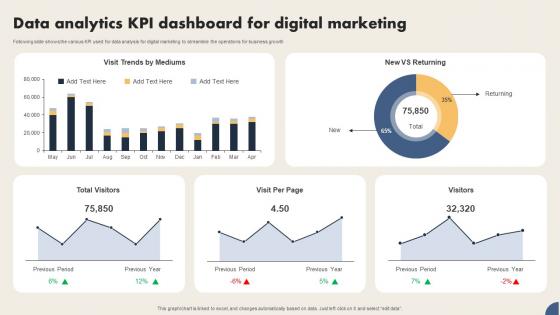
Data Analytics Kpi Dashboard For Digital Marketing




Try Before you Buy Download Free Sample Product
 Impress Your
 Audience
 100%
100% Editable
 Save Hours
 of Time


Following slide shows the various KPI used for data analysis for digital marketing to streamline the operations for business growth
People who downloaded this PowerPoint presentation also viewed the following :
Data Analytics Kpi Dashboard For Digital Marketing with all 7 slides:
Use our Data Analytics Kpi Dashboard For Digital Marketing to effectively help you save your valuable time. They are readymade to fit into any presentation structure.





FAQs for Data Analytics Kpi Dashboard
Key metrics for a data analytics KPI dashboard include data accuracy rates, processing speed, user adoption metrics, cost per insight, and real-time availability percentages. These indicators enable organizations to optimize their analytics investments by monitoring data quality, measuring operational efficiency, and tracking business impact, with many companies finding that comprehensive dashboard monitoring reduces decision-making time while improving strategic outcomes.
Customize your KPI dashboard by selecting metrics that directly measure your strategic goals, configuring visualization types that highlight critical performance trends, and establishing relevant benchmarks for your industry. Through customizable widgets and filtering options, businesses can focus on departmental objectives like sales conversion rates, operational efficiency metrics, or customer satisfaction scores, ultimately delivering actionable insights that drive targeted decision-making and competitive advantage.
Best practices for visualizing KPI dashboard data include using clear hierarchical layouts, consistent color coding, appropriate chart types for different metrics, intuitive navigation flows, and real-time data integration capabilities. These visualization strategies enhance decision-making by minimizing cognitive load, highlighting critical performance trends, and enabling quick pattern recognition, with many organizations finding that well-designed dashboards ultimately deliver faster strategic responses and improved operational efficiency.
Ensure dashboard user-friendliness by implementing intuitive navigation, clear visual hierarchies, customizable views for different roles, and consistent design elements across all interface components. Through strategic color coding, simplified terminology, and role-based access controls, organizations streamline decision-making processes while enhancing stakeholder engagement, with many finding that regular user feedback sessions ultimately deliver improved adoption rates and more effective data-driven insights.
Effective real-time dashboard tools include Tableau, Power BI, Qlik Sense, Grafana, and Looker, each offering robust visualization capabilities and seamless data integration. These platforms streamline decision-making by enabling automatic updates, interactive filtering, and customizable metrics, with many organizations finding that real-time insights significantly enhance operational efficiency and competitive responsiveness.
Integrating data from multiple sources involves using ETL processes, API connections, data warehousing solutions, cloud-based integration platforms, and real-time data streaming tools. These technologies streamline consolidation by automating data extraction, standardizing formats, and ensuring consistent updates, with many organizations finding that centralized dashboards enhance decision-making speed and operational visibility across departments.
Storytelling transforms KPI dashboards from static data displays into compelling business narratives by contextualizing metrics, highlighting trends, and connecting data points to strategic outcomes. Through visual hierarchies, progressive disclosure, and narrative flow, organizations create dashboards that guide decision-makers through insights, ultimately enabling faster comprehension and more confident strategic decisions across departments.
Effectively communicate dashboard insights by using clear visualizations with minimal jargon, focusing on business outcomes rather than technical metrics, and creating executive summaries that highlight actionable recommendations. Present data through storytelling approaches that connect KPIs to strategic objectives, while providing context around what numbers mean for decision-making, ultimately enabling stakeholders to understand performance trends and take informed actions.
Common KPI dashboard mistakes include overcrowding with excessive metrics, using poor visual design choices, lacking clear data hierarchy, ignoring user requirements, and failing to align KPIs with business objectives. These design flaws significantly impact decision-making effectiveness, with many organizations finding that streamlined, user-focused dashboards enhance analytical efficiency and strategic insights.
Historical data trends enhance KPI dashboards by enabling predictive forecasting, seasonal pattern recognition, and performance benchmarking against previous periods. Through trend analysis and comparative visualizations, organizations can identify growth trajectories, anticipate market shifts, and optimize resource allocation, with many finding that historical context transforms reactive reporting into strategic, forward-looking intelligence that drives competitive advantage.
Data accuracy and integrity techniques include automated data validation rules, real-time error detection systems, source data lineage tracking, regular audit protocols, and duplicate record identification processes. These methods streamline dashboard reliability by preventing inconsistent entries, flagging anomalies immediately, and maintaining clean datasets, with many organizations finding that proactive validation ultimately delivers more trustworthy insights and faster decision-making capabilities.
Update frequency depends on your business needs, data criticality, and operational tempo, with real-time updates for mission-critical metrics, daily refreshes for operational KPIs, and weekly or monthly updates for strategic indicators. Many organizations find that combining automated data feeds with scheduled refresh cycles streamlines monitoring while ensuring decision-makers access current insights, ultimately enhancing responsiveness and competitive advantage.
Line charts excel for tracking trends over time, bar charts compare categories effectively, gauge charts display performance against targets, heat maps reveal patterns in large datasets, and pie charts show proportional breakdowns. These visual elements enhance decision-making by presenting complex data intuitively, with many organizations finding that matching chart types to data characteristics streamlines analysis and accelerates strategic responses.
KPI dashboards track employee performance through metrics like task completion rates, quality scores, goal achievement percentages, time management efficiency, and productivity benchmarks. These systems enable managers to identify top performers, streamline resource allocation, and enhance team coordination across departments, while providing real-time insights that ultimately drive operational efficiency and strategic workforce optimization.
Mobile-friendly dashboards deliver real-time access to critical analytics, enhanced team collaboration, faster decision-making capabilities, improved operational flexibility, and seamless integration across devices. These solutions enable executives and managers to monitor KPIs during client meetings, respond to urgent alerts while traveling, and maintain strategic oversight from anywhere, ultimately delivering competitive advantage and accelerated business responses.
-
SlideTeam just saved my project! Thank you so much. The variety of templates helped me showcase multiple perspectives easily.
-
“You have the structure in place that are easy to explore new opportunities.I will be recommending your services to other people.”