


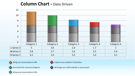
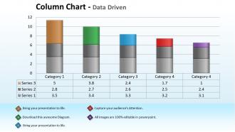
Data driven economic analysis with column chart powerpoint slides




Try Before you Buy Download Free Sample Product
 Impress Your
 Audience
 100%
100% Editable
 Save Hours
 of Time


Address the problem with our Data Driven Economic Analysis With Column Chart Powerpoint Slides. Convince your team of the viability of your solution.
People who downloaded this PowerPoint presentation also viewed the following :
Data driven economic analysis with column chart powerpoint slides with all 3 slides:
Our Data Driven Economic Analysis With Column Chart Powerpoint Slides are chronologically adept. They keep track of the times.
FAQs for Data driven economic analysis with column
Okay so descriptive analysis is basically just describing what you can see in your data - like averages, graphs, that sort of thing. Pretty straightforward stuff. Inferential analysis is where it gets more interesting though - you're trying to figure out what your sample data means for the bigger picture, like making predictions about entire populations. Think of descriptive as "this is what happened" and inferential as "this is probably what it means everywhere else." For inferential you'll need statistical tests, confidence intervals, all that fun math. I'd always start with descriptive first - gotta know what you're working with before you start making grand claims about the world.
Honestly, data viz is a game changer - it turns boring spreadsheets into something you can actually make sense of. Your brain just processes pictures way faster than rows of numbers anyway. Bar charts and line graphs are perfect starting points, then you can mess around with heat maps to see where stuff clusters together. Scatter plots are clutch for catching correlations you'd totally miss otherwise. I always tell people to start basic first - don't get all fancy with interactive dashboards right away. Once you see what patterns pop up, that's when the fun stuff happens. Trust me, you'll spot trends and weird outliers instantly.
Honestly, data cleaning is everything. Your analysis will be complete trash if you don't do it right - doesn't matter how fancy your models are. Missing values, duplicates, weird formatting issues... they'll destroy your results every time. I learned this the hard way when I spent two weeks on this project only to find out my dataset was a mess from day one. Pretty embarrassing actually. Clean data means you're working with real info, not just noise. My rule? Spend at least 30% of your time cleaning upfront. You'll thank me later when everything actually works.
Look at your data first - is it categories or numbers? Sample size matters too. T-tests work great for comparing continuous stuff between groups. Chi-square's your go-to for categorical data. ANOVA if you've got multiple groups to compare. Honestly, I always forget about checking normality assumptions until later (oops). What exactly are you trying to prove? Work backwards from that question. Those statistical flowcharts online are clutch when you're stuck - I've bookmarked like three of them. Don't overthink it though, the basics cover most situations you'll run into.
Honestly, data governance is where you gotta start - figure out what you're collecting and why before diving in. Create naming conventions early because trust me, you'll hate yourself later when you're drowning in "final_data_v2_ACTUAL.csv" files. Cloud storage is your friend since it scales with you. Set up automated backups and quality checks so you catch problems early. Oh, and clean your data right after collecting it - way easier when it's still fresh in your head. Version control everything and document as you go, even if it feels tedious at first.
So predictive analytics is basically using your existing data to figure out what'll probably happen next. Way better than just guessing, right? You can forecast customer behavior, catch risks early, manage inventory smarter - all that good stuff. Honestly, it's one of those things that sounds super complicated but isn't once you get into it. My advice? Don't go crazy trying to predict everything at once. Pick one area where you've got solid historical data and start there. Once you see how it works, you'll probably get hooked on finding patterns everywhere.
First thing - make sure people actually consented to what you're doing with their data. Be honest about your methods and goals too. Only grab the info you really need (seriously, I've watched projects collect way too much and create headaches later). Watch out for bias in your datasets - think about how your results might screw over certain groups unfairly. Anonymize stuff when you can. Before you start anything though, check if your company has ethics guidelines. Oh, and ask yourself if someone could use your analysis to discriminate against people.
So first thing - make some box plots or scatter plots to actually see where the weird data points are. Then run your analysis twice: once with the outliers, once without. Compare how much your means, correlations, and coefficients change between the two runs. If they're wildly different, those outliers are basically hijacking your results (which honestly happens more than you'd think). I like putting the results in a side-by-side table so the differences jump out at you. Oh, and figure out if the outliers are legit extreme values or just data entry mistakes - that'll tell you whether to toss them or keep them.
Apache Kafka's great for streaming data, and you can pair it with Spark or Flink for the actual processing. Tableau and Power BI work well if you want nice-looking dashboards. Budget matters though - some of these tools get expensive quick. I'd probably start with Spark and a basic dashboard to test things out. Oh, and figure out if you actually need instant results or if waiting a few seconds is okay. That changes everything. Your data volume makes a huge difference too, so don't go overboard right away.
Honestly, just start with the boring stuff that eats up your time - anomaly detection, spotting patterns, basic predictions. ML's perfect for that. I'd go with simple things first, like linear regression or clustering on data you already know inside and out. That way you can actually tell if the results make sense, you know? Don't overthink it - it's just another tool sitting next to Excel and SQL. Pick one specific problem, get comfortable with how it works, then slowly try fancier techniques. Way better than jumping into deep learning and having no clue what's happening.
Tell the story, not just the data. Charts should be dead simple - no jargon anywhere. Always start with "here's what this means for the business" because honestly, that's all they care about. I bombed my first exec presentation by diving straight into methodology (cringe). Now I lead with my main recommendation, then build the case backwards. Their goals matter more than your process. Write summaries they can skim in under two minutes - these people are slammed. Oh, and prep for questions by thinking like them. What would you actually need to know to make this call?
Look, your data sources are literally everything. Garbage in, garbage out - that's not just some saying, it's painfully true. If you're working with incomplete databases or biased samples, your whole analysis gets screwed up regardless of how fancy your methods are. I learned this the hard way on a project last year. Quality and accuracy of your source data determines whether you can actually trust what you find. Document any limitations upfront too. Trust me, you don't want to be explaining later why your recommendations bombed because your data was sketchy from the start.
Okay so basically data storytelling is way better than just dumping a bunch of charts on people. You're actually walking them through the "why this matters" part, which honestly makes your analysis way more memorable. People connect with stories about real problems, not just numbers floating around. It helps non-tech folks actually understand what you found - and trust me, that's huge when you need buy-in. Short version: start with the business problem first, then build your data around that narrative. Your stakeholders will actually remember what you presented instead of glazing over.
Ugh, correlation isn't causation - that's the big one everyone screws up. Also don't cherry-pick data just because it fits your theory, even though we all want to sometimes. Make sure your sample actually represents who you're studying, not just convenient people. Here's something I learned the hard way: investigate outliers before tossing them! They might be telling you the real story. Question your own methods constantly. Different explanations probably exist for whatever you found. Get someone else to look at your work before presenting - you'll be blind to obvious problems.
Honestly, just make the data available to everyone first - not locked away with your analytics people. Dashboards, self-service tools, whatever works. Your leadership team needs to actually walk the walk too. When your boss starts asking "what do the numbers say?" in every meeting instead of just winging it, everyone else follows pretty fast. Train folks on basic analysis stuff and make a big deal when teams actually use data for decisions. Oh, and create space where people can mess around with data without getting in trouble if they screw up - that's how they'll actually learn and get comfortable with it.
-
Presentation Design is very nice, good work with the content as well.
-
Informative design.