


Data visualization in human form





Try Before you Buy Download Free Sample Product
 Impress Your
 Audience
 100%
100% Editable
 Save Hours
 of Time


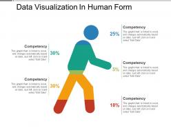
Give folks the confidence to attempt a fresh approach with our Data Visualization In Human Form PPT template. Explain the types of facts envision such as pie charts, bar charts, line charts and many more with the help of this design data visualization PPT layout. Take the assistance of this graphical representation PPT visual to showcase various tools of data visualization. Outline the key design principles for creating beautiful and effective data visualization for everyone with the use of this visual element PPT slide. Exhibit the competency percentage with the help of the human icon included in the PPT template. Help your audience to understand the significance of data with the use of visual representation PPT template. This high-resolution PPT presentation will guide to know about data visualization in the context of business intelligence. Elaborate on the uses of data visualization with the guidance of this visual analytics PPT layout.
People who downloaded this PowerPoint presentation also viewed the following :
Data visualization in human form with all 5 slides:
Get authorities to change conditions with our Data Visualization In Human Form. Interpose on behalf of the effected.

FAQs for Data visualization
Key principles of effective data visualization include clarity, accuracy, simplicity, consistency, and contextual relevance. These principles enhance decision-making by eliminating visual clutter, ensuring data integrity, and presenting information in intuitive formats, with many organizations finding that well-designed dashboards and charts significantly improve stakeholder comprehension and accelerate strategic business insights.
Choosing the right chart type depends on your data's purpose, audience, and story you want to tell, with bar charts for comparisons, line graphs for trends, pie charts for proportions, and scatter plots for relationships. Financial institutions use dashboards combining multiple chart types to present quarterly performance, customer segmentation, and market analysis, ultimately enhancing stakeholder understanding and accelerating data-driven decision making.
Color theory enhances data visualizations by improving readability, guiding attention to key insights, establishing visual hierarchy, and ensuring accessibility through contrast ratios. Through strategic color palettes, organizations streamline decision-making processes, reduce cognitive load for viewers, and create more intuitive dashboards, with many financial services and healthcare institutions finding that thoughtful color application significantly accelerates data comprehension.
Interactive data visualization enhances audience engagement by allowing users to explore, filter, customize views, drill down into details, and manipulate parameters in real-time. These dynamic features transform passive viewers into active participants, enabling deeper data exploration and personalized insights, while increasing comprehension rates and decision-making confidence across presentations and dashboards.
Common data visualization pitfalls include cluttered designs, misleading scales, inappropriate chart types, overwhelming color schemes, and lack of clear context or labels. These mistakes confuse audiences and undermine decision-making processes, with many organizations finding that streamlined, well-labeled visualizations enhance stakeholder comprehension, accelerate strategic discussions, and ultimately deliver more effective data-driven outcomes across departments.
Data visualization tools significantly enhance business decision-making by transforming complex datasets into clear, actionable insights through interactive dashboards, real-time analytics, and intuitive charts. These technologies enable faster pattern recognition, reduce analysis time, and improve stakeholder alignment, with many organizations finding that visual data presentation accelerates strategic decisions and enhances competitive advantage.
Storytelling in data visualizations can be integrated through sequential narratives, contextual annotations, interactive guided tours, progressive data reveals, and compelling visual metaphors. These techniques transform static charts into engaging experiences, with companies like Netflix using narrative dashboards to explain viewer trends and financial institutions creating story-driven reports that guide stakeholders through complex performance data, ultimately delivering clearer insights and stronger decision-making outcomes.
Cultural differences significantly affect visual data interpretation through varying color associations, reading patterns, symbolic meanings, and numerical conventions. For example, while red signifies danger in Western cultures, it represents prosperity in many Asian markets, and right-to-left reading cultures process charts differently, with many international organizations finding that localized visualizations enhance comprehension and decision-making across diverse stakeholder groups.
Ethical data visualization considerations include avoiding misleading scales, ensuring representative sampling, providing proper context, maintaining transparency about limitations, and preventing discriminatory interpretations. These principles enhance credibility by promoting accurate storytelling, protecting stakeholder trust, and enabling informed decision-making, with many organizations finding that ethical practices ultimately deliver stronger analytical outcomes and competitive advantage.
Font and typography choices significantly influence data comprehension by affecting readability, hierarchy establishment, and cognitive processing speed. Clear, sans-serif fonts like Arial or Helvetica enhance legibility across digital platforms, while strategic font sizing and weight variations guide viewers through data relationships, ultimately reducing interpretation time and improving decision-making accuracy in business presentations.
Emerging data visualization trends include augmented reality dashboards, AI-powered automated insights, voice-activated analytics, real-time collaborative visualization platforms, and immersive 3D data environments. These technologies streamline decision-making by enabling intuitive data exploration, reducing analysis time, and enhancing cross-team collaboration, with organizations in finance and healthcare finding significantly improved strategic planning and operational efficiency.
Animations enhance data presentation by highlighting key trends, guiding viewer attention through sequential changes, and revealing patterns over time through smooth transitions. Strategic use includes progressive data reveals, hover-activated details, and controlled pacing, with many organizations finding that subtle motion graphics improve comprehension while maintaining professional credibility, ultimately delivering clearer insights without overwhelming audiences.
Scale and proportion significantly impact data visual clarity by determining how accurately audiences interpret relationships, trends, and comparative values within datasets. Proper scaling ensures data points maintain their true proportions, while inappropriate scaling can distort perceptions, mislead decision-makers, and undermine analytical credibility, with many organizations finding that consistent scaling standards enhance comprehension and trust.
Ensuring accessibility in data visualizations involves incorporating color-blind friendly palettes, alternative text descriptions, keyboard navigation, screen reader compatibility, and high contrast ratios. These design principles enable organizations across healthcare, finance, and government sectors to reach broader audiences while enhancing user engagement, ultimately delivering inclusive experiences and competitive advantage.
**INPUT**: What resources and tools are recommended for beginners in data visualization? **OUTPUT**: Recommended resources for data visualization beginners include Tableau Public, Power BI, Google Data Studio, online courses from Coursera, and foundational books like "Storytelling with Data." These tools and educational materials streamline learning by offering intuitive interfaces, comprehensive tutorials, and hands-on practice opportunities, with many professionals finding that starting with user-friendly platforms accelerates skill development while building strategic analytical capabilities. [Word count: 60 words]
-
Amazing product with appealing content and design.
-
Unique design & color.