


Defining The Customer Journey Video Marketing Playbook




Try Before you Buy Download Free Sample Product
 Impress Your
 Audience
 100%
100% Editable
 Save Hours
 of Time


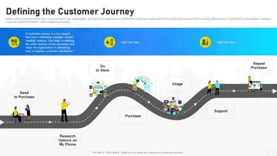
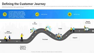
Defining the customer journey plays a crucial role for any organization, as it helps the organization to define their customer engagement touch points and measure their marketing effectiveness. The following slide displays a detailed customer journey framework with multiple touch points.
People who downloaded this PowerPoint presentation also viewed the following :
Defining The Customer Journey Video Marketing Playbook with all 6 slides:
Use our Defining The Customer Journey Video Marketing Playbook to effectively help you save your valuable time. They are readymade to fit into any presentation structure.





FAQs for Defining The Customer Journey
So the usual stages are awareness, consideration, purchase, onboarding, and advocacy. You might tweak those depending on your business though. For presenting it, horizontal timelines work great - people just get them instantly. Funnels are solid too. Oh, and circular diagrams look pretty slick if you want to show it's an ongoing relationship thing. Don't forget touchpoints and pain points at each stage. Honestly, the best advice I can give you? Keep it straightforward and throw in real customer quotes or actual data. Makes it way less theoretical and more like... you know, something that actually happens to real people.
Dude, those emotional moments are everything. People buy with their feelings first, then make up logical reasons later - I see it all the time. One bad support call? Purchase dead. But surprise someone with awesome onboarding or throw in unexpected perks? They're hooked. Your customers hit all these different emotional states as they move through your funnel. Map out where they might get pissed off, confused, or genuinely excited. Then you can actually design those touchpoints instead of just hoping they work out. Trust me, focusing on the feels beats rational arguments every single time.
Honestly, I'd focus on just 2-3 key metrics per stage or you'll drive yourself crazy trying to track everything. For awareness, look at website traffic and social reach. Consideration stage? Email opens and how people engage with your content. Then conversion stuff like trial signups and actual purchases. Oh, and don't ignore what happens after someone buys - retention rates and repeat purchases tell you if your product actually works. I learned this the hard way when I was obsessing over acquisition but had terrible churn. Map your specific KPIs to each funnel touchpoint, then build simple dashboards. Pick metrics that actually move the needle for revenue, not vanity numbers.
Honestly, drawing out your customer's journey is a game changer. Make some simple sketches or flowcharts showing every step - when they first hear about you, buying process, getting support after. Way better than staring at boring spreadsheets! The visual stuff makes problems super obvious. Watch for spots where people bail out or get frustrated. I'd start with just one type of customer first, like your most common buyer. Then grab your team and brainstorm fixes using those same drawings. It's kinda fun actually - like solving a puzzle but for your business.
Customer feedback is basically your GPS for spotting what's broken in your customer experience. People will straight-up tell you where they're getting stuck or frustrated - you just have to listen. Surveys work great, but don't sleep on support tickets and reviews either. Honestly, even random conversations can reveal patterns you missed. The hard part isn't collecting feedback though, it's actually doing something with it. Most companies just let it sit there collecting digital dust. Pick your top 3 complaints and fix those pain points first. Way better than guessing what's wrong.
Okay so think about it this way - when you lump everyone together, you're basically missing how different people actually shop. Like, new customers might spend weeks researching everything while your regulars already know what they want and just buy it. It's kinda like giving the same directions to tourists and locals, which obviously doesn't work. What you want to do is break people into groups - maybe by demographics or how they've shopped before. Then you can actually see the different paths each group takes. I'd start with just 2-3 segments and compare them side by side. Way easier to spot the patterns that way.
Don't rely on assumptions - use actual customer data or you'll map fantasy scenarios. Focus on real paths, not just the smooth ones (customers always find weird ways to break things, honestly). Keep your maps simple enough that people will actually look at them. Get stakeholders involved early and validate everything with real feedback. Your first version will probably suck anyway, so expect to redraw entire sections. Test it out, see what's wrong, fix it. The messy detours are usually where you learn the most interesting stuff about how people actually use your product.
Create personas for different user paths in your presentation. Sarah the busy exec takes shortcuts, Mike the researcher reads everything - honestly, the cheesier the names, the better people remember them. Walk through 2-3 distinct personas with different pain points and show how each navigates your product. I like using their actual quotes between journey stages because it keeps things real. Your stakeholders will think "what would Sarah do?" instead of forgetting some generic scenario. Way more memorable than abstract user flows that don't stick.
Okay so there's a bunch of options depending on your budget. UXPressia and Smaply are built specifically for customer journeys, which is nice. But honestly? Most people I know just use Miro or Mural because the collaboration features are solid and your team can jump in easily. PowerPoint works too if you're being scrappy about it - I've seen some surprisingly good maps come out of basic tools like that. Lucidchart's decent as well. Don't overthink the platform choice though. I'd probably start with Miro's free trial since it's pretty intuitive and sharing with stakeholders is painless.
Look, omnichannel is really just about meeting customers where they actually are. Someone browses on their phone, chats with support, then shows up in-store - and somehow all that info follows them around. No more "let me start from the beginning" conversations, which honestly should've been fixed years ago. Your systems need to actually communicate with each other (shocking concept, I know). That way you can personalize stuff without making people repeat their whole story every time they switch channels. I'd start by figuring out where your handoffs currently suck the most.
Oh totally! Starbucks nailed this - they figured out customers were pissed about waiting forever, so they completely revamped their stores and mobile ordering. Revenue shot up 21% after that. Disney did something similar and boosted guest satisfaction by 30%. The healthcare stuff is wild too, like really dramatic changes. My advice? Don't try mapping your entire customer journey right away - that's overwhelming. Pick one problem area first and work from there. Way more manageable that way.
Okay so first thing - map out where people are actually hitting your brand, then match your messaging to that stage. Someone just discovering you? Don't immediately pitch them your premium package lol. Educational stuff works way better early on. Time your campaigns around the data you're seeing, and honestly, most brands blow their budget on channels that look good but don't actually push people through the funnel. Quick win: take your current campaigns and see where they totally miss the mark compared to your customer journey. You'll probably find some pretty glaring gaps.
Start with the visual flow - you want people following along without getting lost. Stick to the same icons and colors throughout, but definitely call out pain points with red zones or whatever catches the eye. I'm partial to timeline layouts myself, though I've seen some cool circular ones that actually work pretty well. Throw in real customer quotes and data at key moments - keeps it from feeling too theoretical, you know? Each stage should end with clear emotions like "frustrated" or "delighted." Don't overdo the text. Let your visuals do the heavy lifting.
Dude, skip the boring flowcharts - nobody cares about those. Turn your customer journey into an actual story instead. Like "Sarah's laptop crashes right before her big presentation" - way more engaging than bullet points, right? Include the emotional stuff too - where people get frustrated, those tiny wins they feel. Makes the data way stickier. Honestly, I've seen presentations transform just by starting with "Meet Jessica" instead of diving straight into steps. People connect with characters, not processes. Oh, and don't forget those friction moments - they're usually the most interesting part anyway.
Honestly, visuals are a game-changer for this stuff. People's eyes just glaze over when you start talking about "awareness phases" and whatnot - but show them a flowchart or infographic? Suddenly they get it. I've had good luck with simple sketches showing the emotional rollercoaster customers go through. Interactive maps are clutch too since people can click around and actually explore. Oh, and don't just slap visuals on at the end - that never works. Build your whole presentation around the visual story first. Makes everything flow better and keeps people awake.
-
Unique research projects to present in meeting.
-
Enough space for editing and adding your own content.